




Dallas Trinity FC
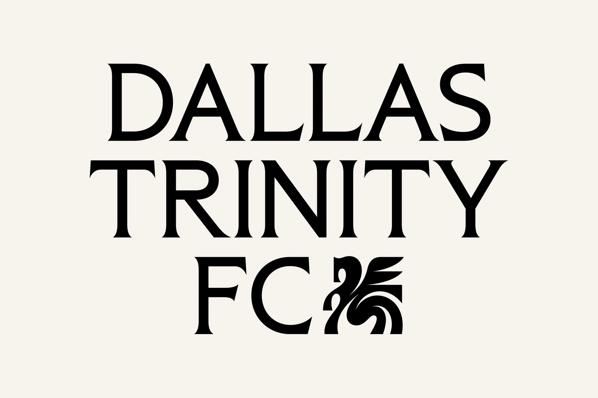
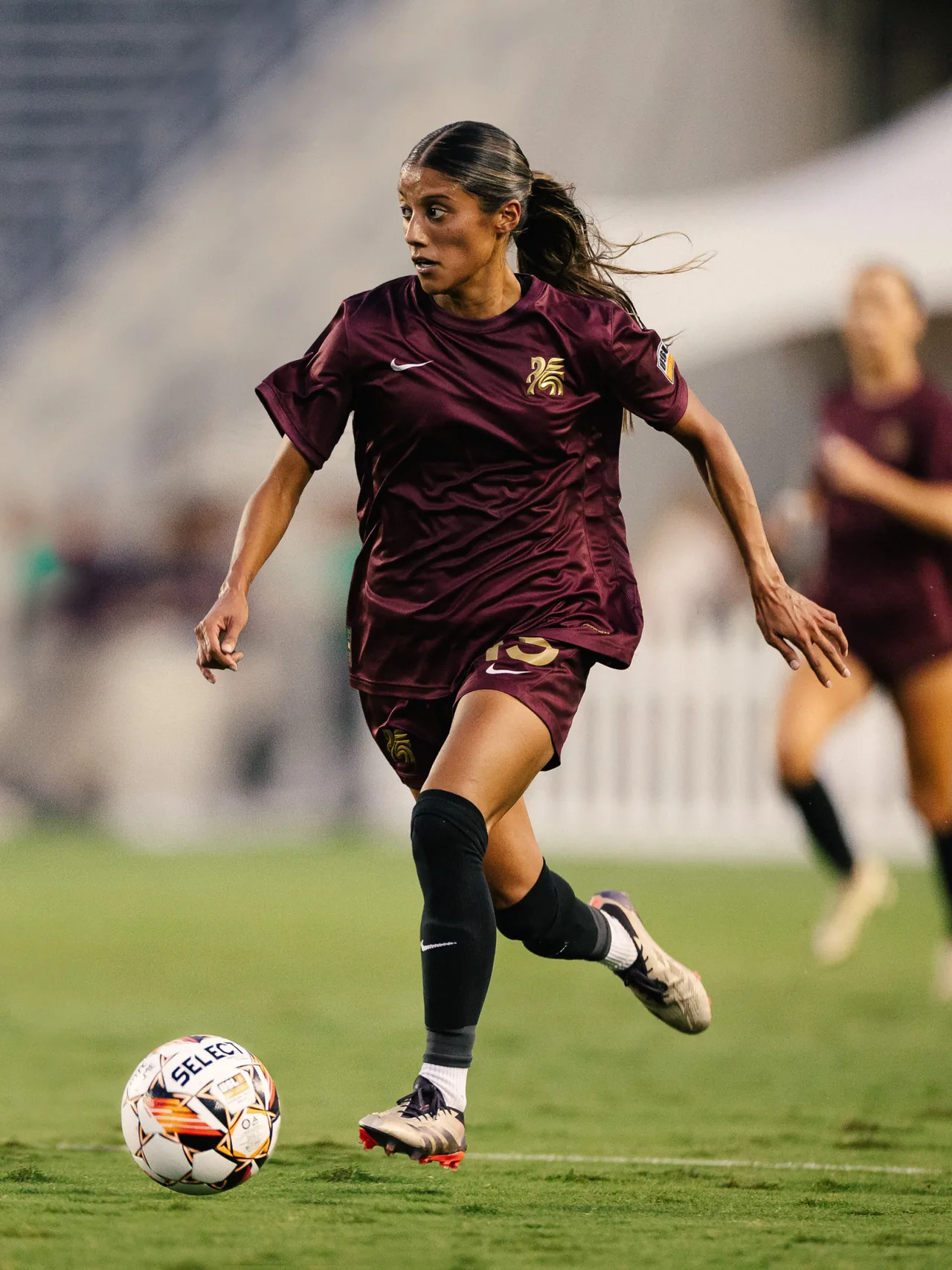
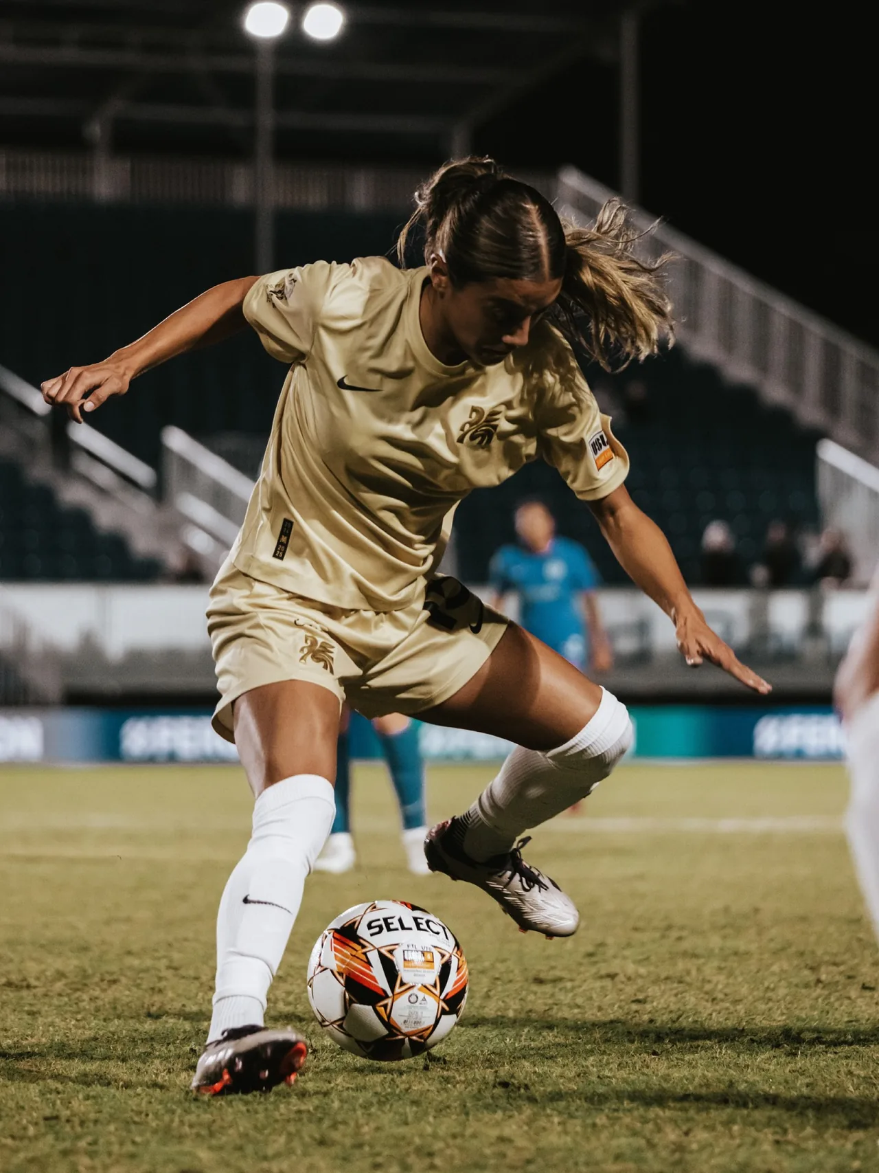
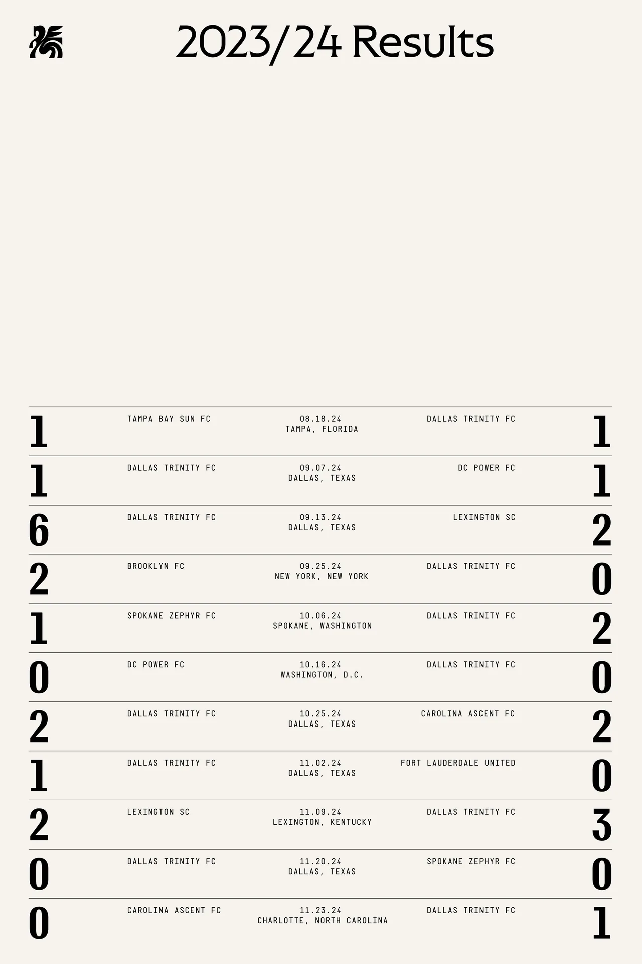
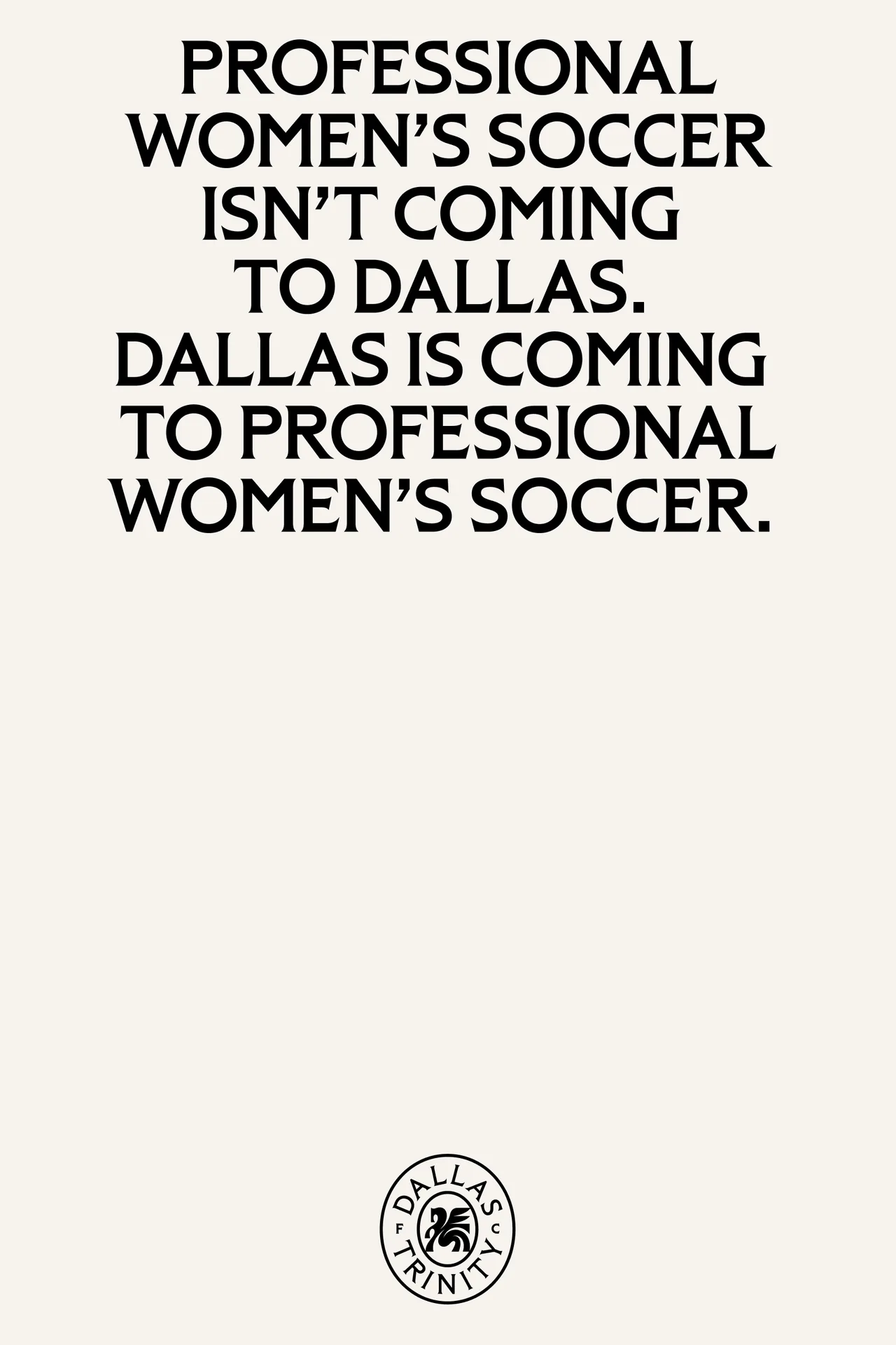
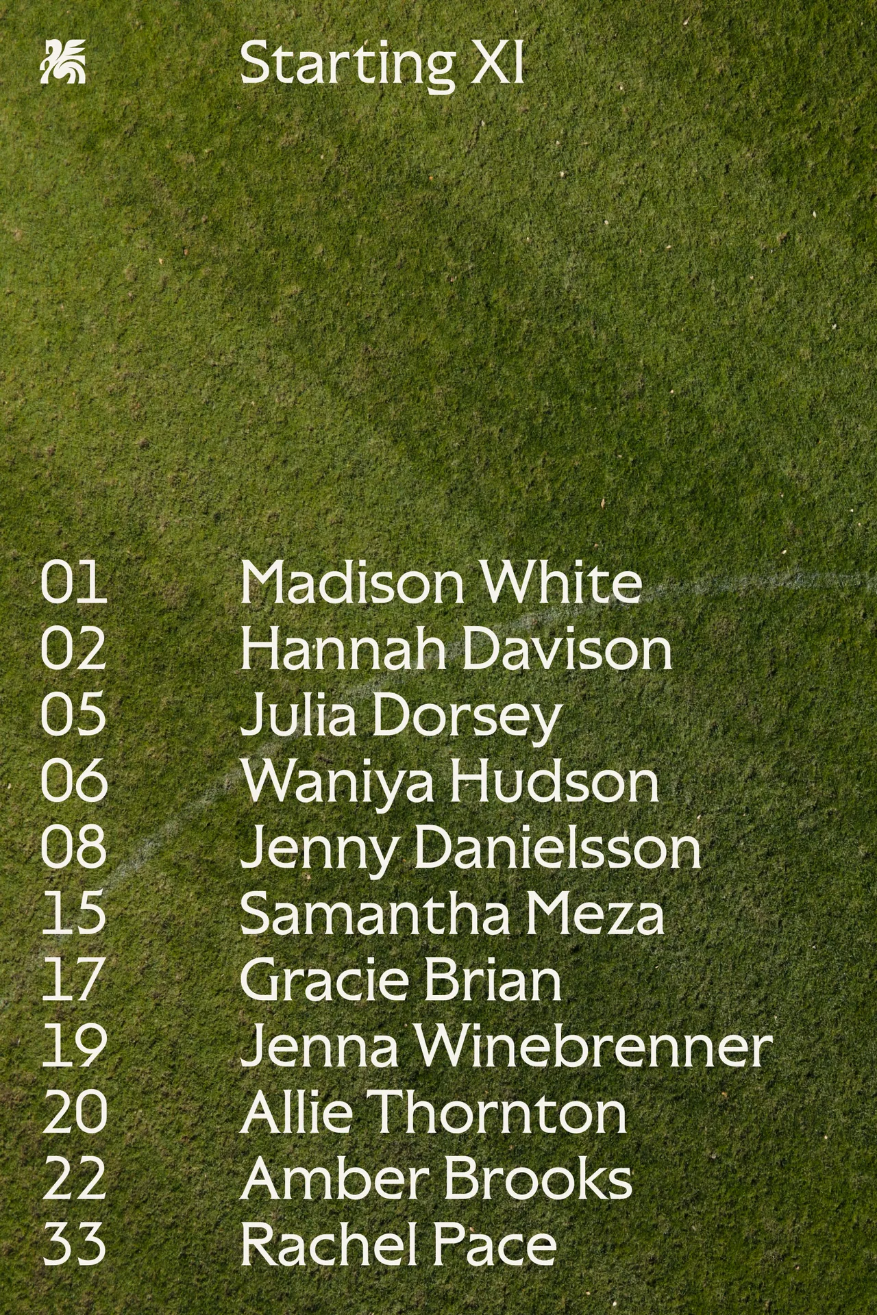
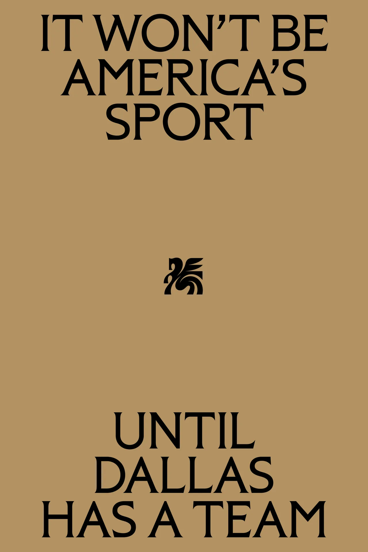
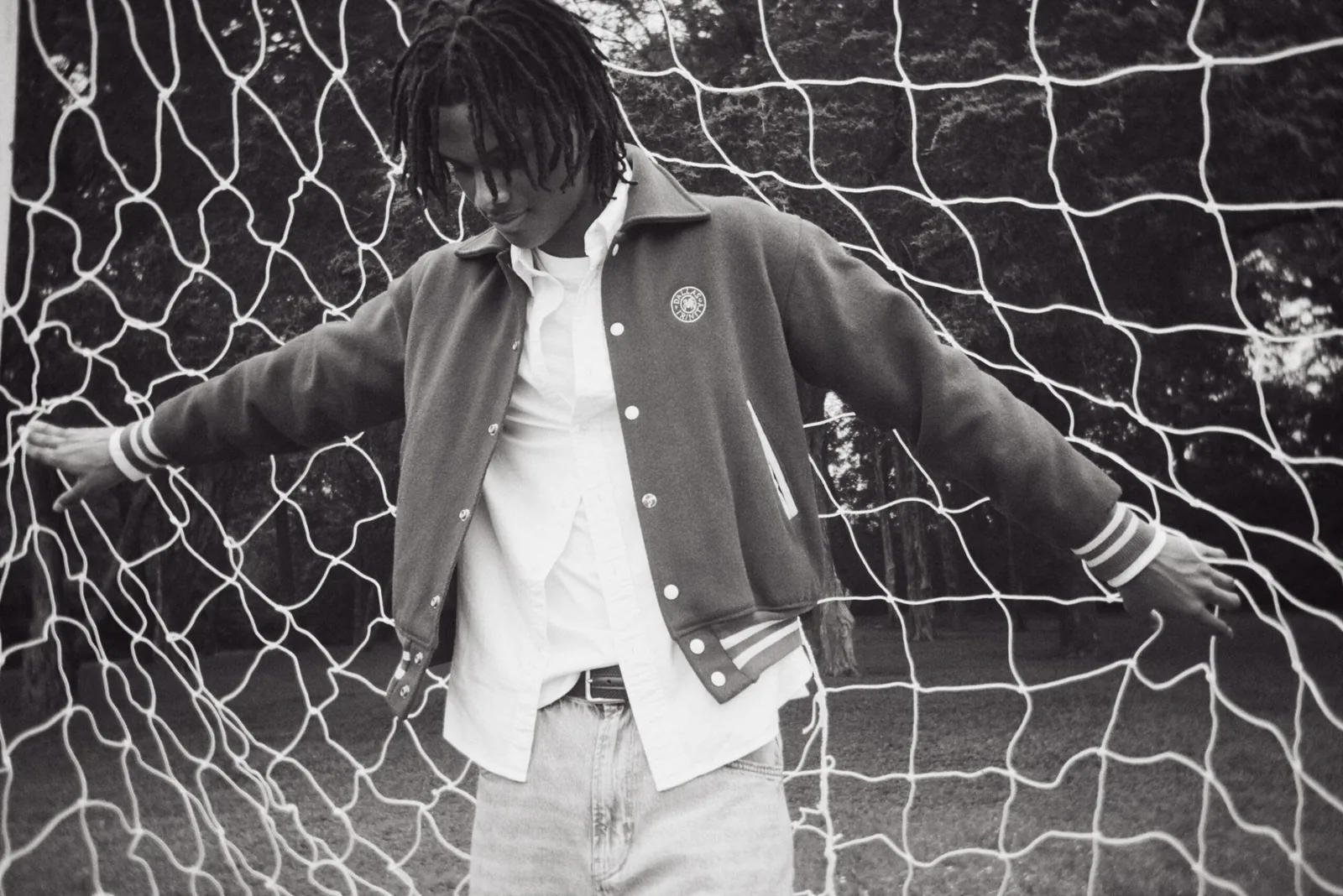
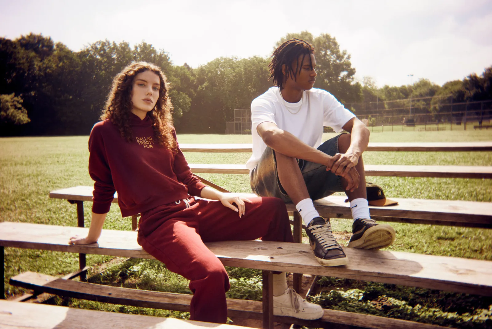
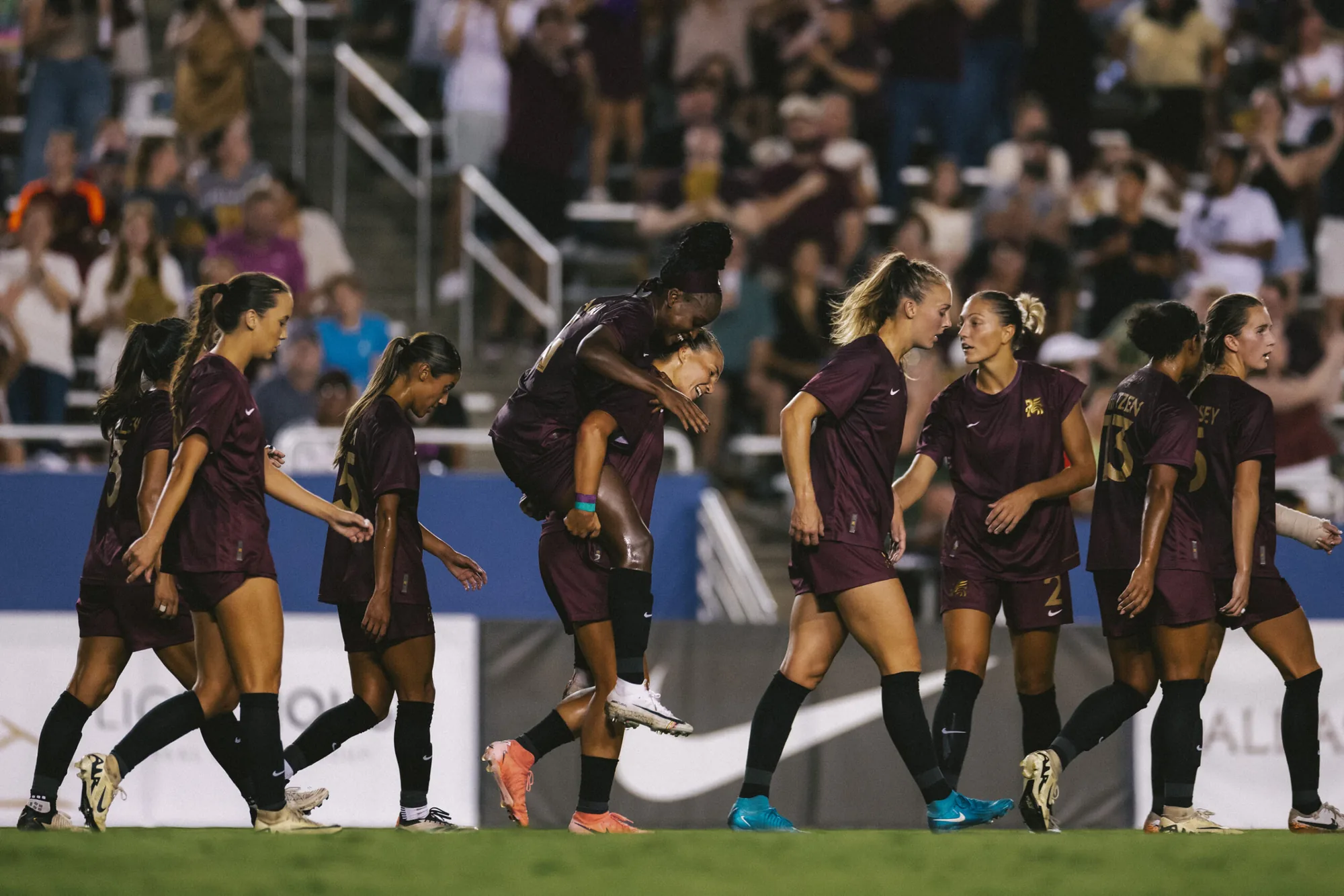
Dallas Trinity FC is the first professional women's soccer team in Dallas, part of the new USL Super League. Moniker built the identity with ModestWorks around one line: women's soccer is on the rise, but it's not America's sport until Dallas has a team.
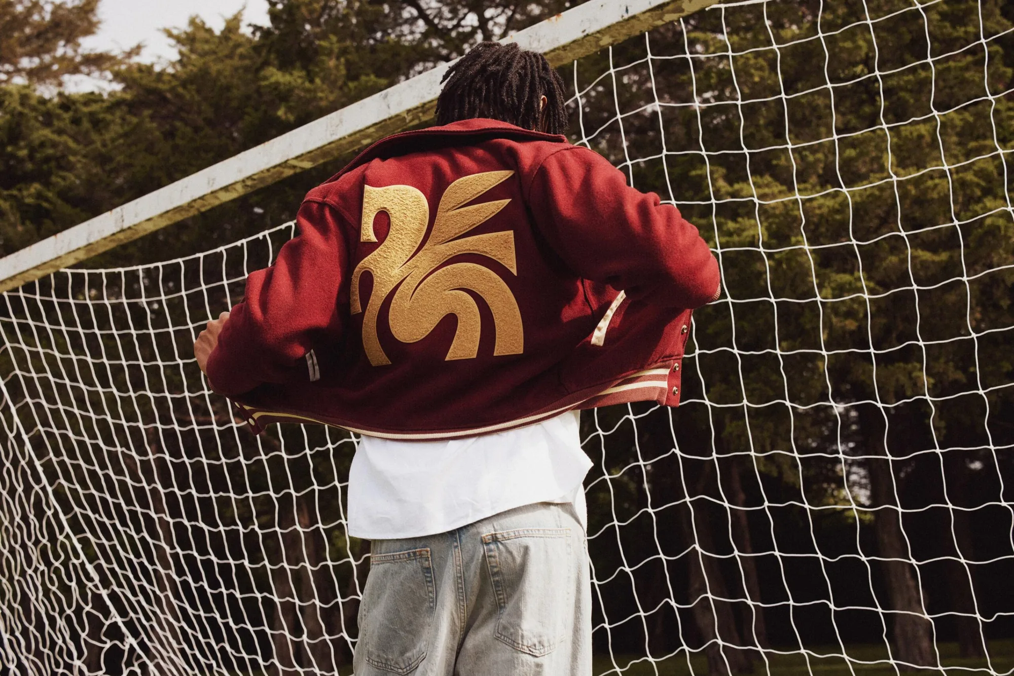
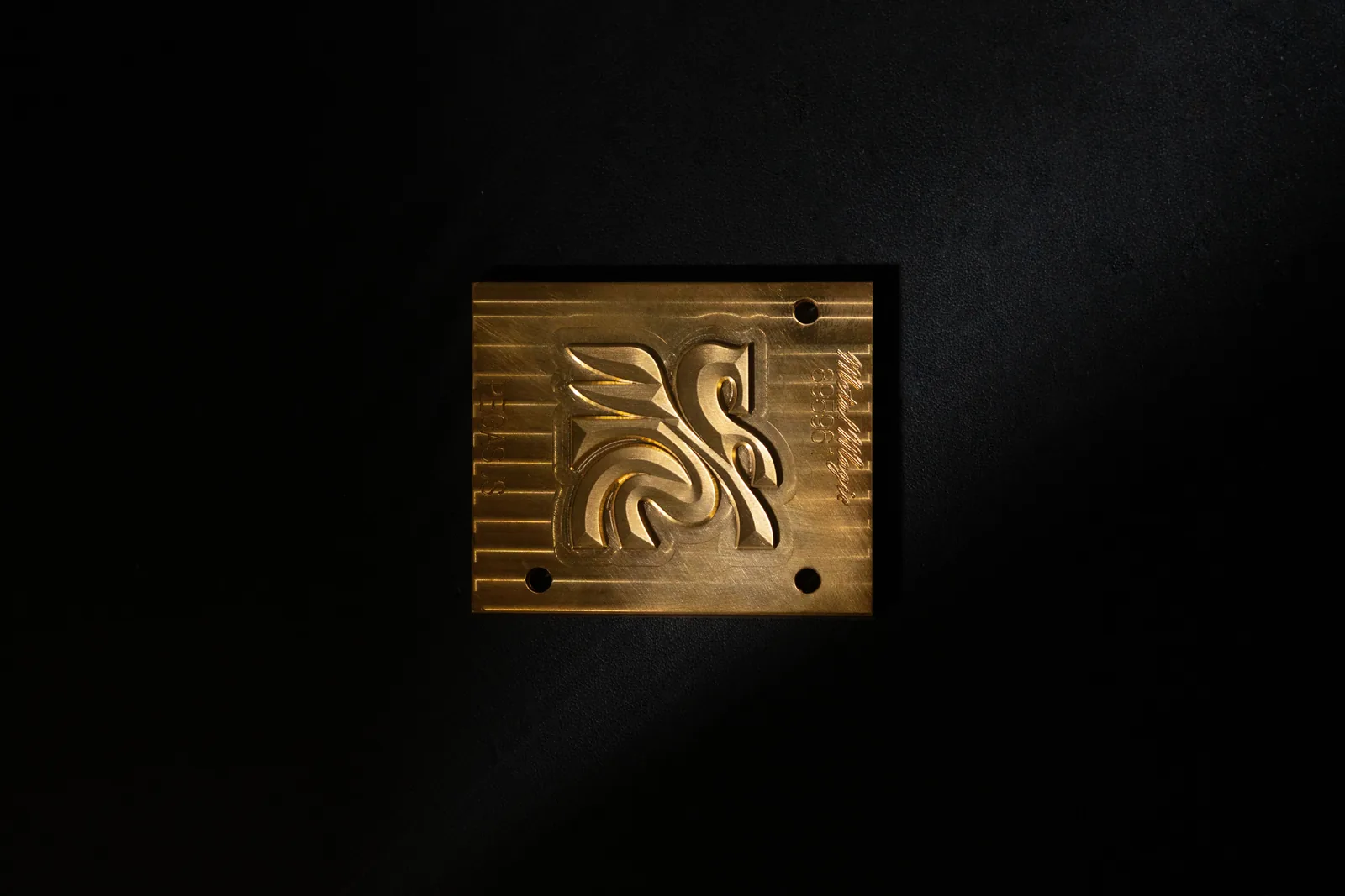
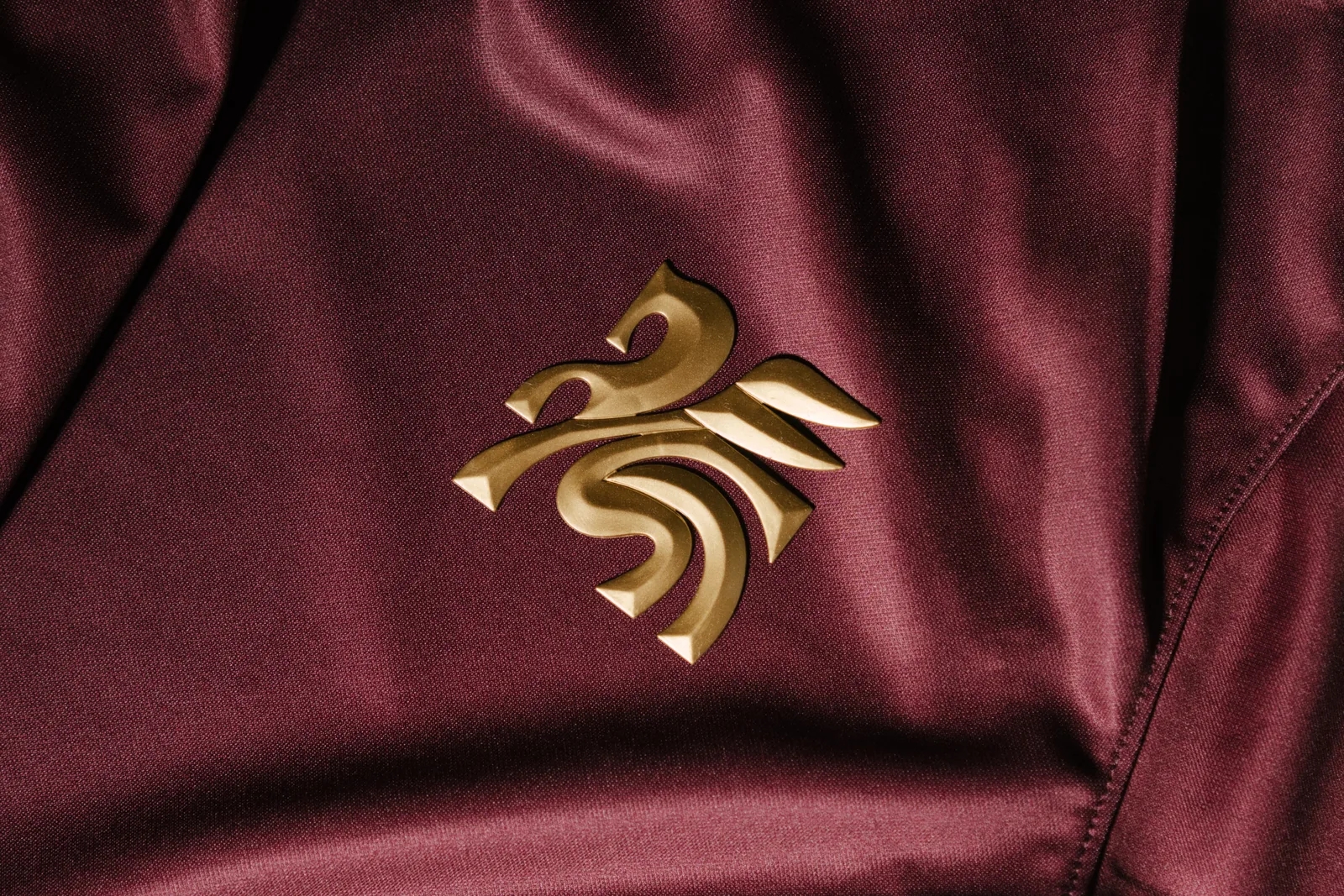
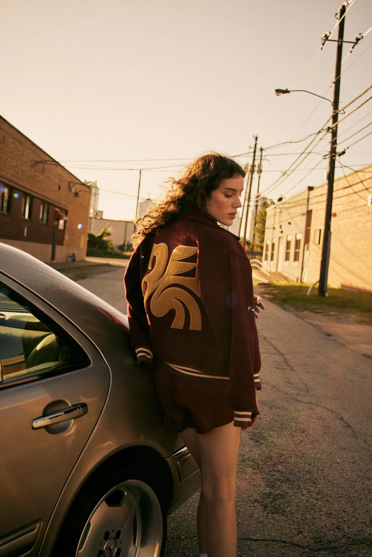
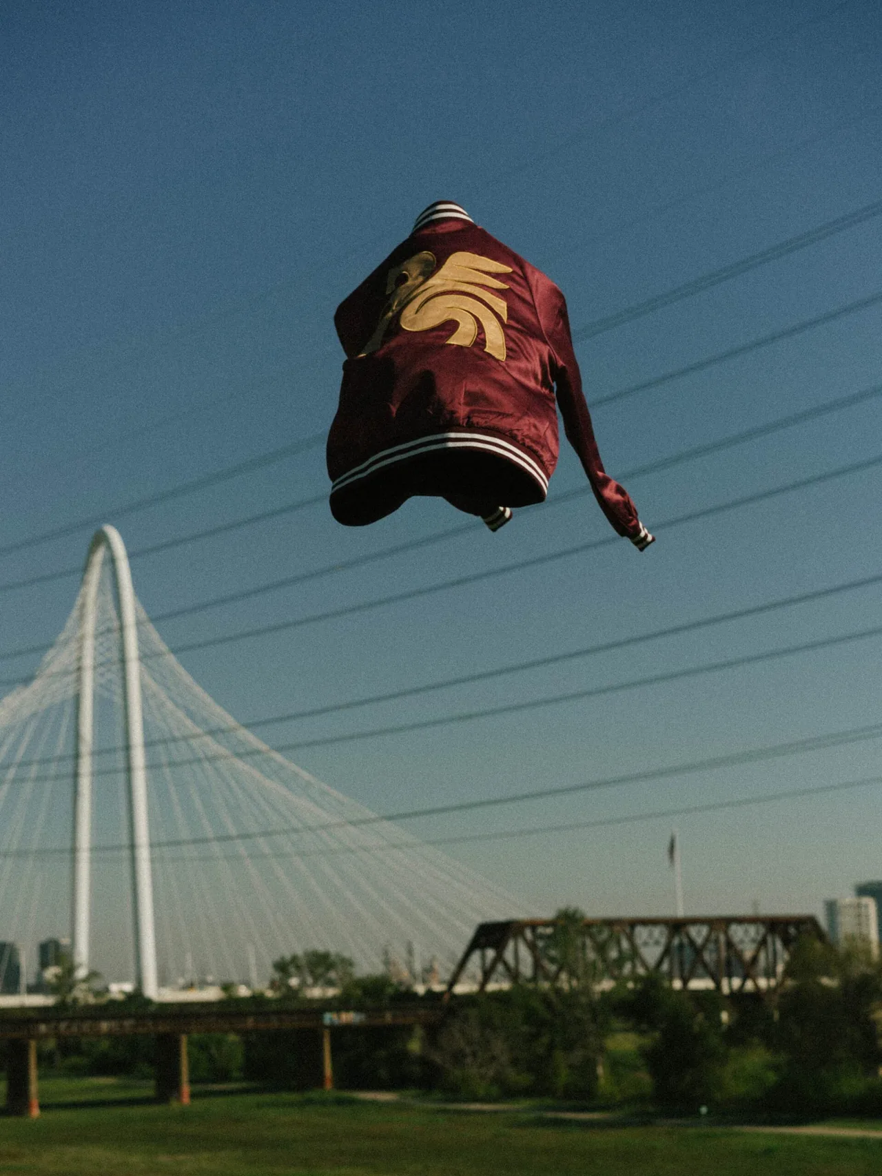
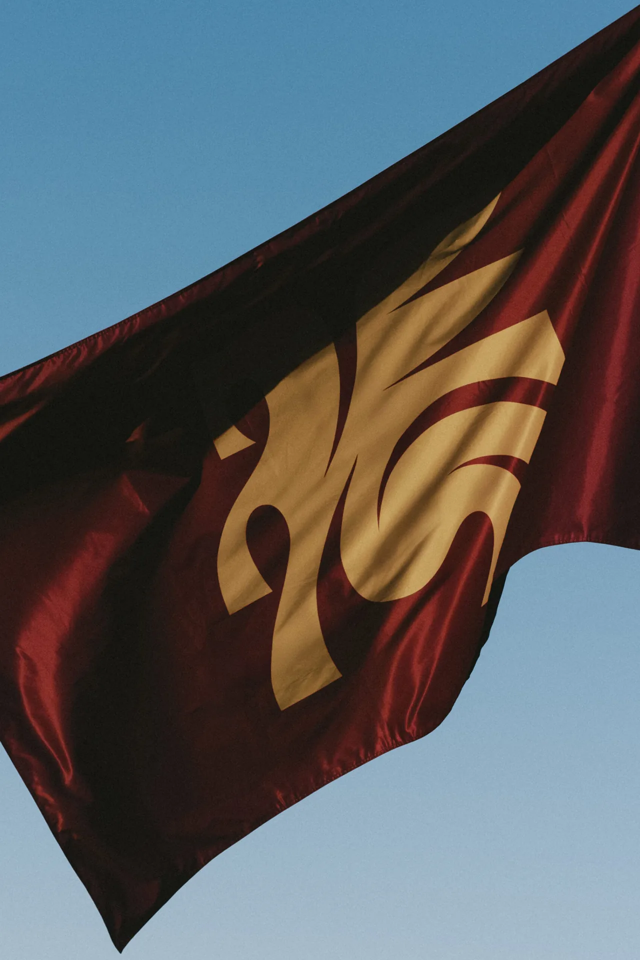
The name comes from the Trinity River, which winds through town and has been part of Dallas's story since the city was founded in 1841. The crest reimagines the red neon Pegasus that has lit downtown Dallas from the top of the Magnolia Petroleum Building since the 1930s, a symbol of the city's pride, progress and persistence.
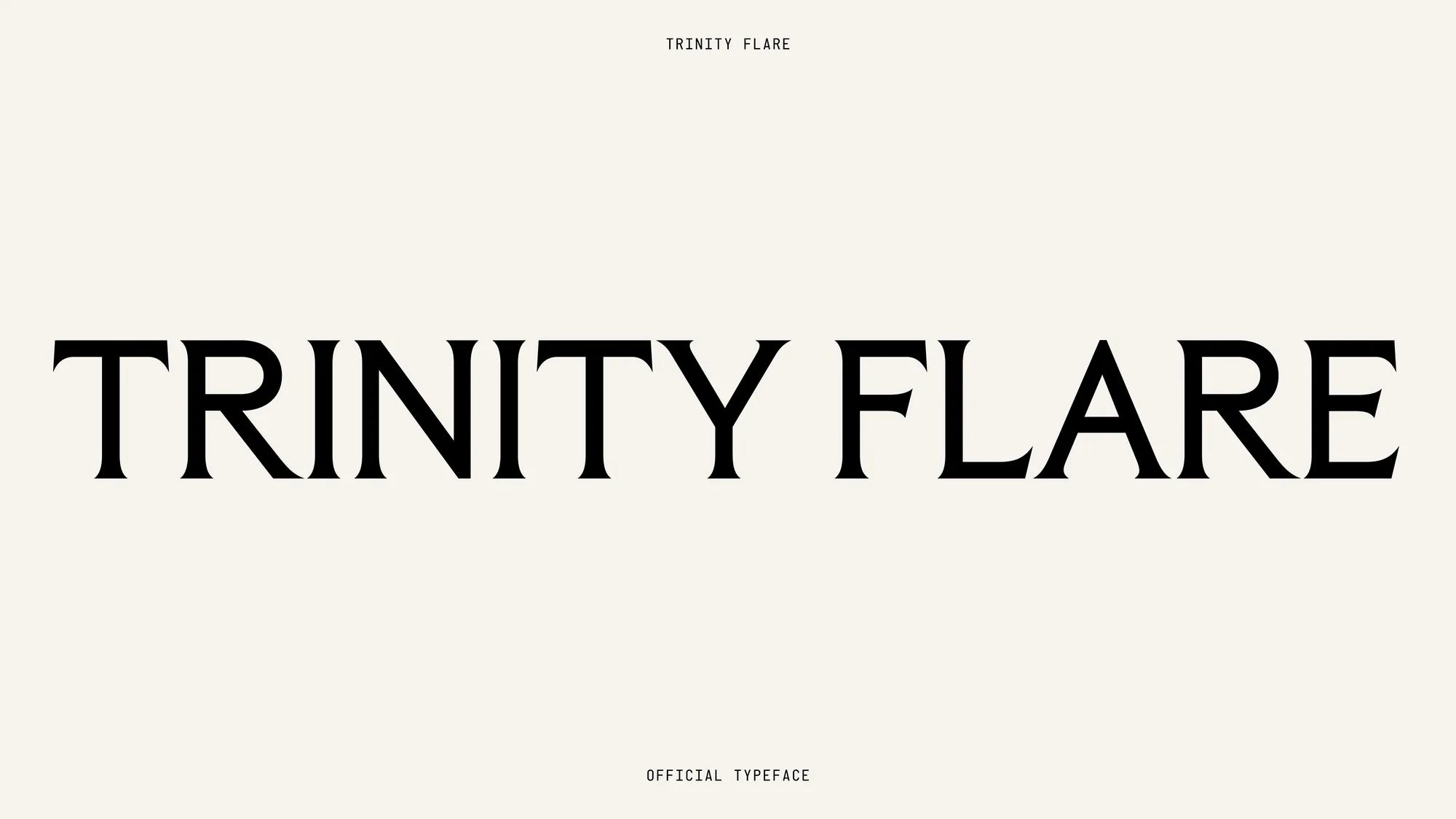
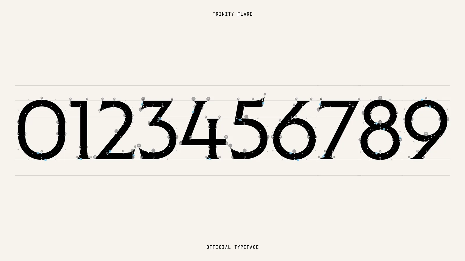
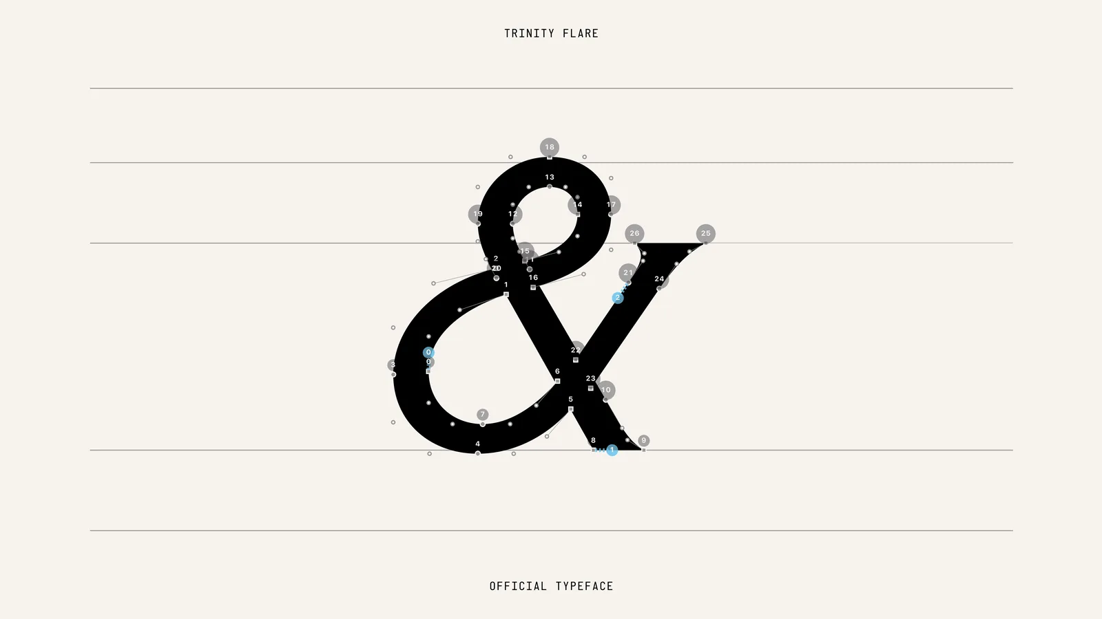
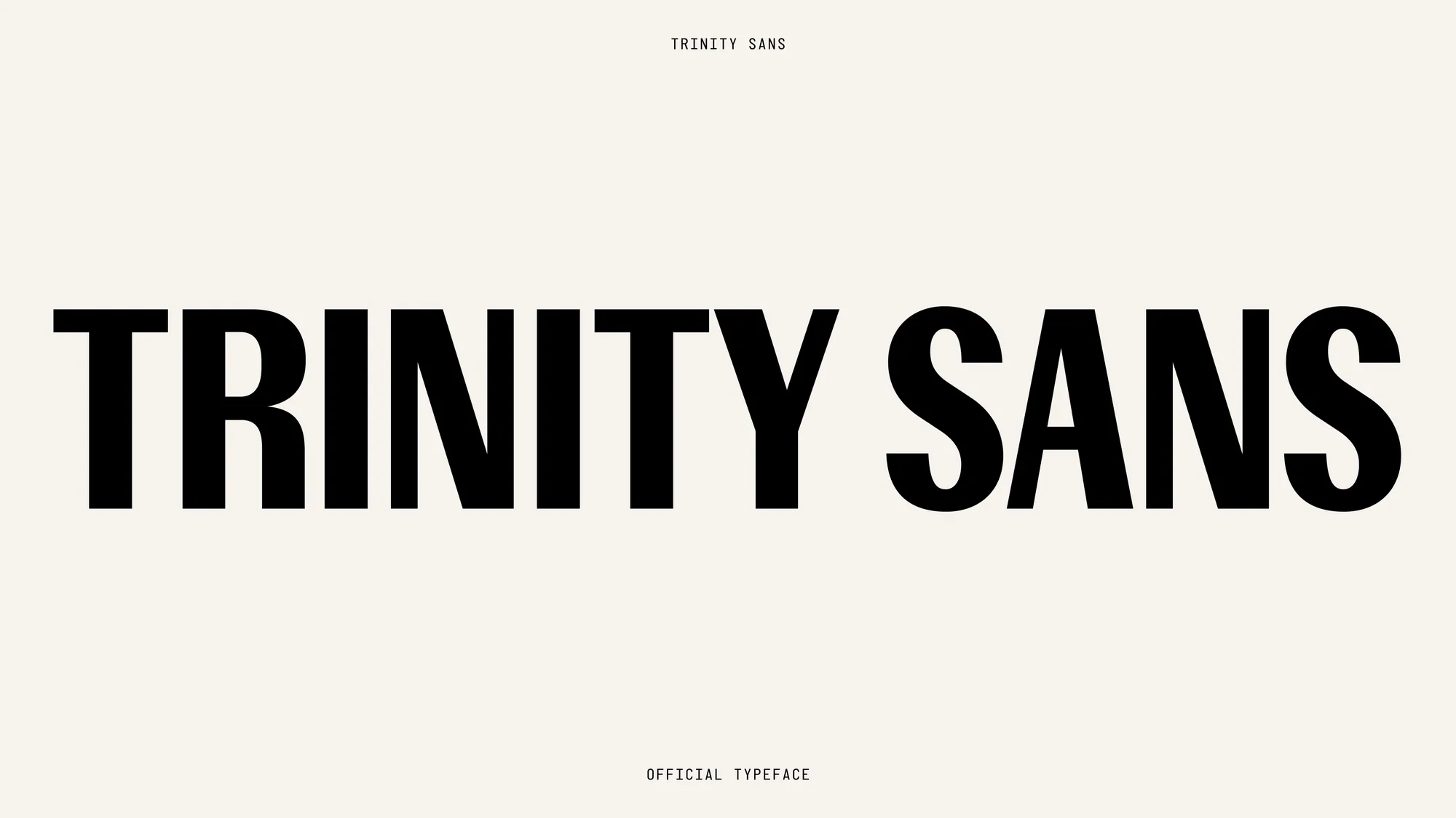
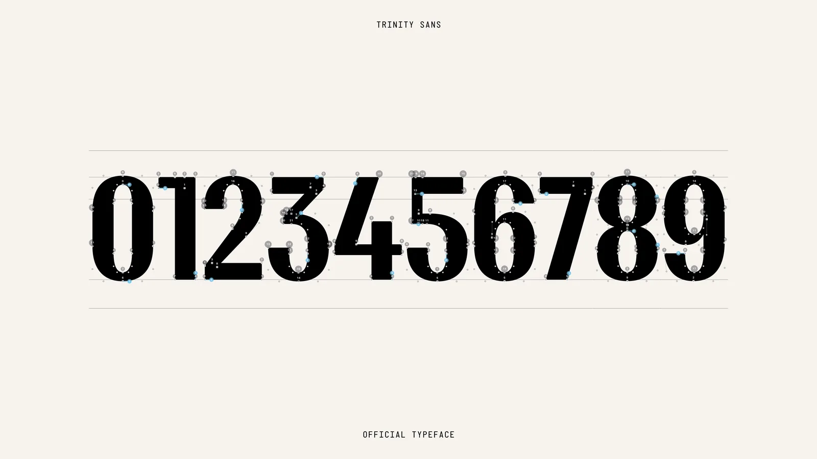
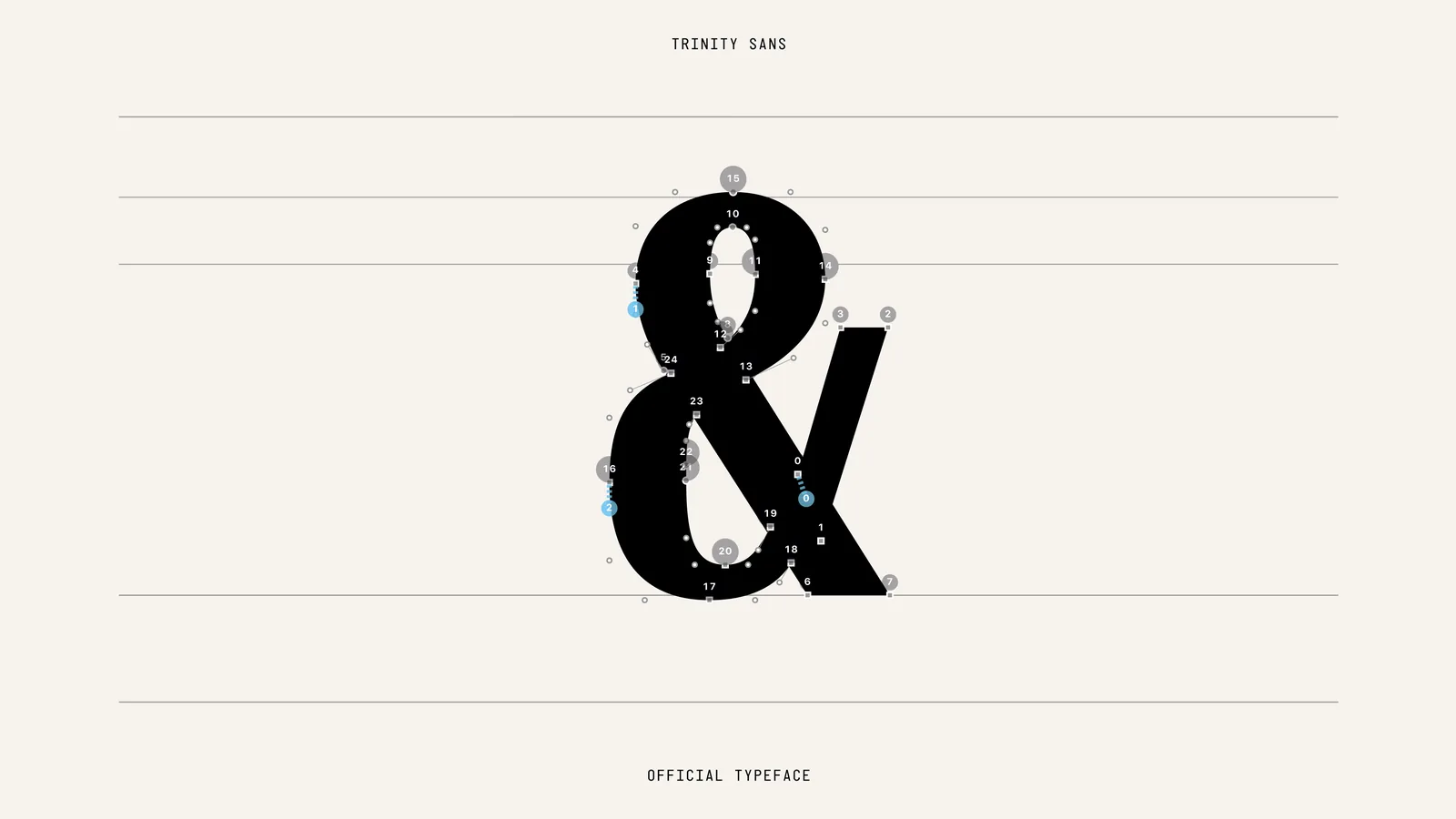
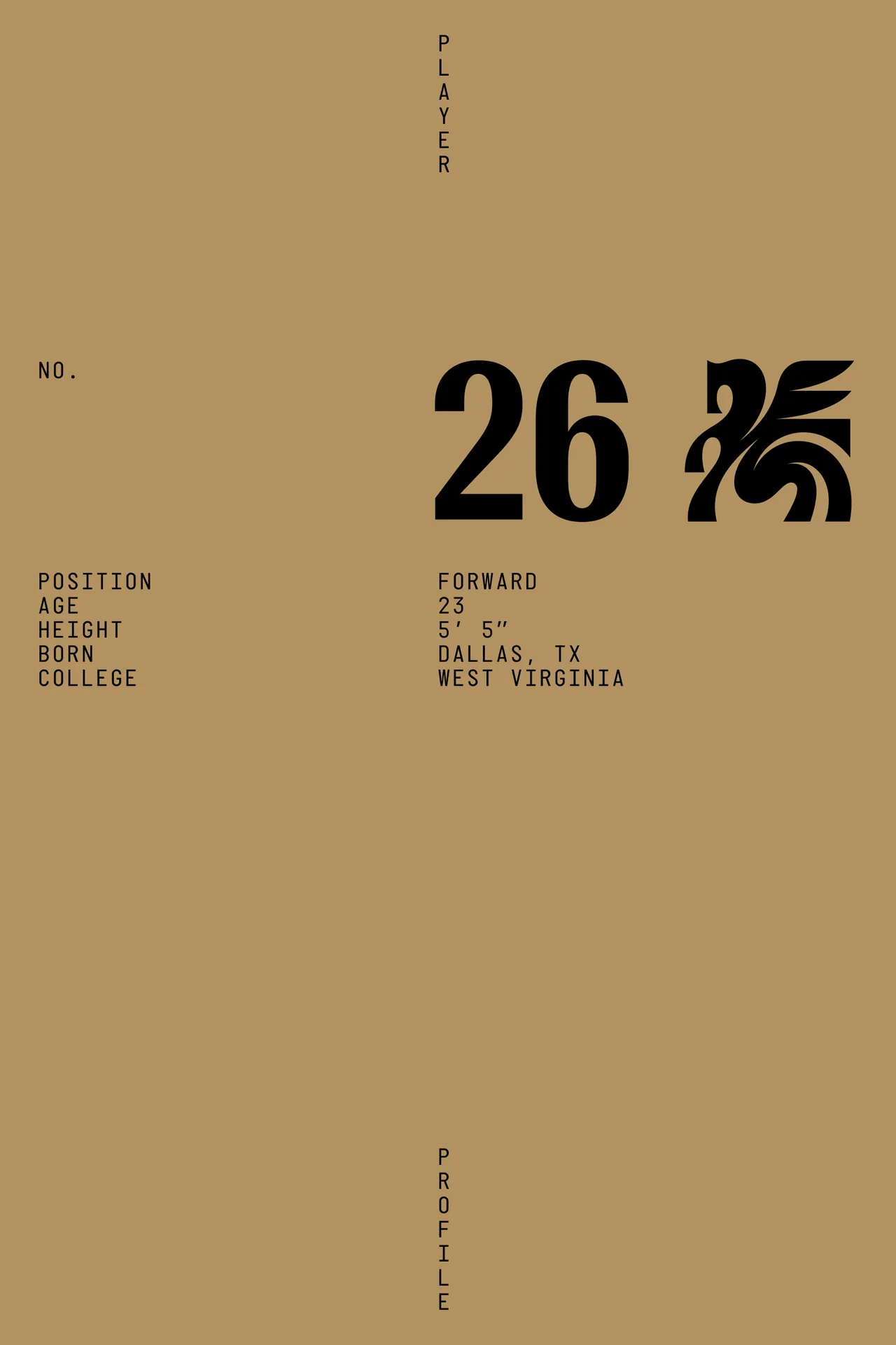
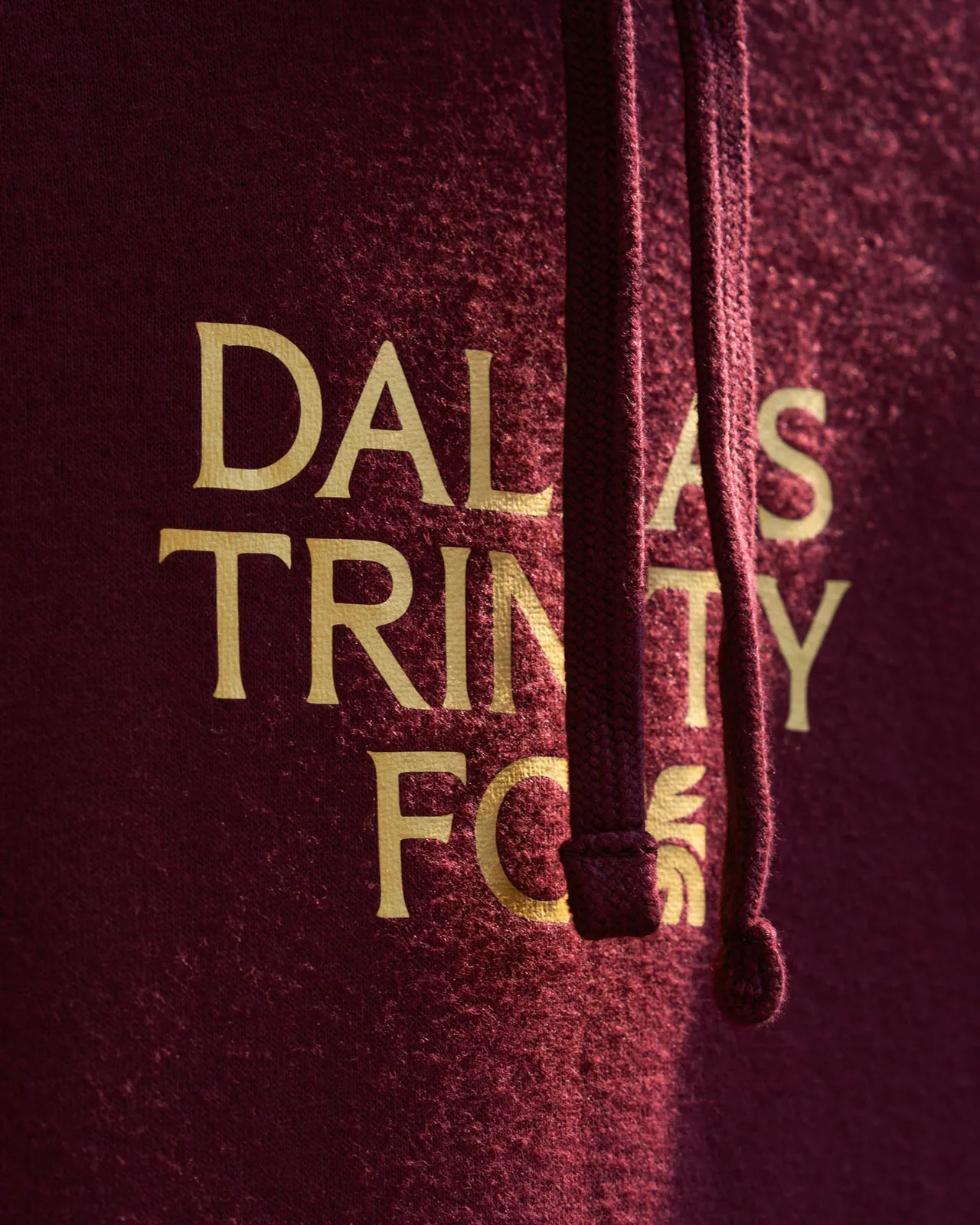
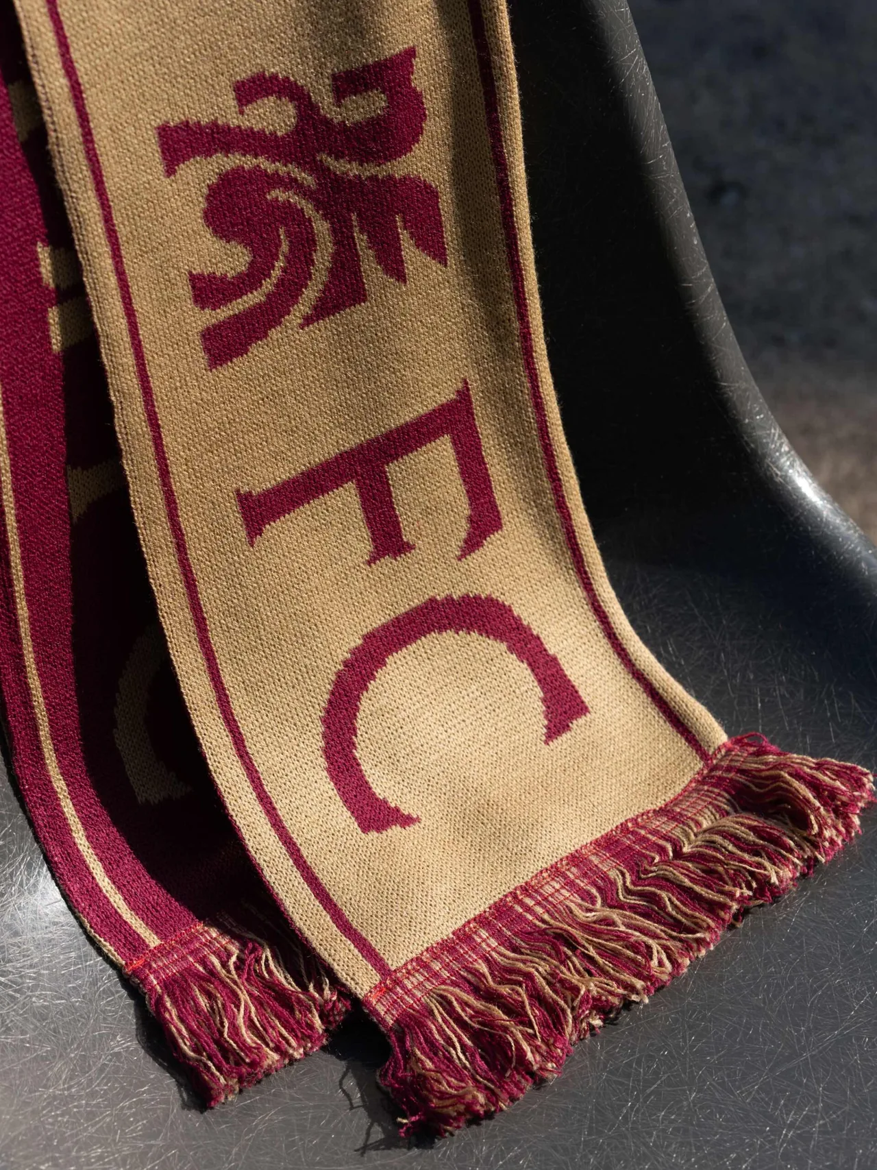
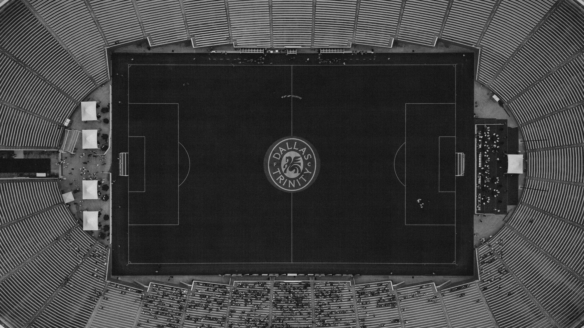
The look comes from the team's first home, the Cotton Bowl in Fair Park, surrounded by one of the world's finest collections of art deco architecture. Two custom typefaces, Trinity Flare and Trinity Sans, echo the letters carved into stone across Fair Park's buildings.
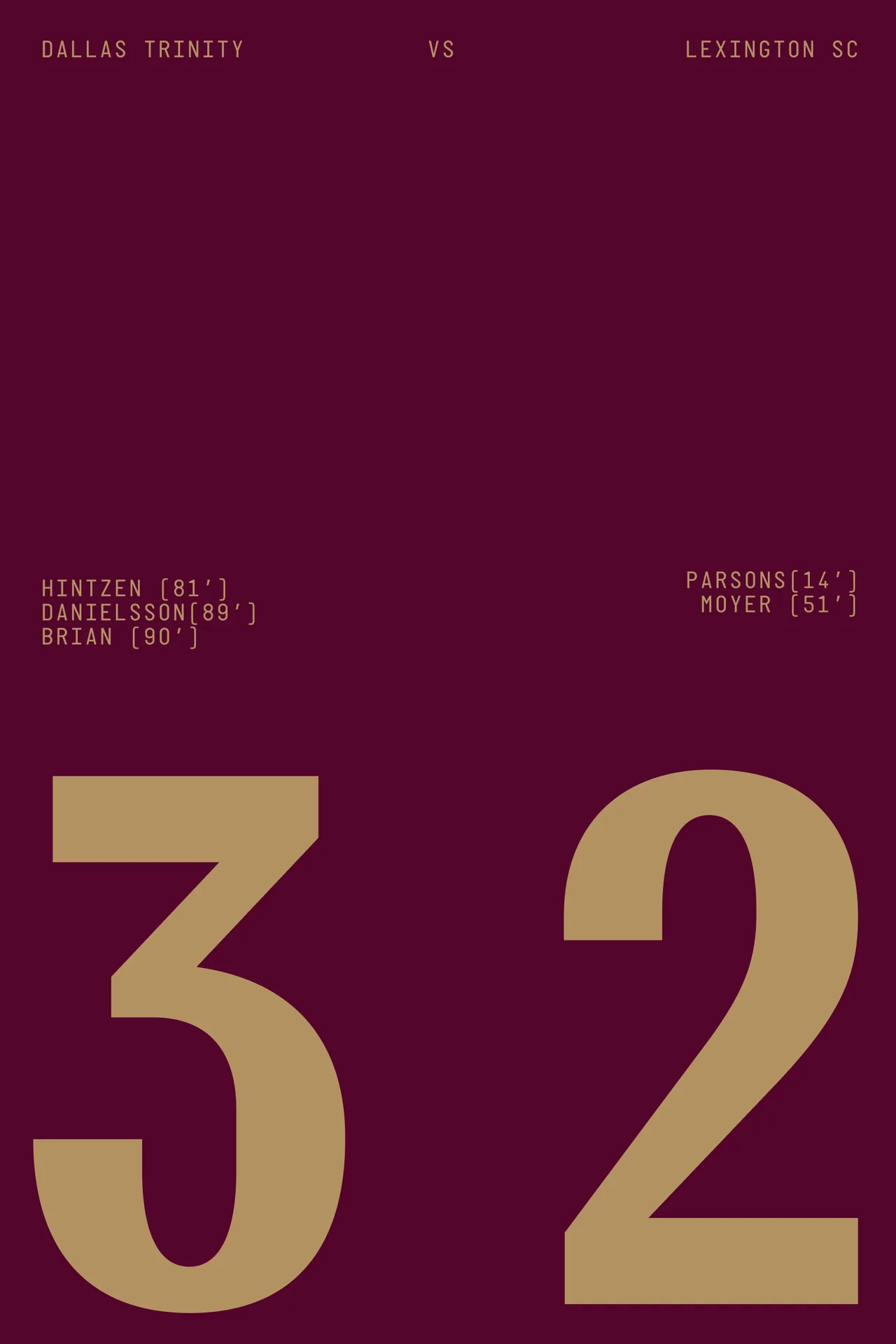
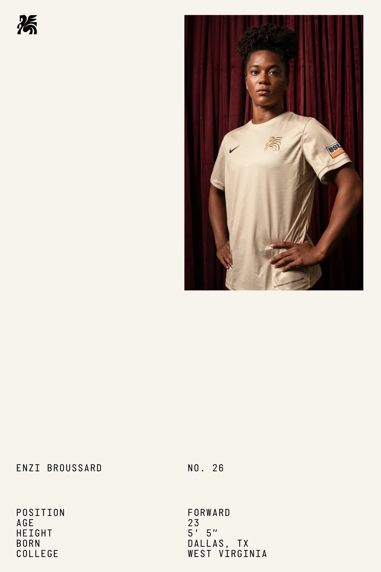
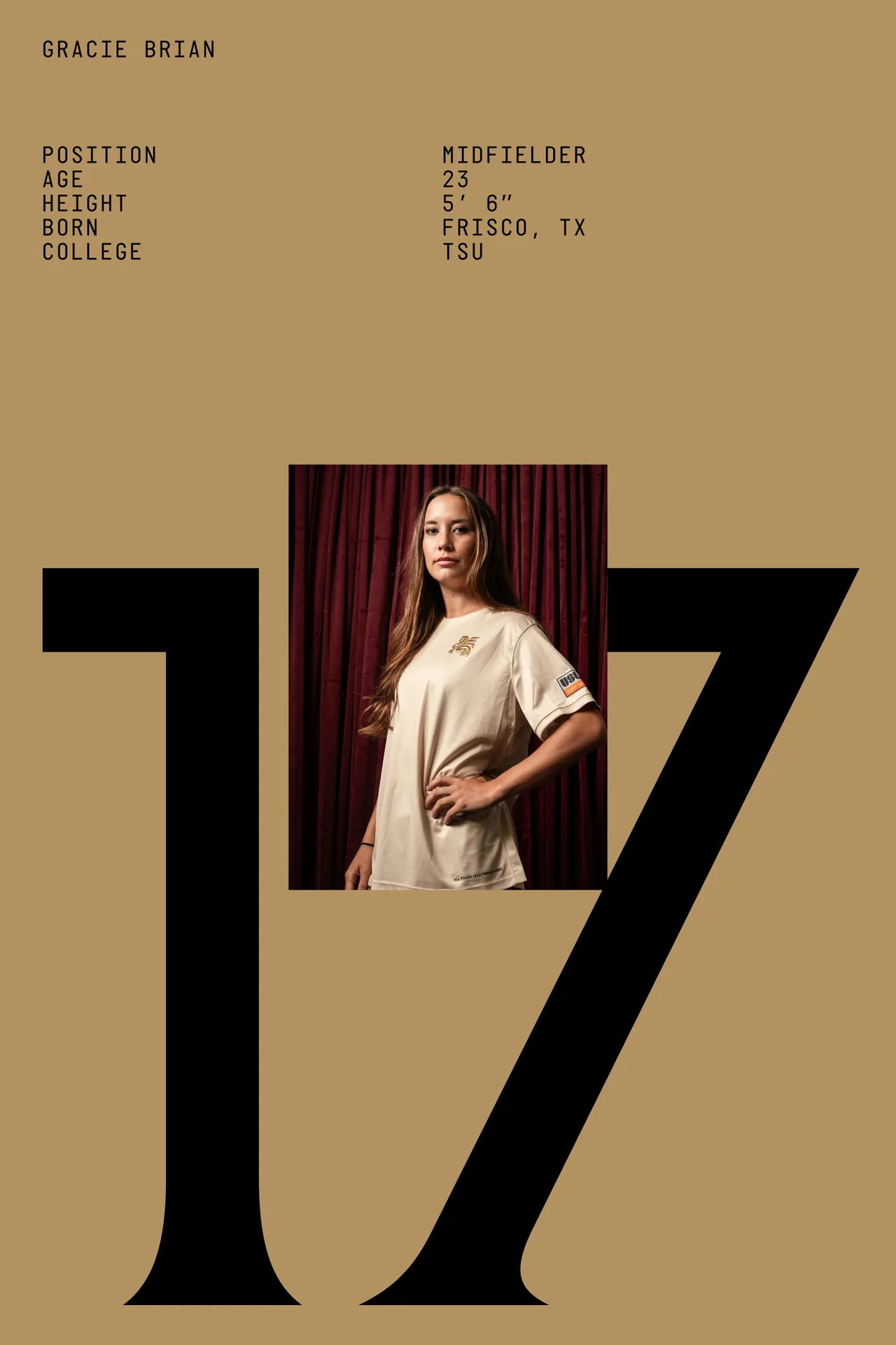
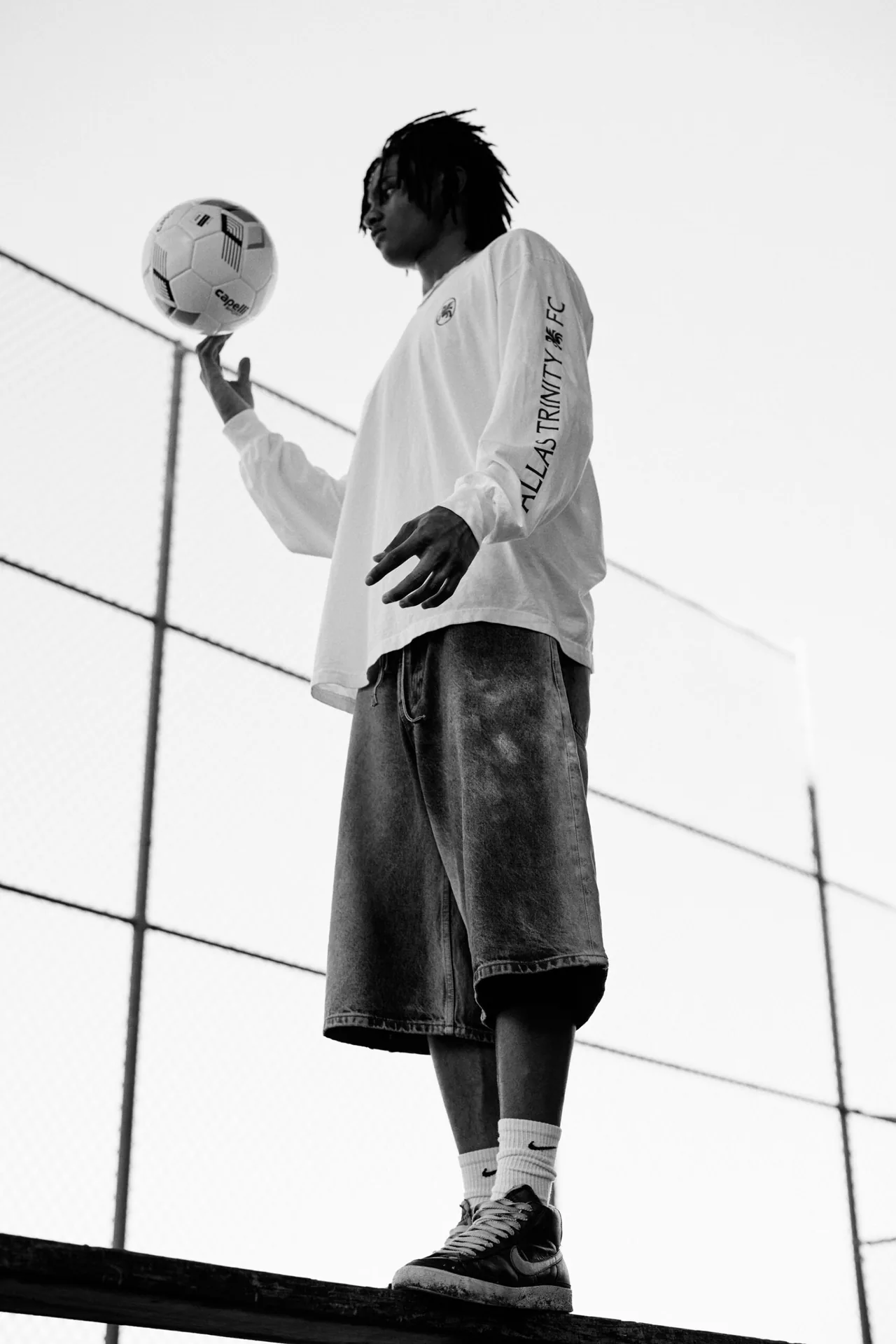
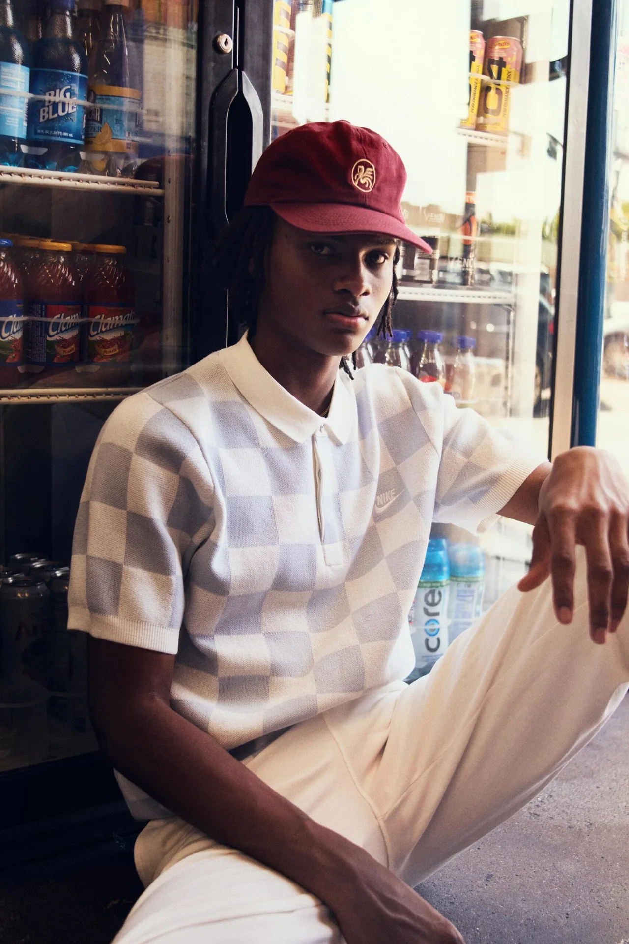
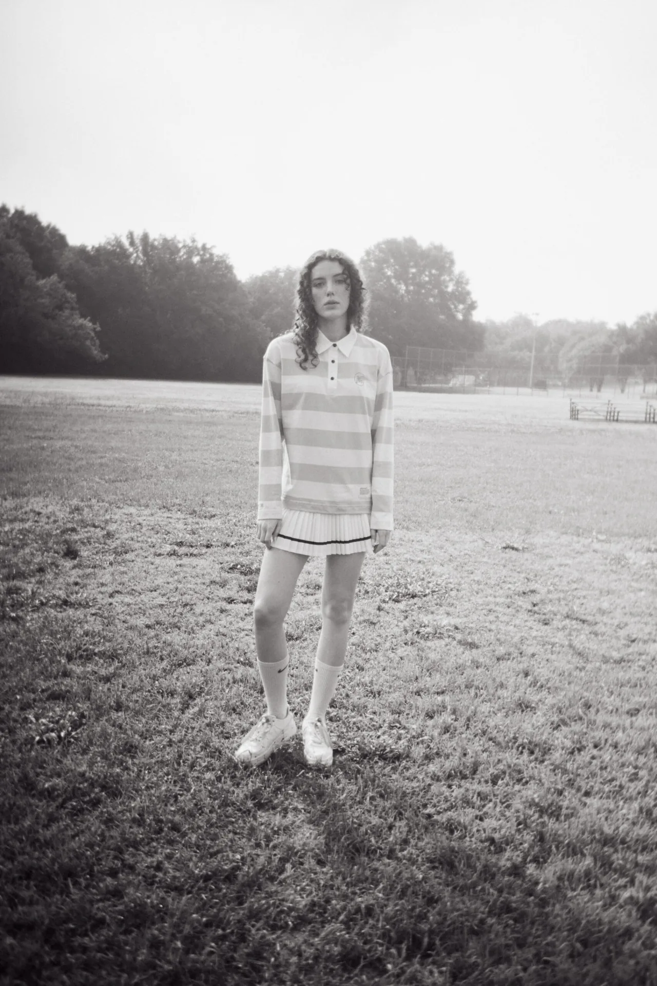
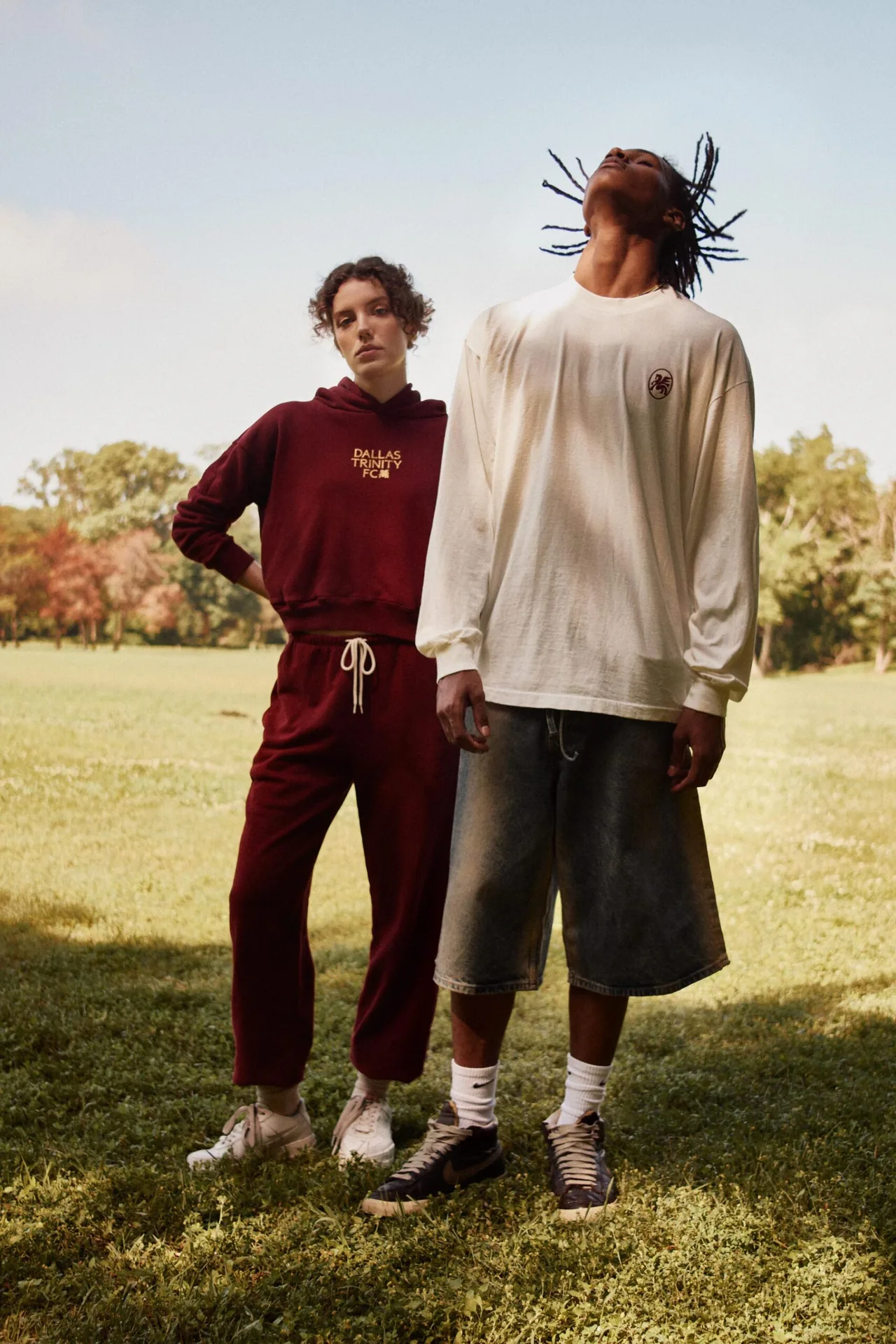
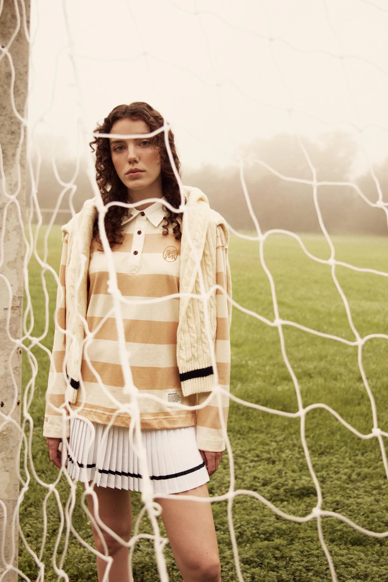
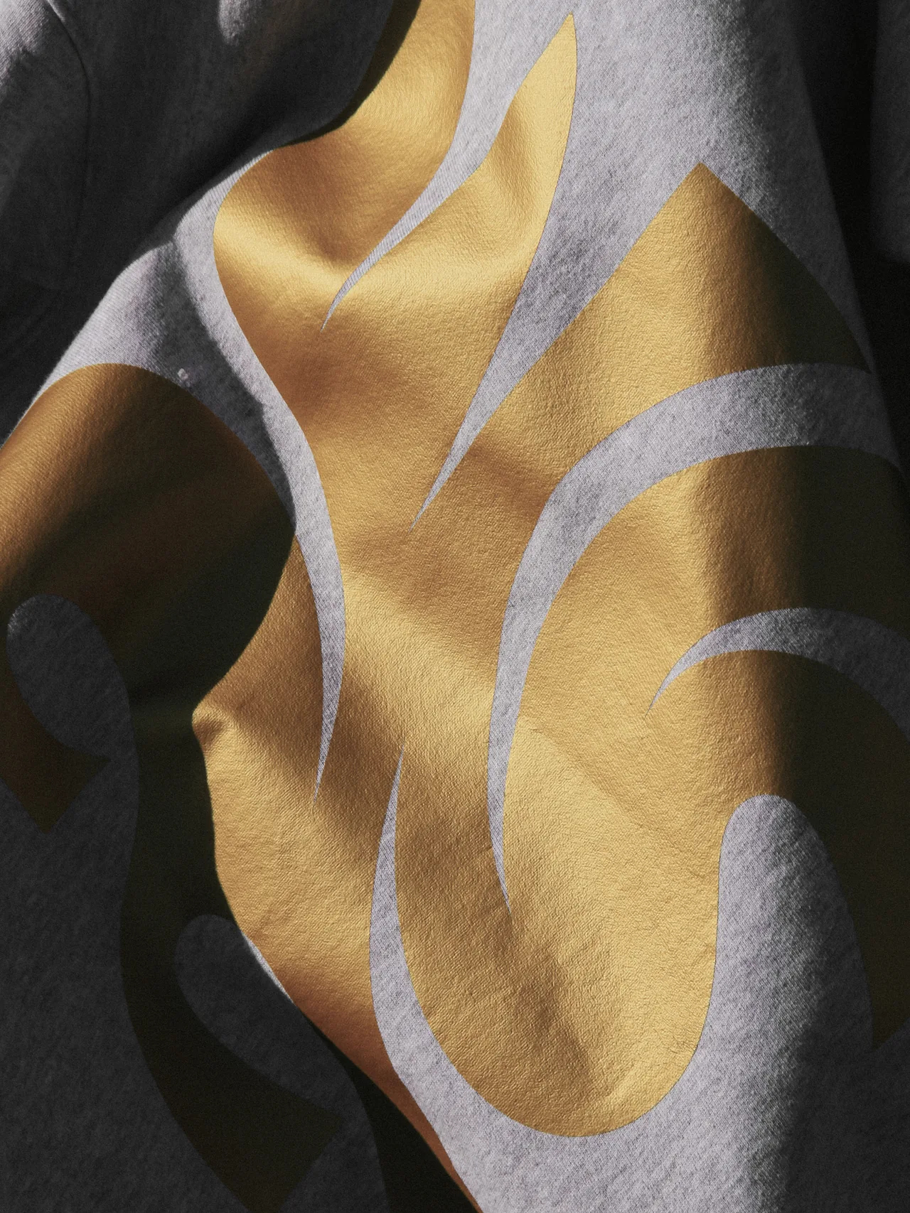
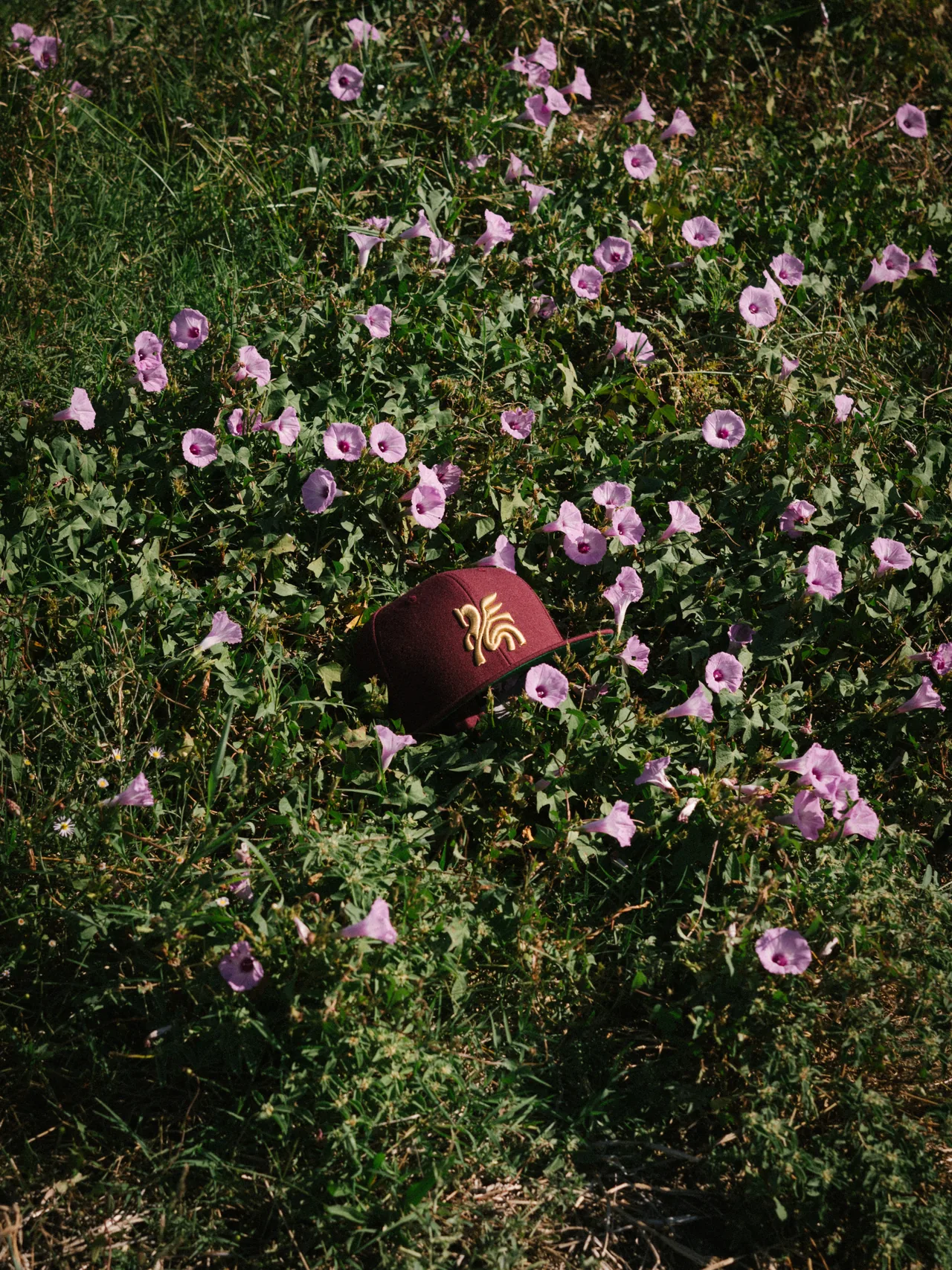
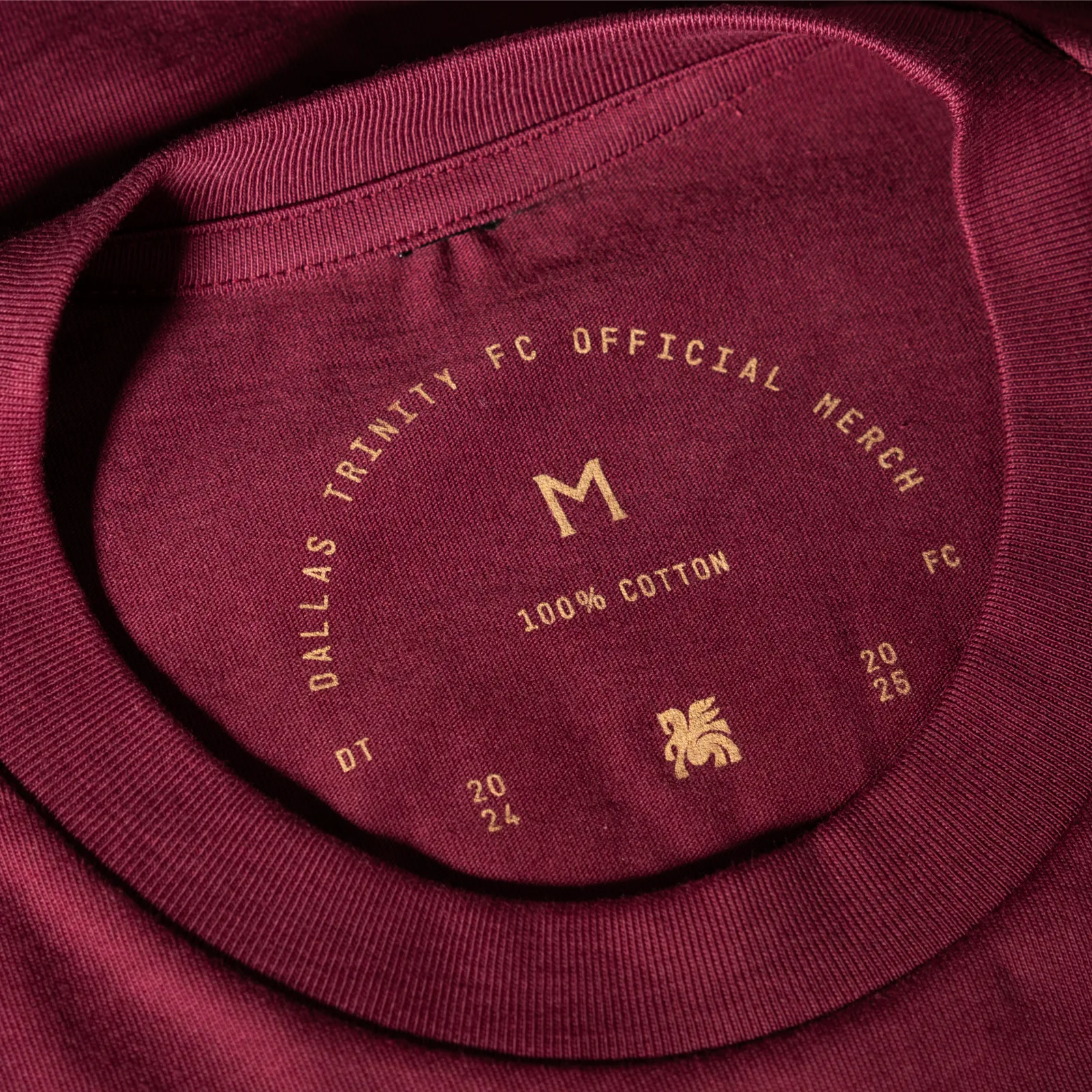
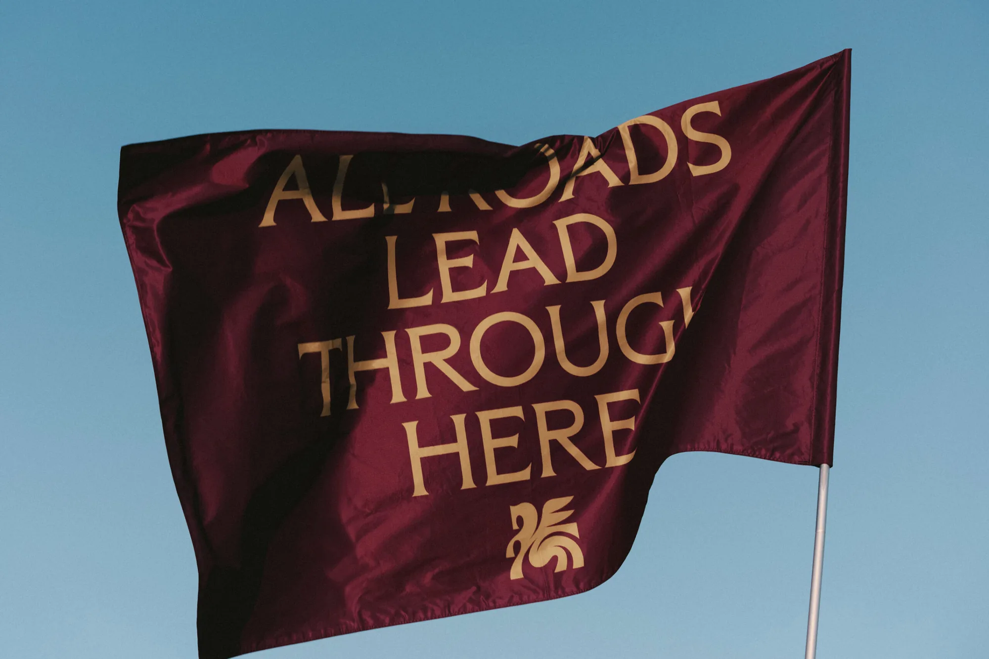
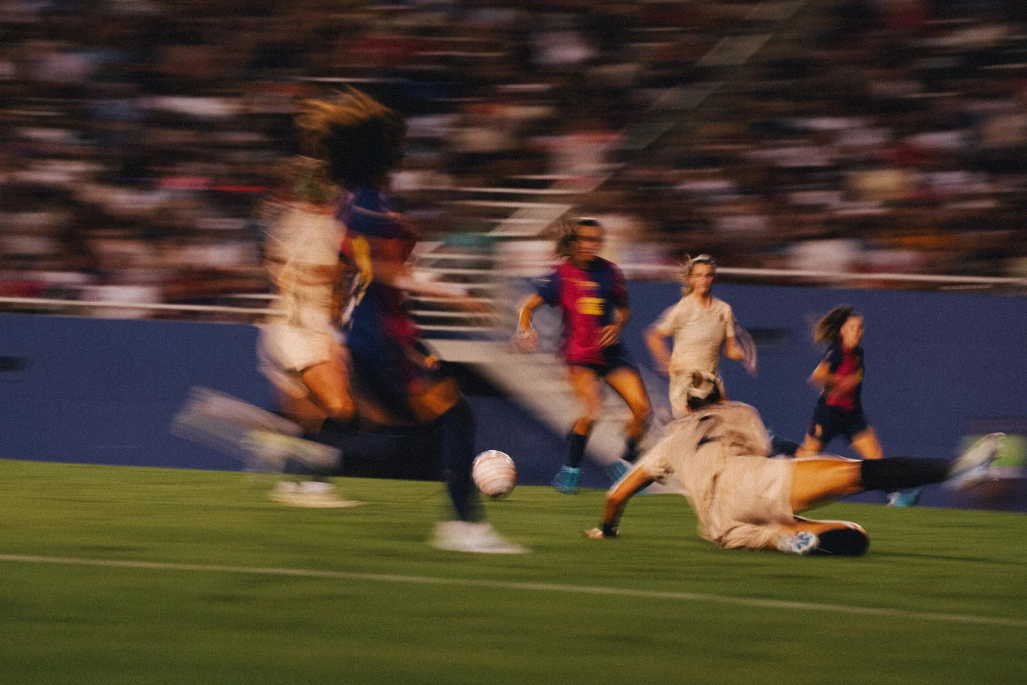
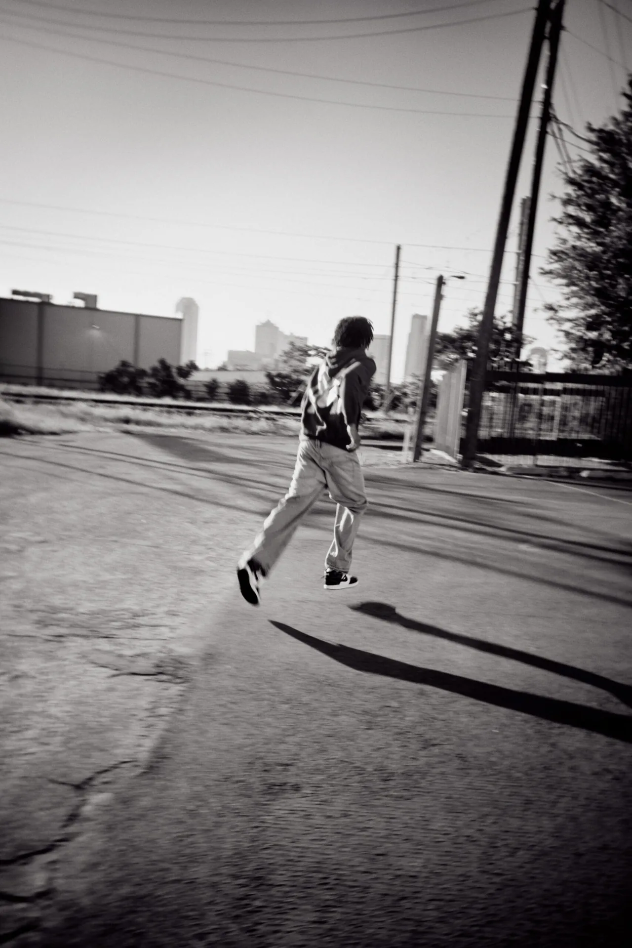
Maroon, gold and cream run through the crest, matchday posters, stadium boards, social, kits, merch and a launch campaign shot around the city.
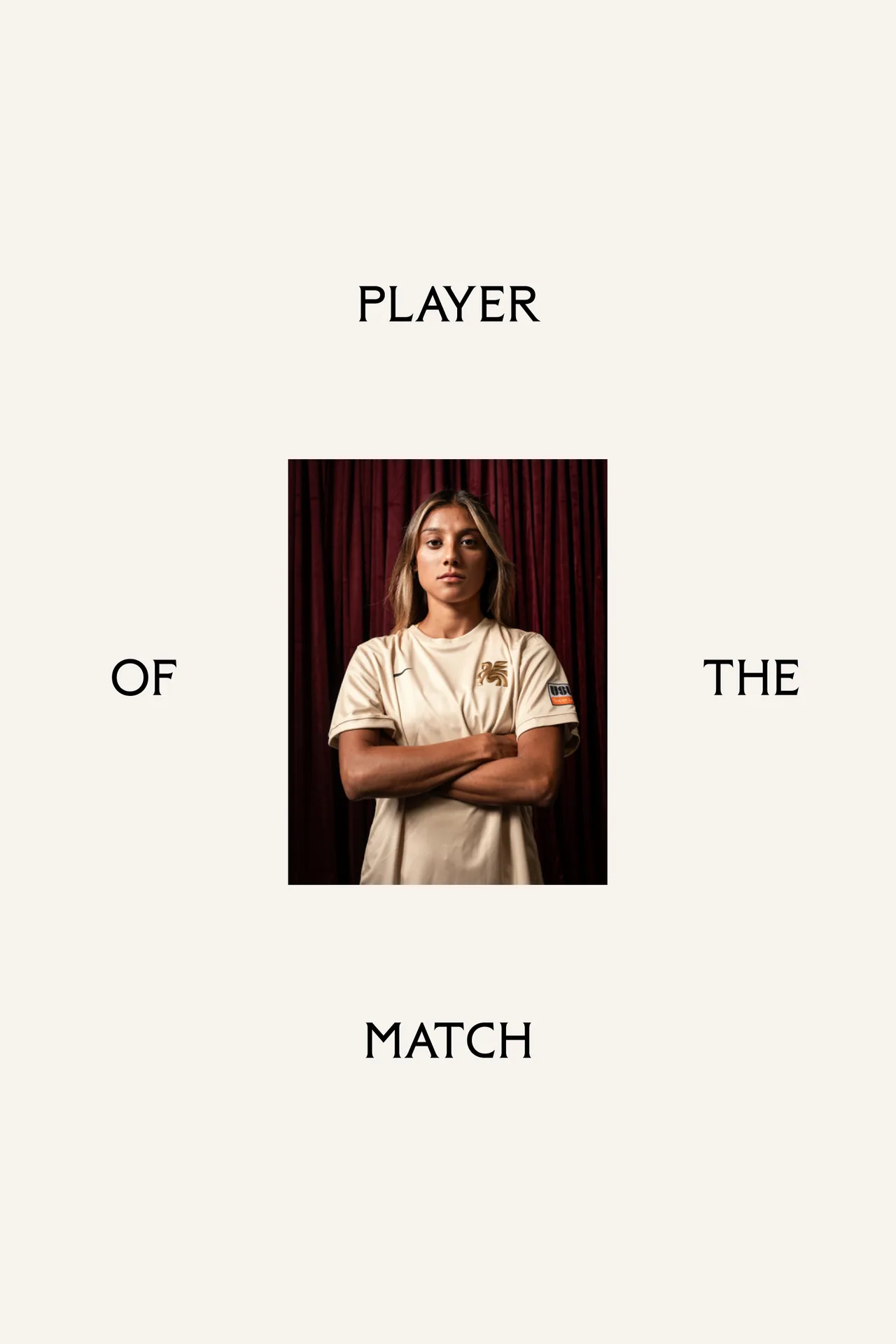
Campaign photography by Molly Dickson, team photography by Sean Berry, away photography by Adam Keelan.
Typefaces: Trinity Flare by Moniker, Trinity Sans by Moniker


The BRRRANDING newsletter
Liked Dallas Trinity FC?
Get work like this in your inbox.
New identities every Monday, a themed issue every Thursday. Picked by hand, free.
More inspiration

Branding mockups right inside Figma. No PSD wrestling.
Try the Figma plugin →This spot is booked monthly. Become a sponsor


Designing typefaces for creatives seeking to leave a lasting impression.
Explore Salina →This spot is booked monthly. Become a sponsor
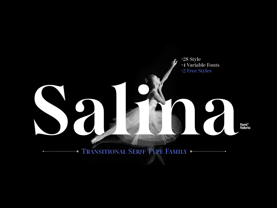
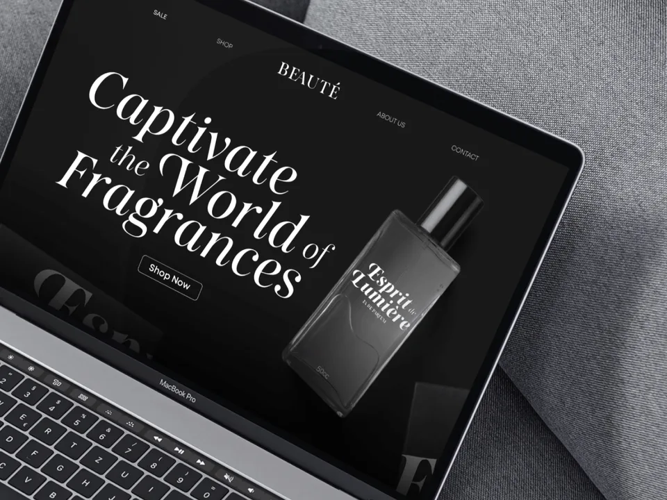
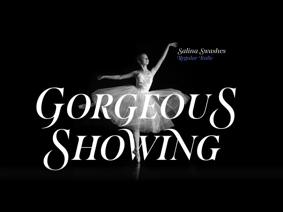
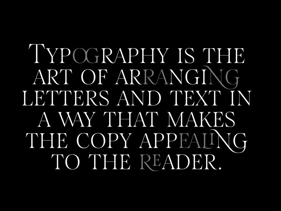
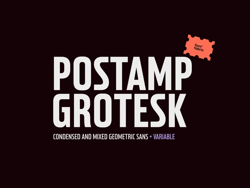
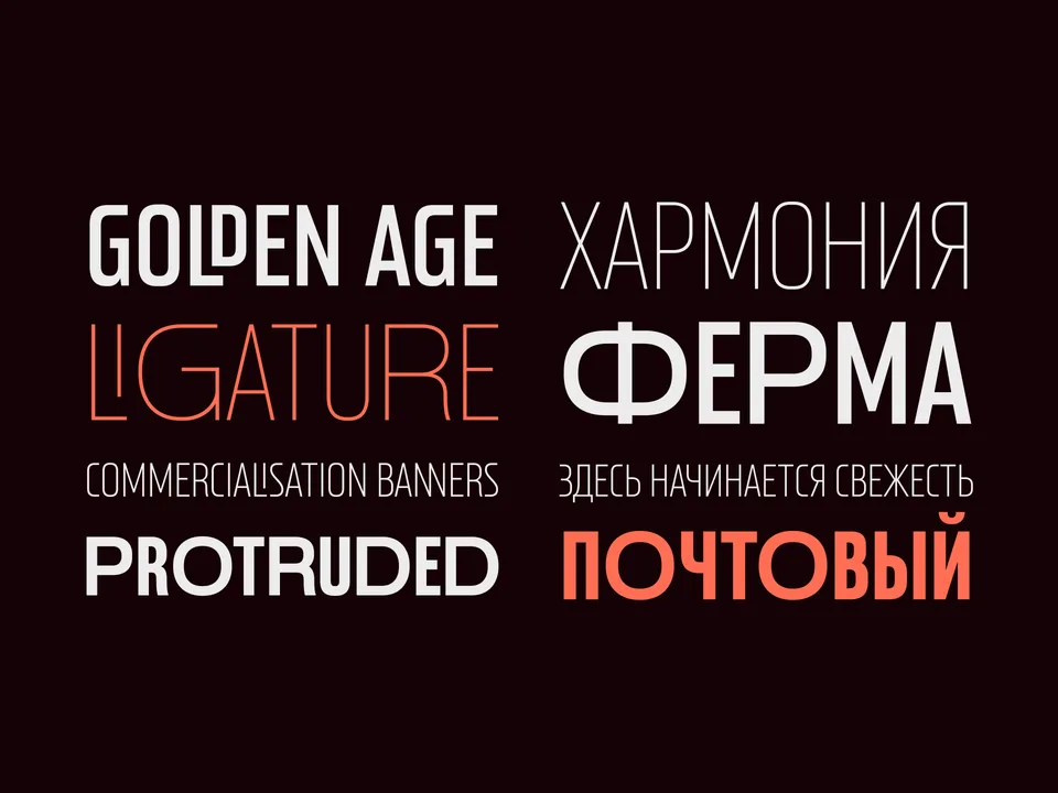
Designing typefaces for creatives seeking to leave a lasting impression.
Explore Postamp Grotesk →This spot is booked monthly. Become a sponsor

Designing typefaces for creatives seeking to leave a lasting impression.
Explore Fabric Grotesk →This spot is booked monthly. Become a sponsor