

Camp Yerba
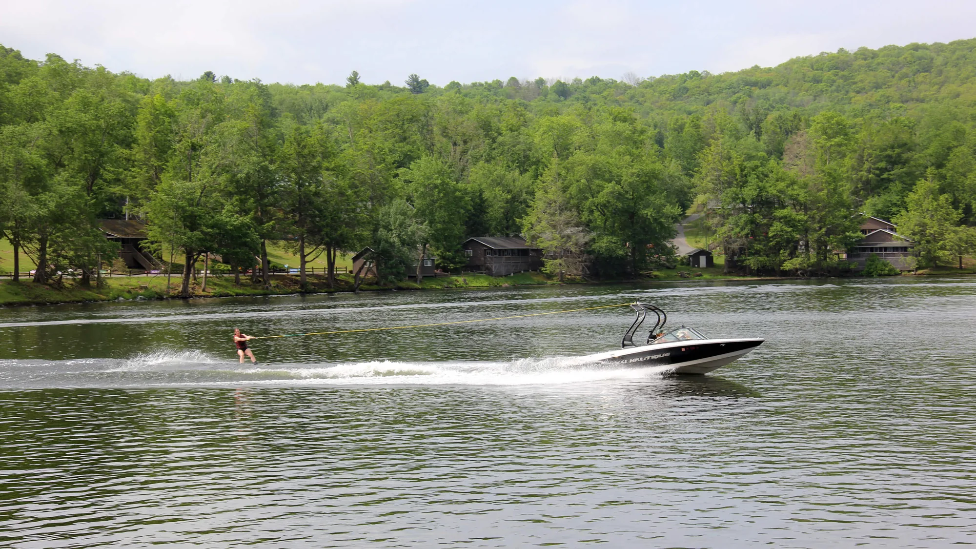
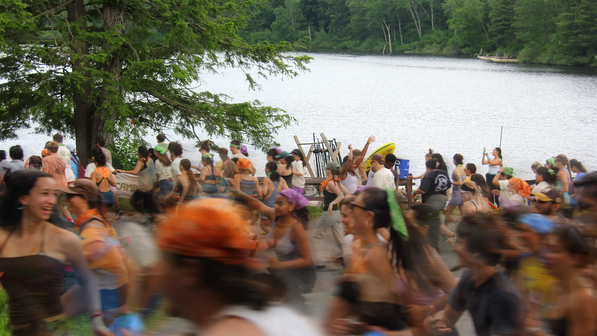
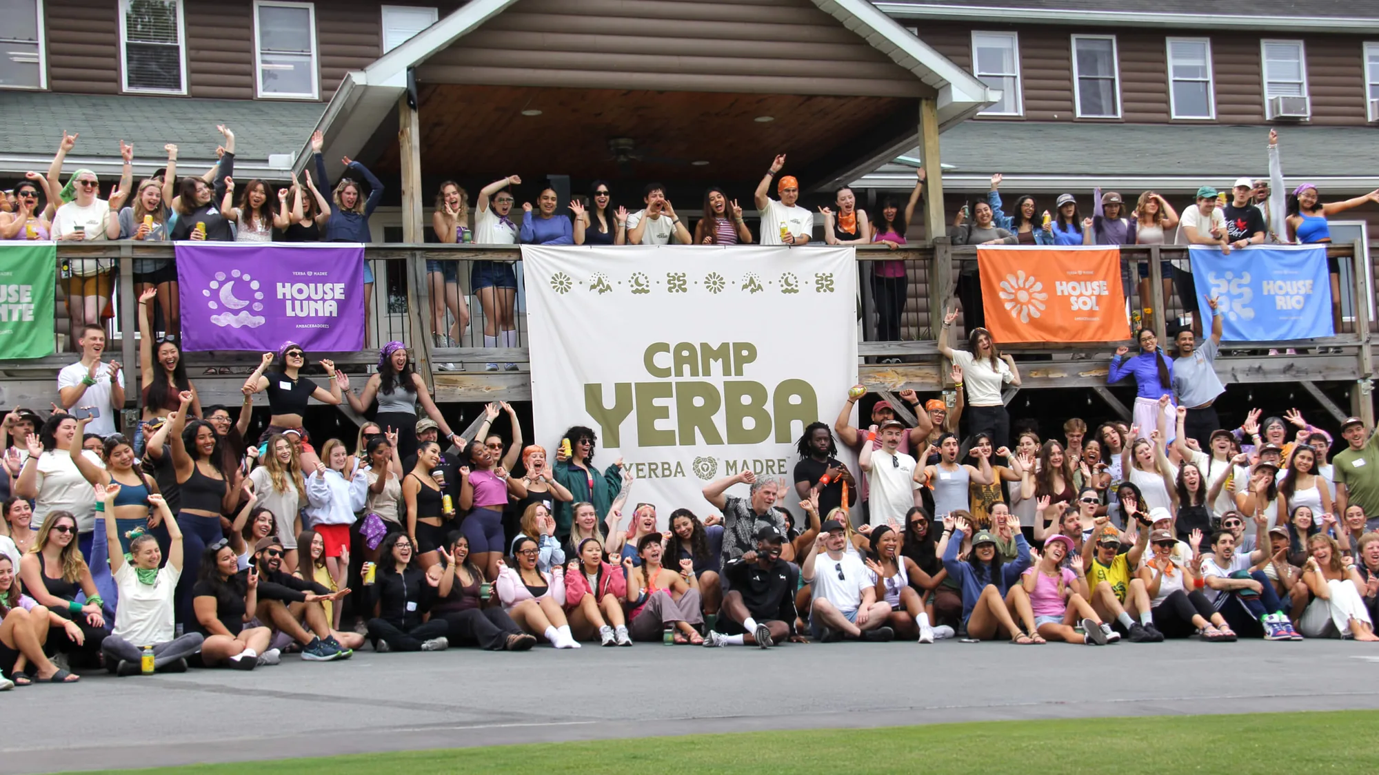
Camp Yerba is Yerba Madre’s inaugural camp experience, bringing its community together for four days of outdoor adventure, shared rituals, and unforgettable moments in the heart of the Pocono Mountains.
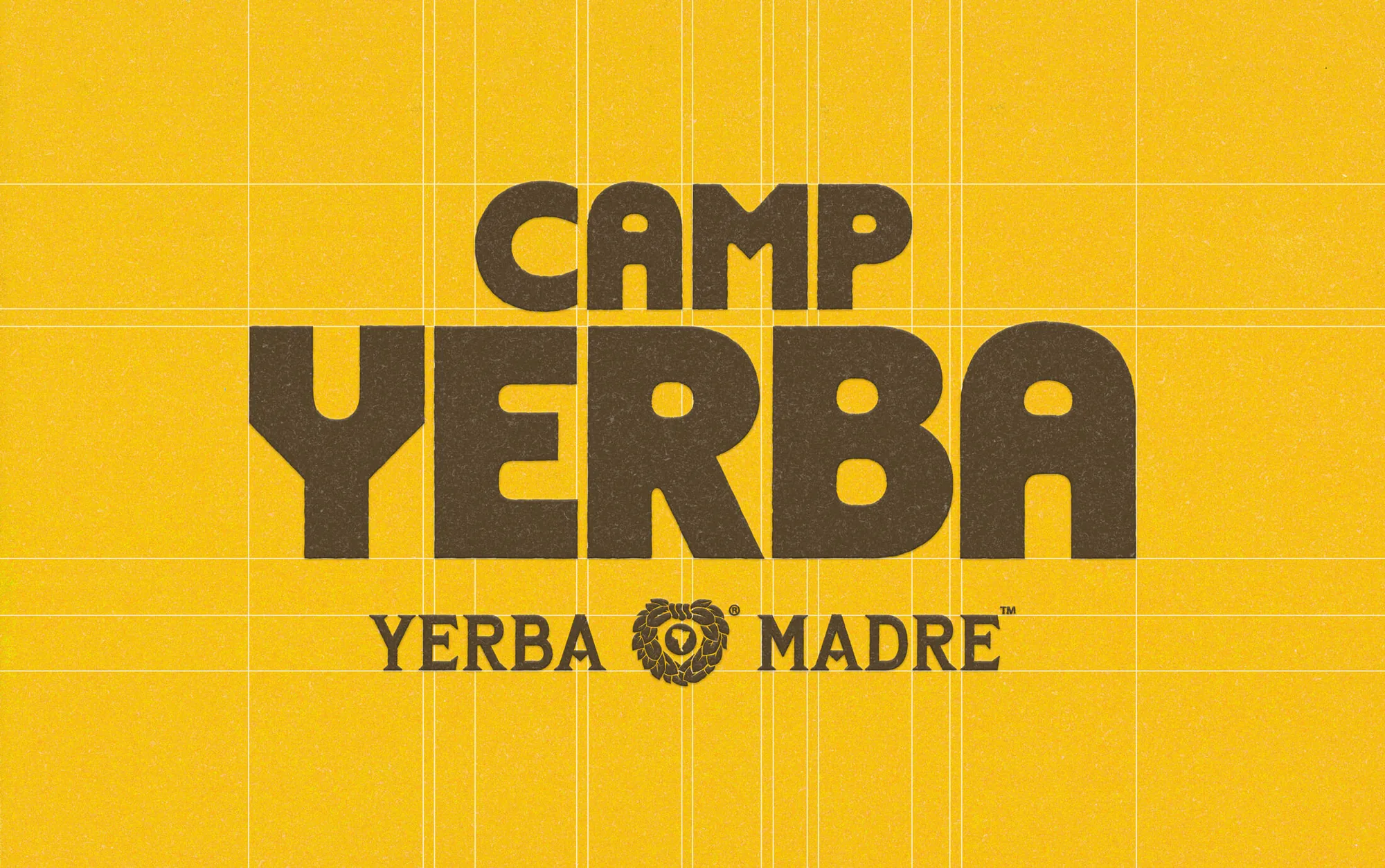
Forth+Back developed the visual identity for the experience, creating a distinct camp aesthetic that extends the Yerba Madre brand while standing as a world of its own.
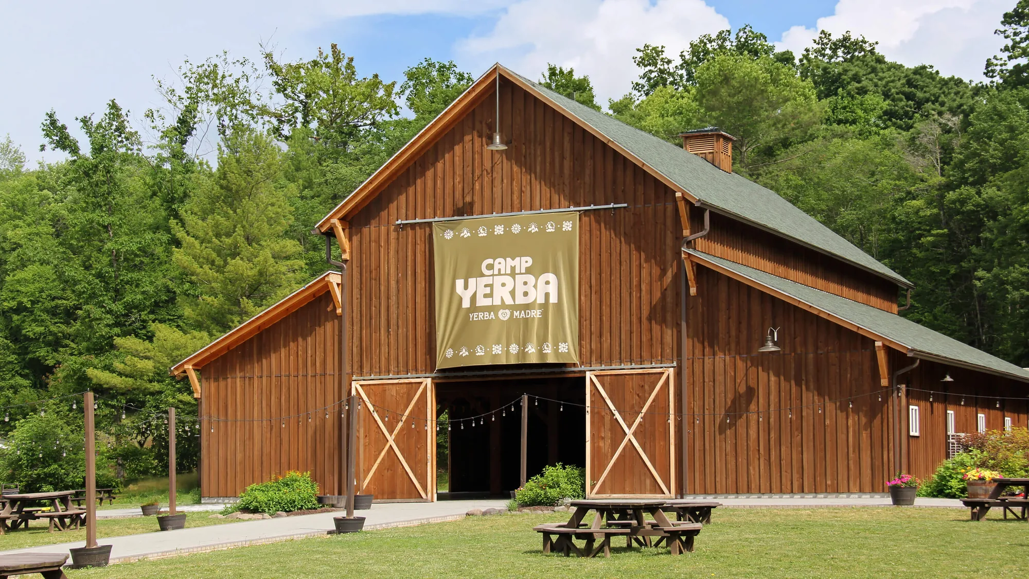
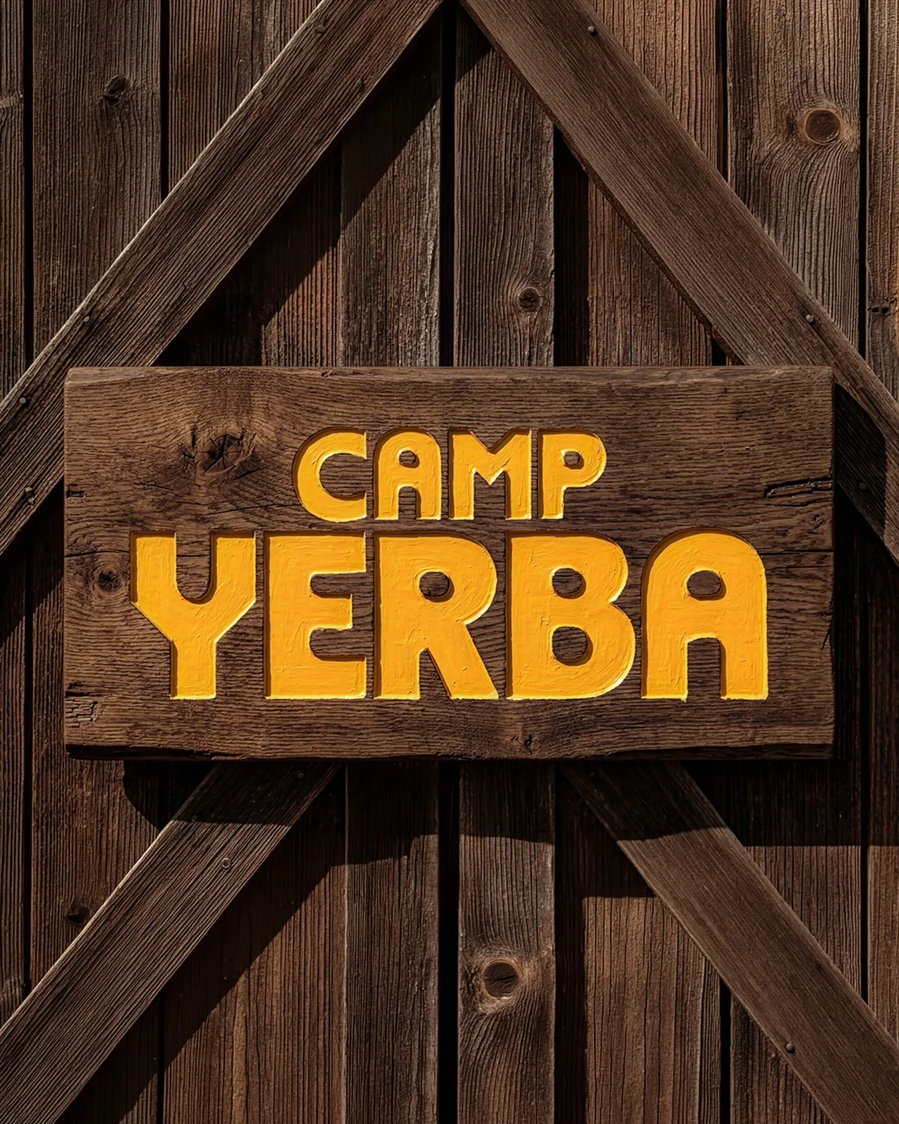
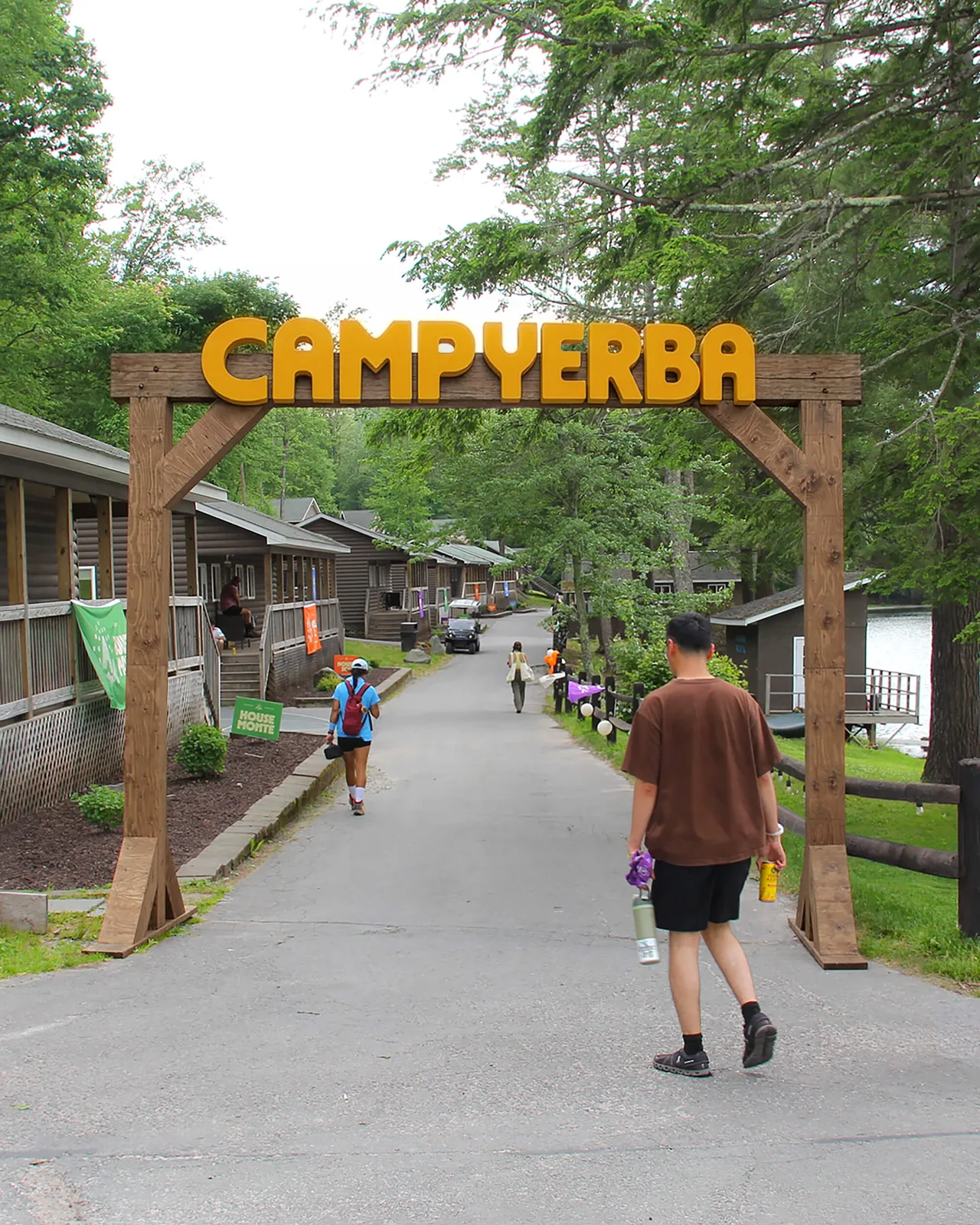
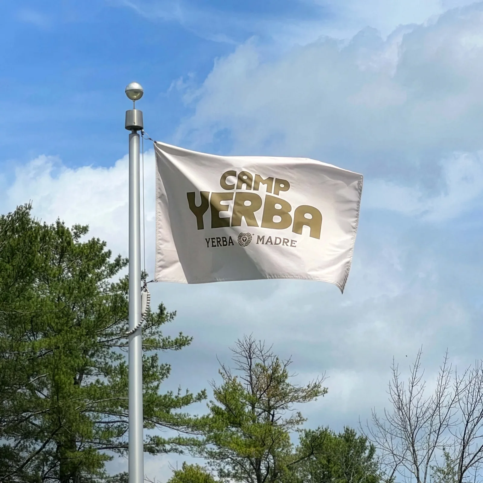
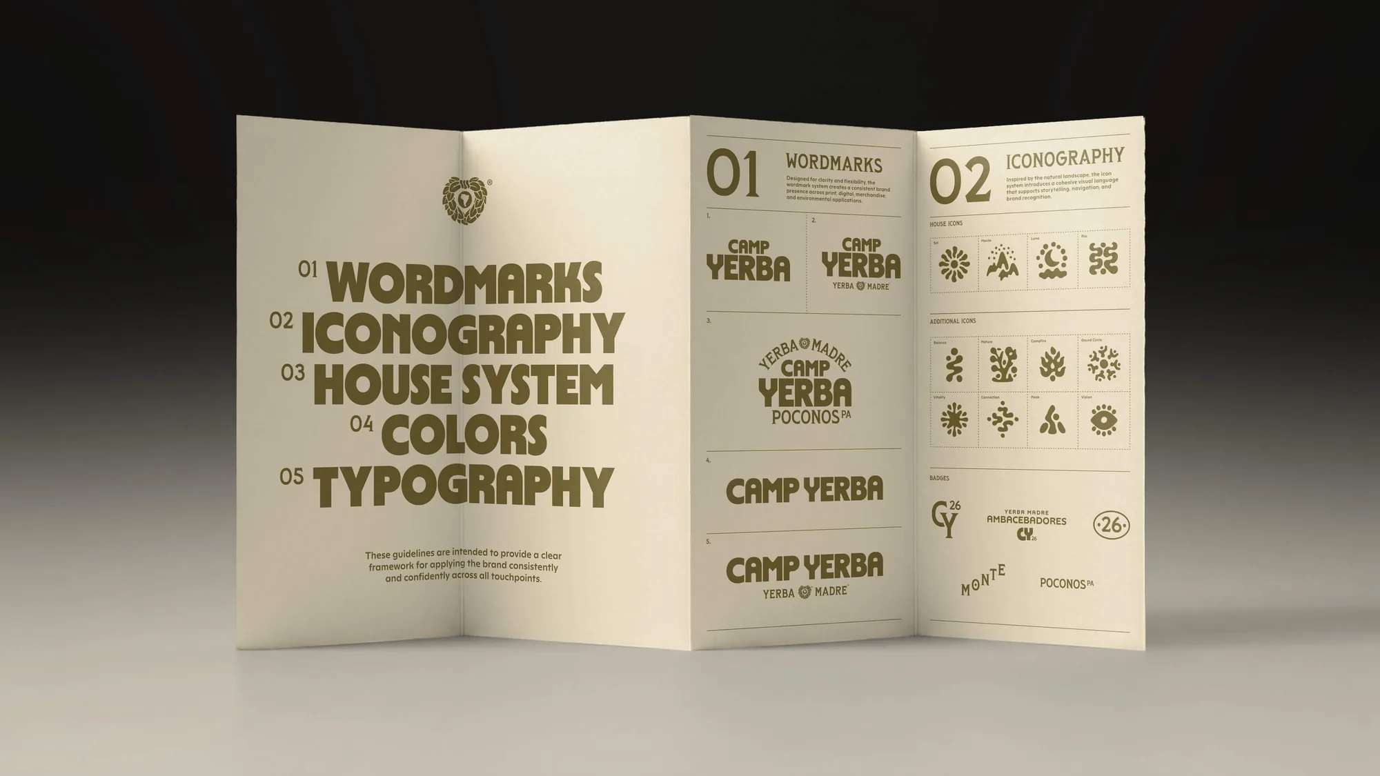
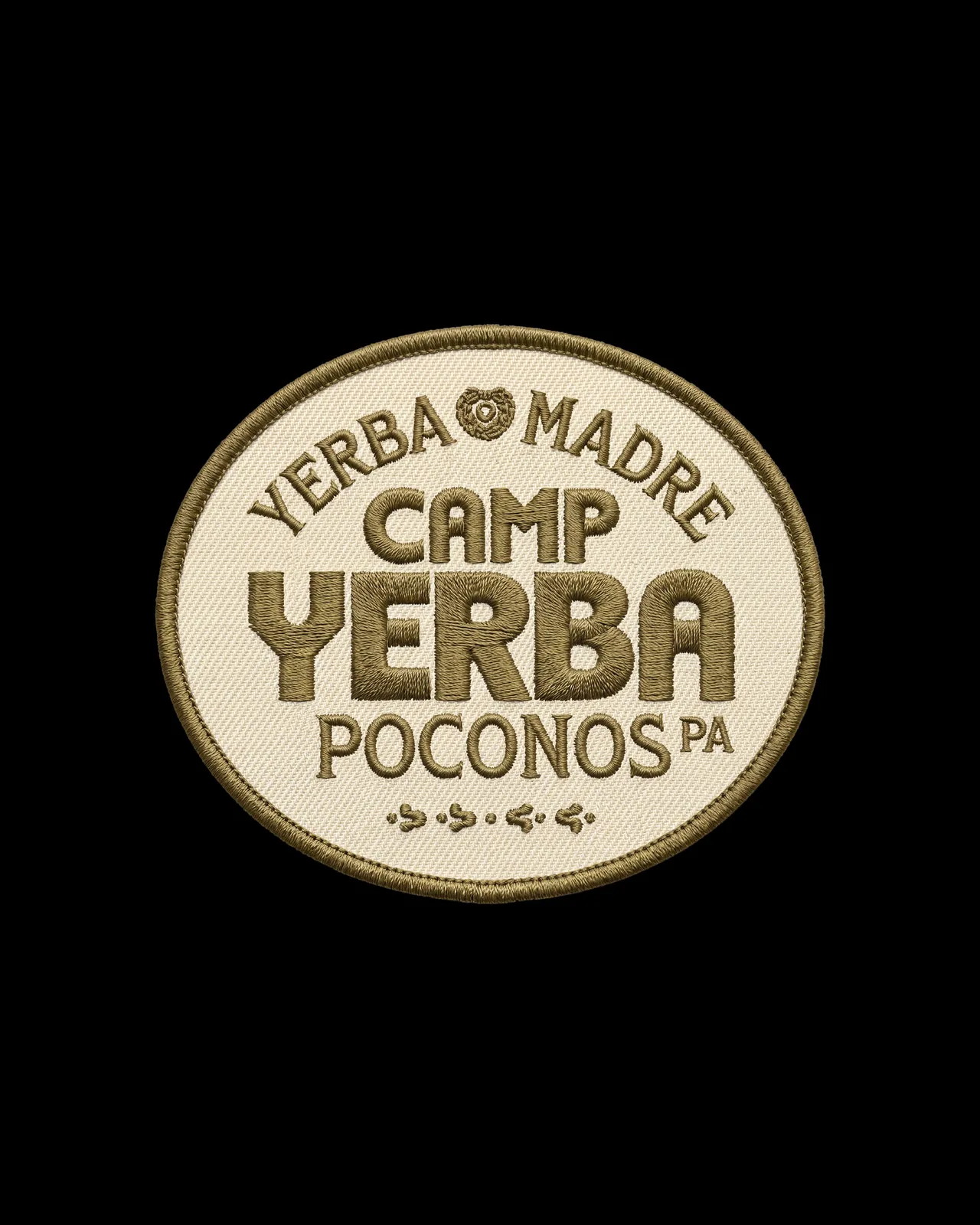
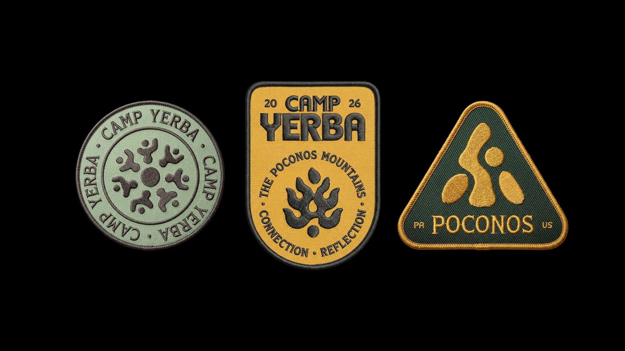
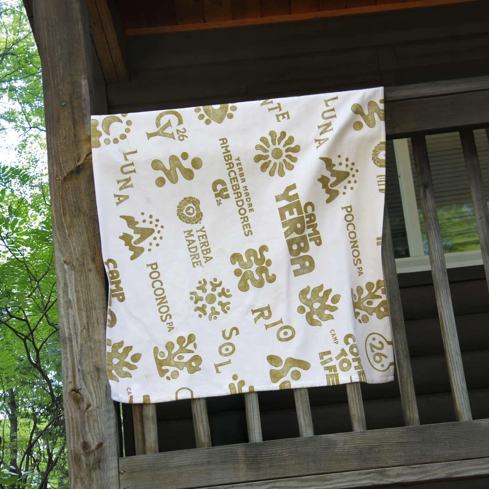
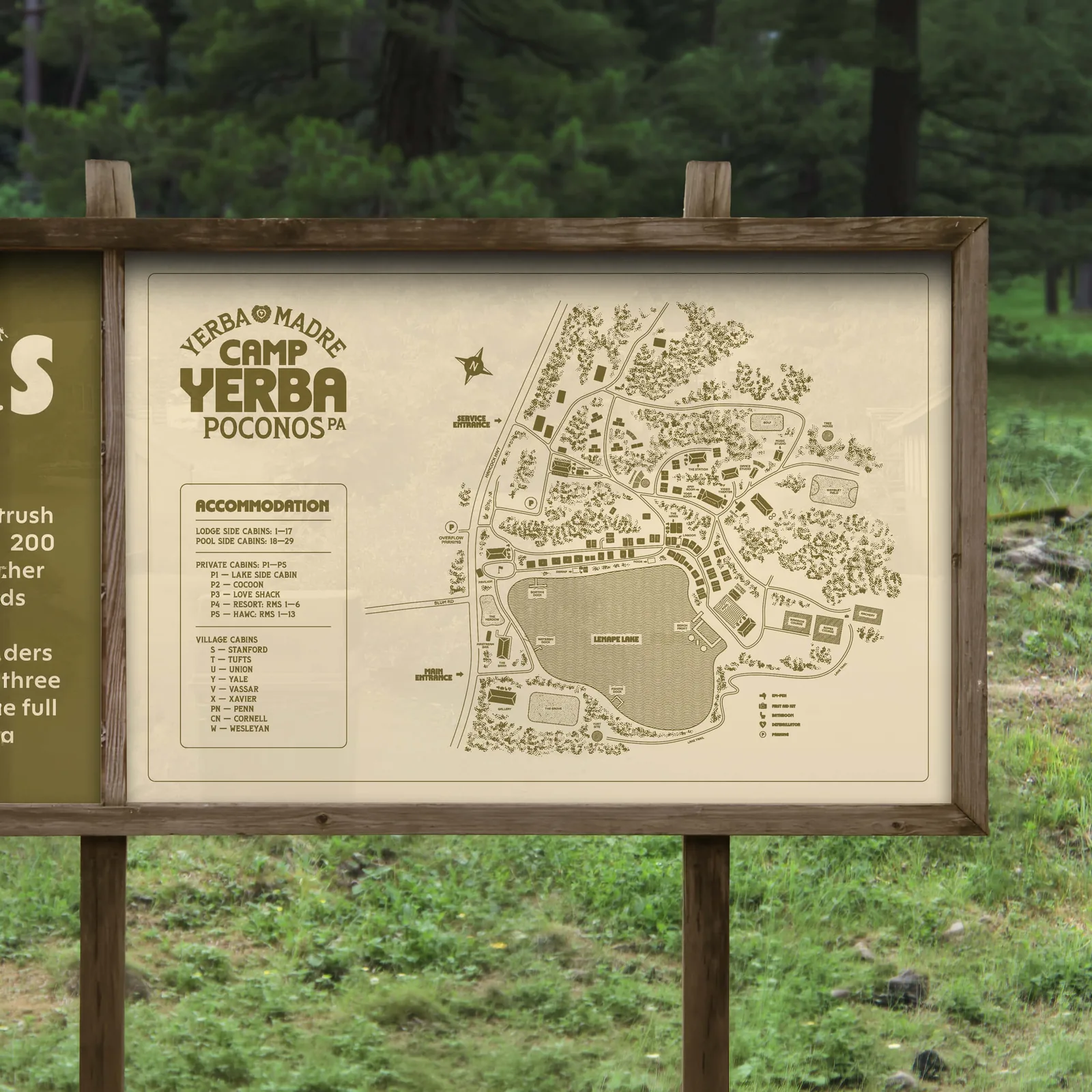
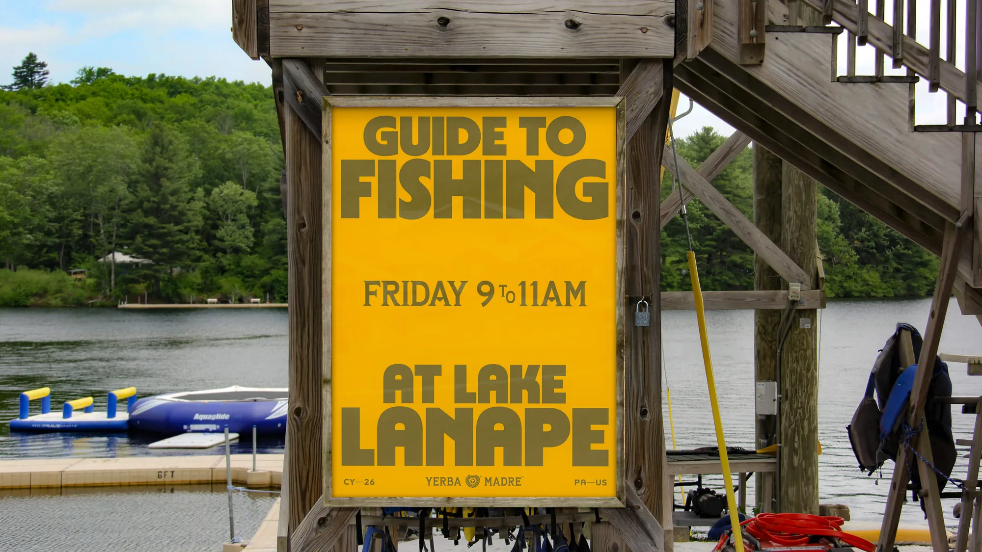
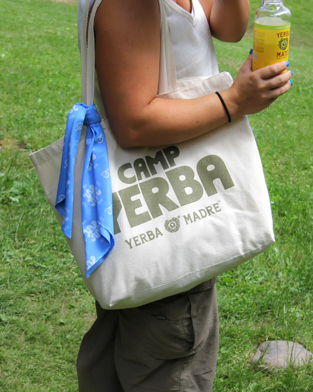
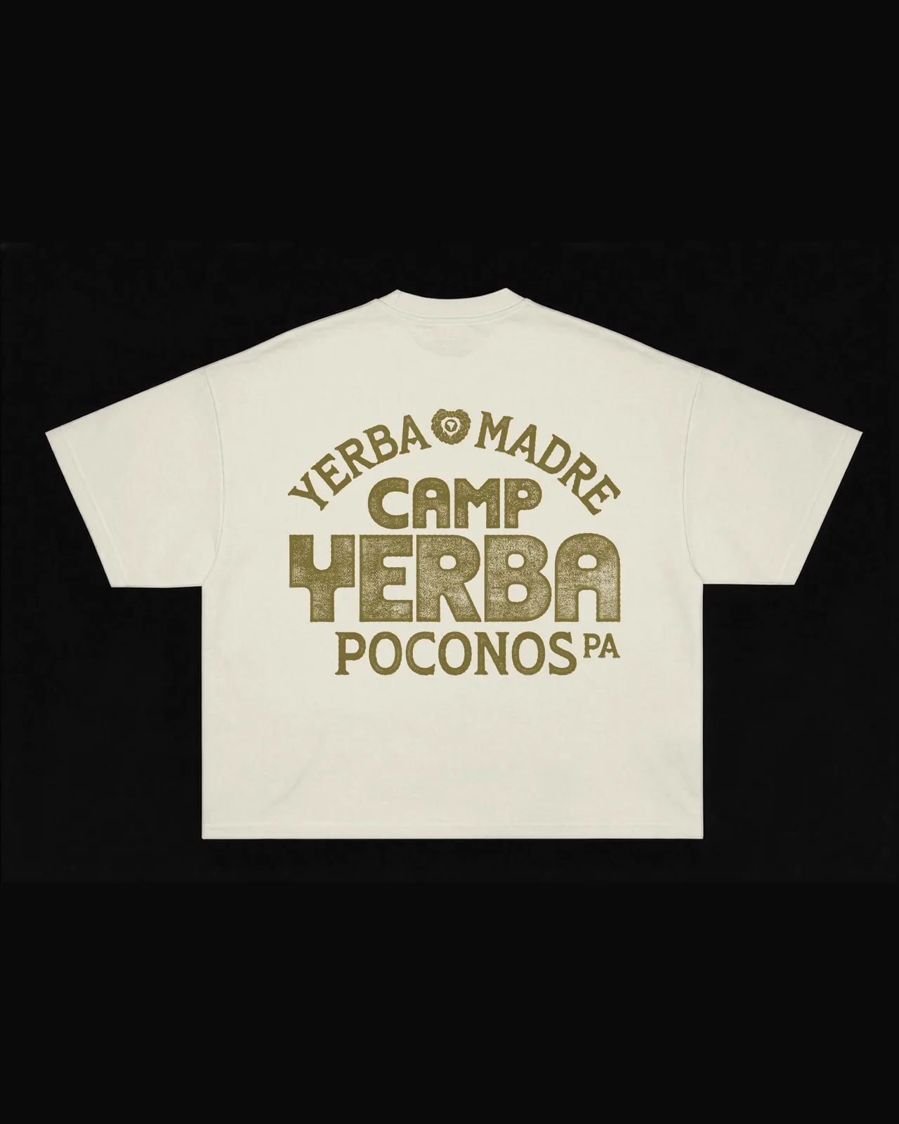
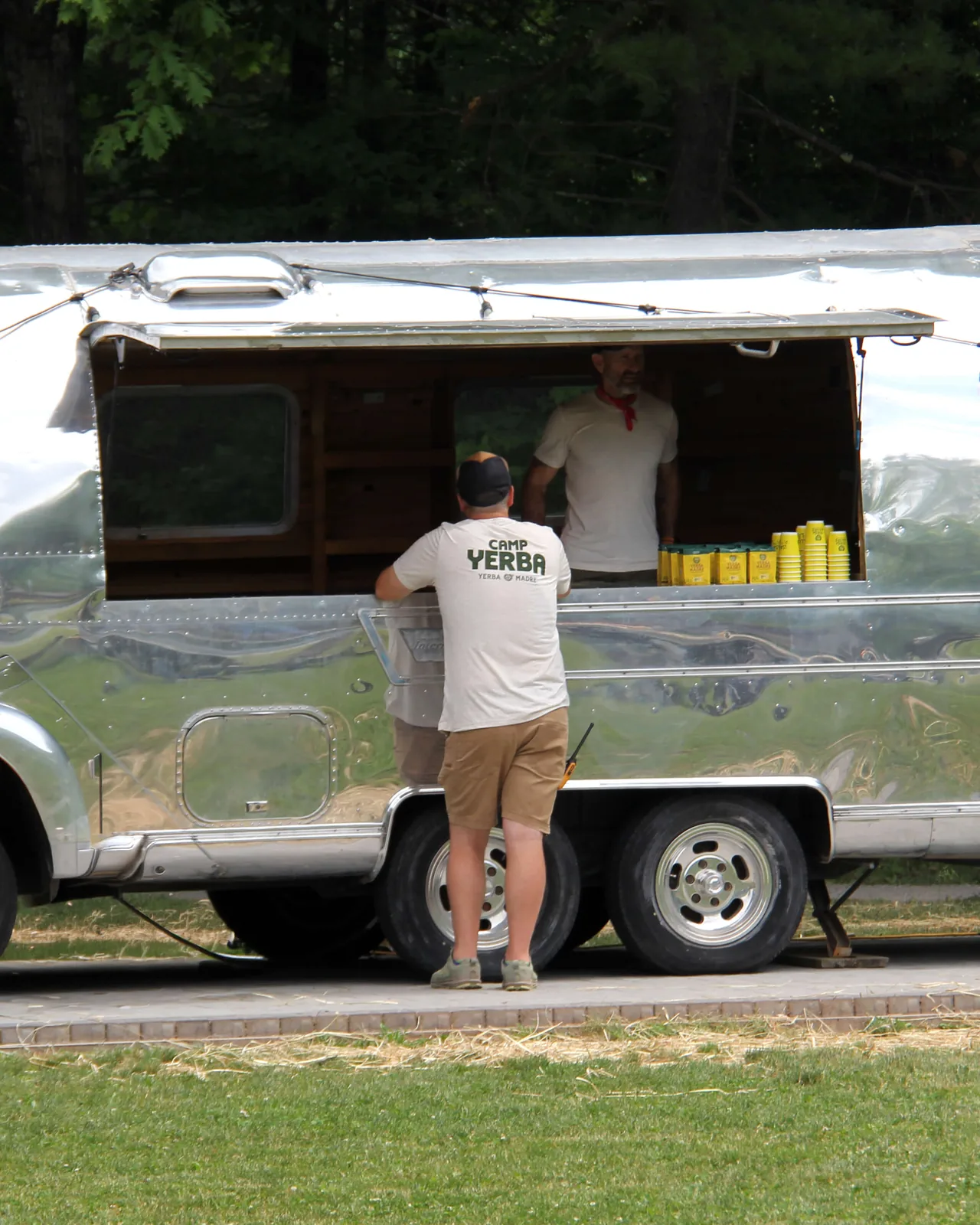
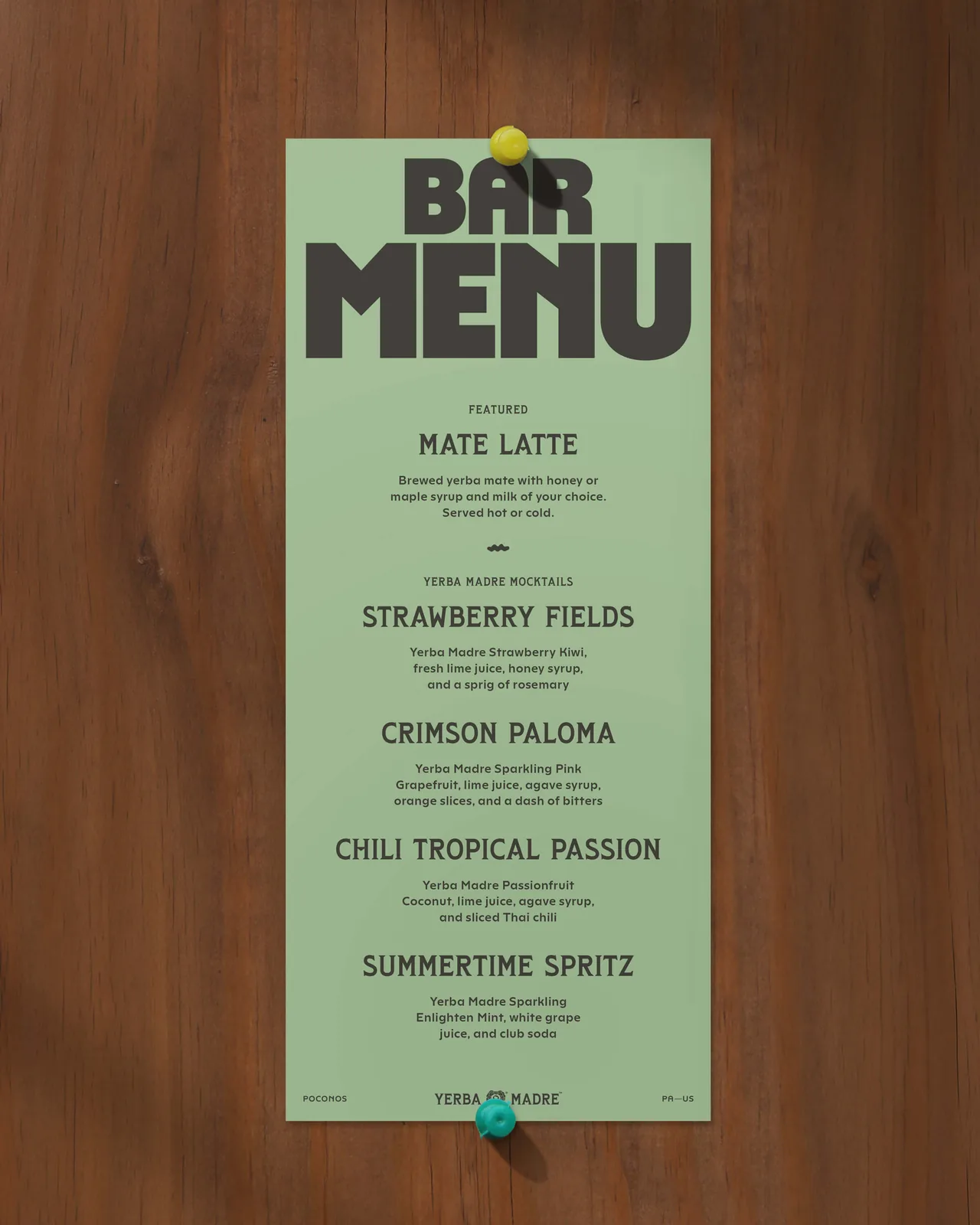
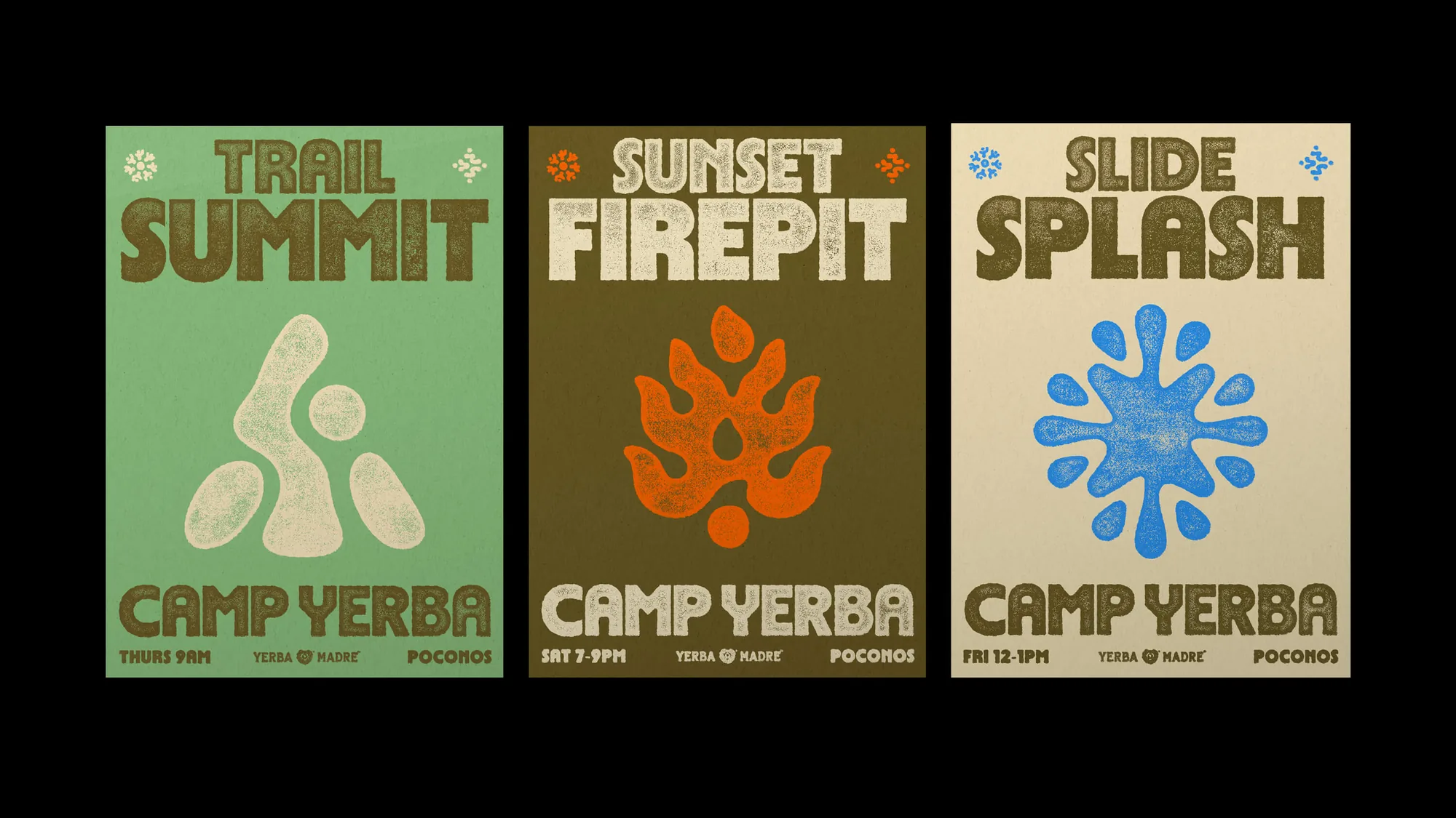
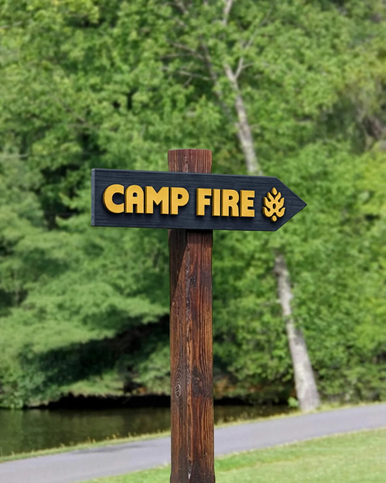
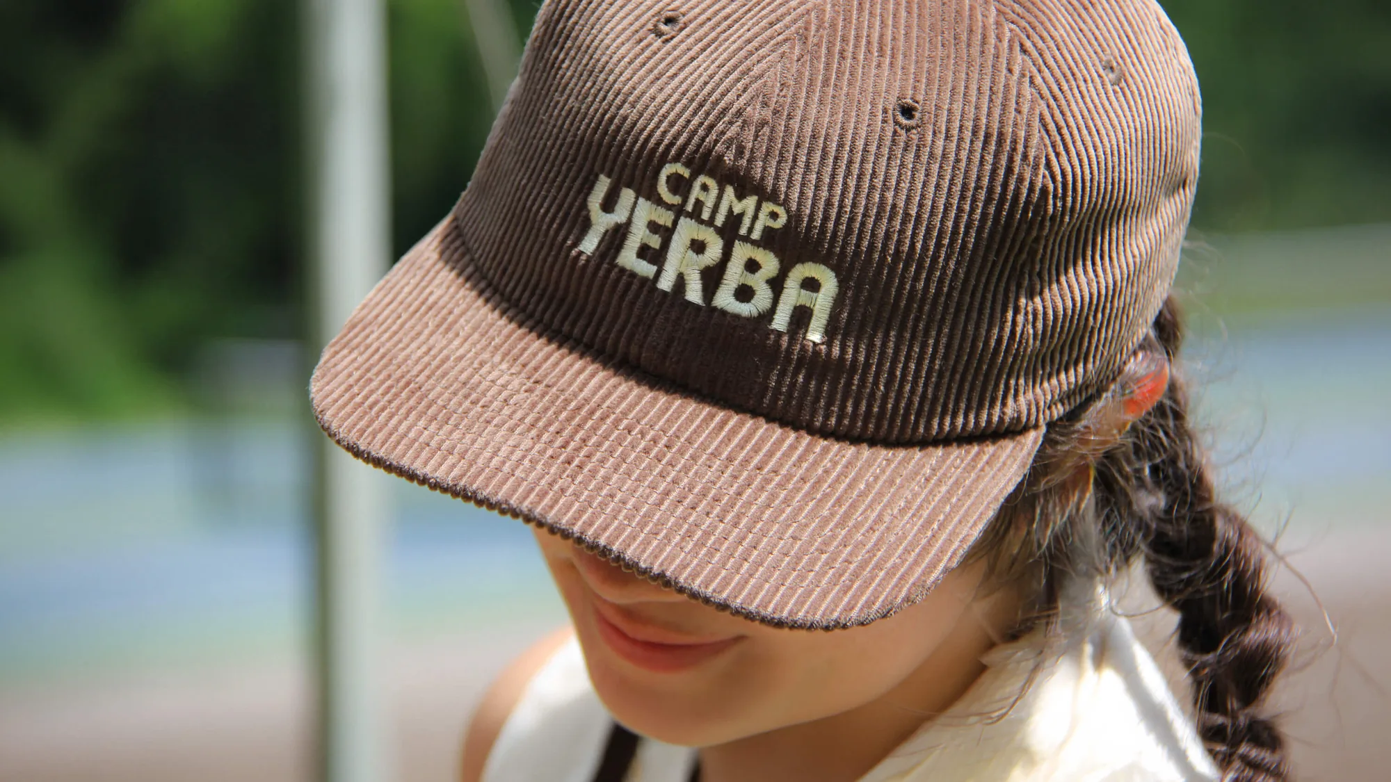
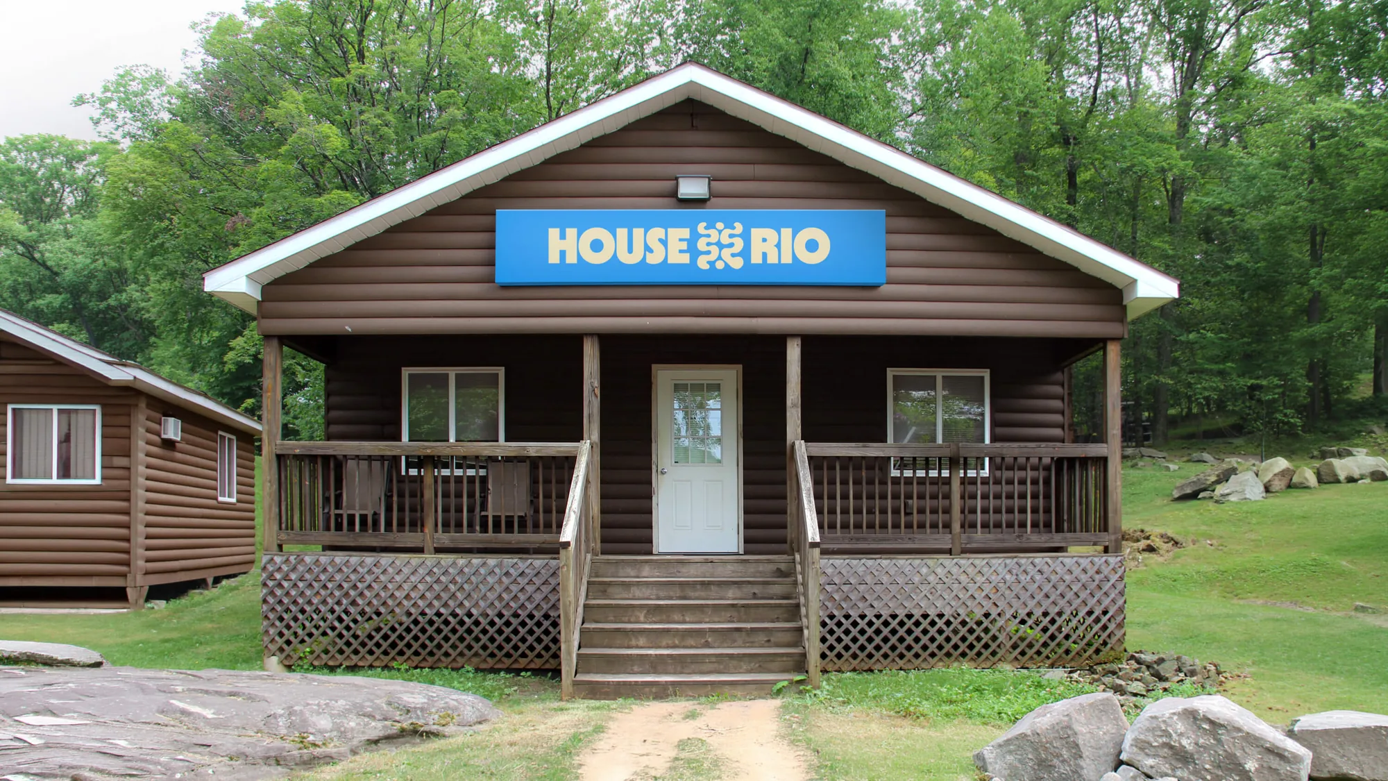
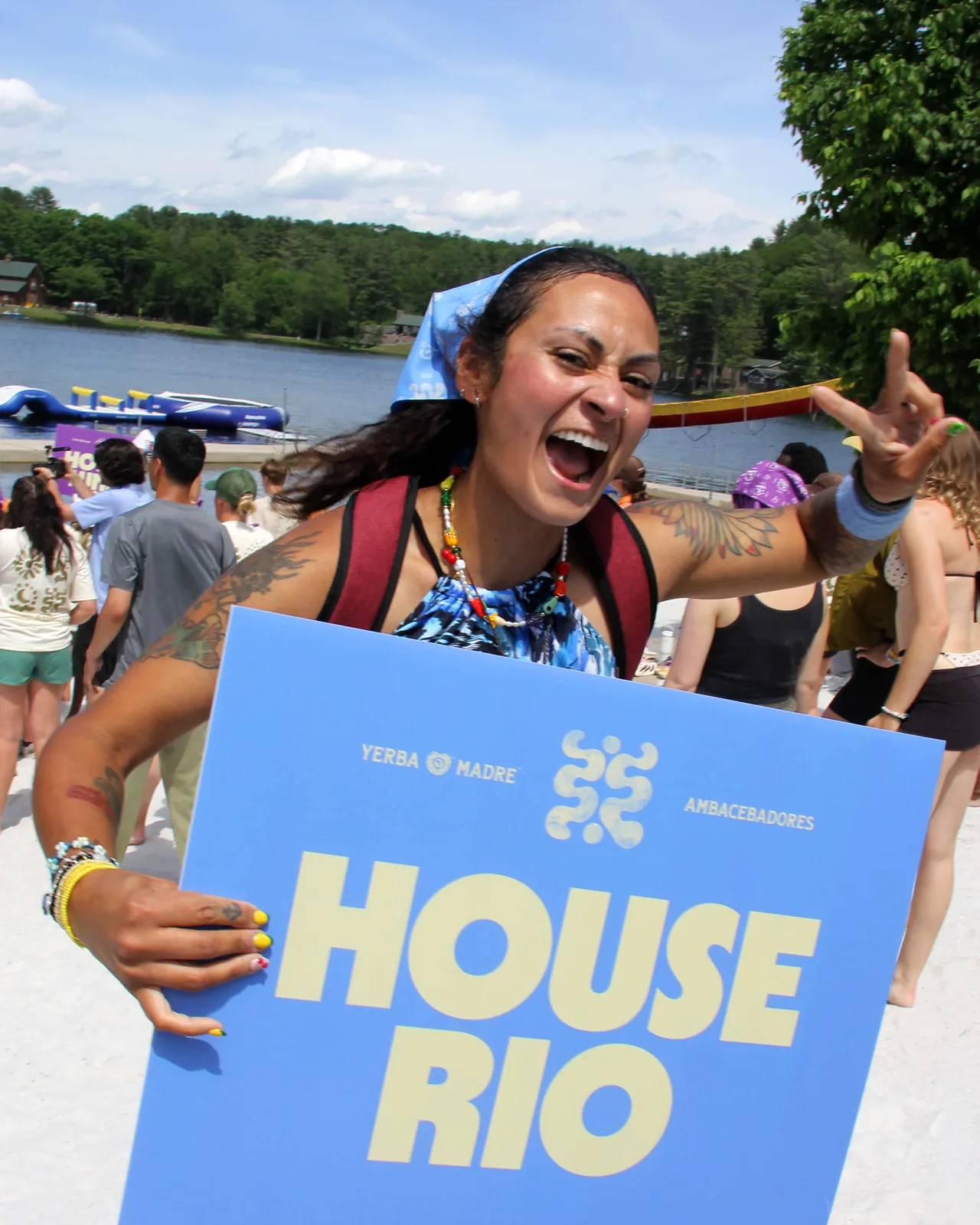
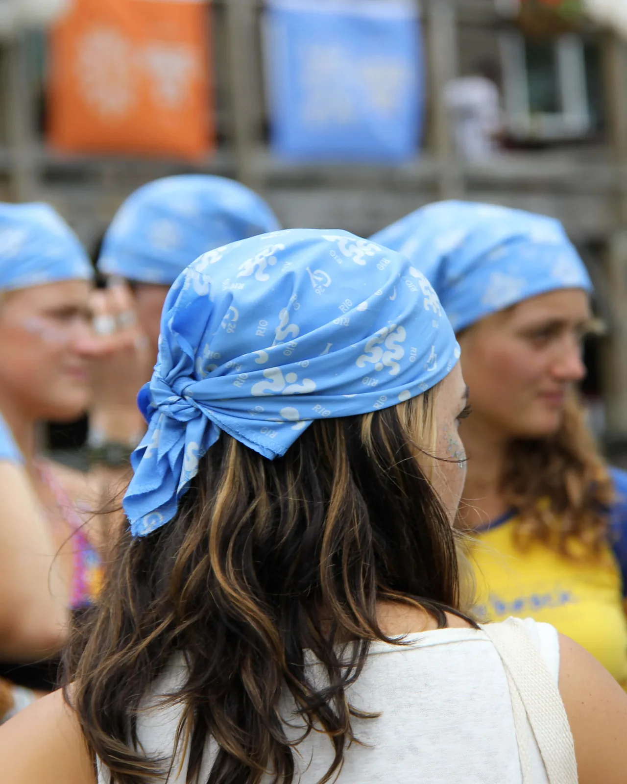
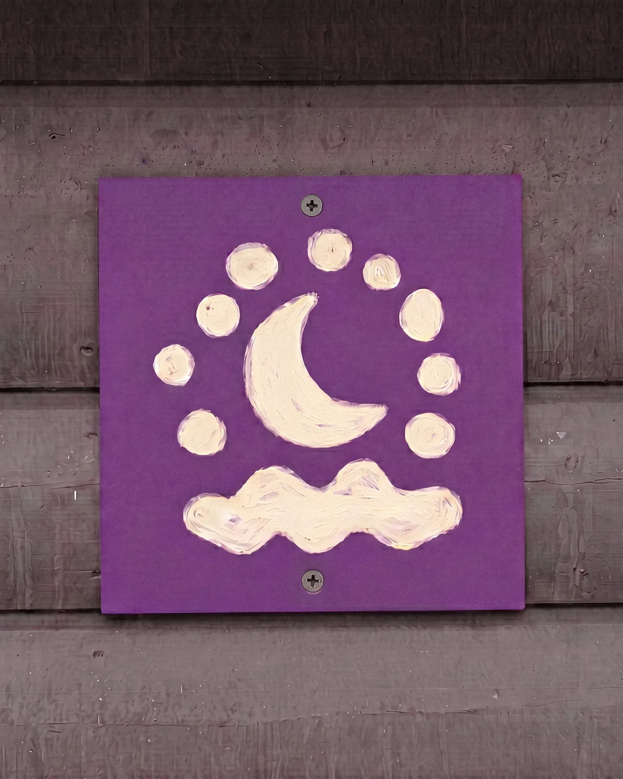
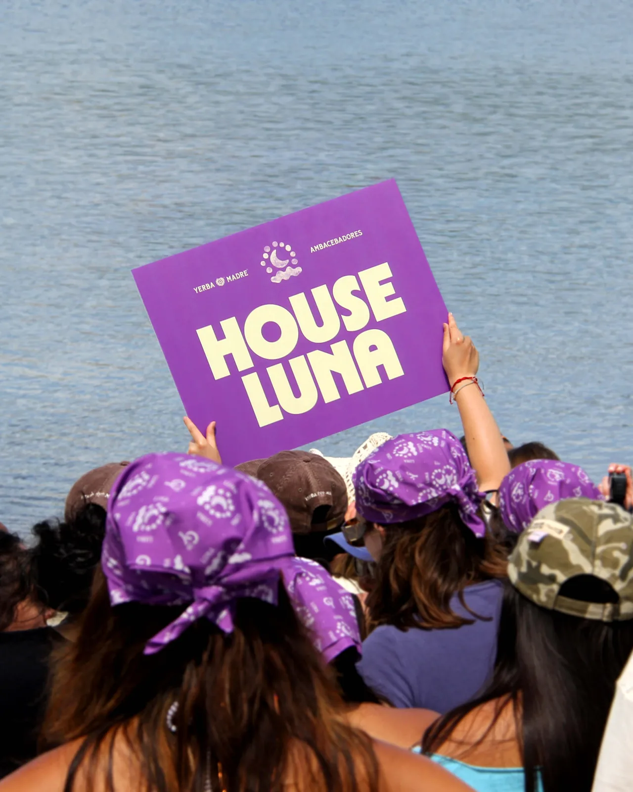
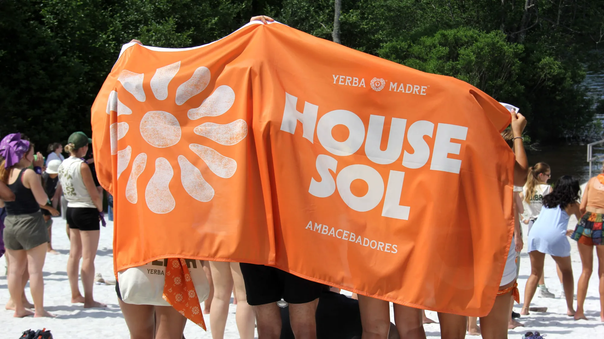
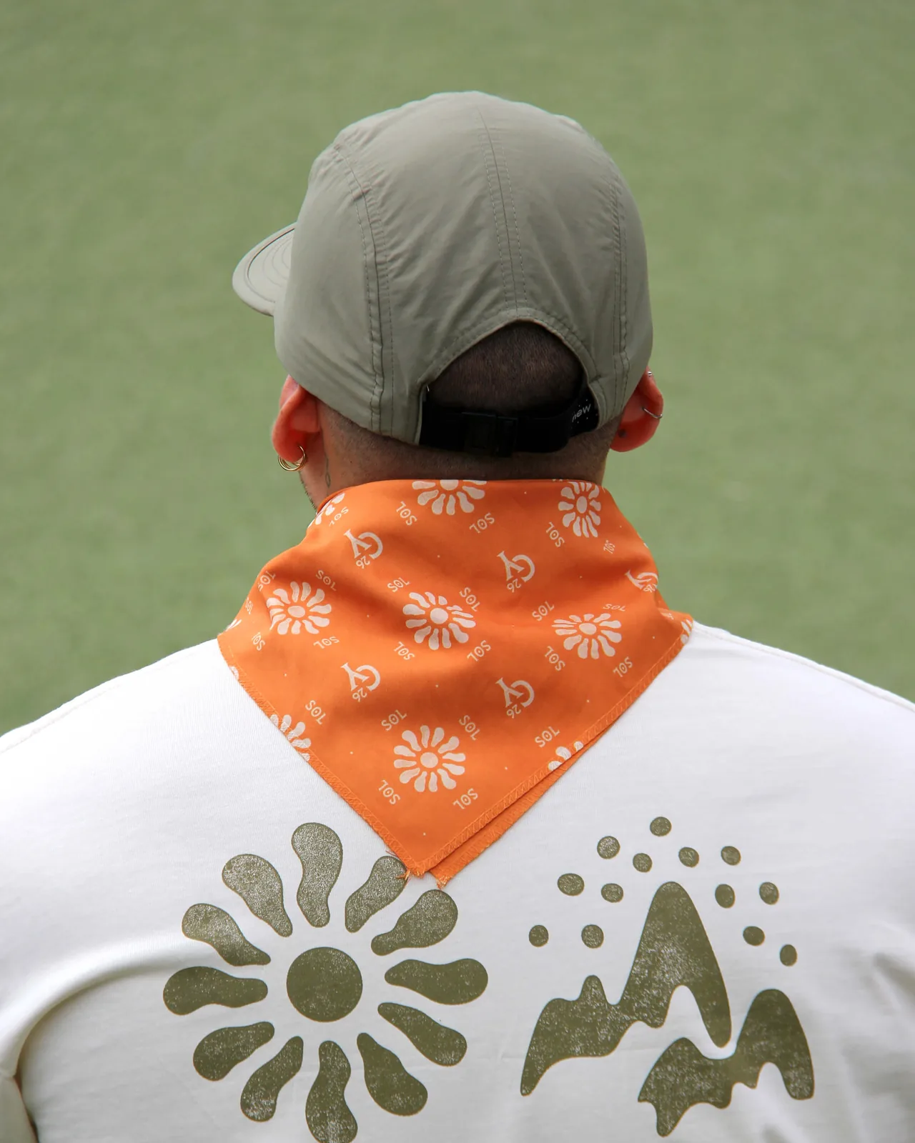
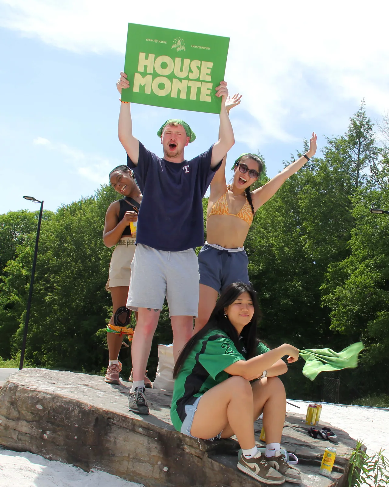
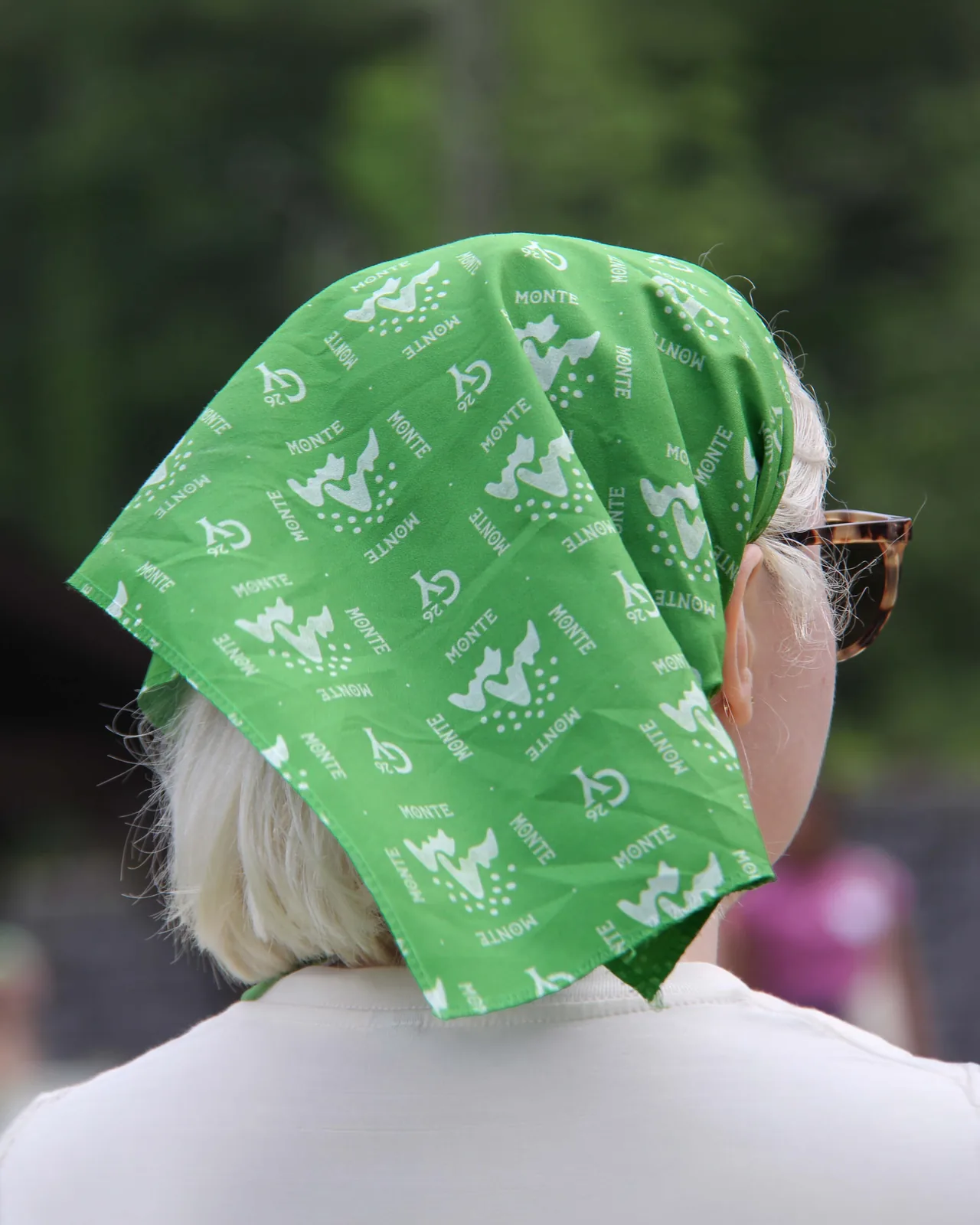
Inspired by the nostalgia of summer camp and the natural character of the Poconos, the identity spans environmental graphics, banners, House systems, merchandise, signage, and wayfinding, bringing Camp Yerba to life through a cohesive visual language that feels both familiar and uniquely Yerba.
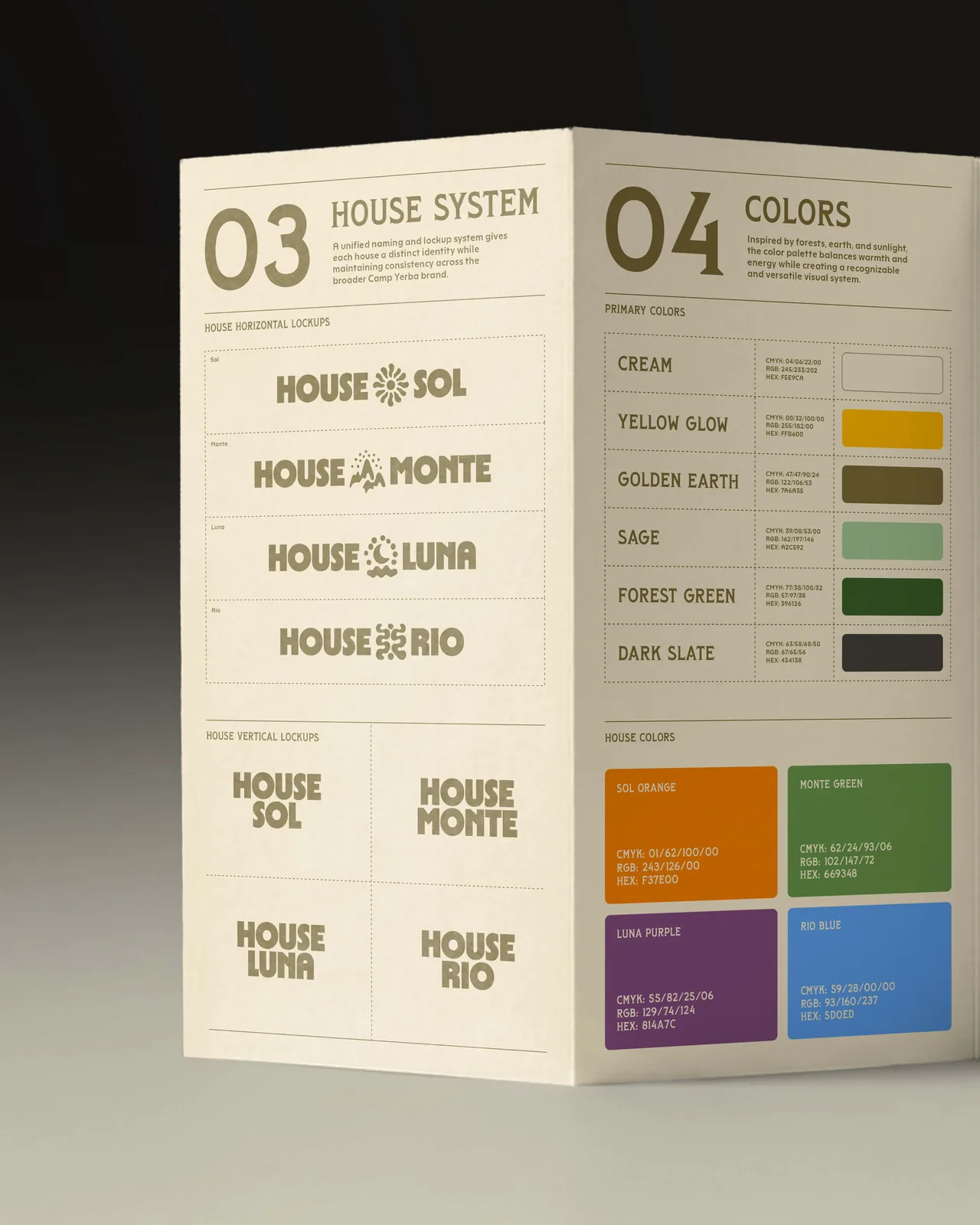
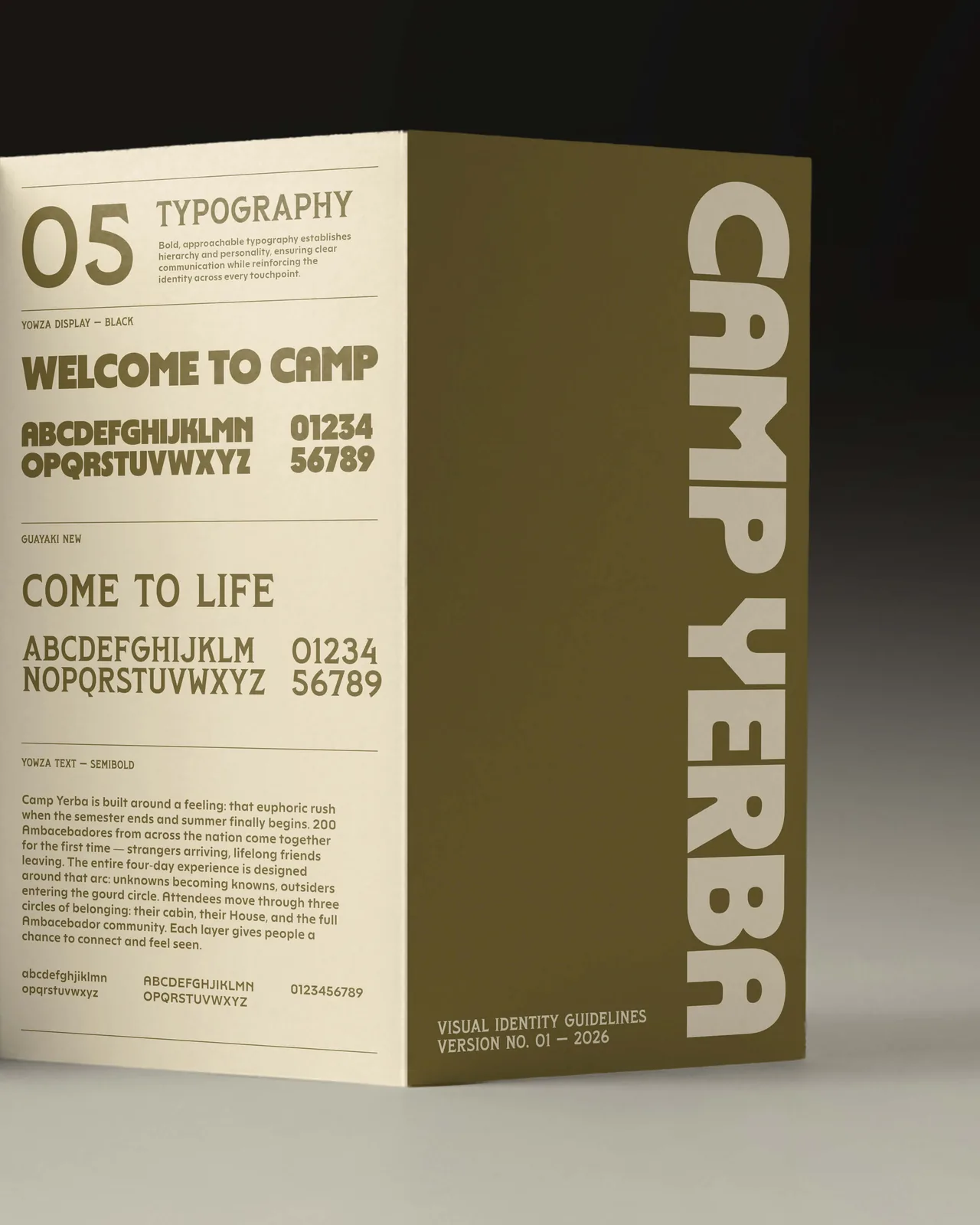
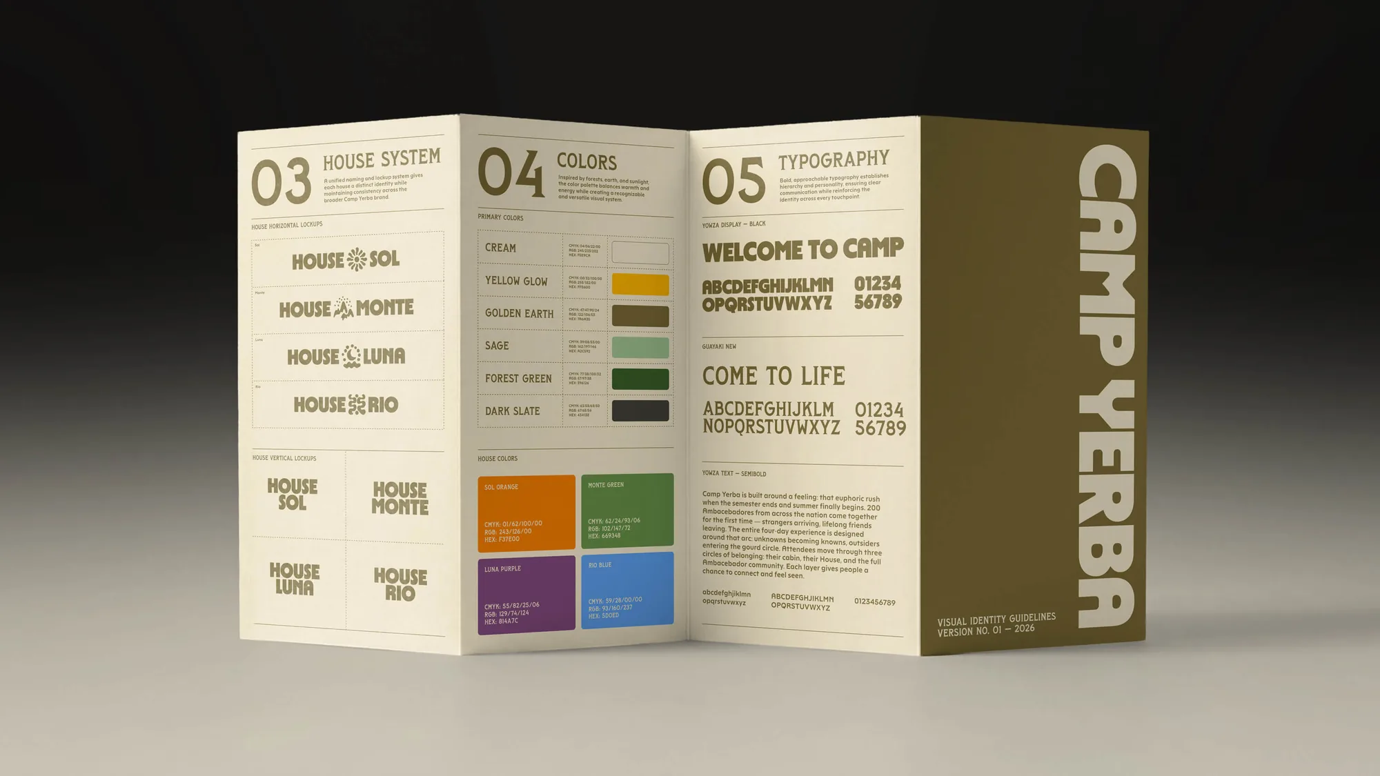
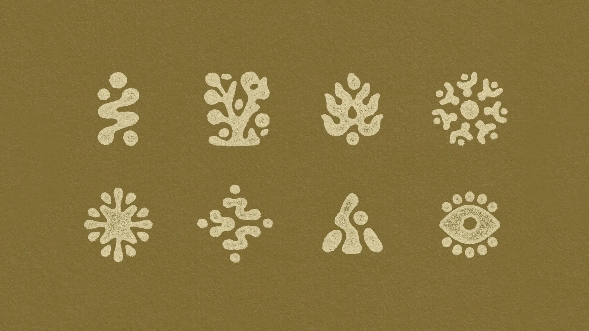
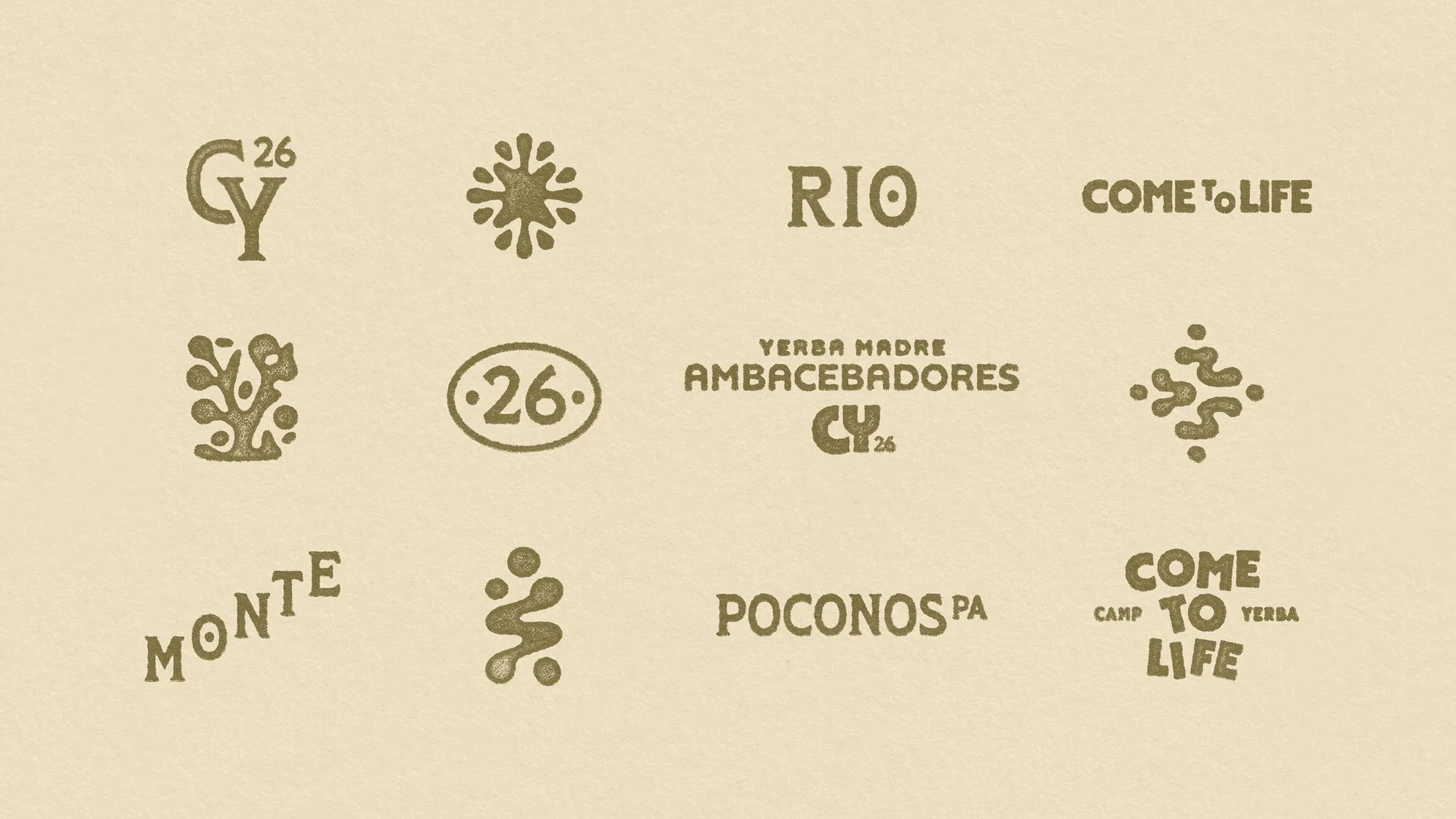
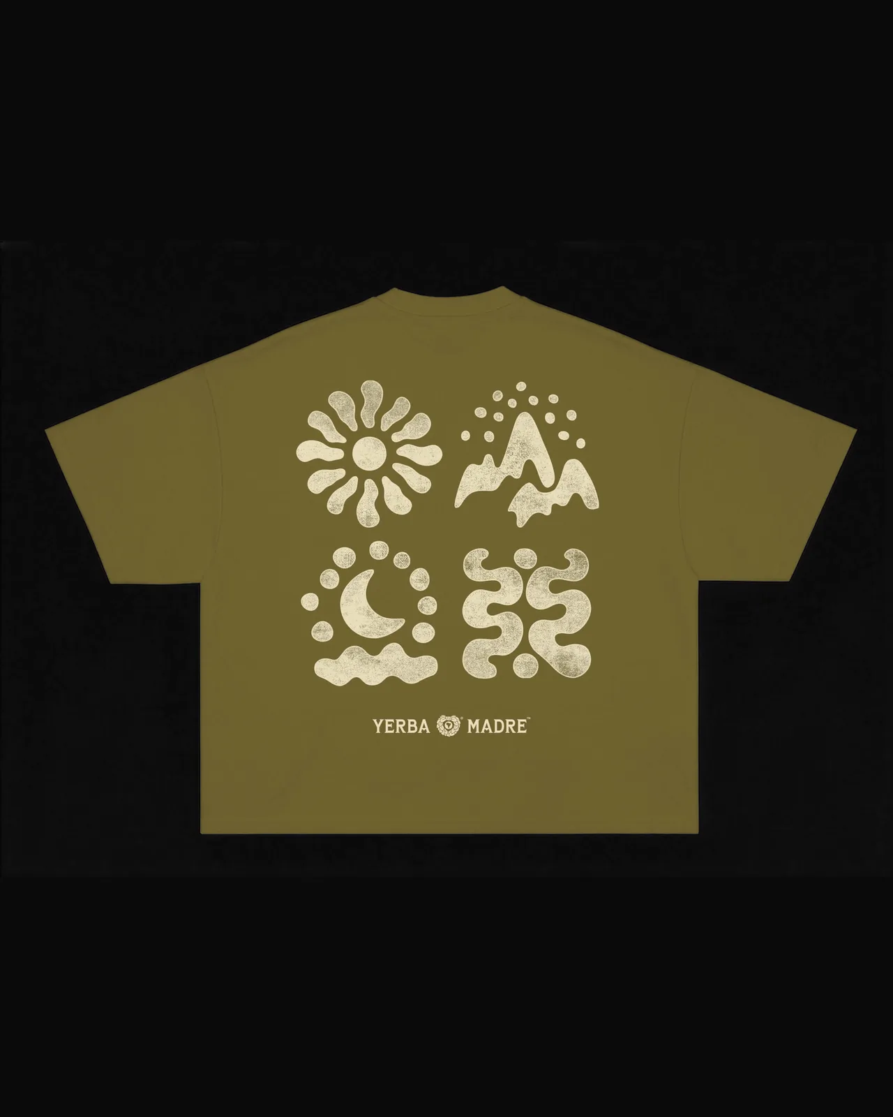
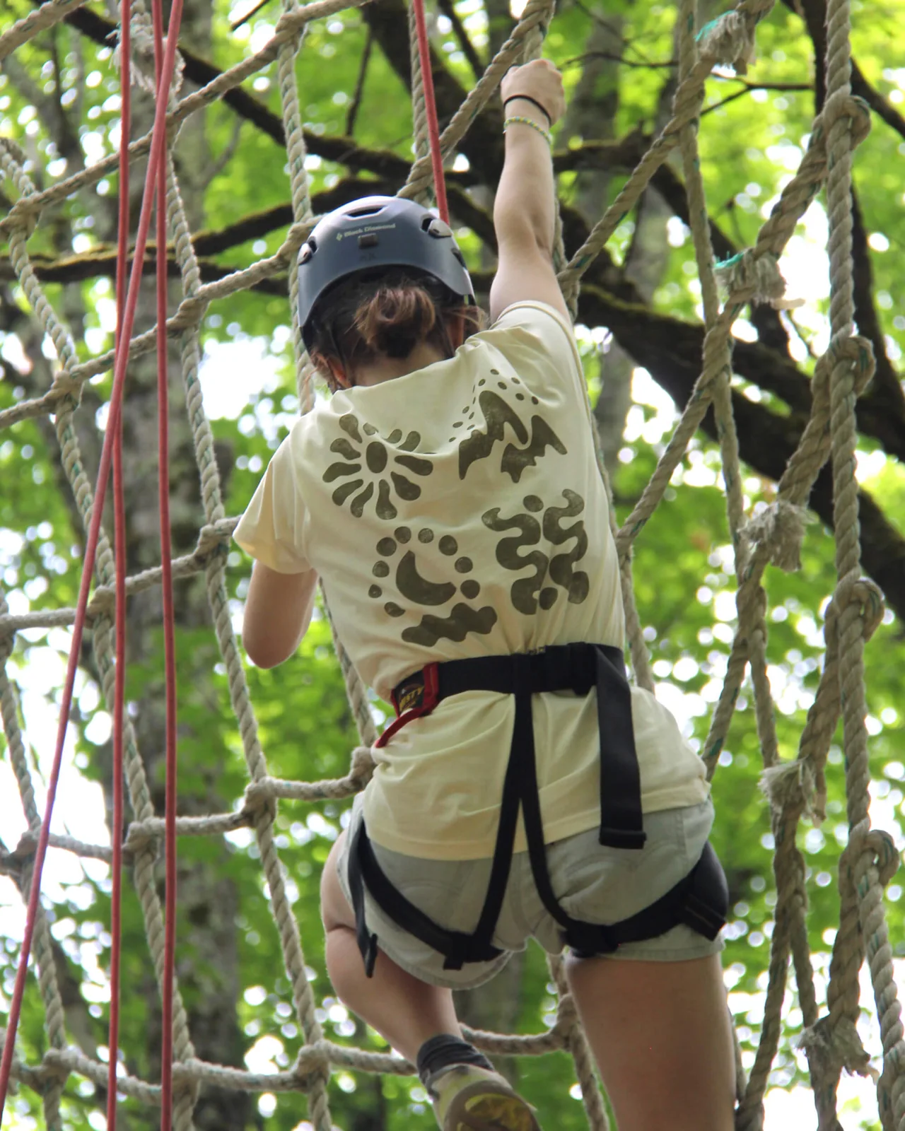
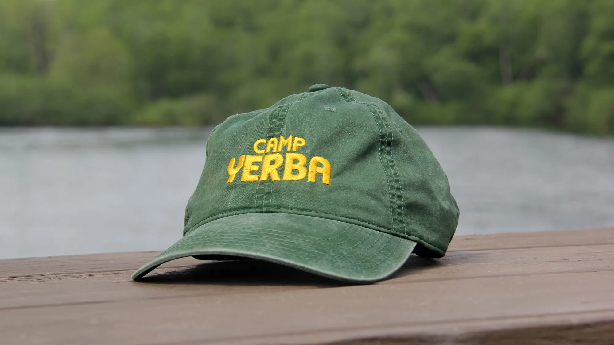
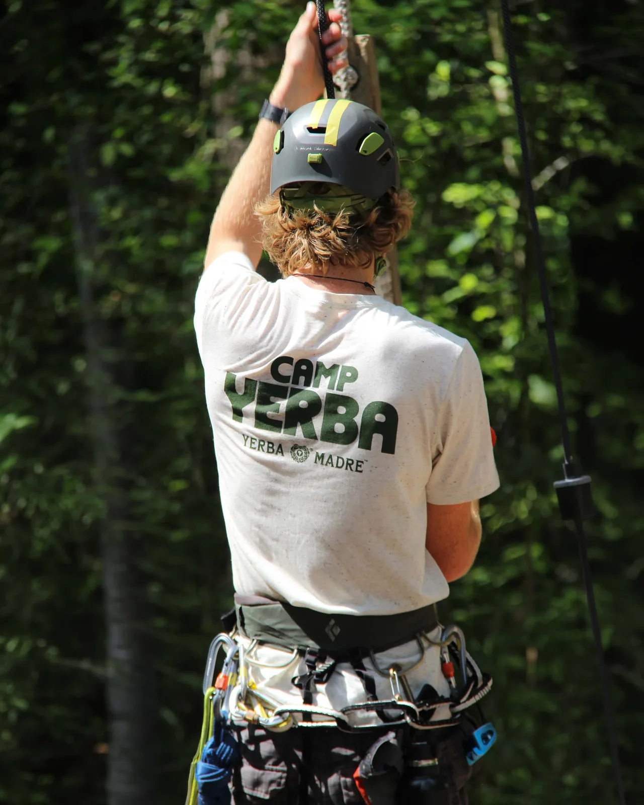
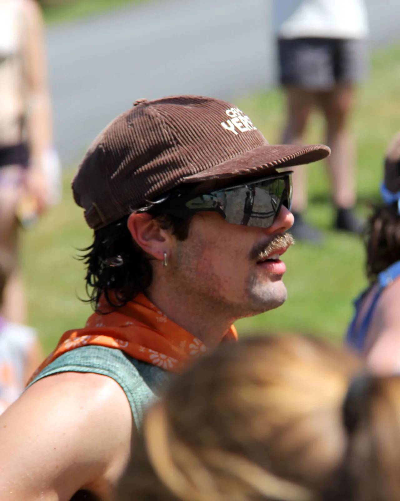
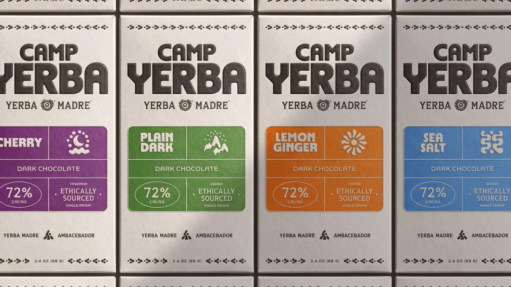
About 200 Yerba Madre Ambacebadores arrive as strangers and leave as friends, and the system follows that arc through three circles of belonging: their cabin, their House and the whole community. Each of the four Houses, Sol, Monte, Luna and Rio, has its own hand-drawn icon, lockup and colour (orange, green, purple and blue), set on a palette of cream, yellow, golden earth, sage, forest green and dark slate. The type is Yowza Display and Yowza Text by Blaze Type with Guayaki New, and the icons run through patches, bandanas, caps, posters, the bar menu, the camp map and a line of dark chocolate bars.
Typefaces: Yowza by Blaze Type, Guayaki New
The BRRRANDING newsletter
Liked Camp Yerba?
Get work like this in your inbox.
New identities every Monday, a themed issue every Thursday. Picked by hand, free.
More inspiration

Branding mockups right inside Figma. No PSD wrestling.
Try the Figma plugin →This spot is booked monthly. Become a sponsor

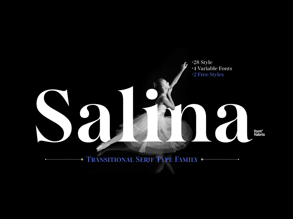
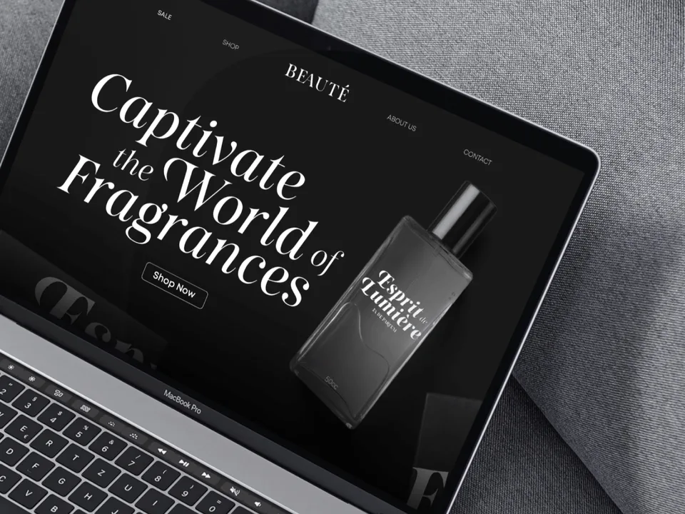
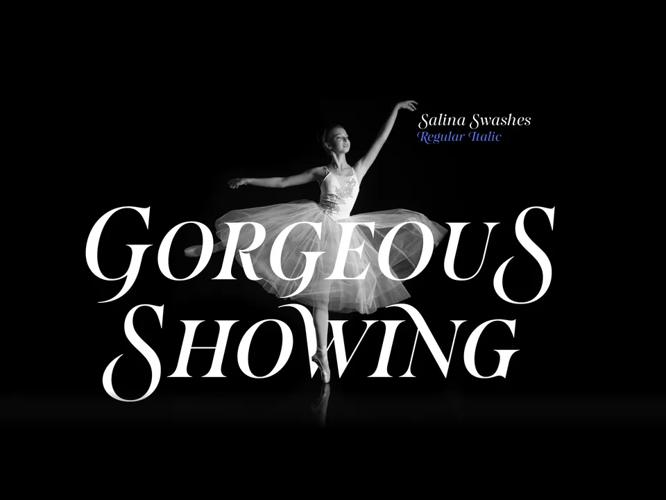
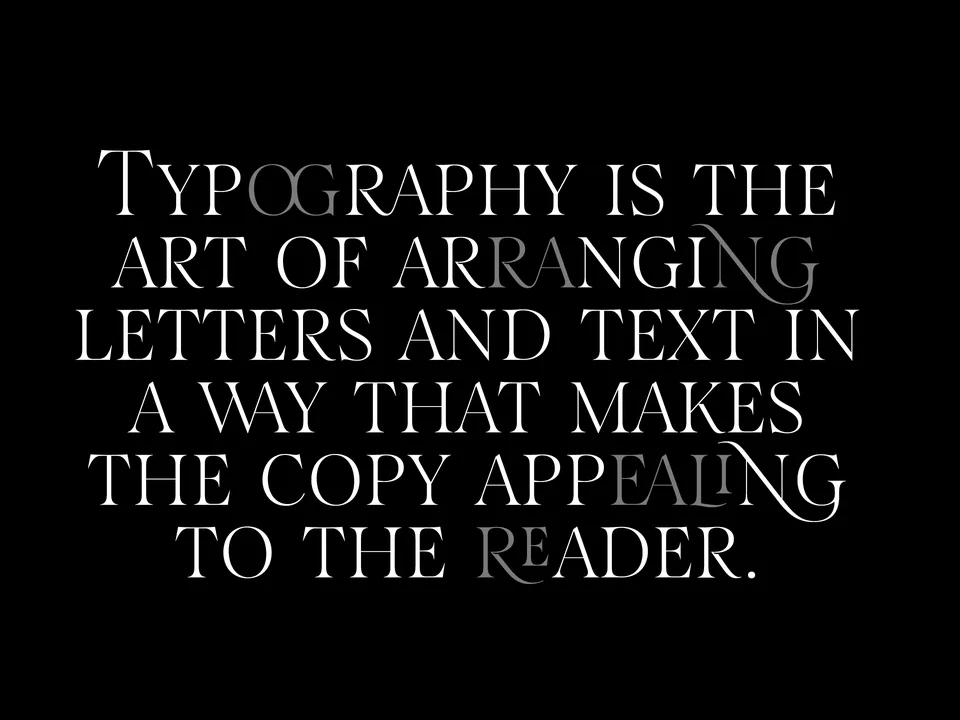
Designing typefaces for creatives seeking to leave a lasting impression.
Explore Salina →This spot is booked monthly. Become a sponsor
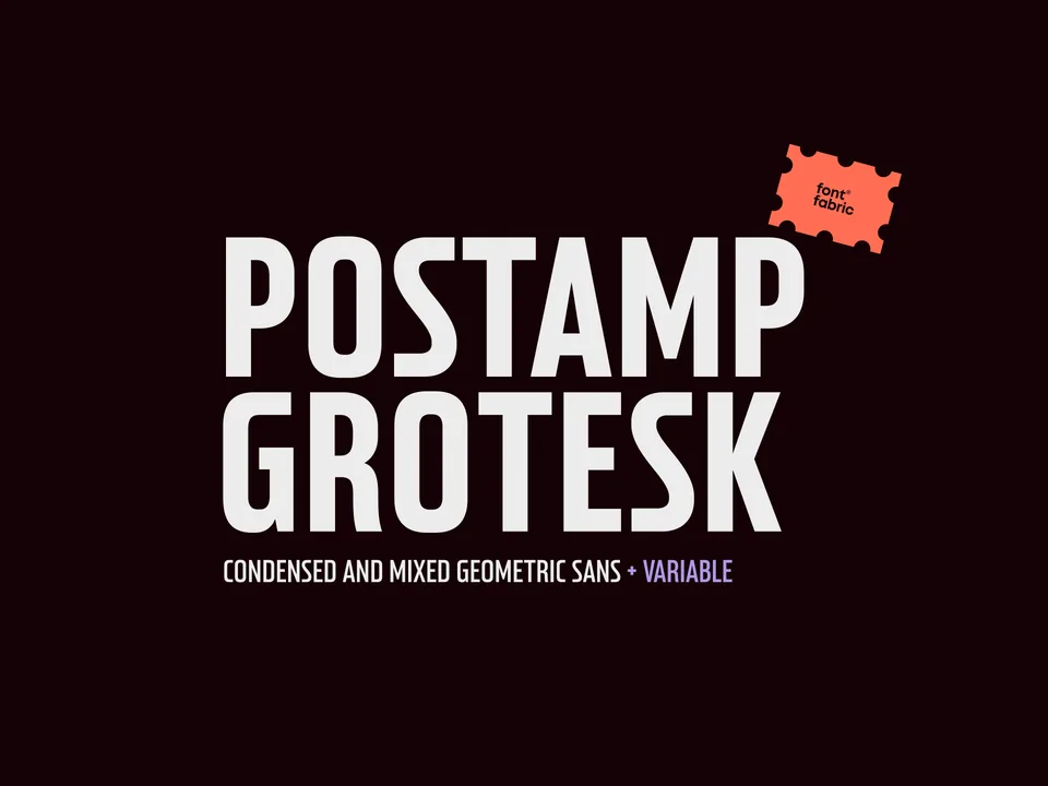
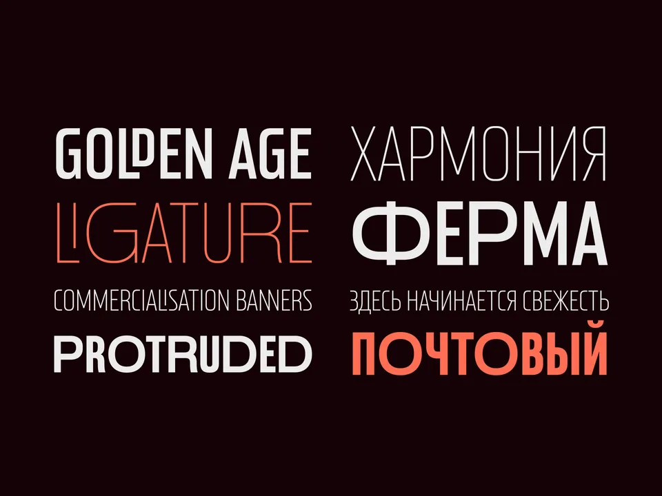
Designing typefaces for creatives seeking to leave a lasting impression.
Explore Postamp Grotesk →This spot is booked monthly. Become a sponsor
Designing typefaces for creatives seeking to leave a lasting impression.
Explore Fabric Grotesk →This spot is booked monthly. Become a sponsor