


Common Goal
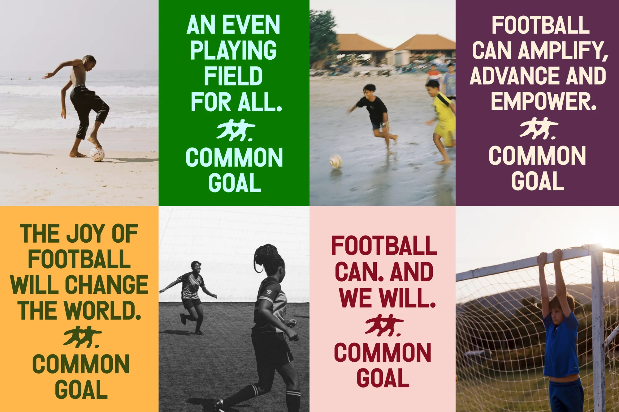
Common Goal is a global football-for-good network with more than 30 years of experience behind it. It connects the cultural and financial pull of the football industry with local organisations that fight inequality, and its new vision is an even playing field for all. Barkas, working with strategist Sarah Trounce, gave it a new brand narrative and identity to bring its fast-growing community together.
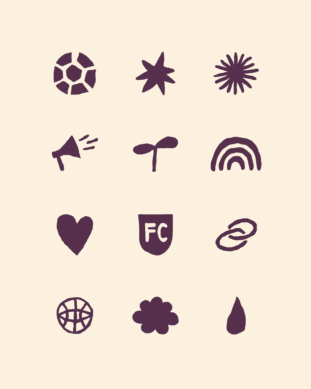
The idea balances an inclusive, celebratory warmth with the energetic, slightly rough language of football. The headline face is RAW from Out of the Dark, a defiant, characterful font inspired by protest posters, paired with Ladna from Tüpokompanii. The logo is hand-drawn: two players running together with a heart between them, and the same loose hand shaped a full set of icons, from the ball and megaphone to an FC crest.
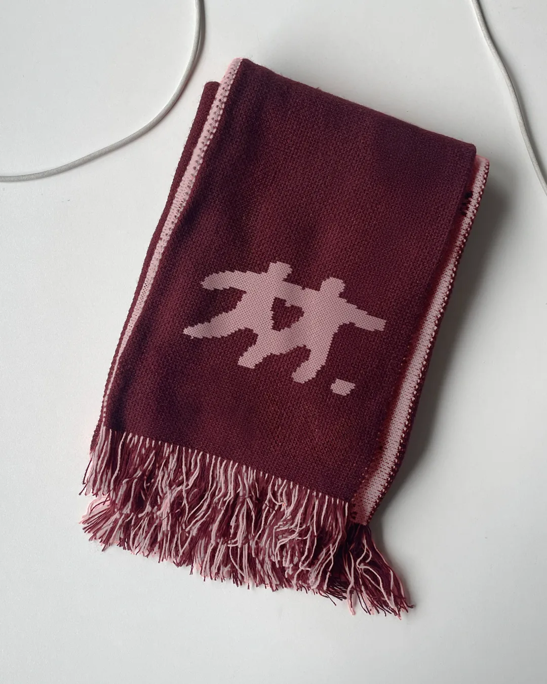
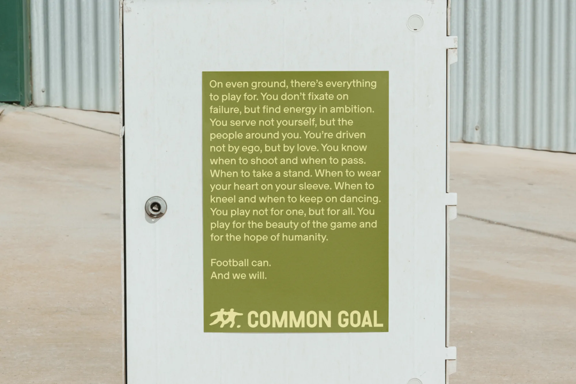
A joyful palette of burgundy, olive, pale yellow, amber, aubergine and cream runs through player portraits, social posts, website player cards, a manifesto poster and a knitted scarf. The aim was a brand everyone can share, one that shows Common Goal as a relevant, engaged brand and not only an influential network.
The BRRRANDING newsletter
Liked Common Goal?
Get work like this in your inbox.
New identities every Monday, a themed issue every Thursday. Picked by hand, free.
More inspiration

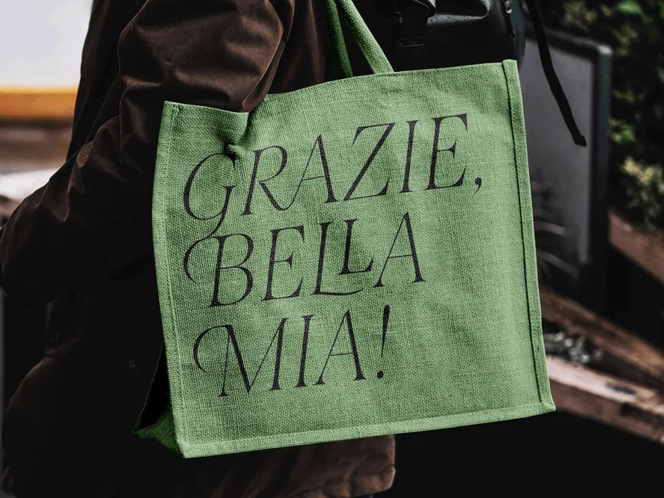
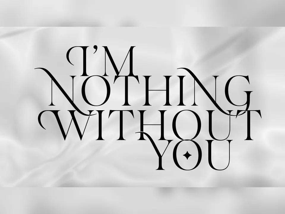
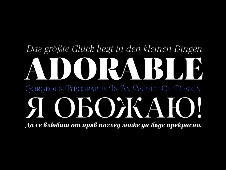
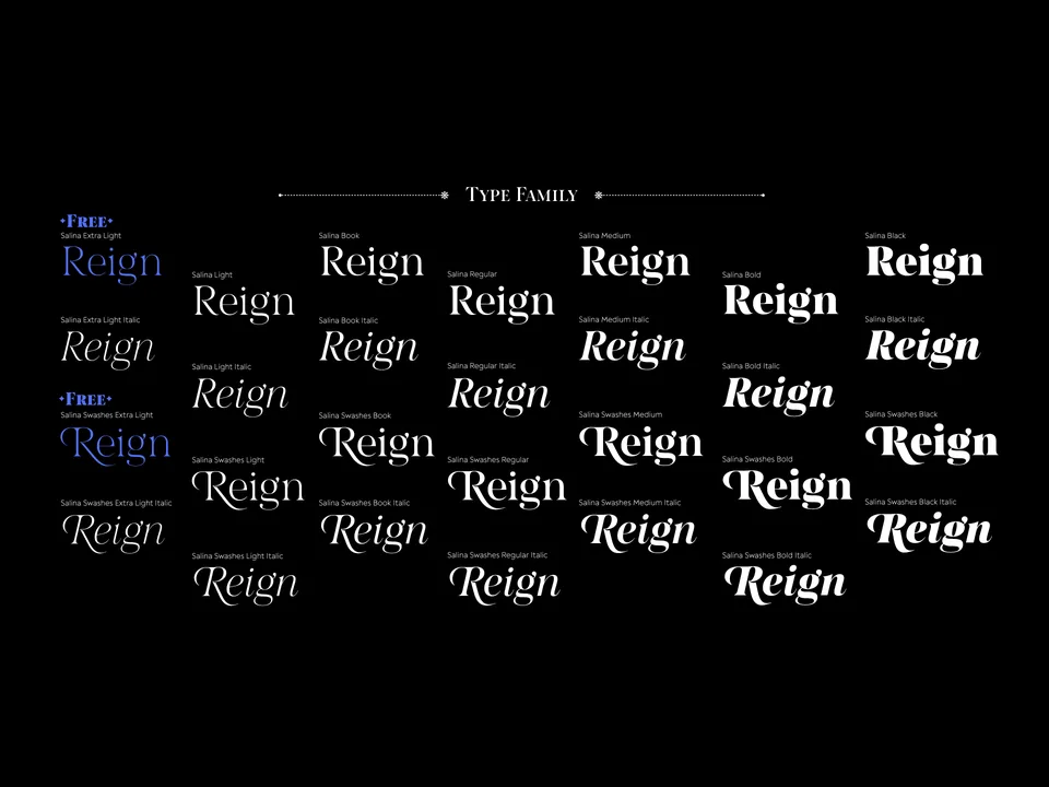
Designing typefaces for creatives seeking to leave a lasting impression.
Explore Salina →This spot is booked monthly. Become a sponsor
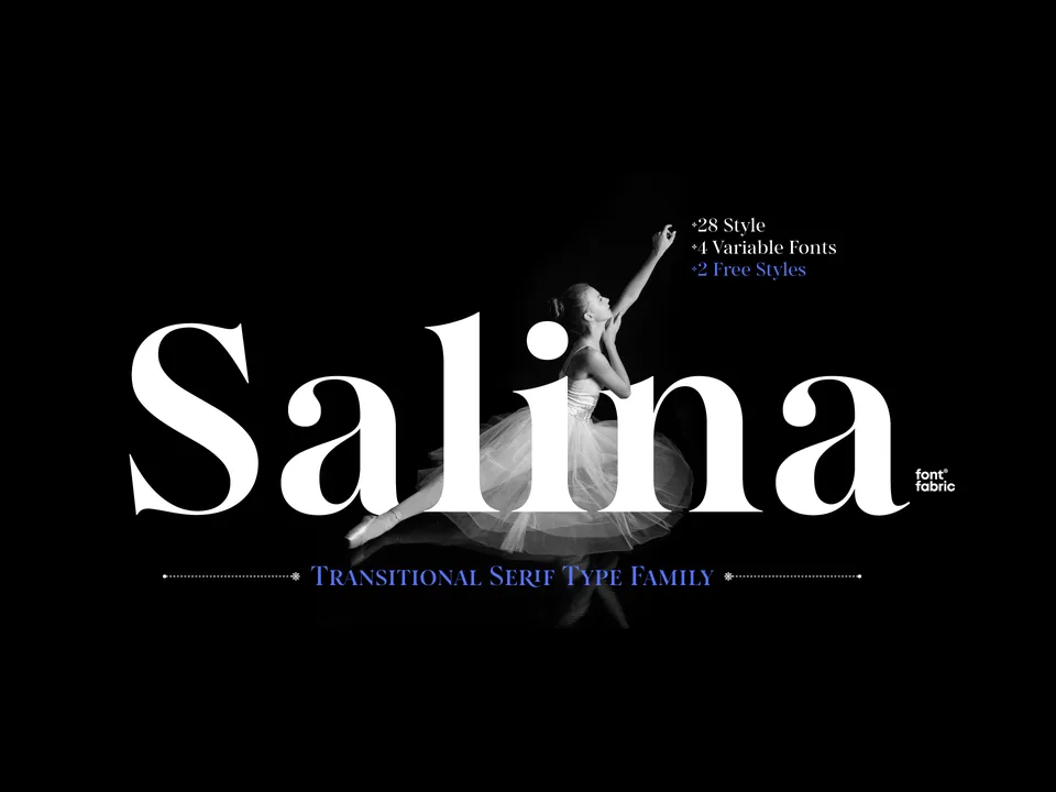
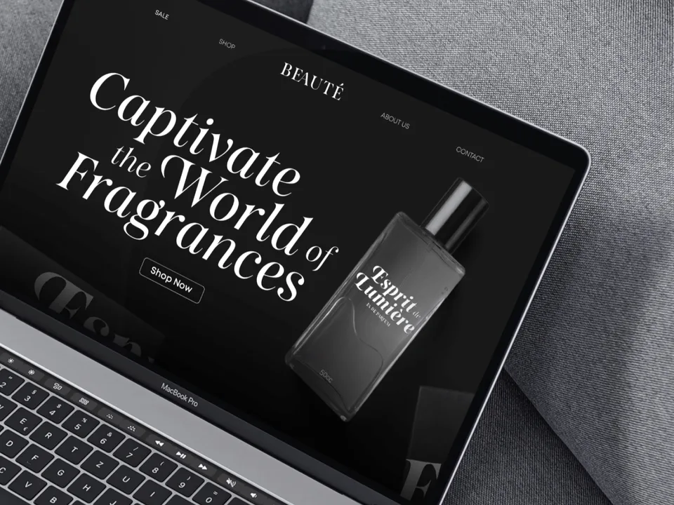
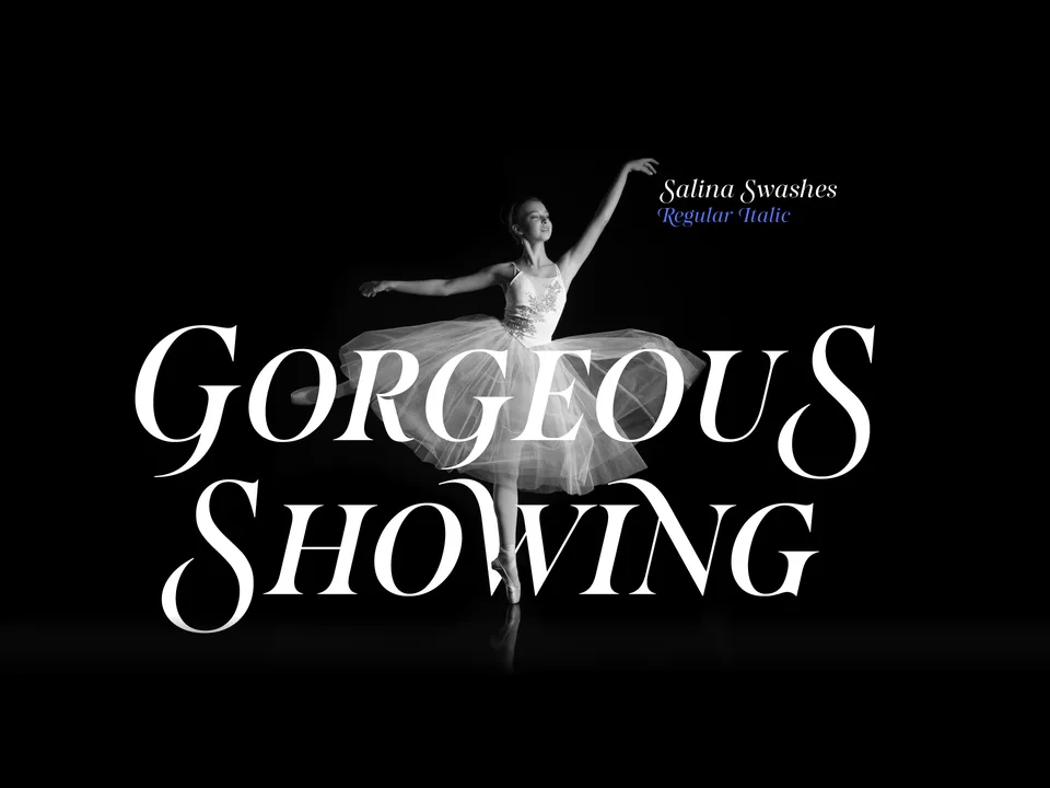
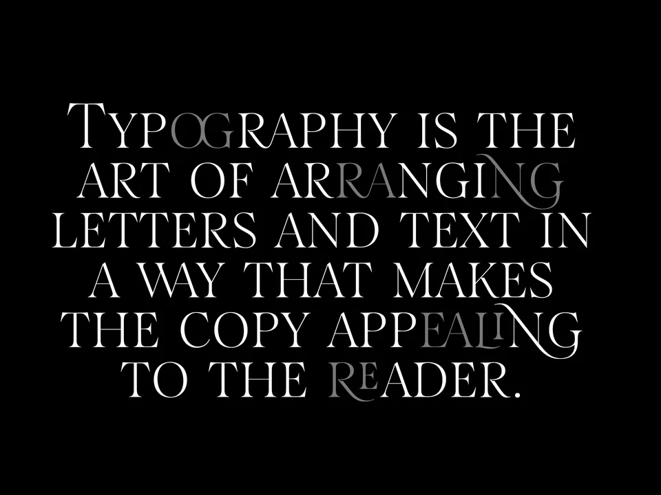
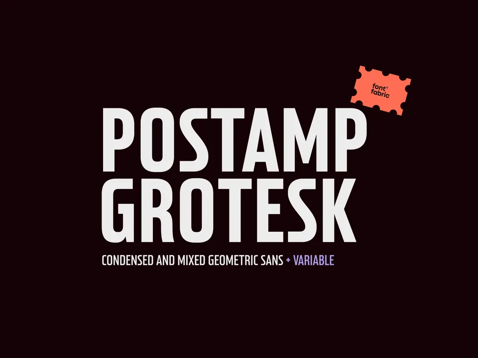
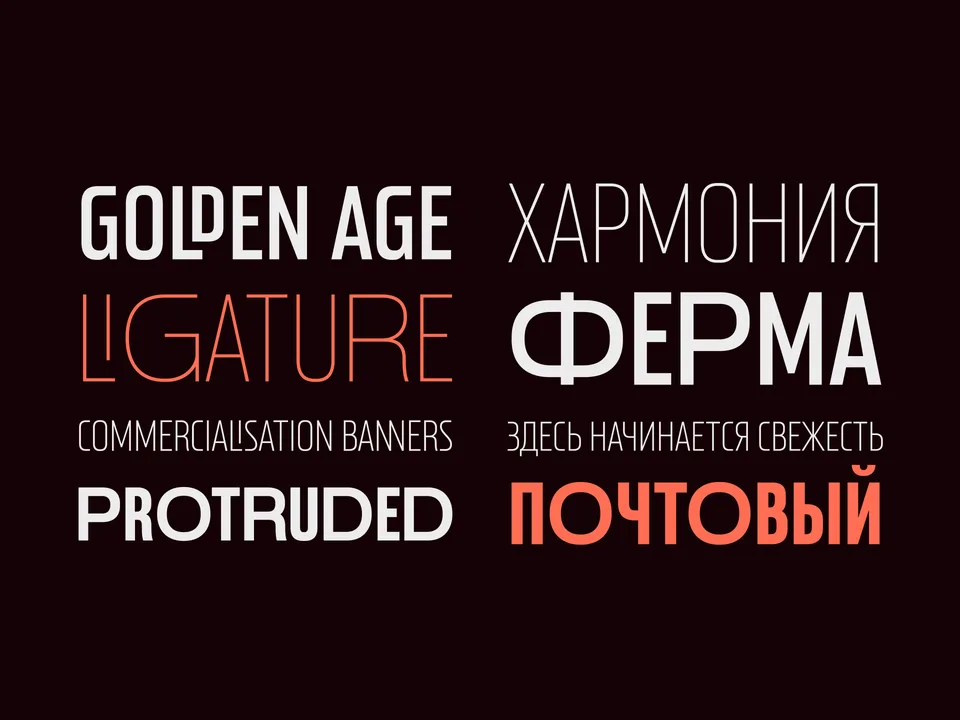
Designing typefaces for creatives seeking to leave a lasting impression.
Explore Postamp Grotesk →This spot is booked monthly. Become a sponsor
Designing typefaces for creatives seeking to leave a lasting impression.
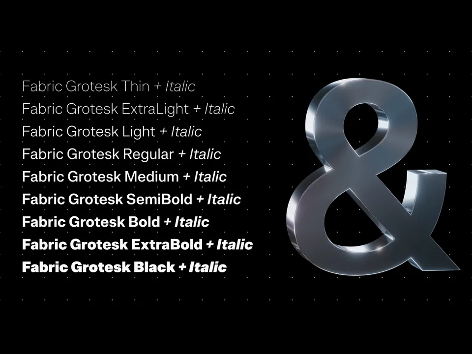
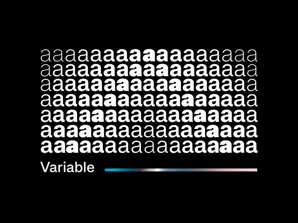
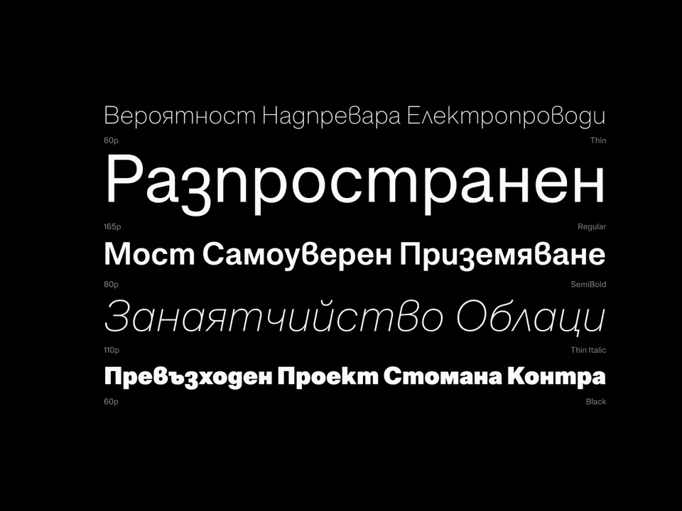
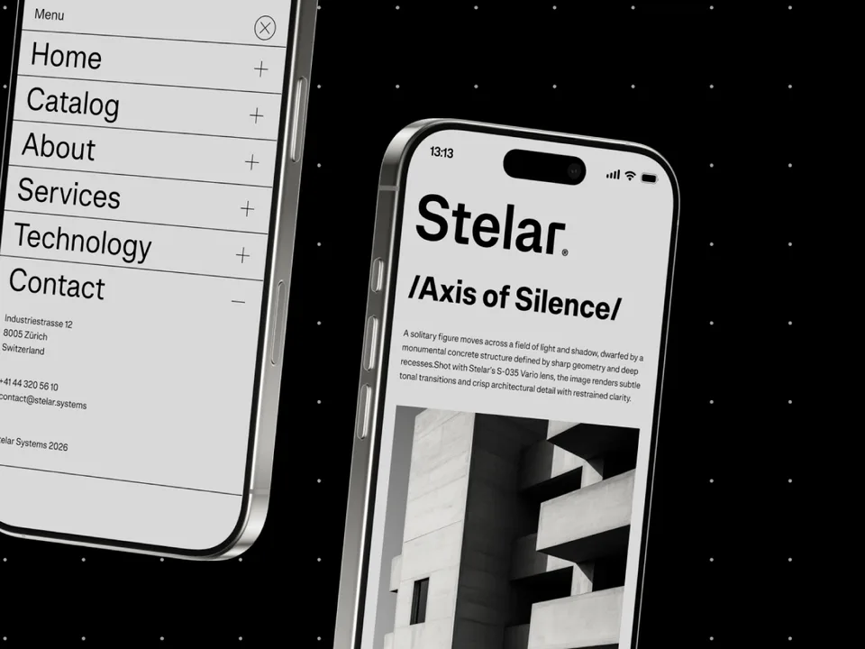
Explore Fabric Grotesk →This spot is booked monthly. Become a sponsor