Public Pool
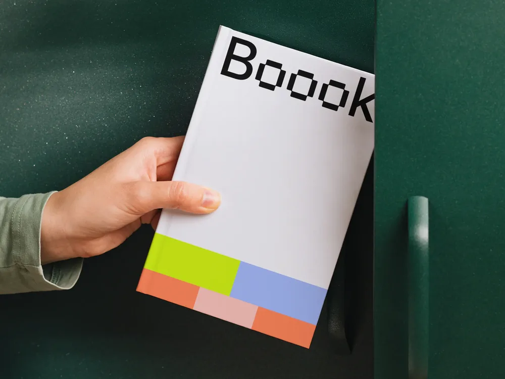
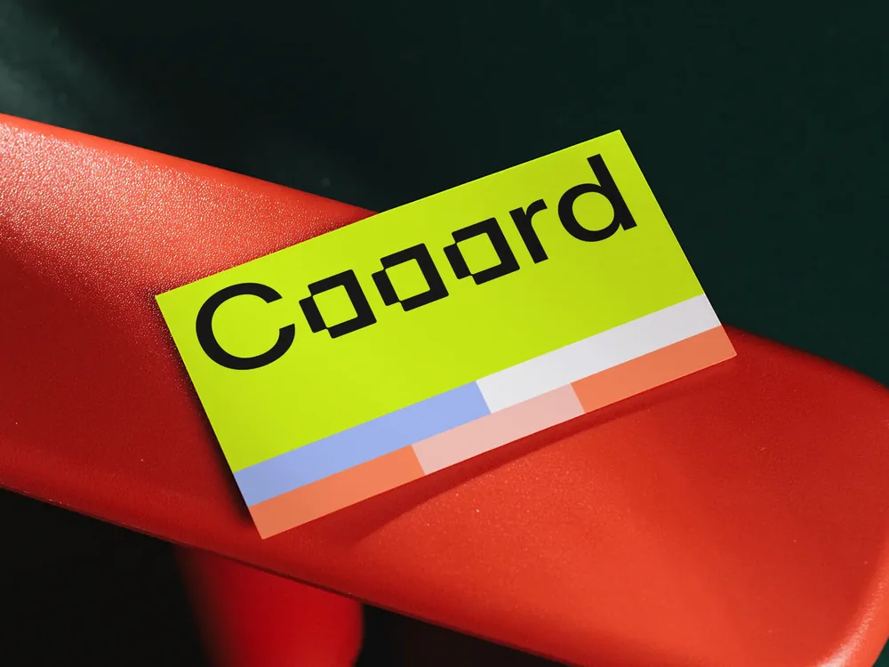
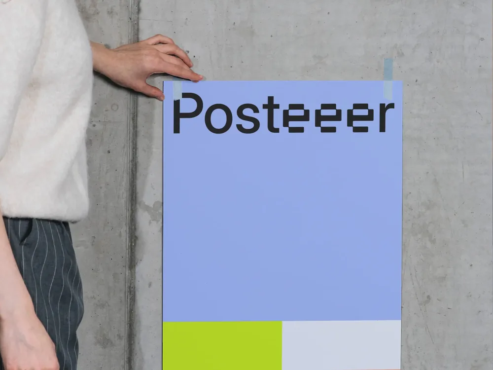
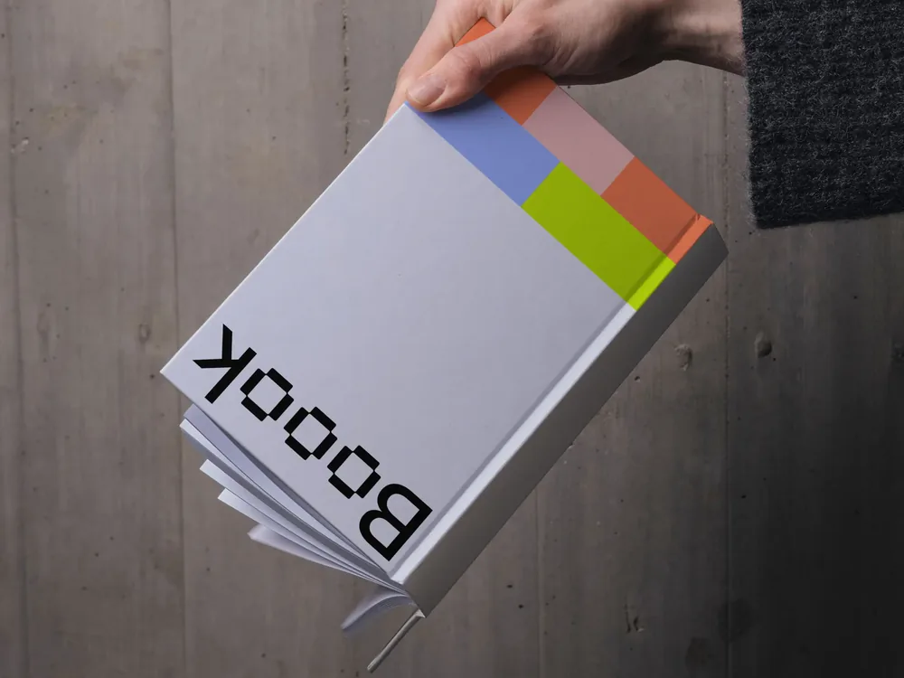
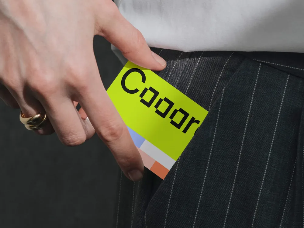
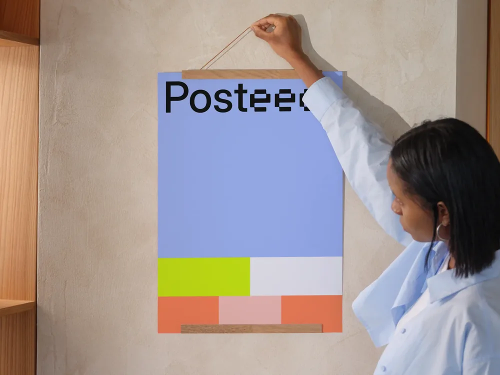
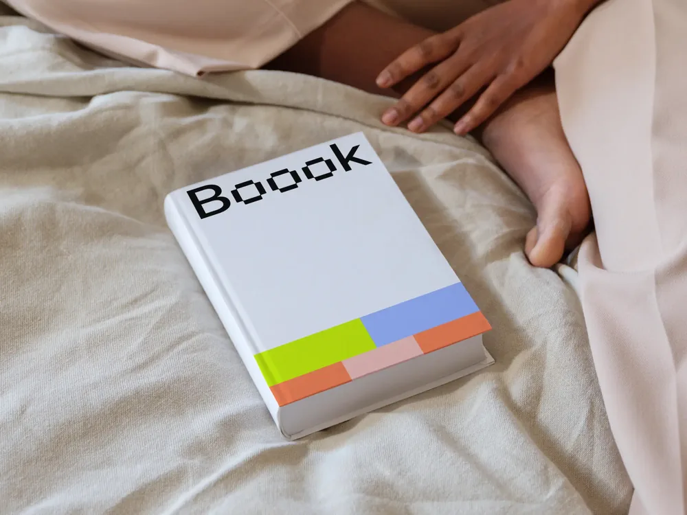
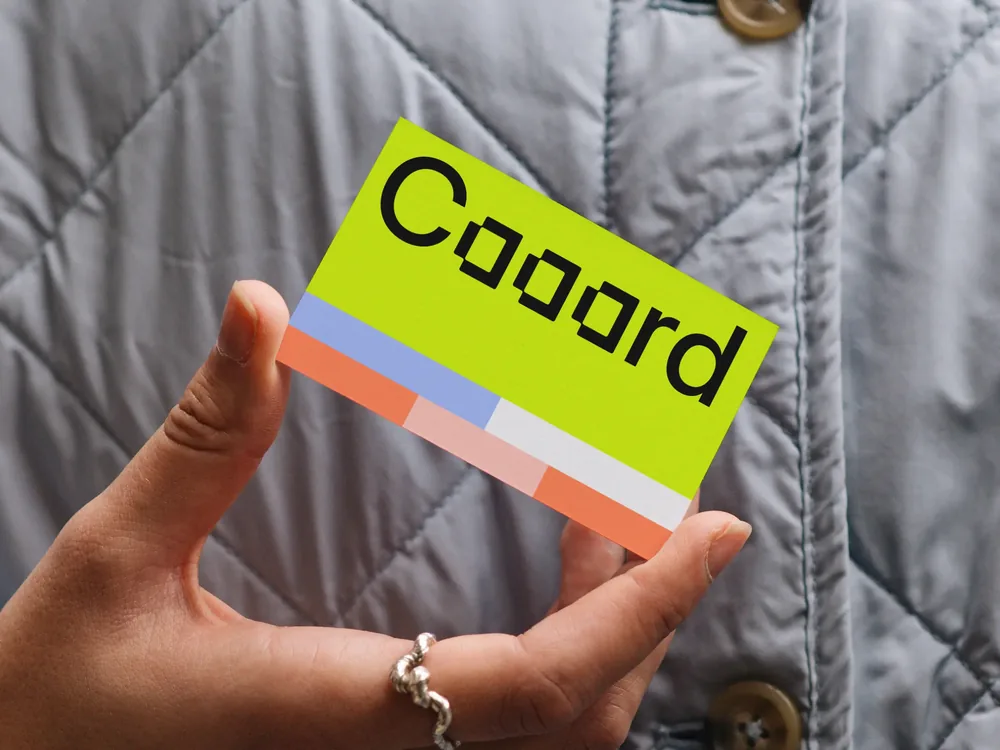
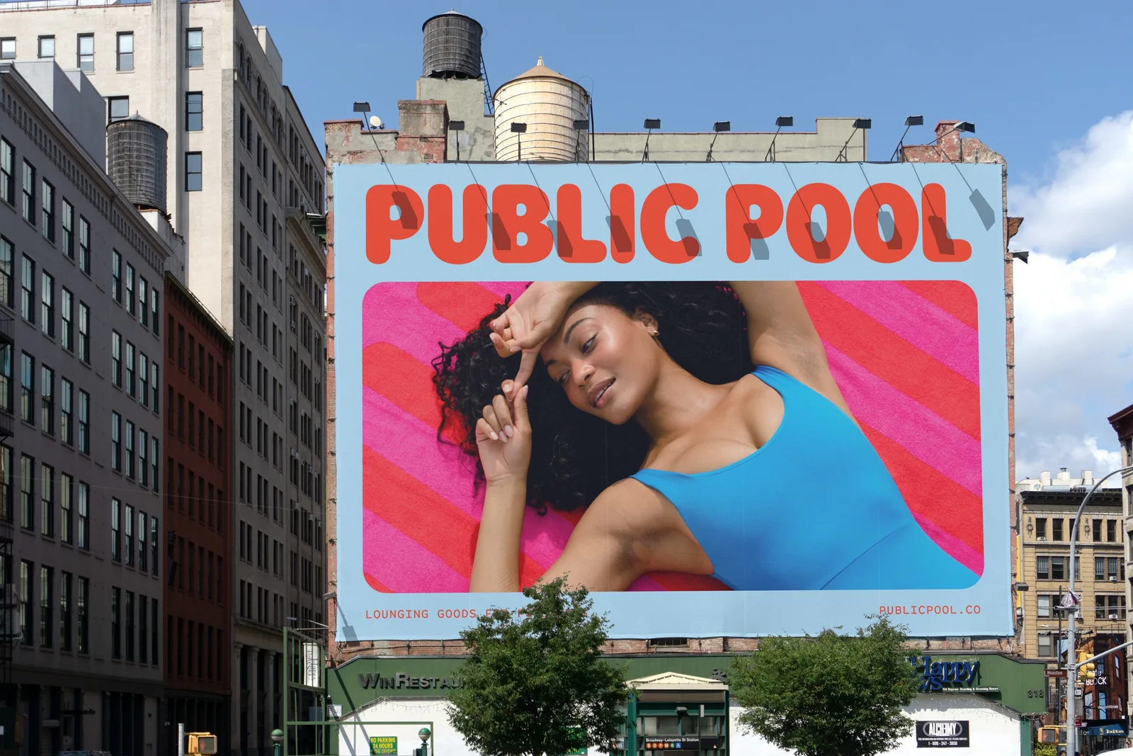
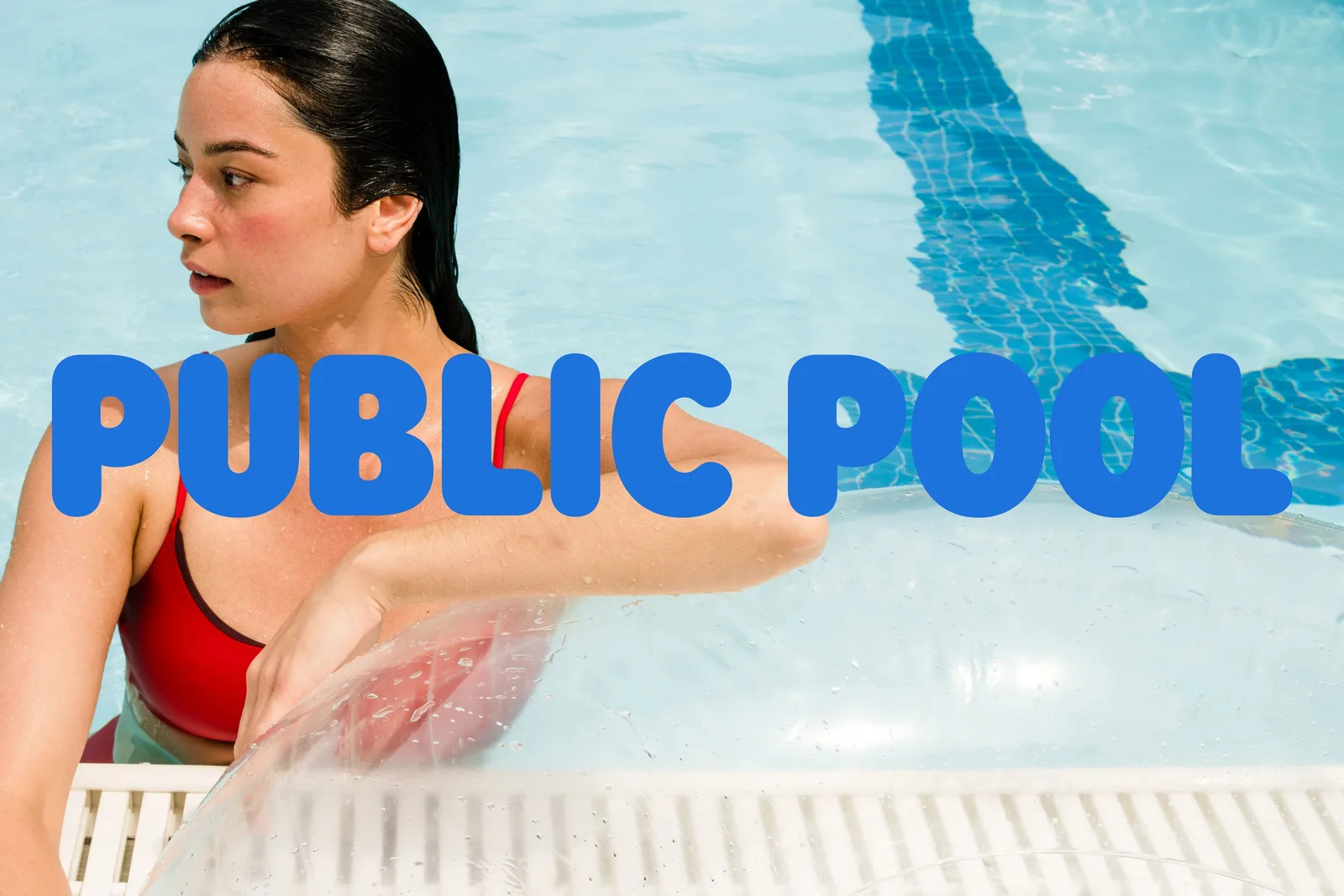
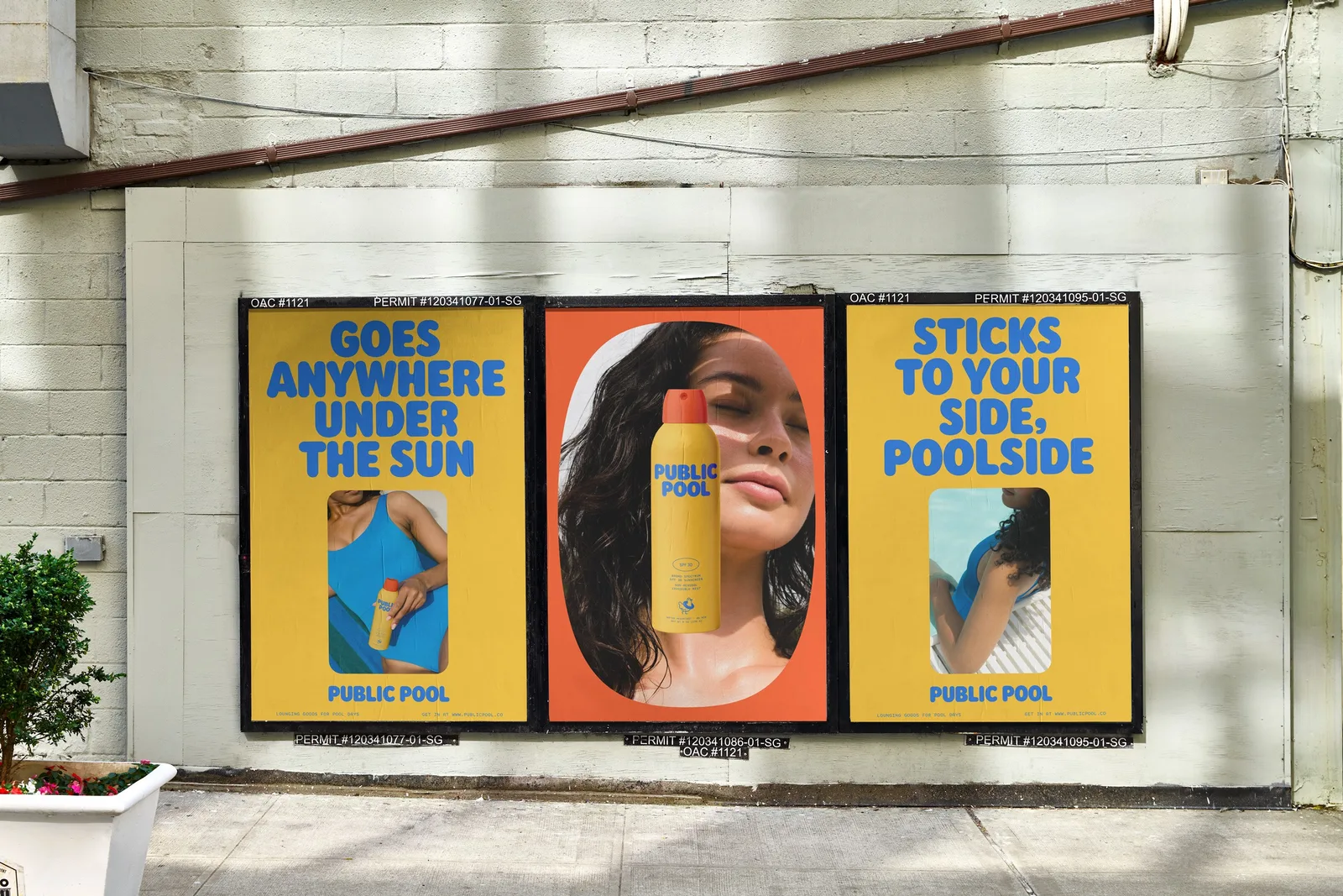
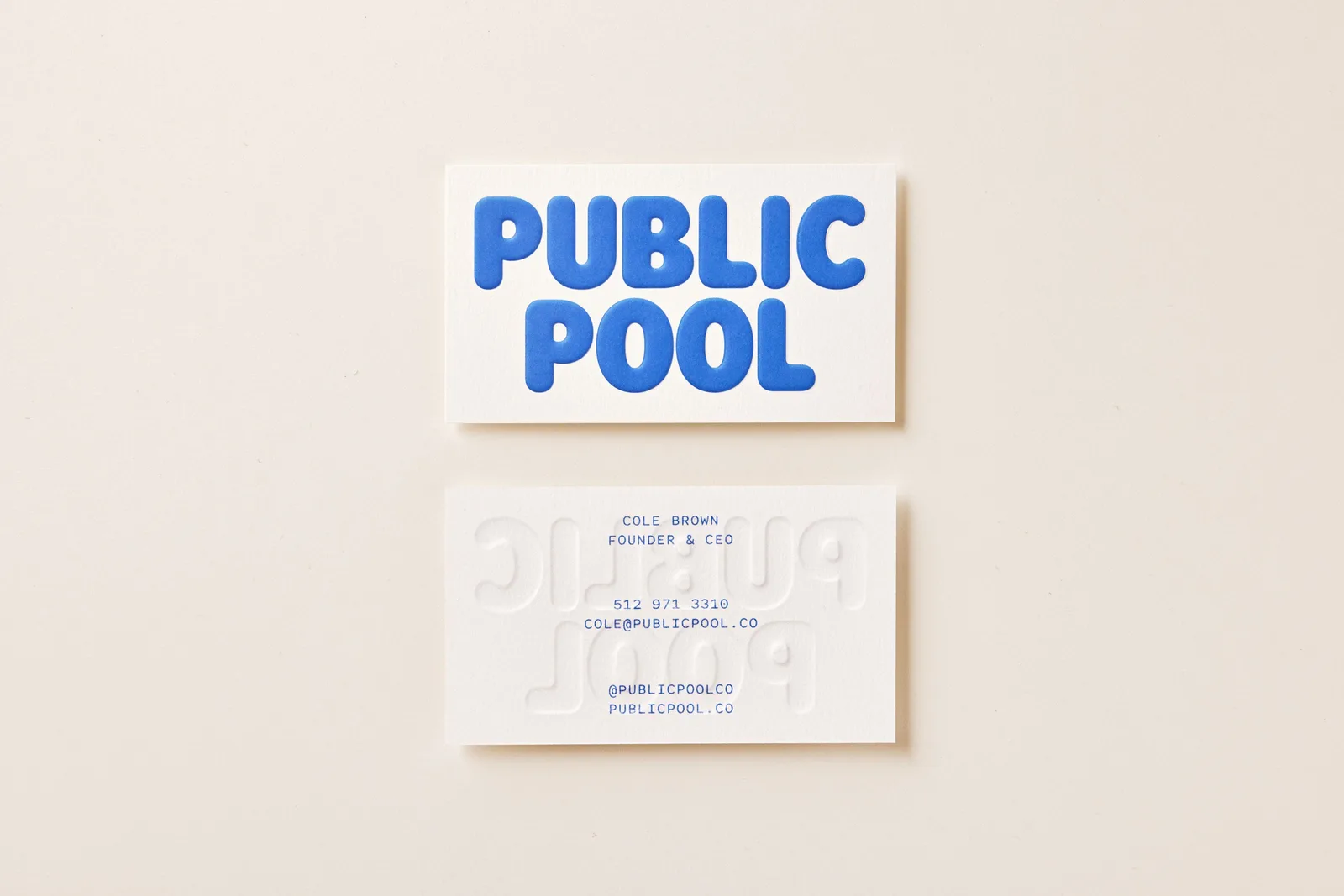
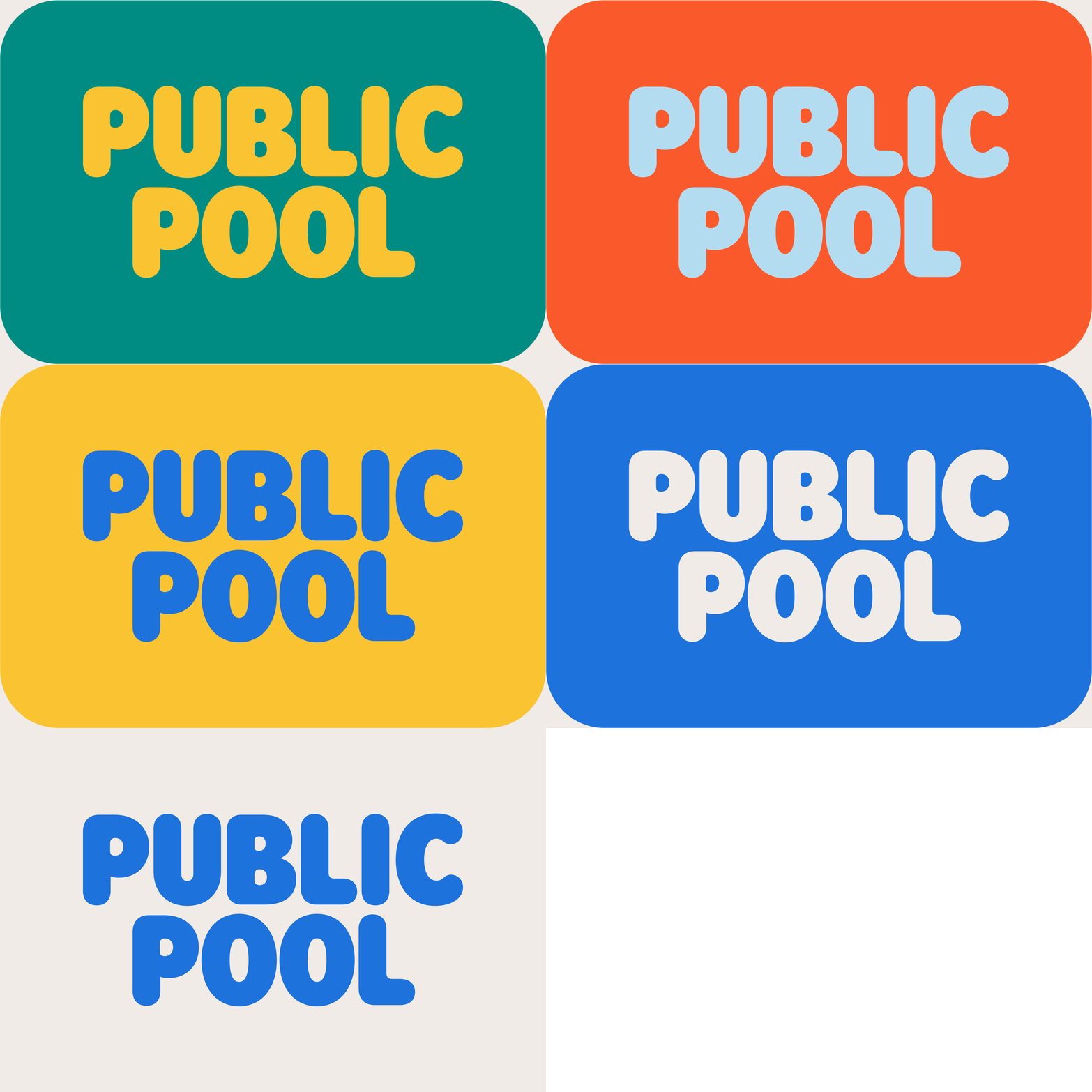
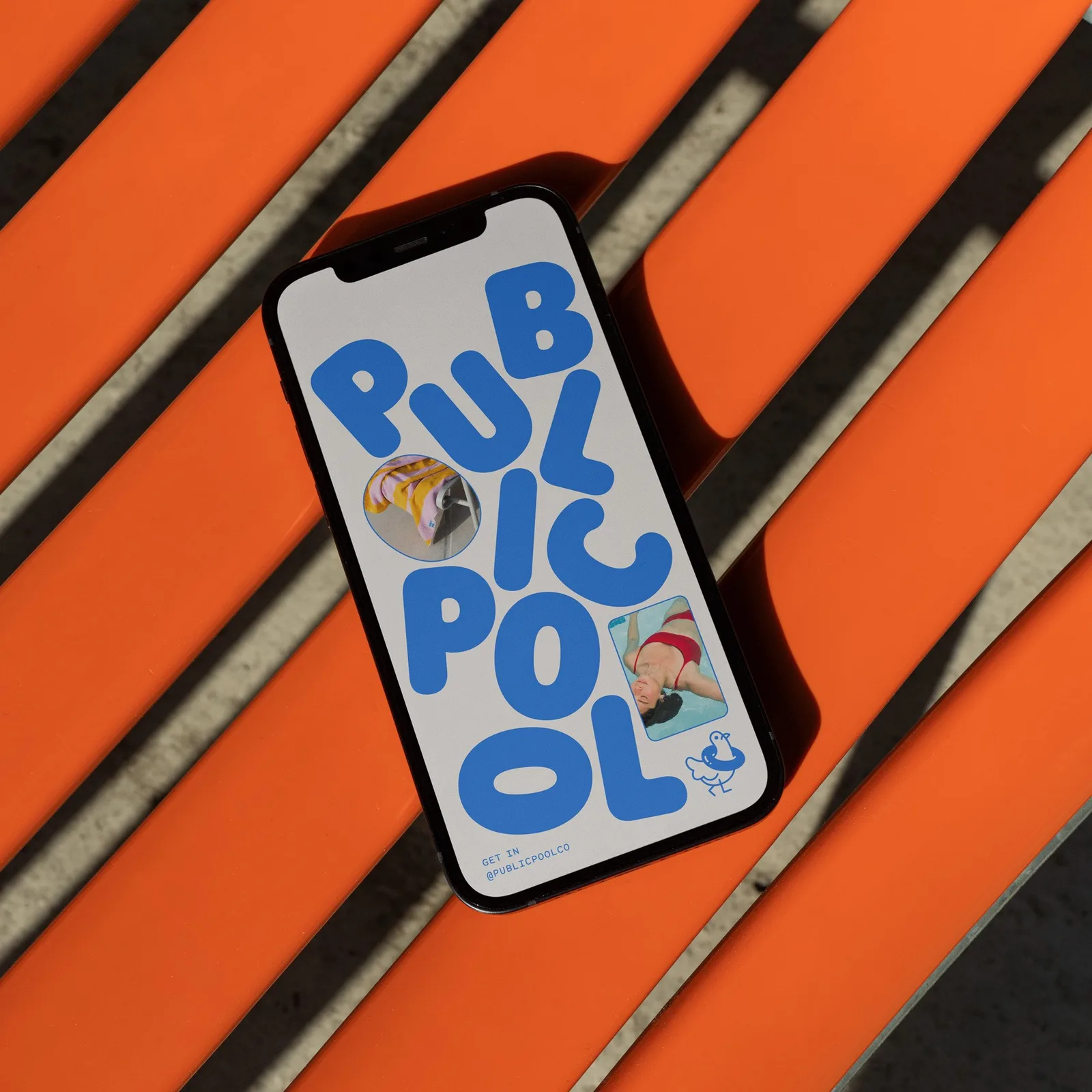
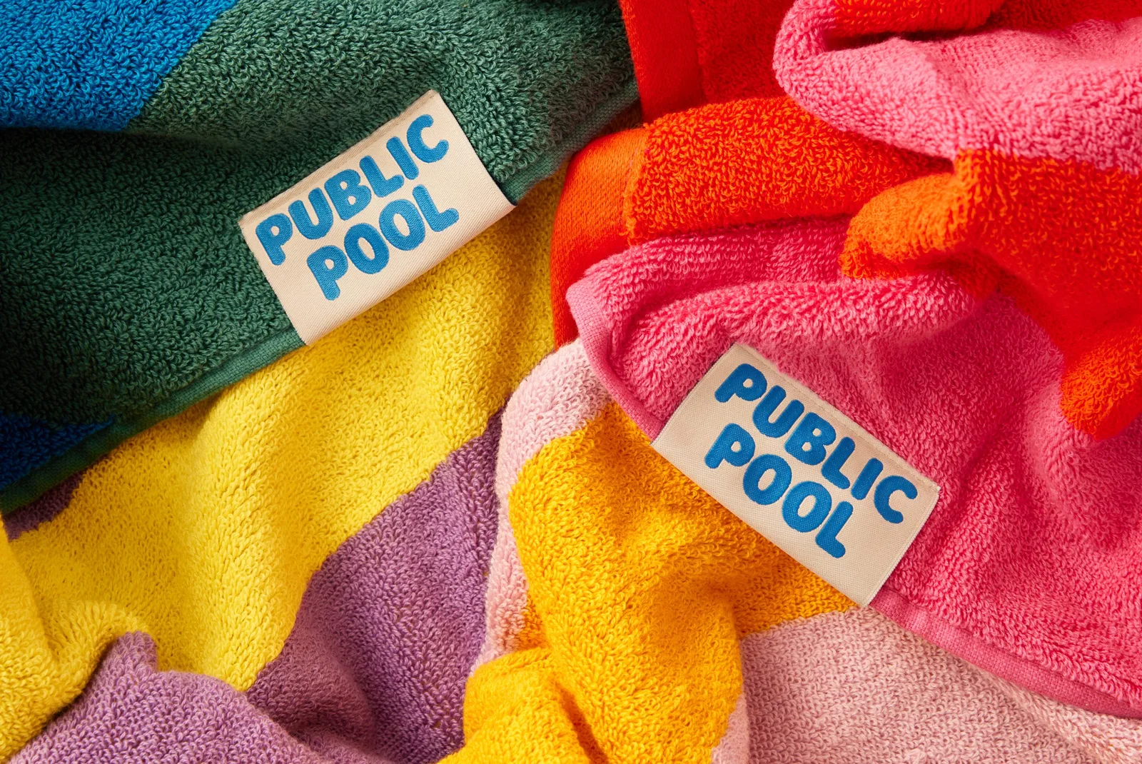
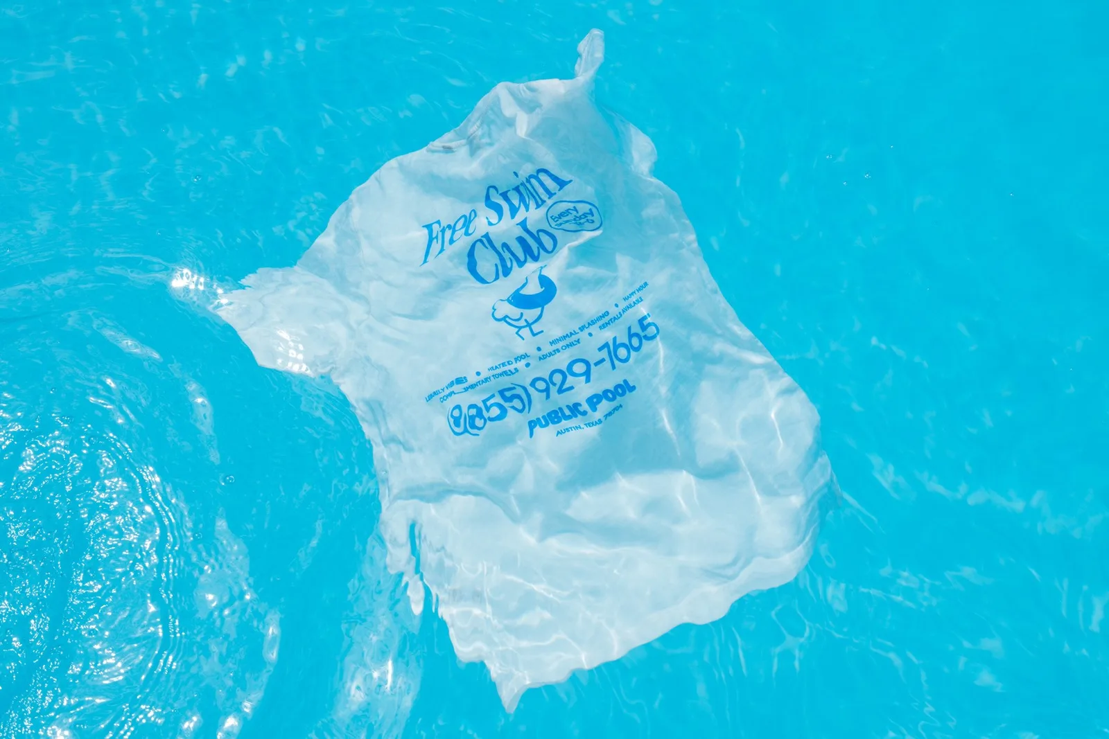
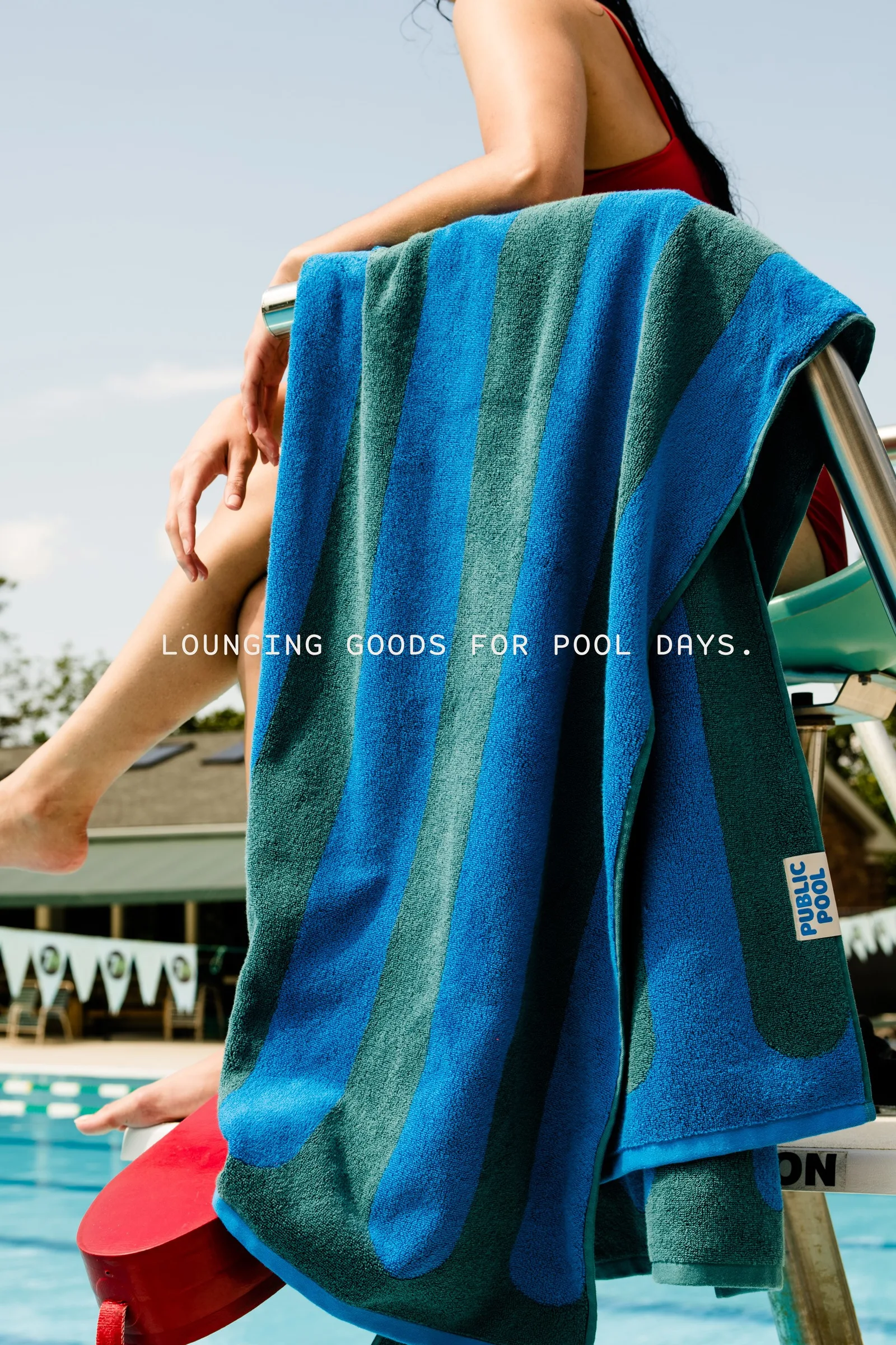
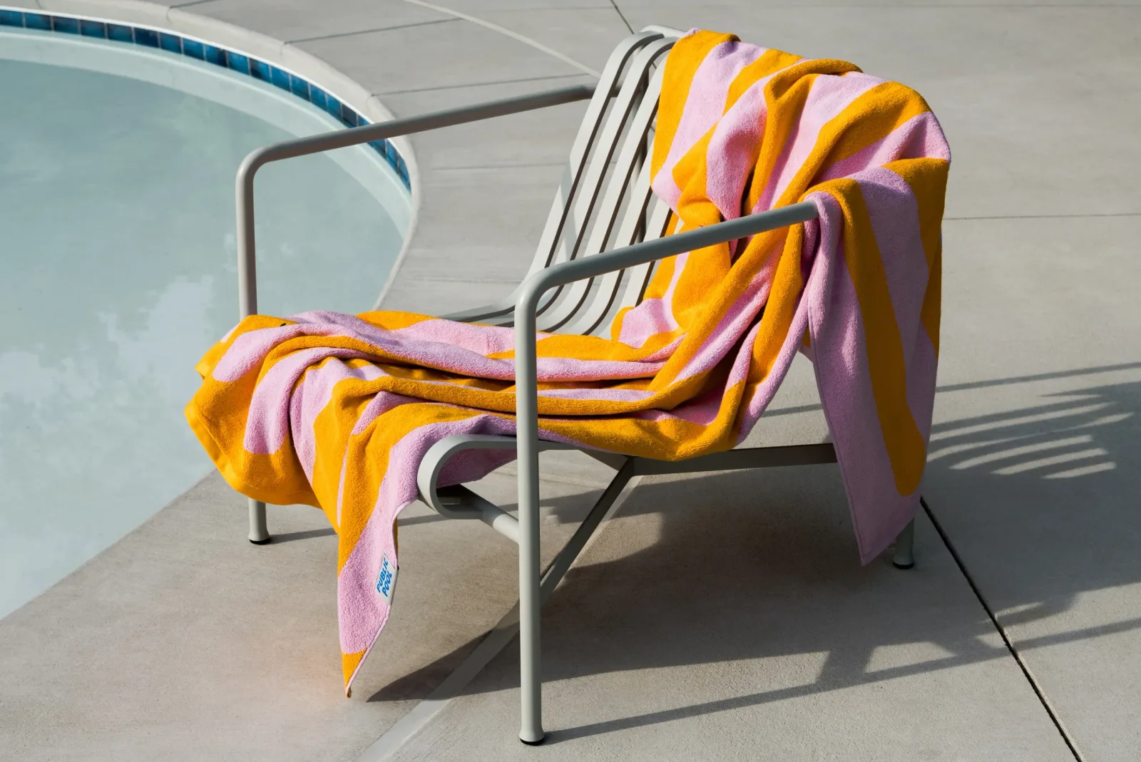
"Lounging goods for pool days: an identity for the leisurewear brand made for adult swimmers at community pools, not beaches. Perky Bros channeled sun-soaked concrete and the scents of sunscreen and chlorine — a wordmark with bold lettering inspired by pool floats, a mono-weight pigeon symbol for inland urban life, the custom Rodger typeface, vibrant off-center colors, soft pool-shaped frames, and dome-embossed packaging that subtly evokes the sensation of floating just above the surface."
Typefaces: Rodger by Central Type, Euclid Circular A by Swiss Typefaces, Spot Mono
The BRRRANDING newsletter
Liked Public Pool?
Get work like this in your inbox.
New identities every Monday, a themed issue every Thursday. Picked by hand, free.
More inspiration

Branding mockups right inside Figma. No PSD wrestling.
Try the Figma plugin →This spot is booked monthly. Become a sponsor