


HumaHome
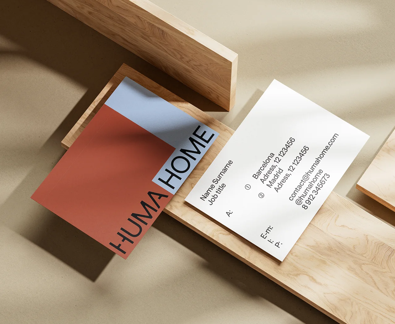
HumaHome is a real estate agency in Spain, working across Madrid, Barcelona, Valencia and Alicante. Demand there is higher than supply, so most agencies fight for listings and forget about the people buying. Kidults, a studio from Barcelona, built HumaHome from scratch around that gap: when people spend that kind of money, finding a home shouldn't feel this frustrating. They did the go-to-market strategy, positioning, name, identity and website.
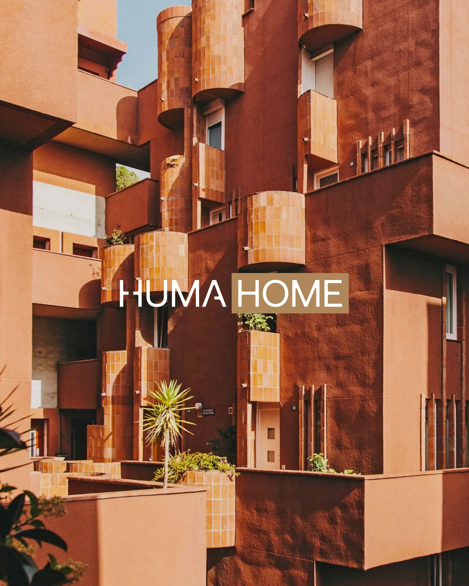
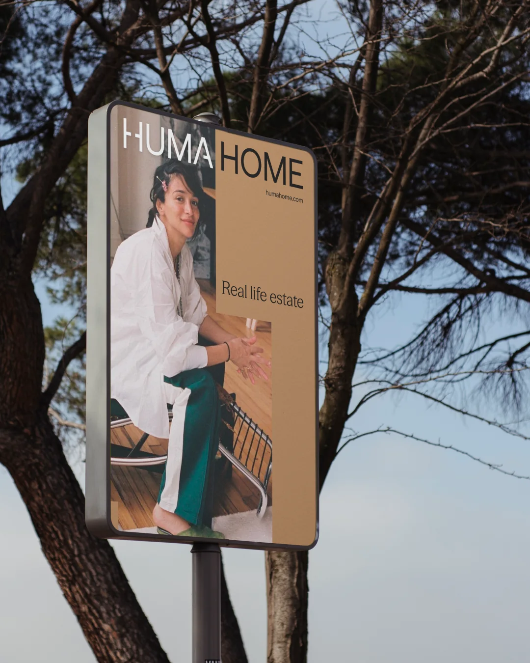
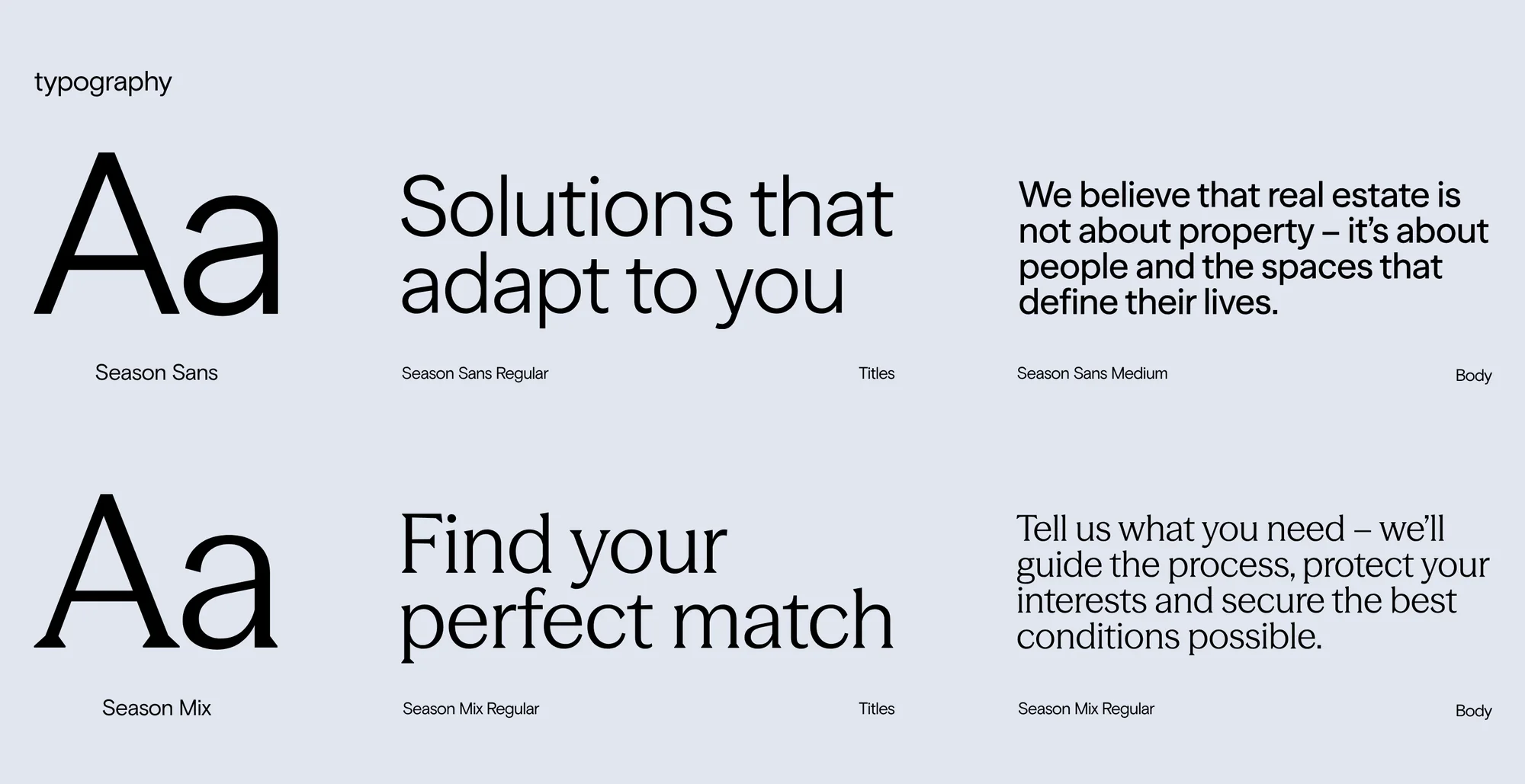
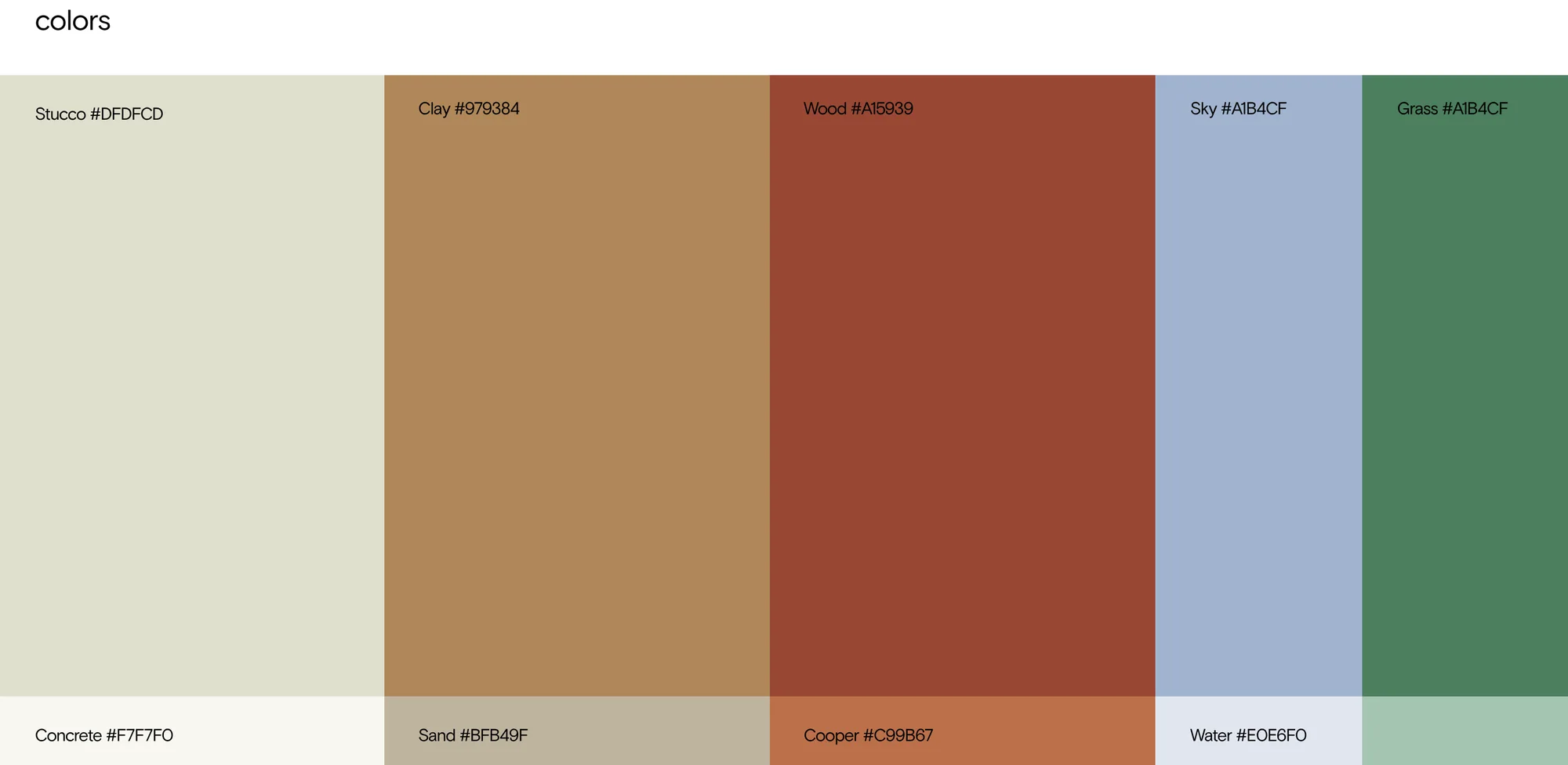
The name puts the human first. Huma stays fixed and Home works as a variable, ready for future lines like Huma Academy or Huma Development. The H is drawn like a floor plan with a doorway between two rooms, and the A follows the same logic. The type is Season Sans with Season Mix by Displaay, and the palette comes from Ricardo Bofill's buildings and their materials: clay, terracotta, concrete and sand, with a soft sky blue and a grass green for contrast. The tagline sums it up: real life estate.
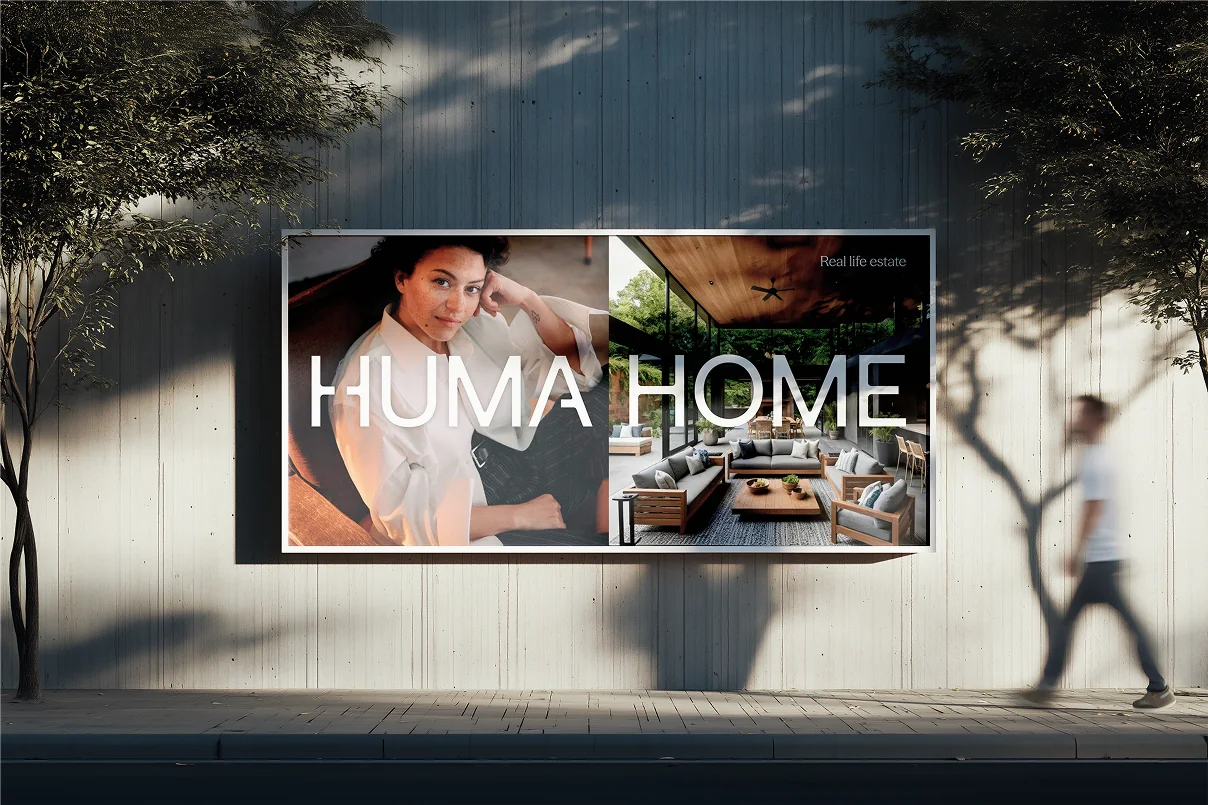
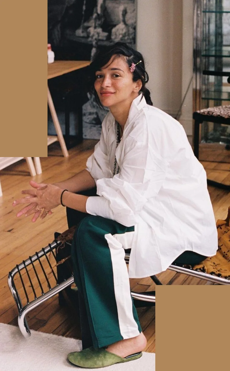
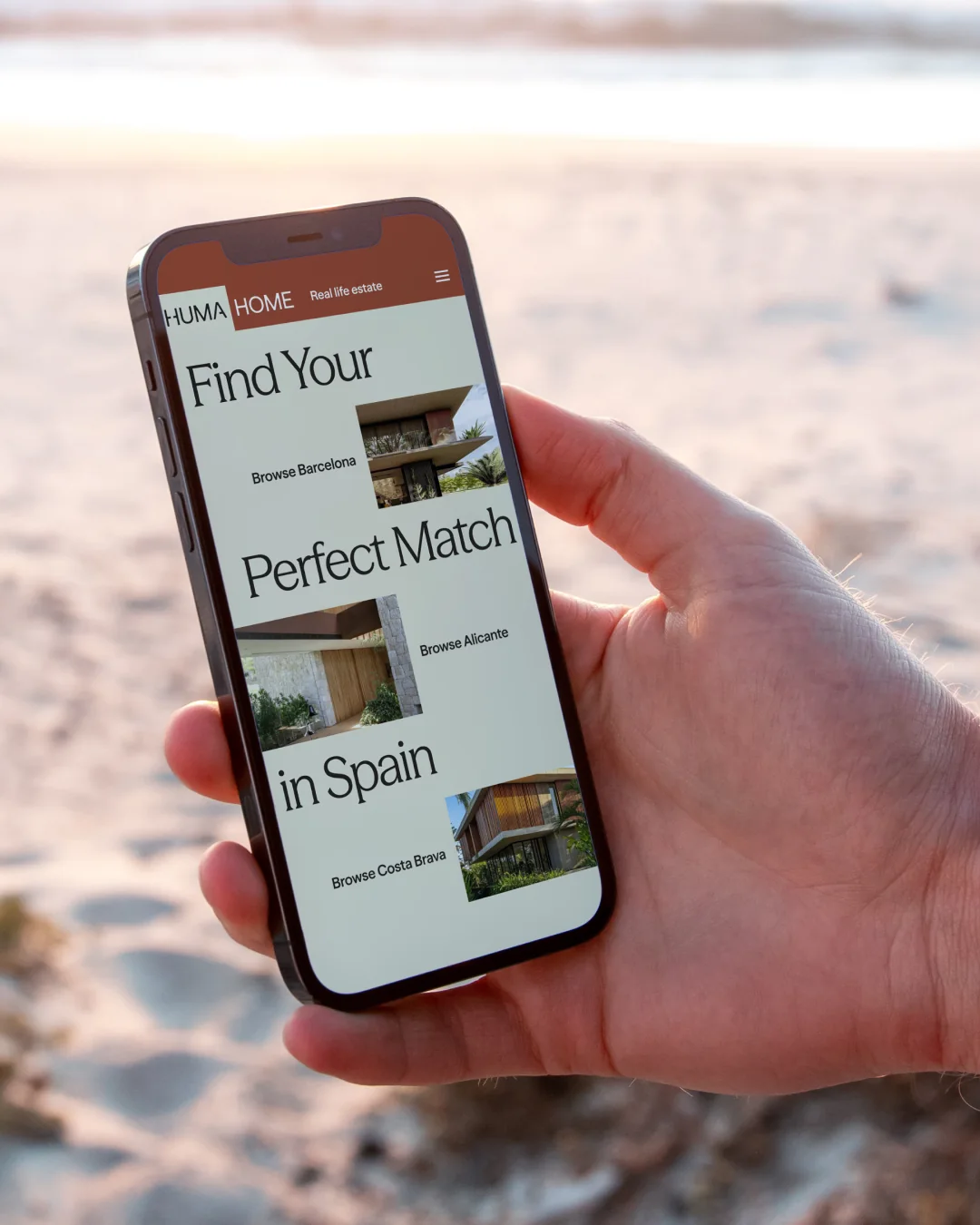
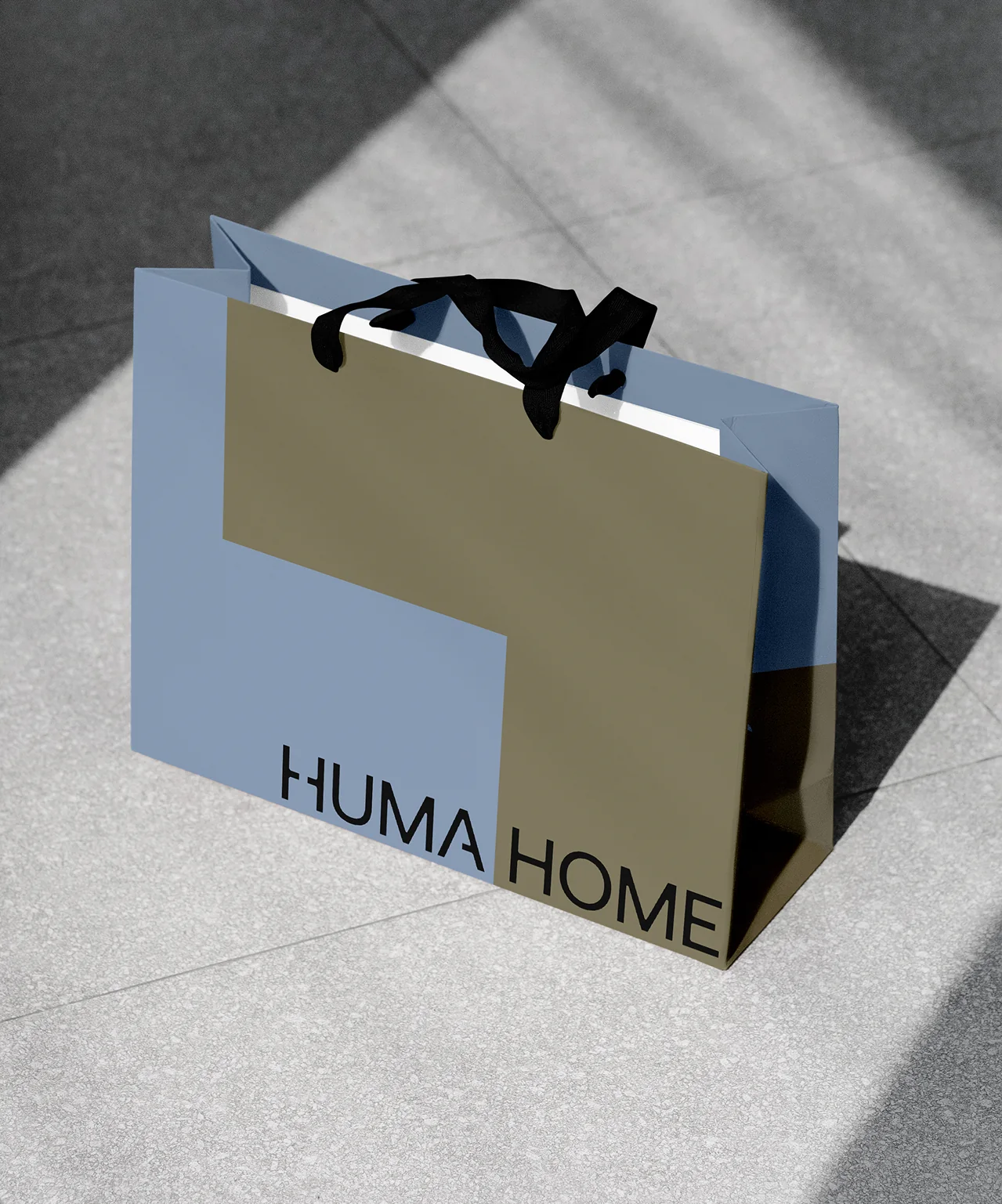
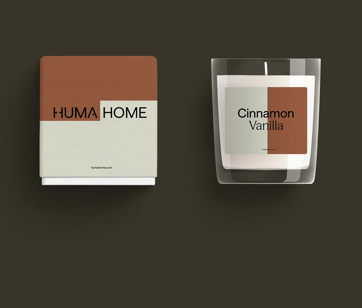
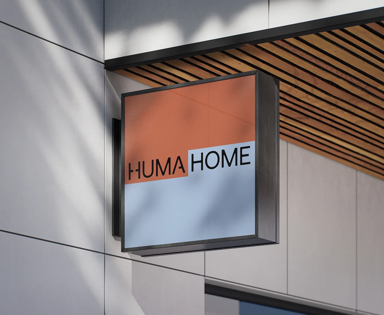
The brand shapes are simple blocks you'd recognise from a floor plan. They extend, shift and recombine like rooms taking shape, so in the social templates and street posters the layout bends around the person, the way a home follows how you live. The website stays clear of the usual property listing look and opens with a single question: how would you like to live? Offline, the brand moves into objects that feel at home: a gift box, a scented candle, a paper bag, a hanging sign and business cards in the same terracotta and blue.
Typefaces: Season Sans by Displaay, Season Mix by Displaay
The BRRRANDING newsletter
Liked HumaHome?
Get work like this in your inbox.
New identities every Monday, a themed issue every Thursday. Picked by hand, free.
More inspiration

Branding mockups right inside Figma. No PSD wrestling.
Try the Figma plugin →This spot is booked monthly. Become a sponsor

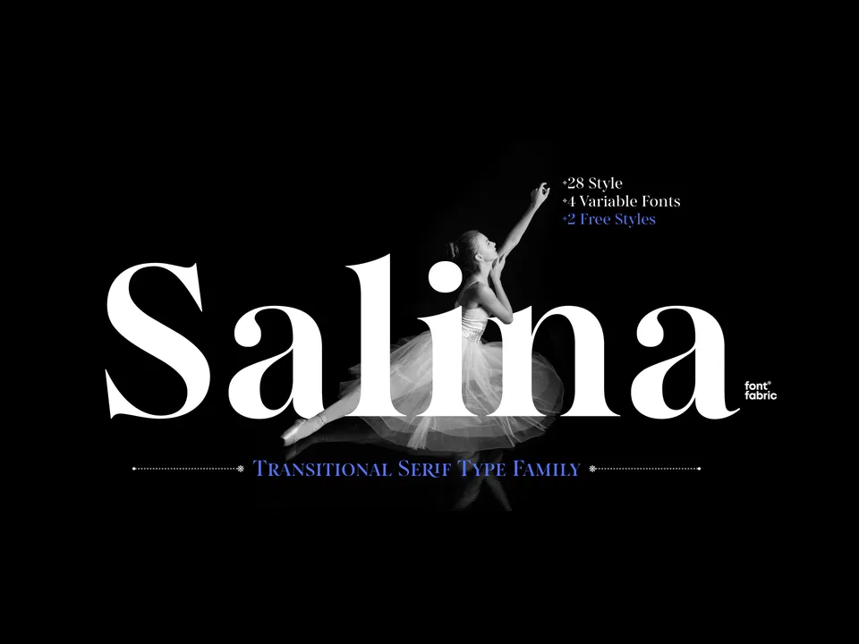
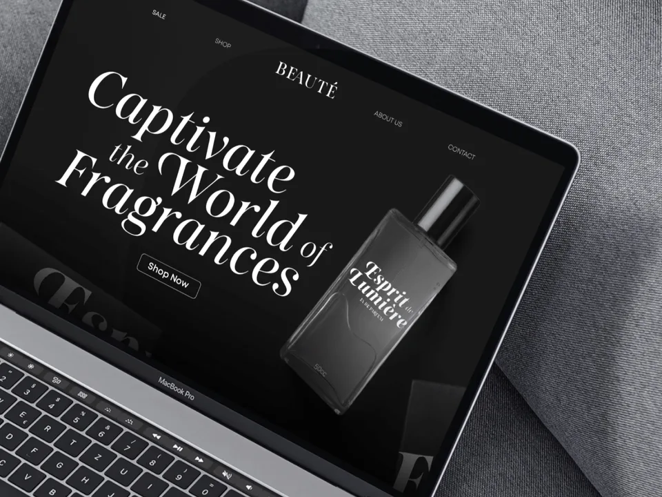
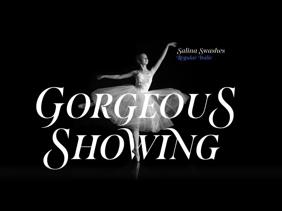
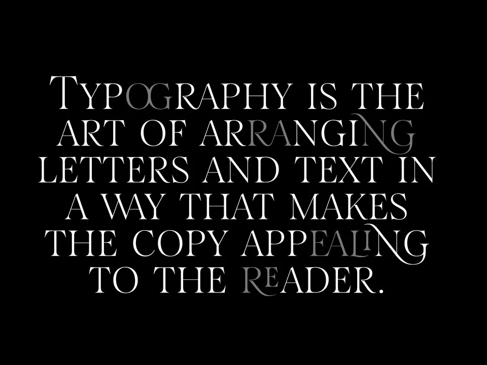
Designing typefaces for creatives seeking to leave a lasting impression.
Explore Salina →This spot is booked monthly. Become a sponsor
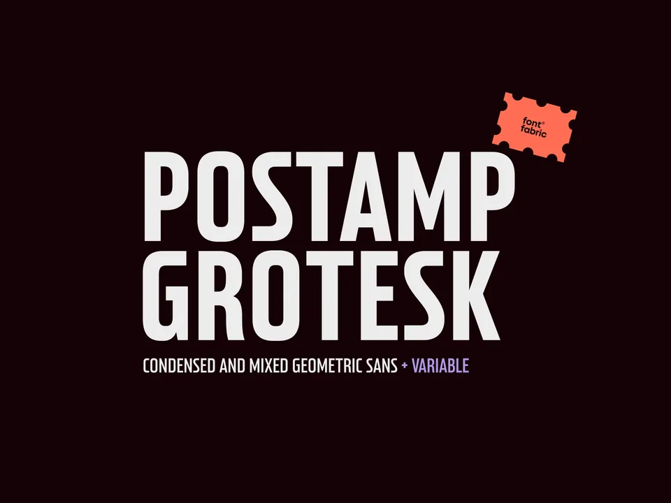
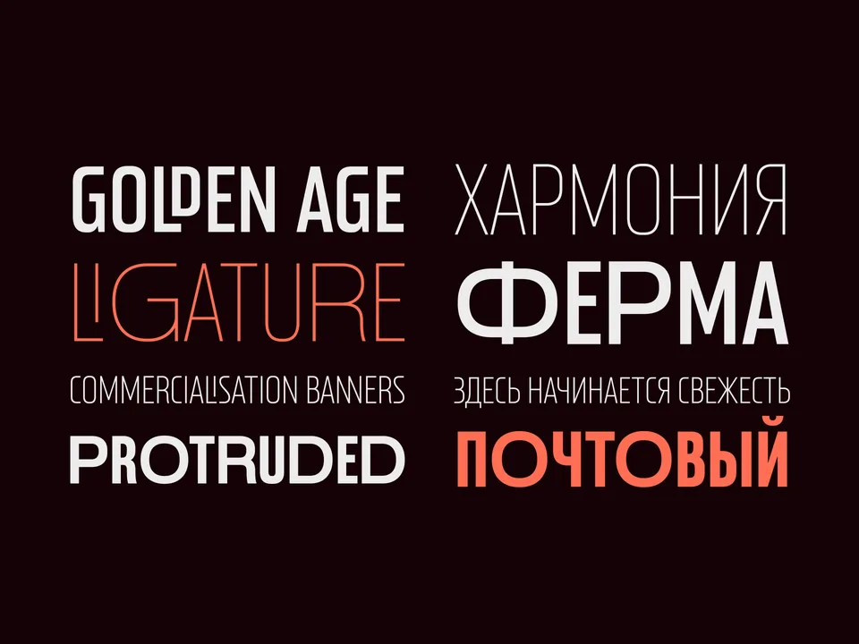
Designing typefaces for creatives seeking to leave a lasting impression.
Explore Postamp Grotesk →This spot is booked monthly. Become a sponsor
Designing typefaces for creatives seeking to leave a lasting impression.
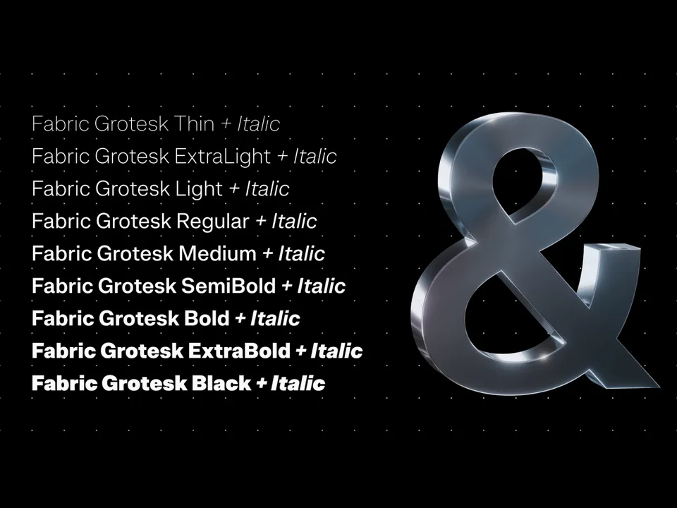
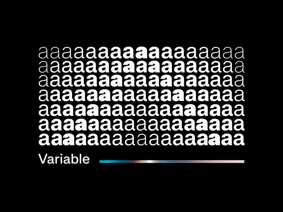
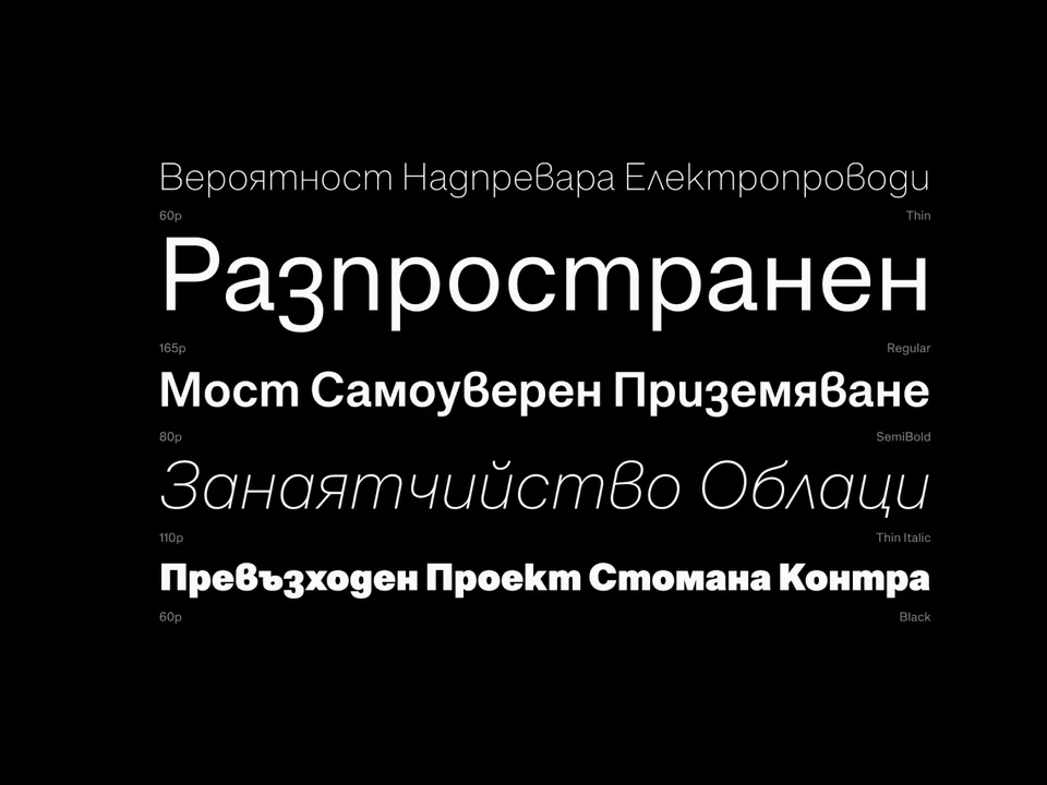
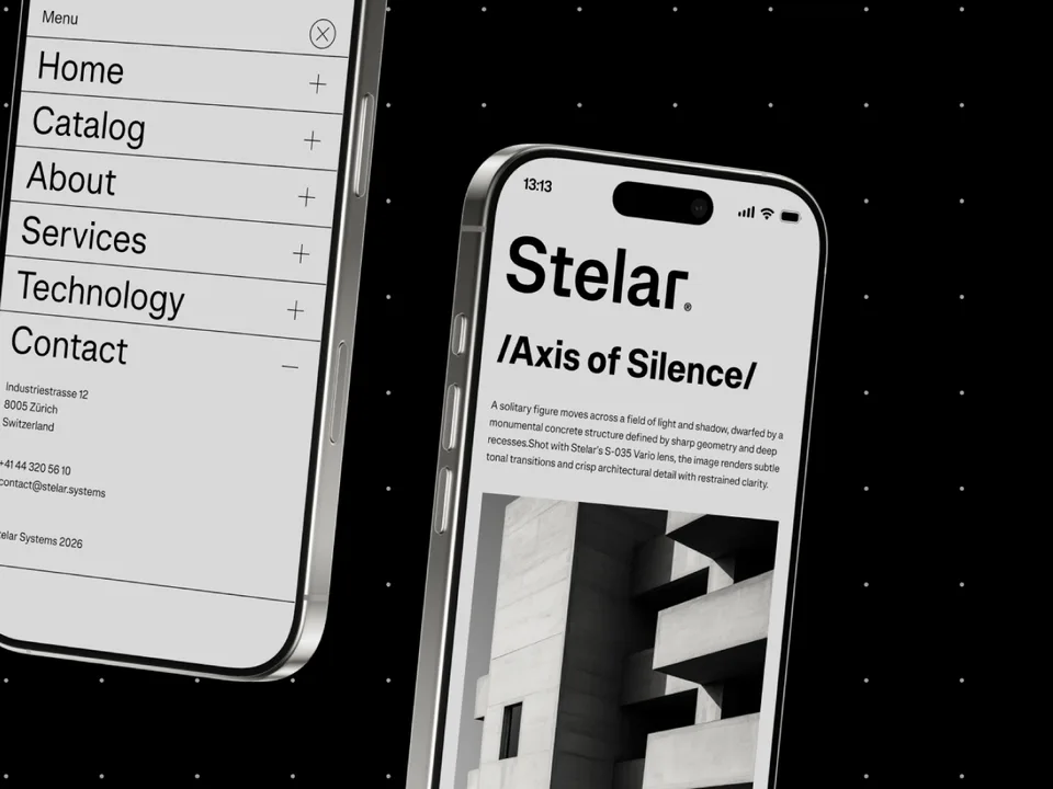
Explore Fabric Grotesk →This spot is booked monthly. Become a sponsor