



DailyFood
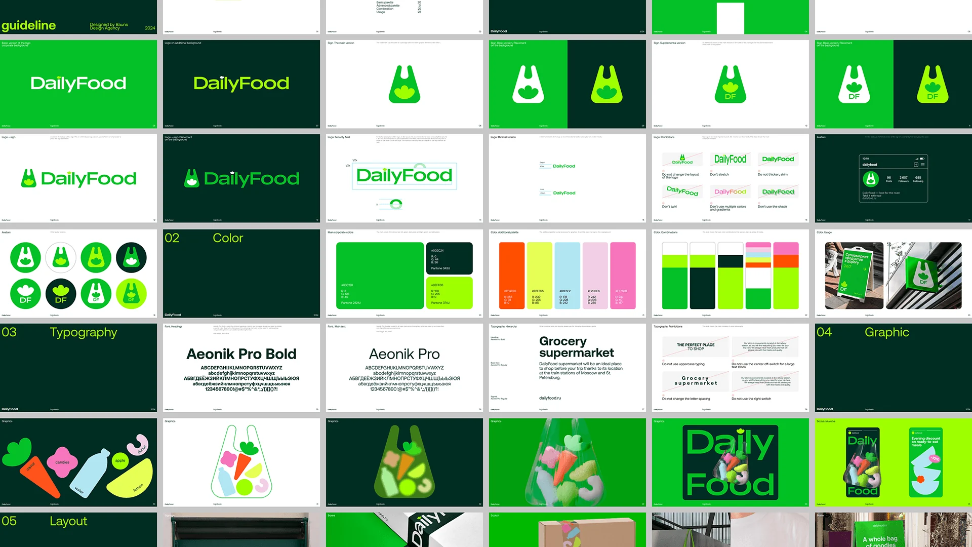
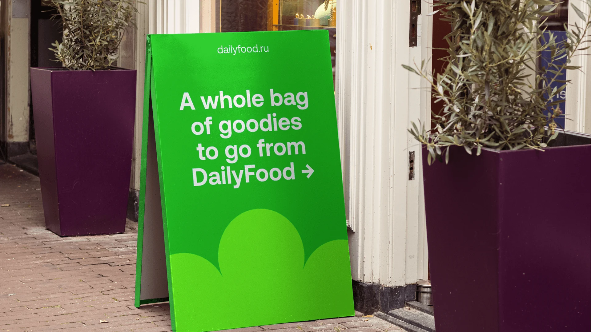
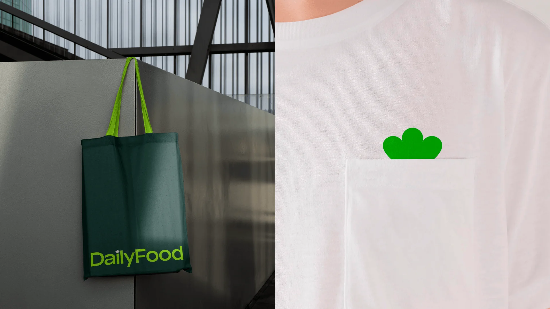
DailyFood is a chain of grocery stores at the railway stations of Moscow and St. Petersburg, the place you grab water and a snack on the way to your train. Bauns Agency built the identity to be found fast, even at the busiest station.
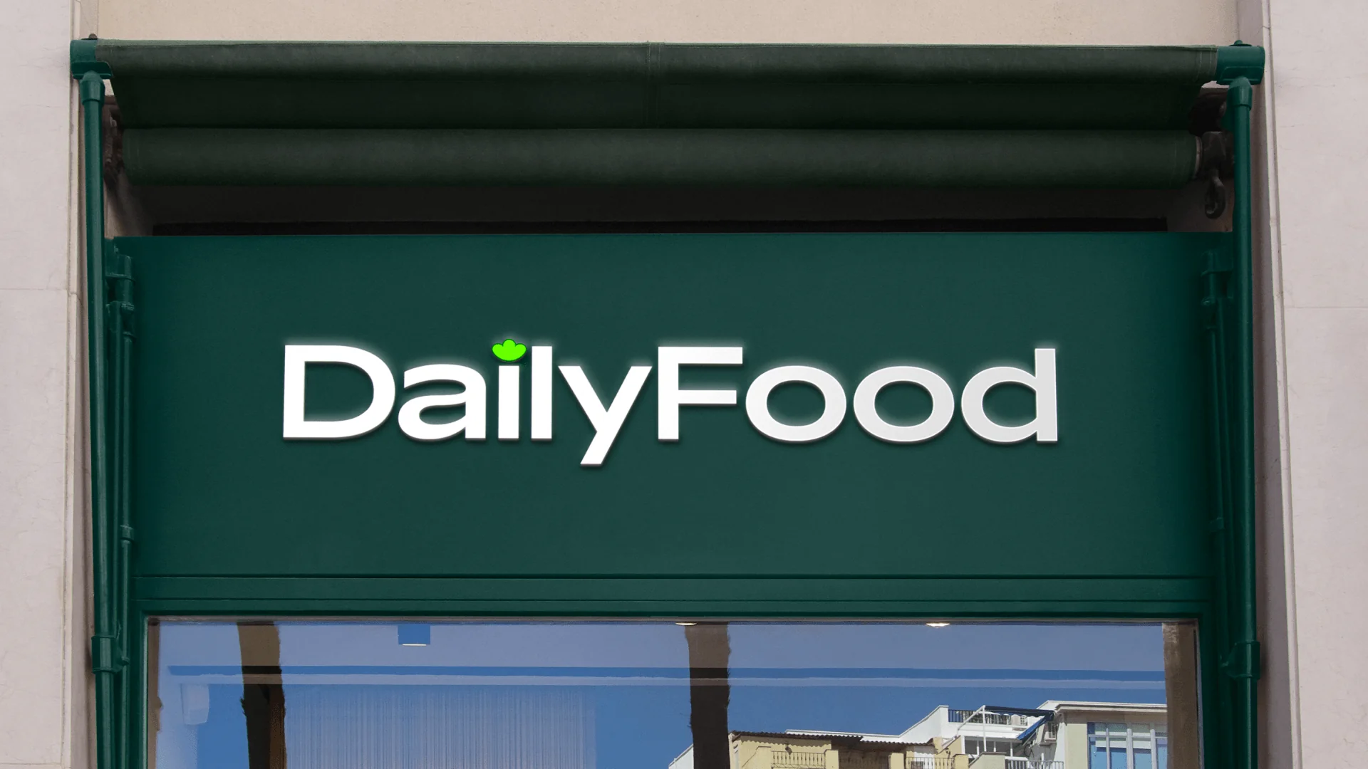
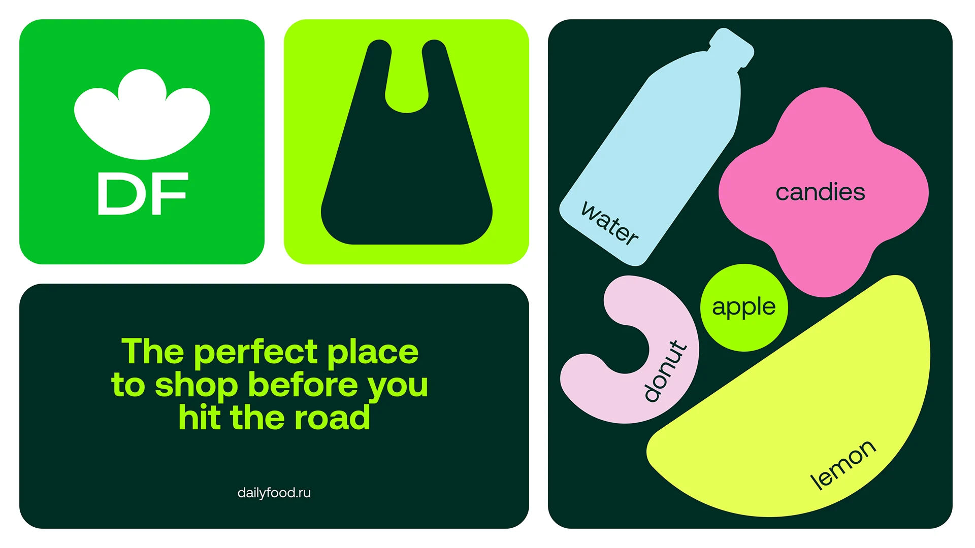
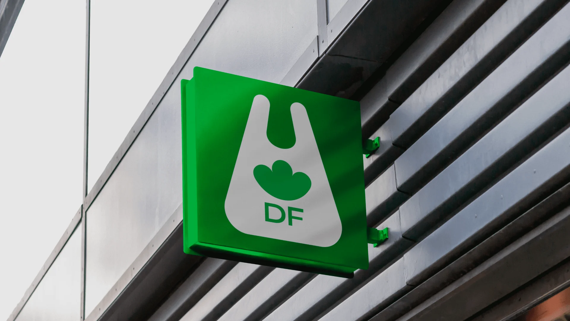
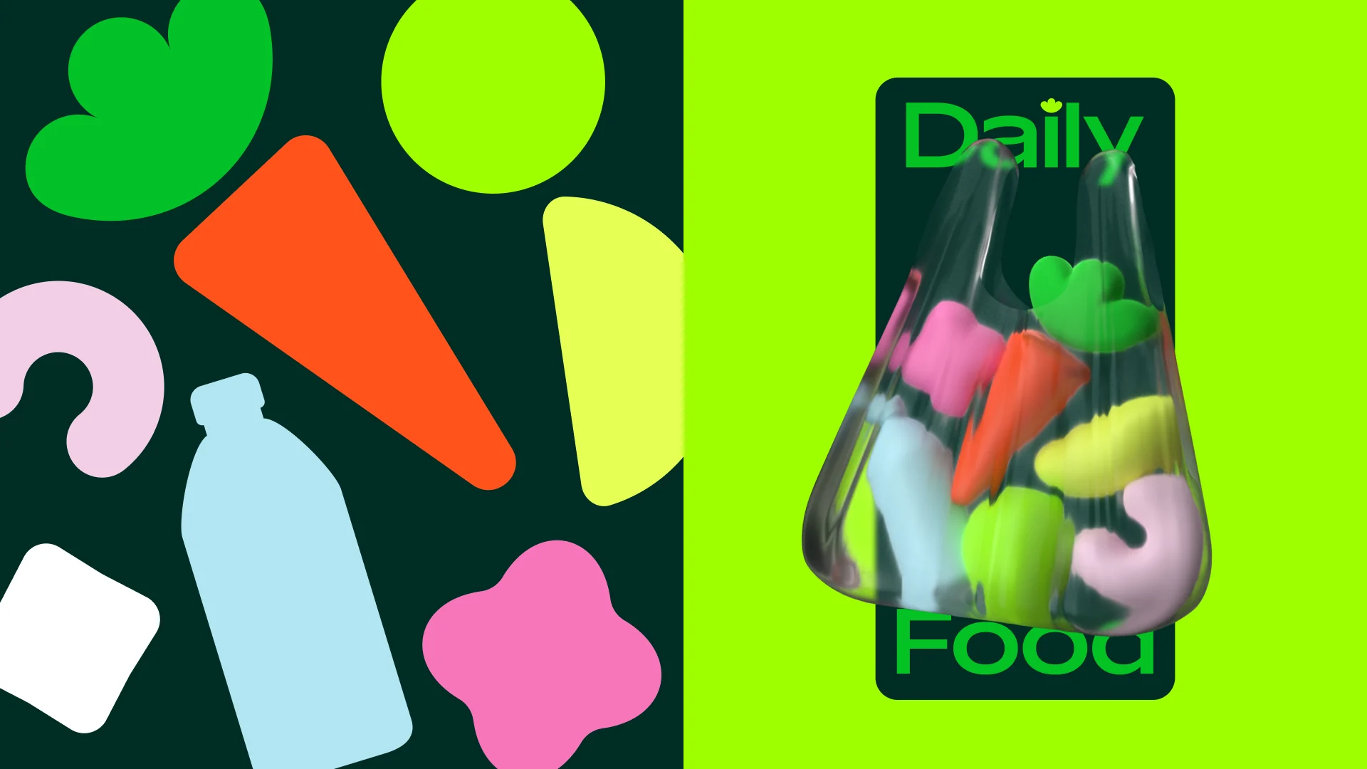
The logo is a plain carrier bag, the one we all use every day, with a little leaf in place of the groceries. The wordmark is wide and active so it reads from across a concourse. The main colour is a rich green for freshness and the feeling of heading off on a journey, paired with a deep forest green and an acid lime.
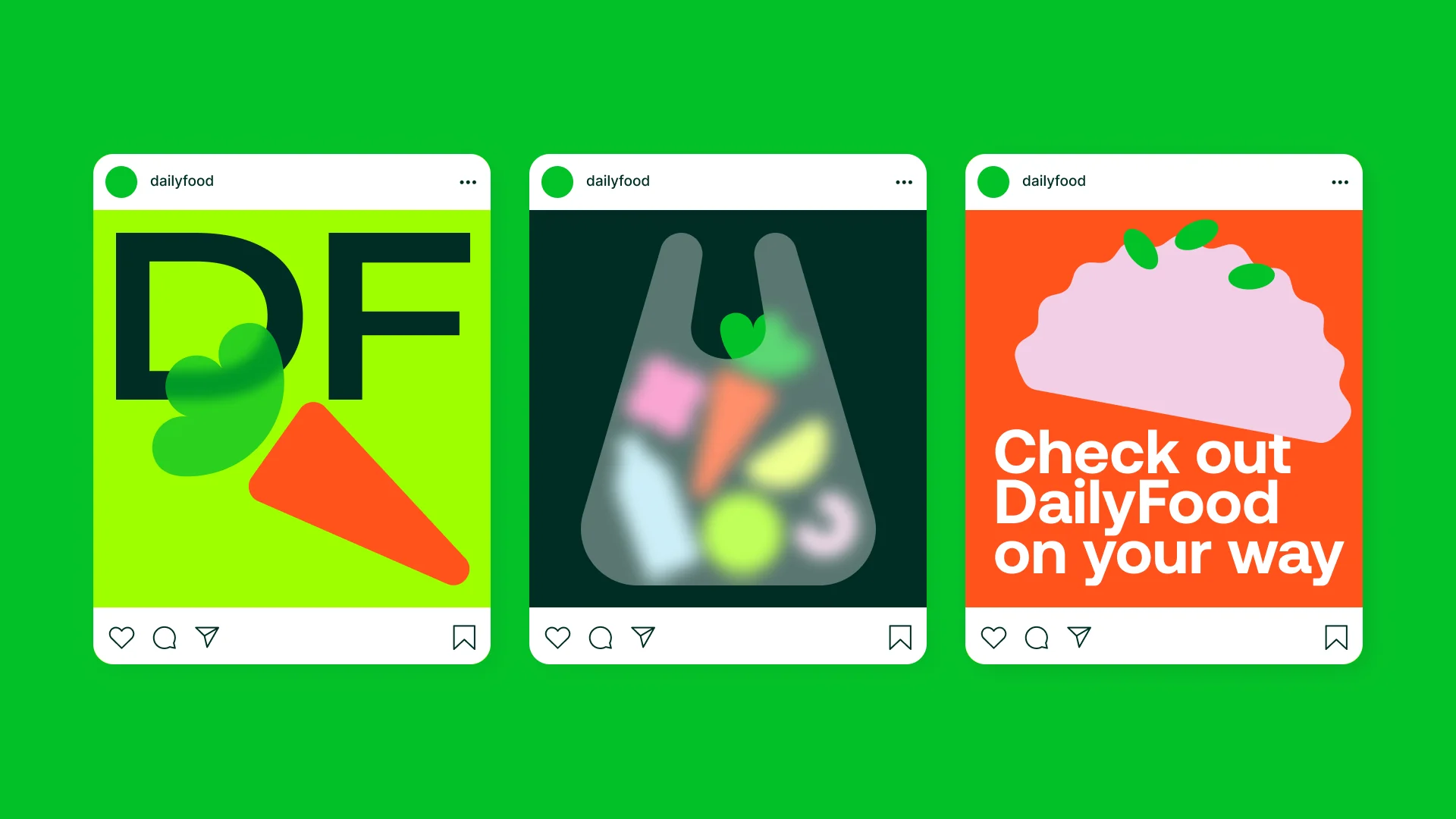
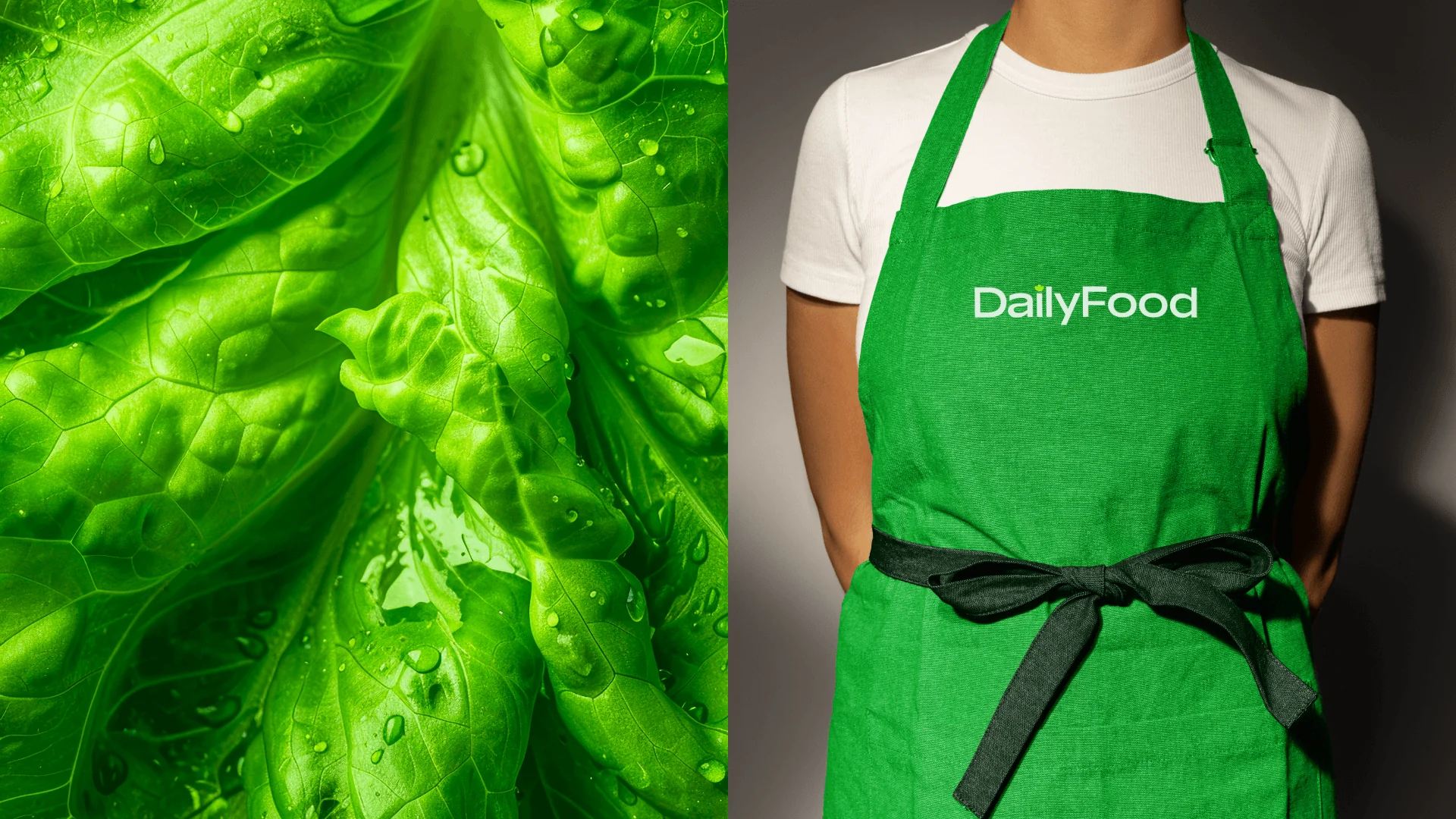
Transparency runs through everything. Almost every plastic bag is see-through, so the layouts are too: a 3D bag full of soft, abstract products, blurred layers on social posts and packing tape printed with the same product shapes. Those simple illustrations of carrots, bottles, donuts and lemons carry the posters, signs, boxes and staff uniforms.
Art direction: Alisa Dolgopolova. Lead designer: Maria Salnikova. Project manager: Anna Eremina. Animation: Vitaliy Prodanov.
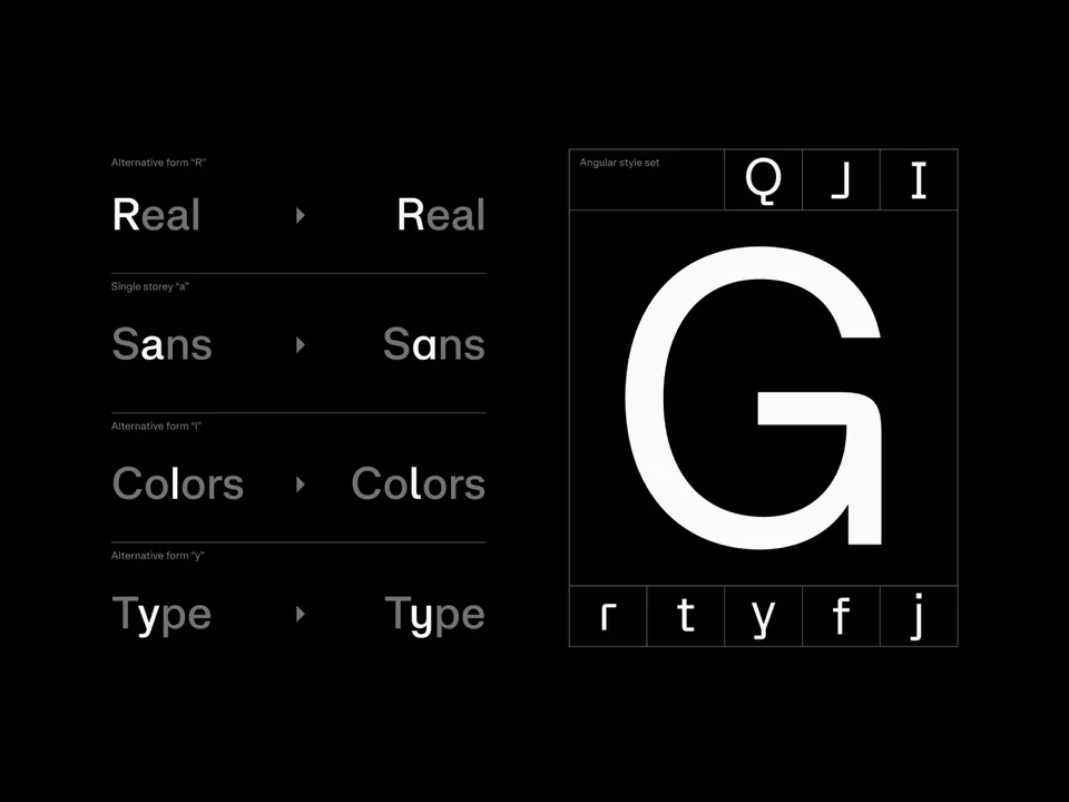
Typefaces: Aeonik by CoType


The BRRRANDING newsletter
Liked DailyFood?
Get work like this in your inbox.
New identities every Monday, a themed issue every Thursday. Picked by hand, free.
More inspiration

Branding mockups right inside Figma. No PSD wrestling.
Try the Figma plugin →This spot is booked monthly. Become a sponsor

Designing typefaces for creatives seeking to leave a lasting impression.
Explore Salina →This spot is booked monthly. Become a sponsor


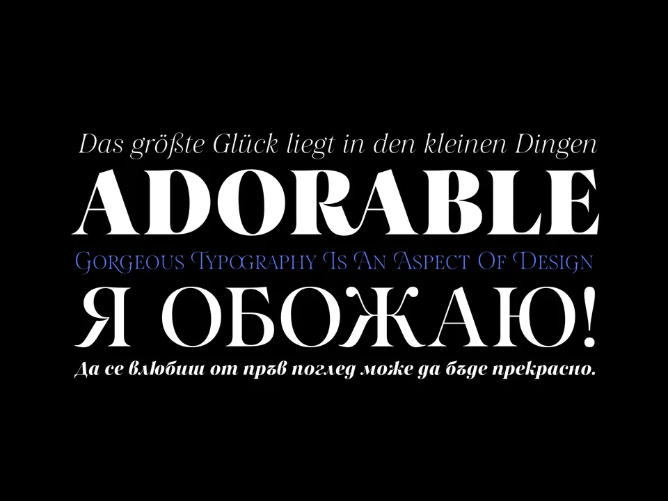
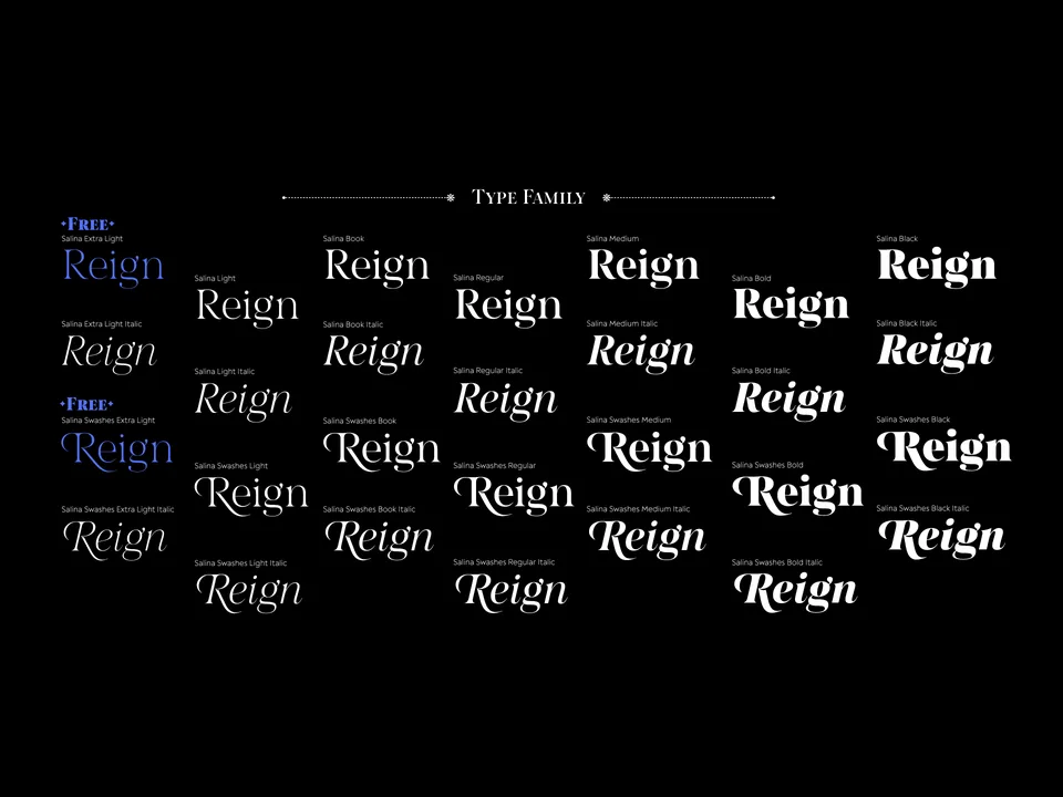

Designing typefaces for creatives seeking to leave a lasting impression.
Explore Postamp Grotesk →This spot is booked monthly. Become a sponsor
Designing typefaces for creatives seeking to leave a lasting impression.
Explore Fabric Grotesk →This spot is booked monthly. Become a sponsor