





Cocolab
Cocofloss was a cult-favourite floss. Born in California in 2015 and made by dentists, it won fans with its loofah-like floss and a long run of fun flavours. As the range grew, the brand needed to become more than one product. Wedge was asked to turn it into a whole world of oral care, with flavour meeting dentist-designed performance.
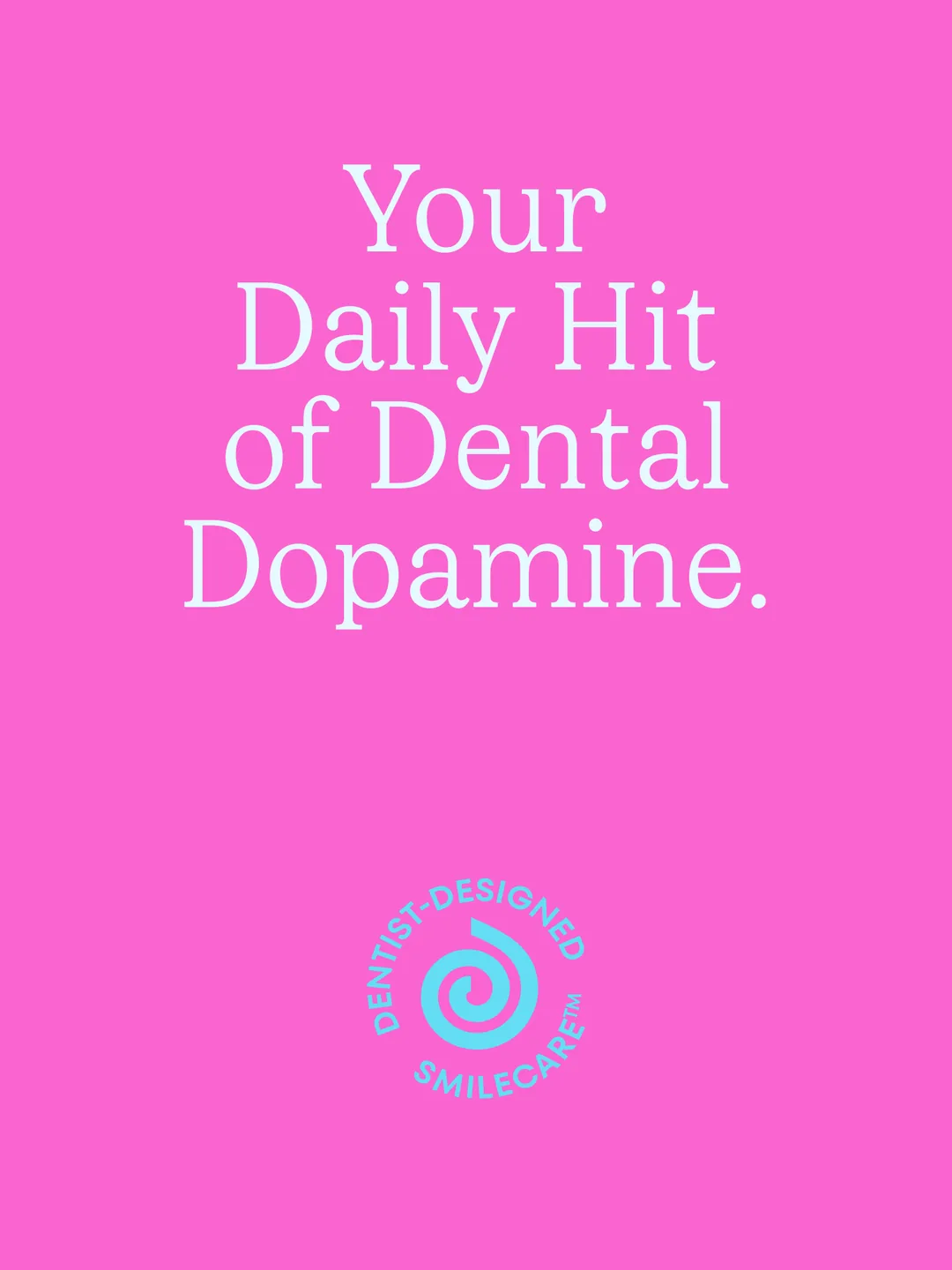
The idea was to crash routine with joy. Wedge asked what a universal Smile Care System worthy of the MoMA store would look like. The answer was a new name, Cocolab, and a new brand platform: Your Daily Hit of Dental Dopamine.
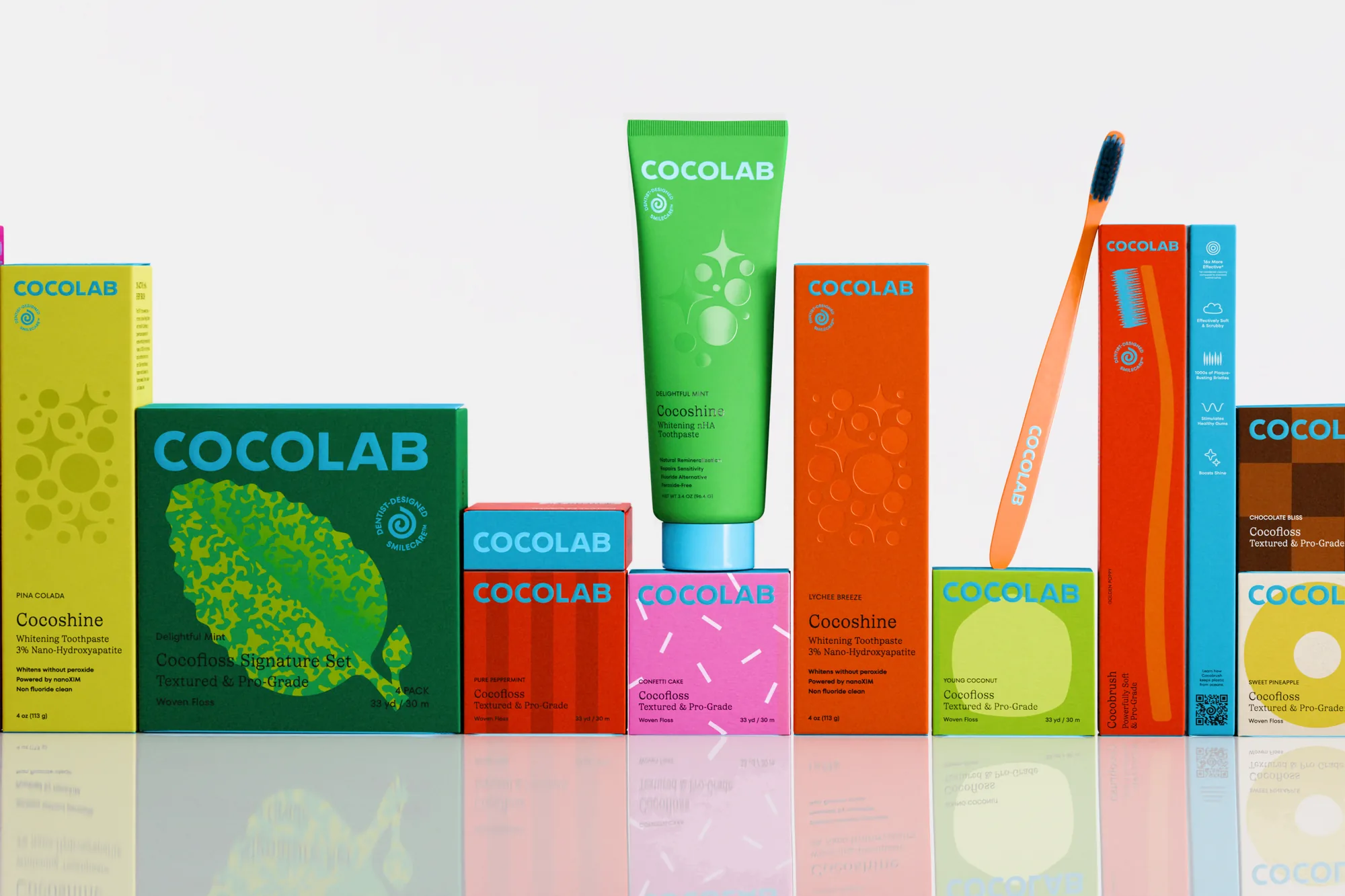
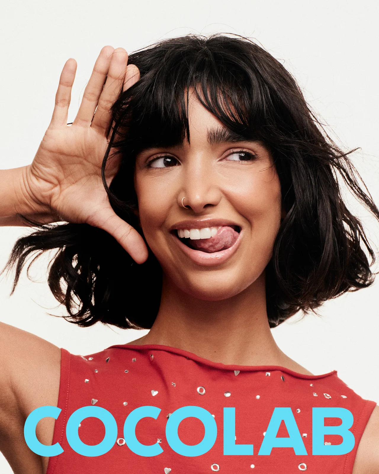
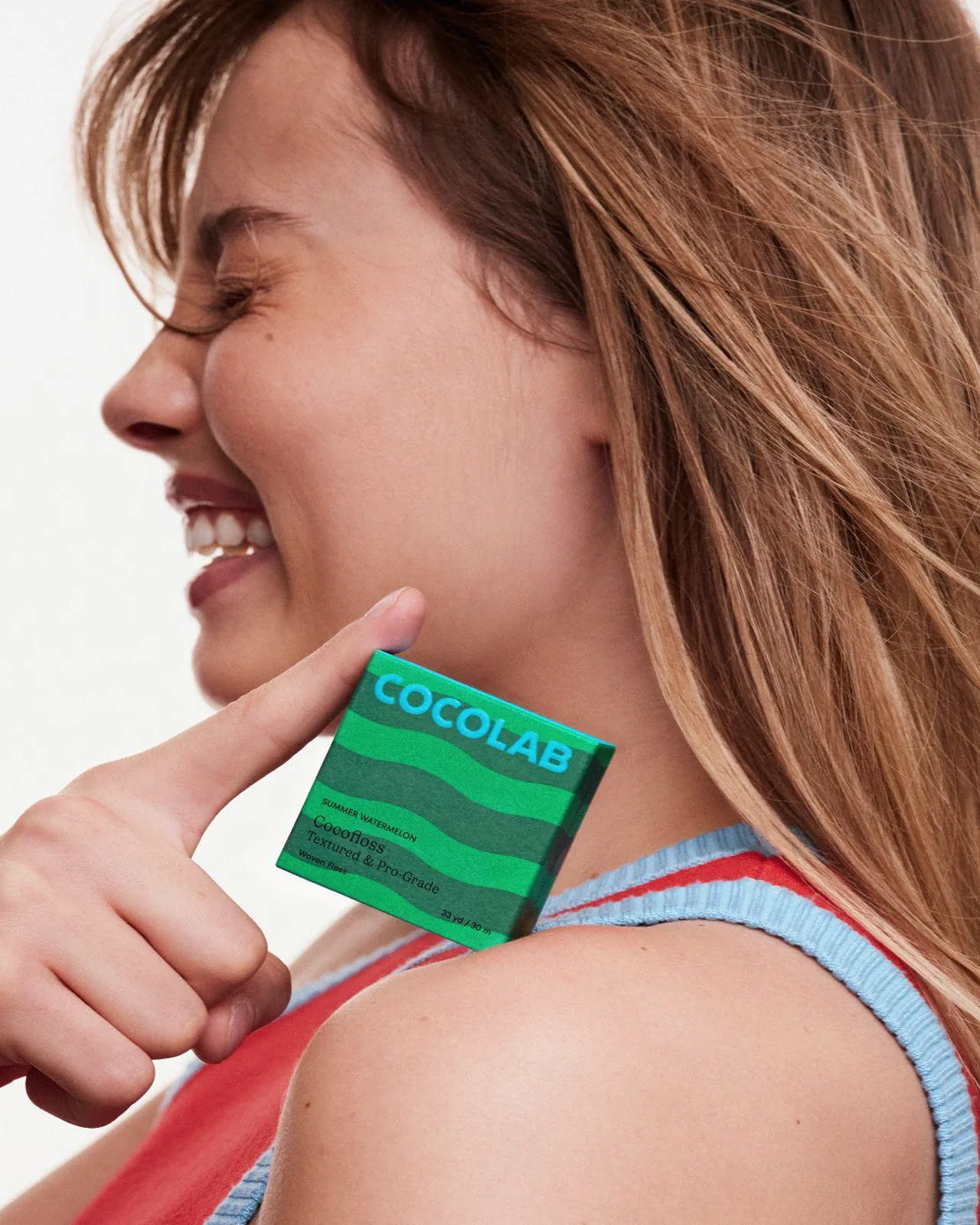
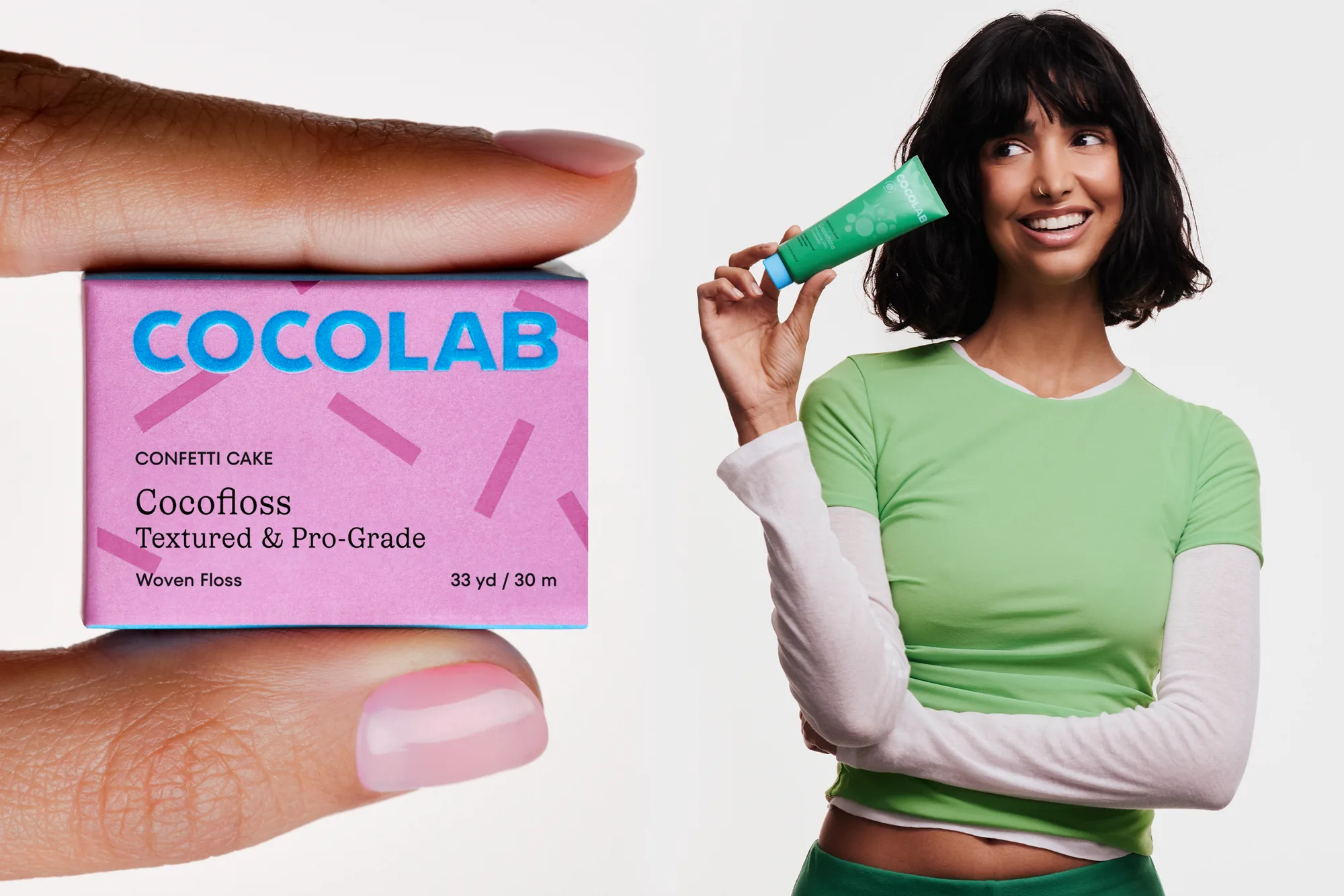
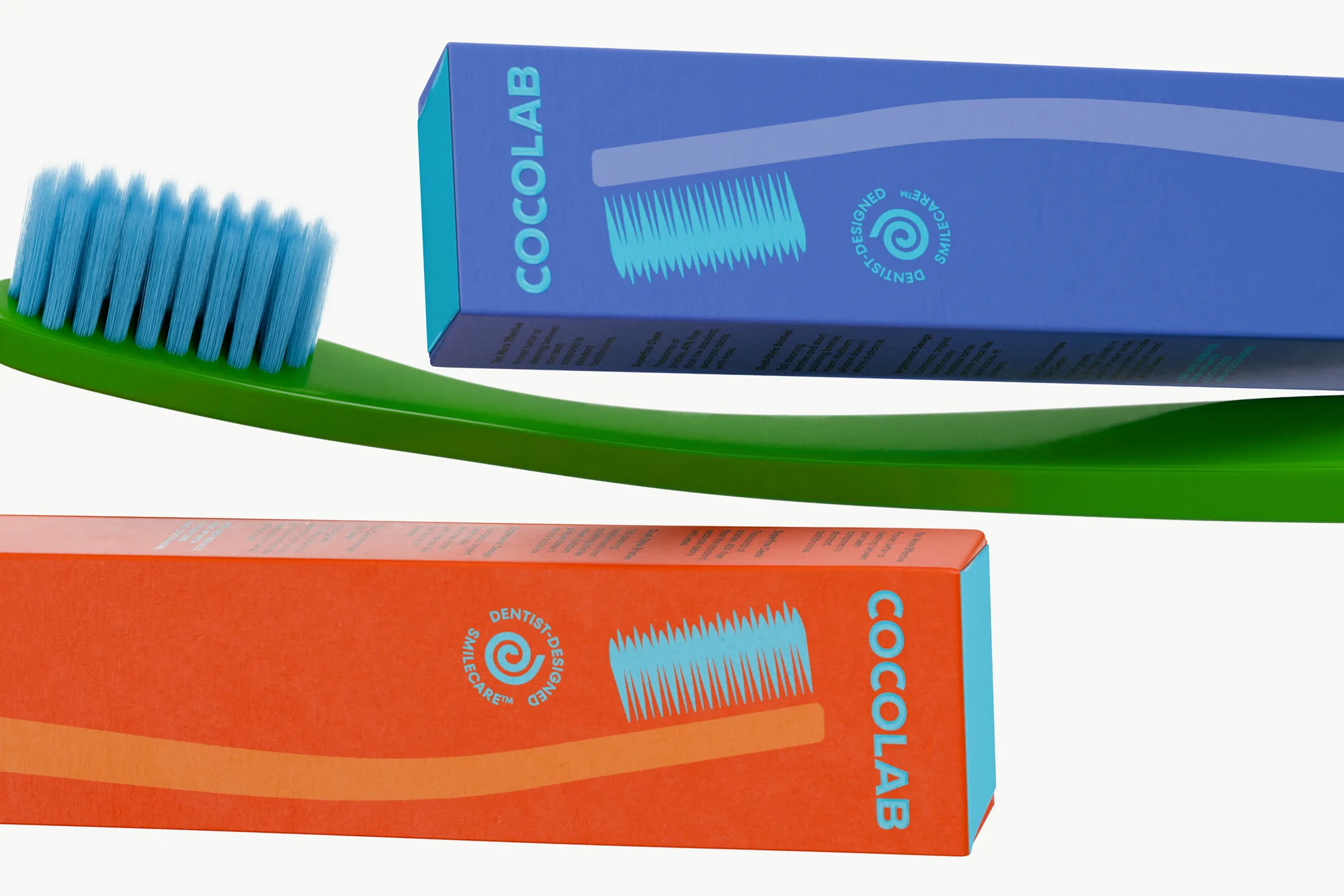
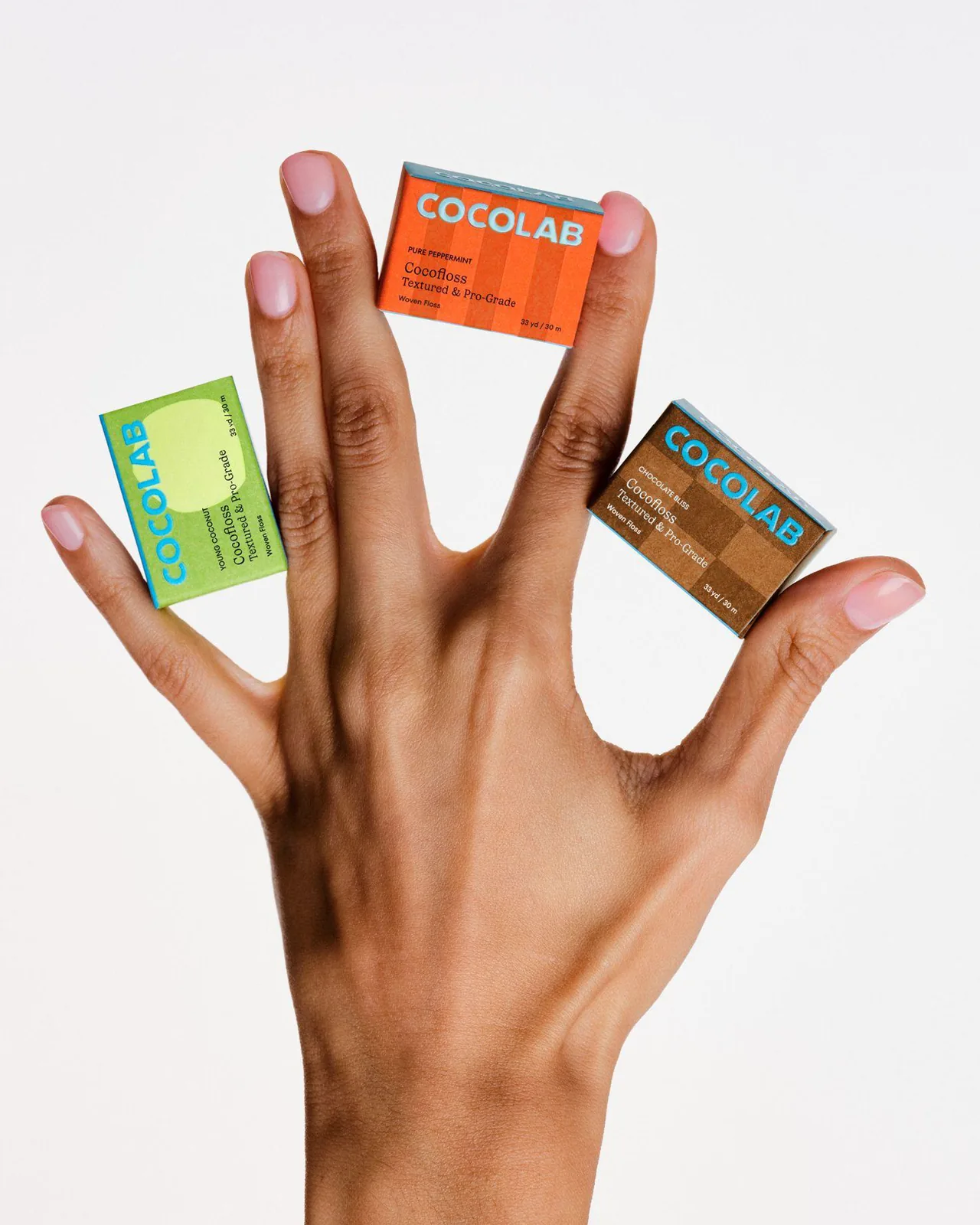
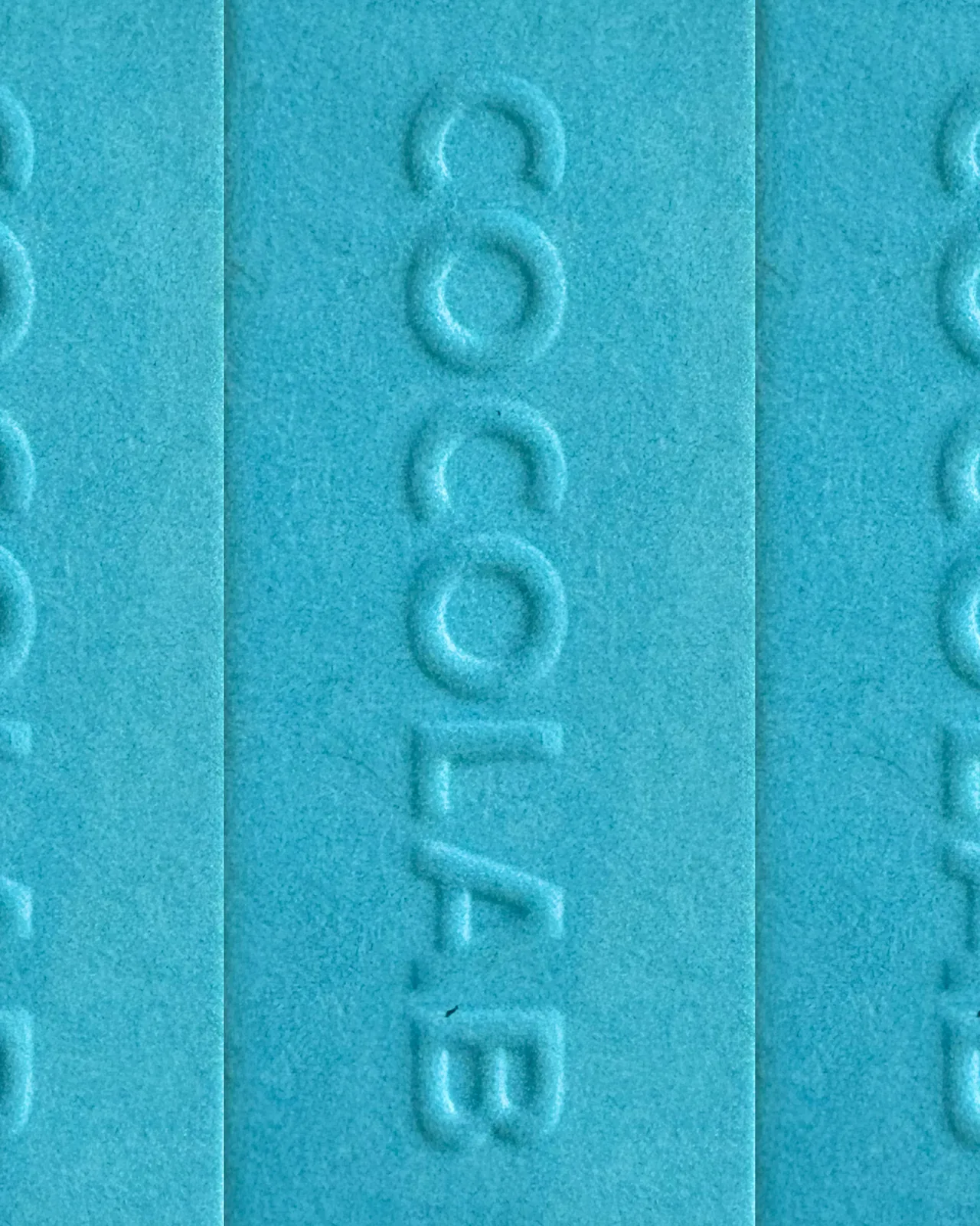
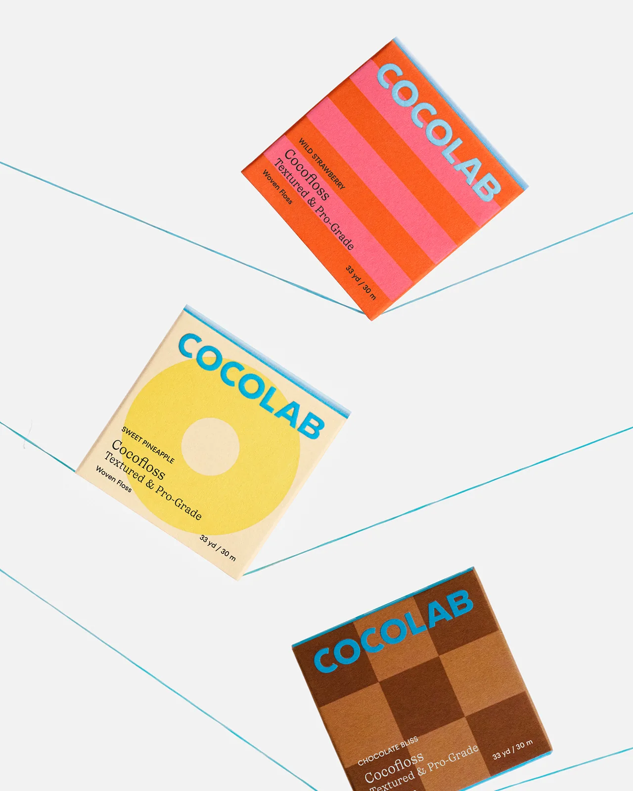
The identity pairs a bold blue wordmark and a dentist-designed smilecare seal with a bright, flavour-led palette of pink, blue, green, orange and yellow. The type pairs Ivory TT, a serif, with the sans-serif TT Fors, and every box in the packaging system gets its own pattern and colour. Photography is playful and close, with real faces, tight crops and hands holding the products.
Wedge reports that the work helped Cocolab grow 183% year on year, lift quality perception and land retail partners. It won a D&AD Wood Pencil for packaging and Rebrand of the Year at the Dieline Awards. Design director Justin Lortie, creative director Sarah Di Domenico, strategy by Nancy Chen and narrative by Marco Patricio. Photography by Blouin Heartz.

The BRRRANDING newsletter
Liked Cocolab?
Get work like this in your inbox.
New identities every Monday, a themed issue every Thursday. Picked by hand, free.
More inspiration

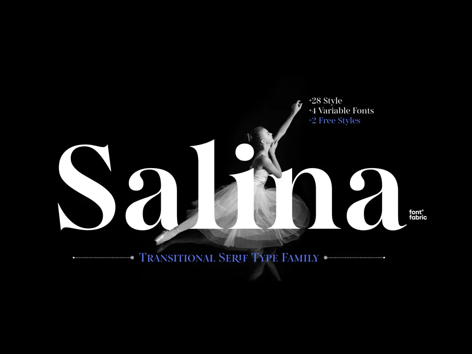
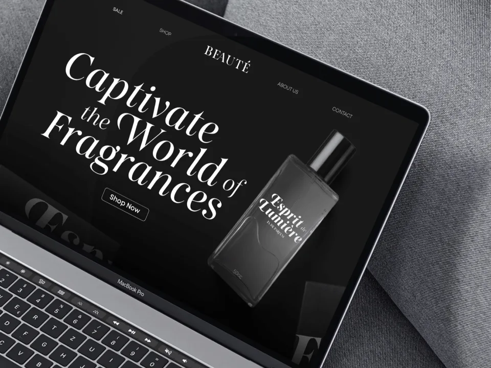
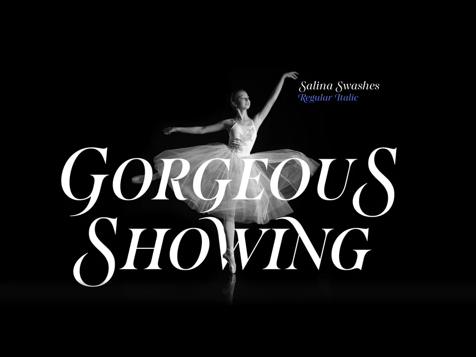
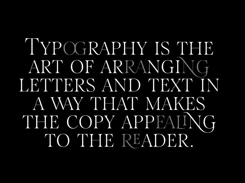
Designing typefaces for creatives seeking to leave a lasting impression.
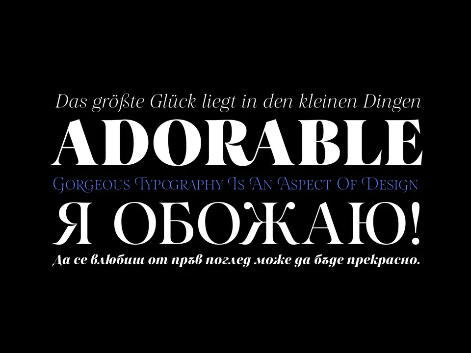
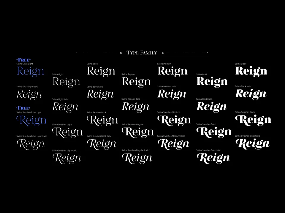
Explore Salina →This spot is booked monthly. Become a sponsor
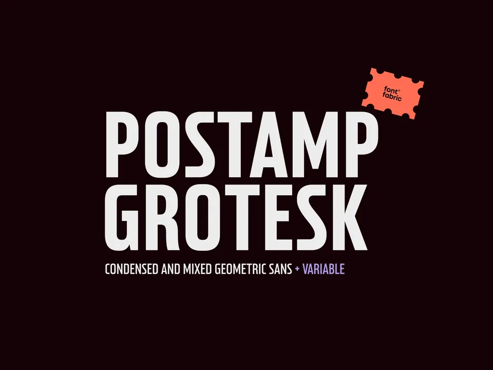
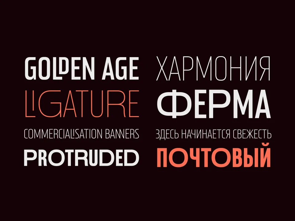
Designing typefaces for creatives seeking to leave a lasting impression.
Explore Postamp Grotesk →This spot is booked monthly. Become a sponsor
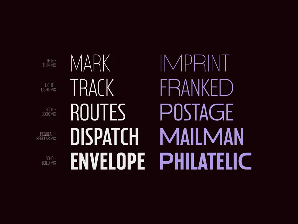
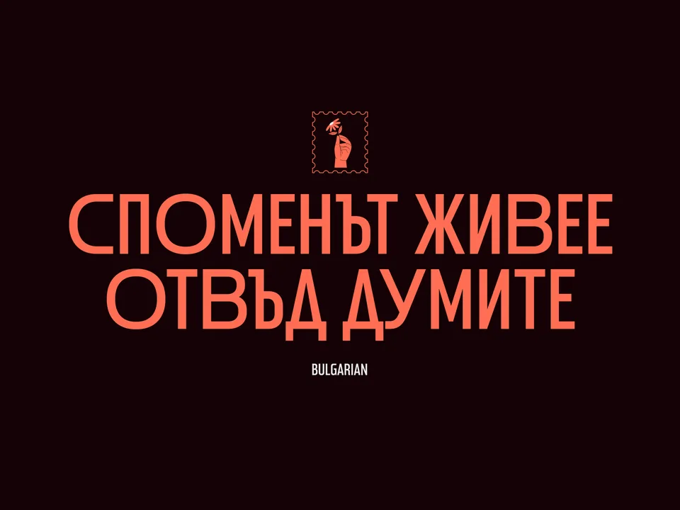
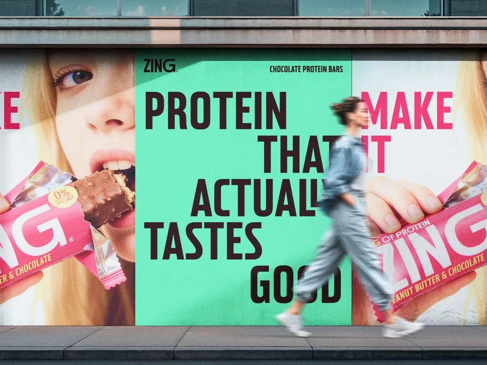
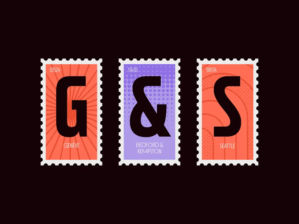
Designing typefaces for creatives seeking to leave a lasting impression.
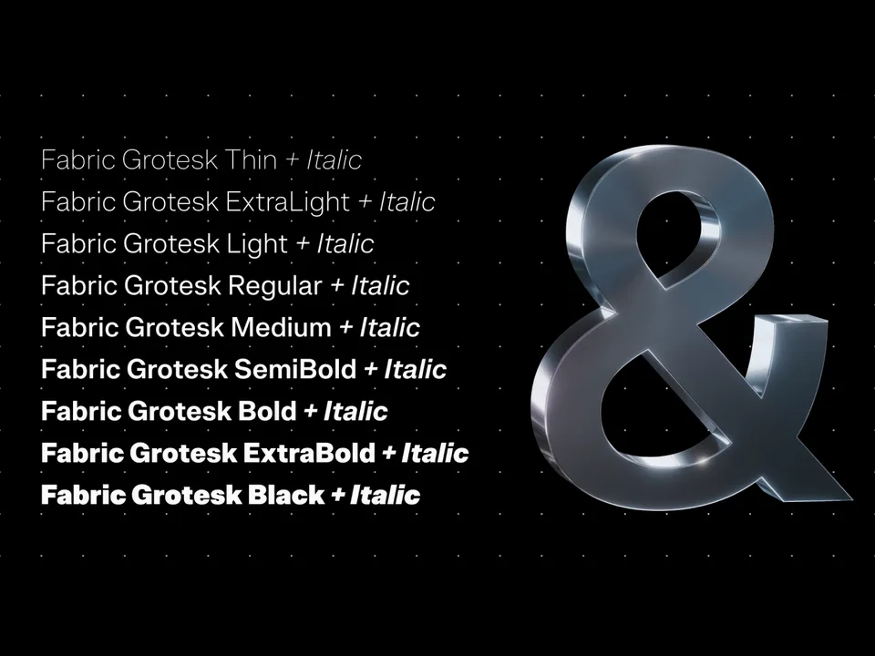
Explore Fabric Grotesk →This spot is booked monthly. Become a sponsor