Stack Overflow
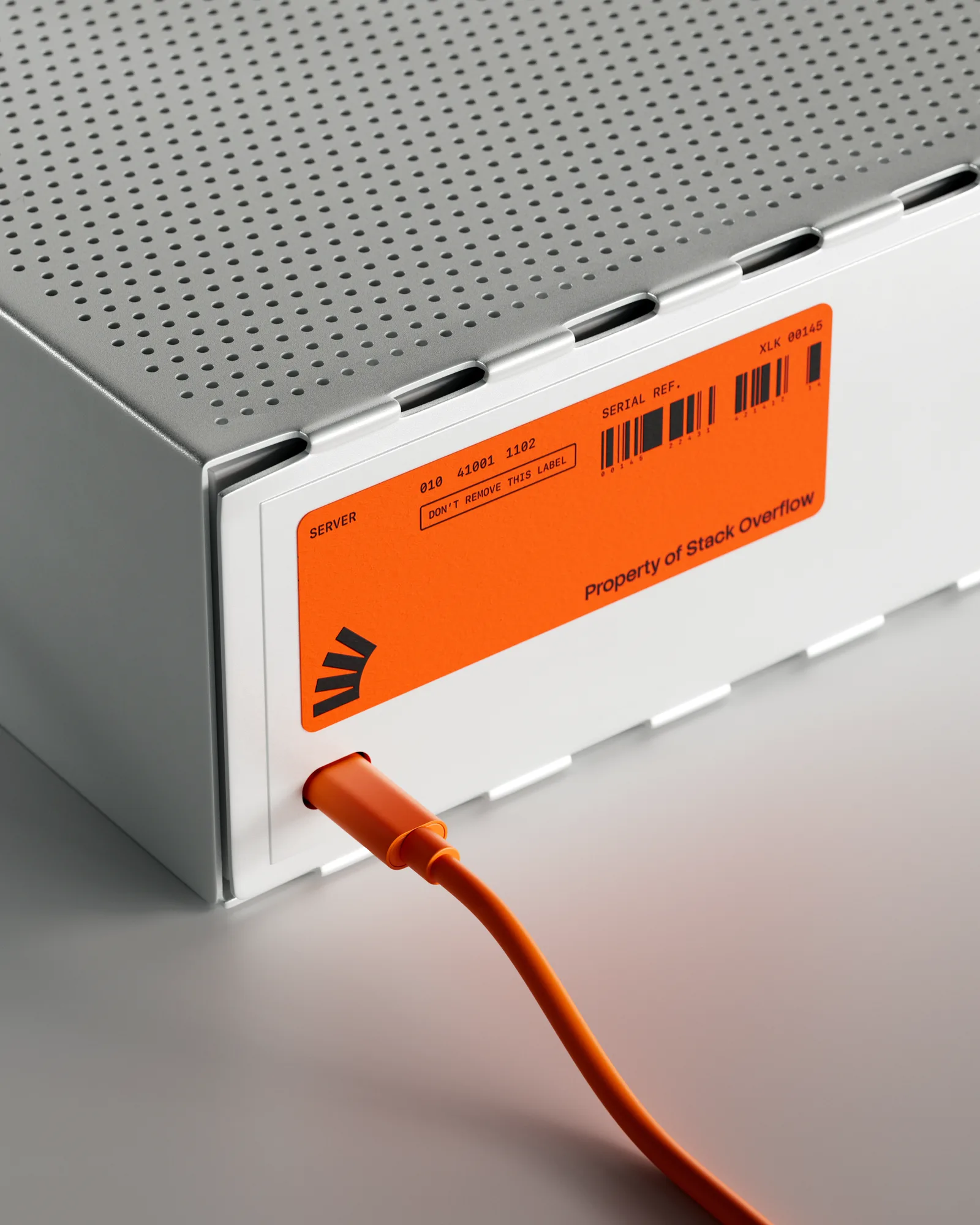
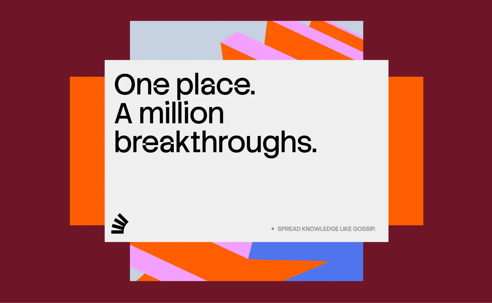
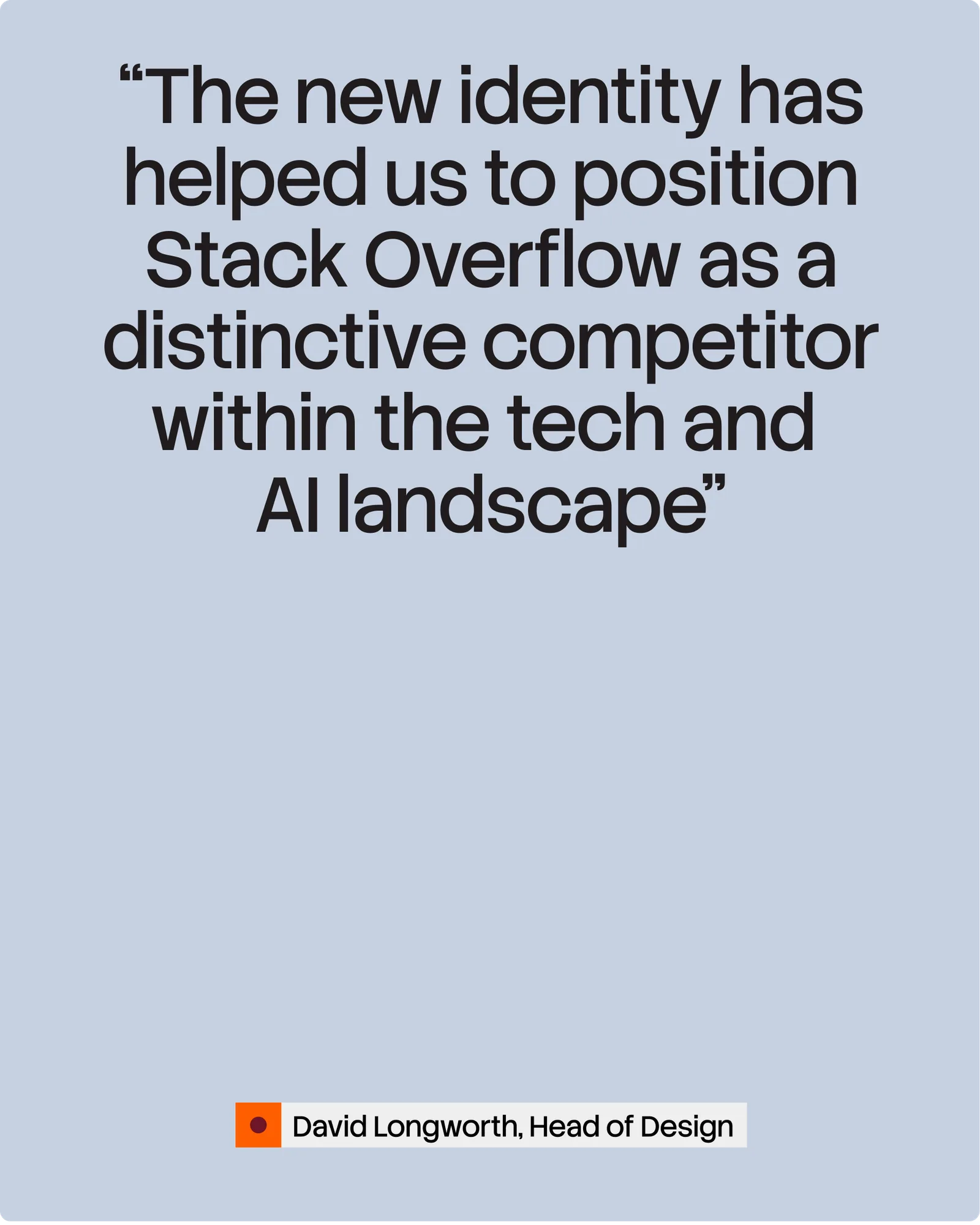
For years Stack Overflow was the tab every developer kept open. When AI tools started answering coding questions, and training on the site's own archive, the brand needed a new reason to exist. Koto reframed it around what models cannot fake: expert, human-checked knowledge. The public site and the business products now sit under two clear names, Stack Overflow and Stack Overflow Business, tied together by one idea, Always in Build.
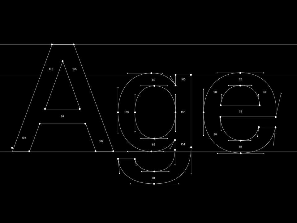
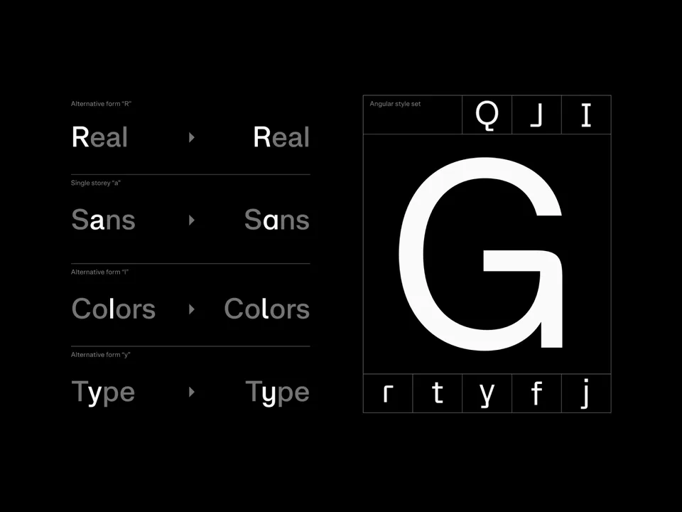
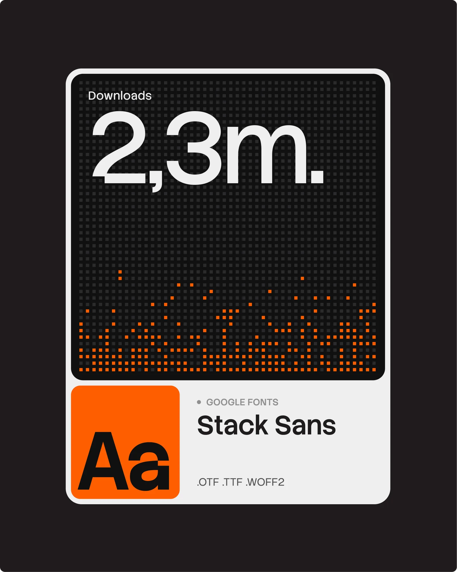
The symbol is cleaner and single-color, drawn like building blocks in motion, and the toppling tower is still there, a nod to the coding error behind the name. Those shapes unfold into a system that rearranges itself like code being rebuilt, with a custom generative tool so the in-house team can make new assets on their own. A custom typeface, Stack Sans, with a small notch cut into its letters, gives the brand its own voice in type and is free on Google Fonts.
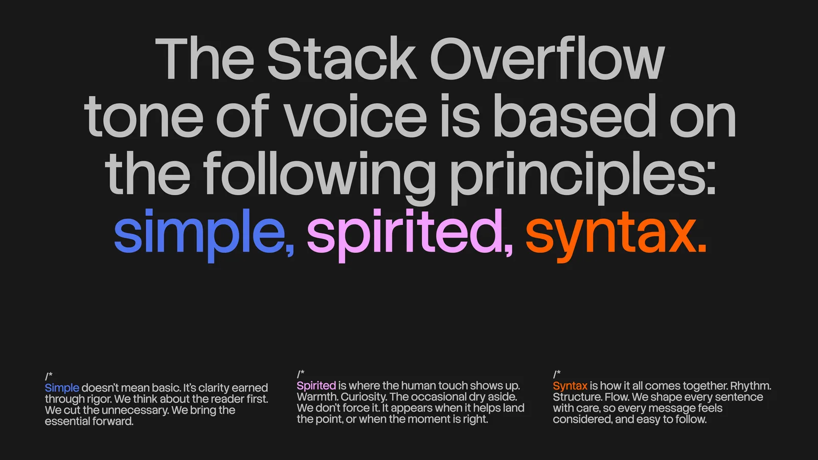
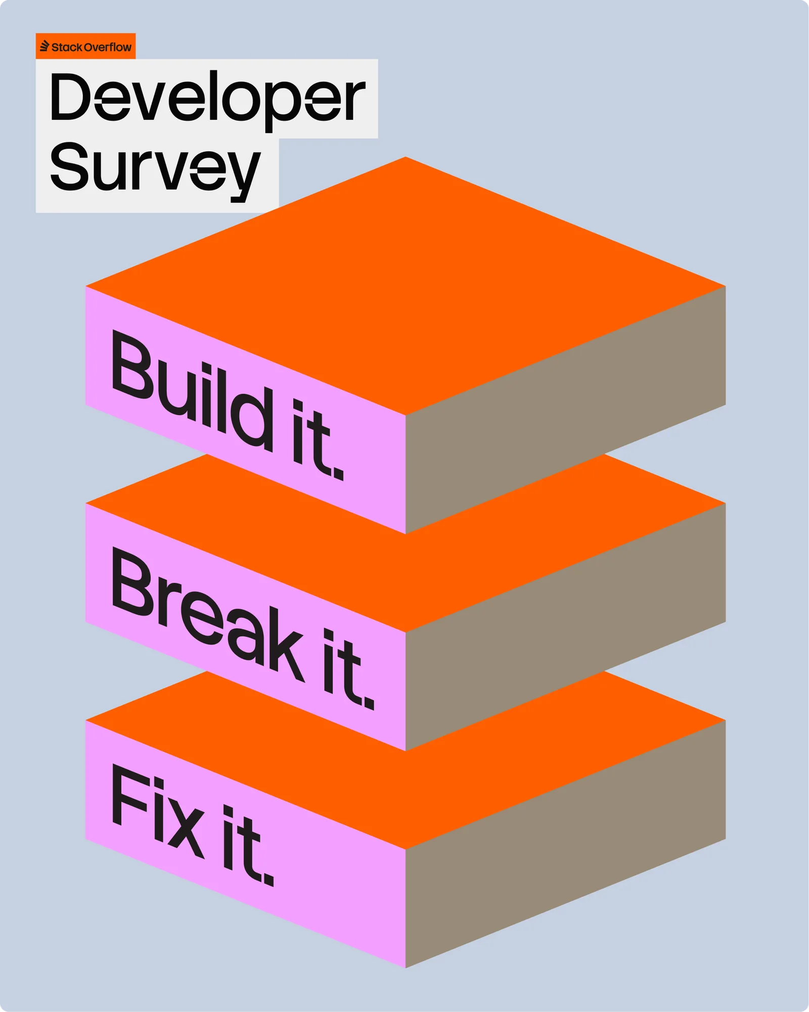
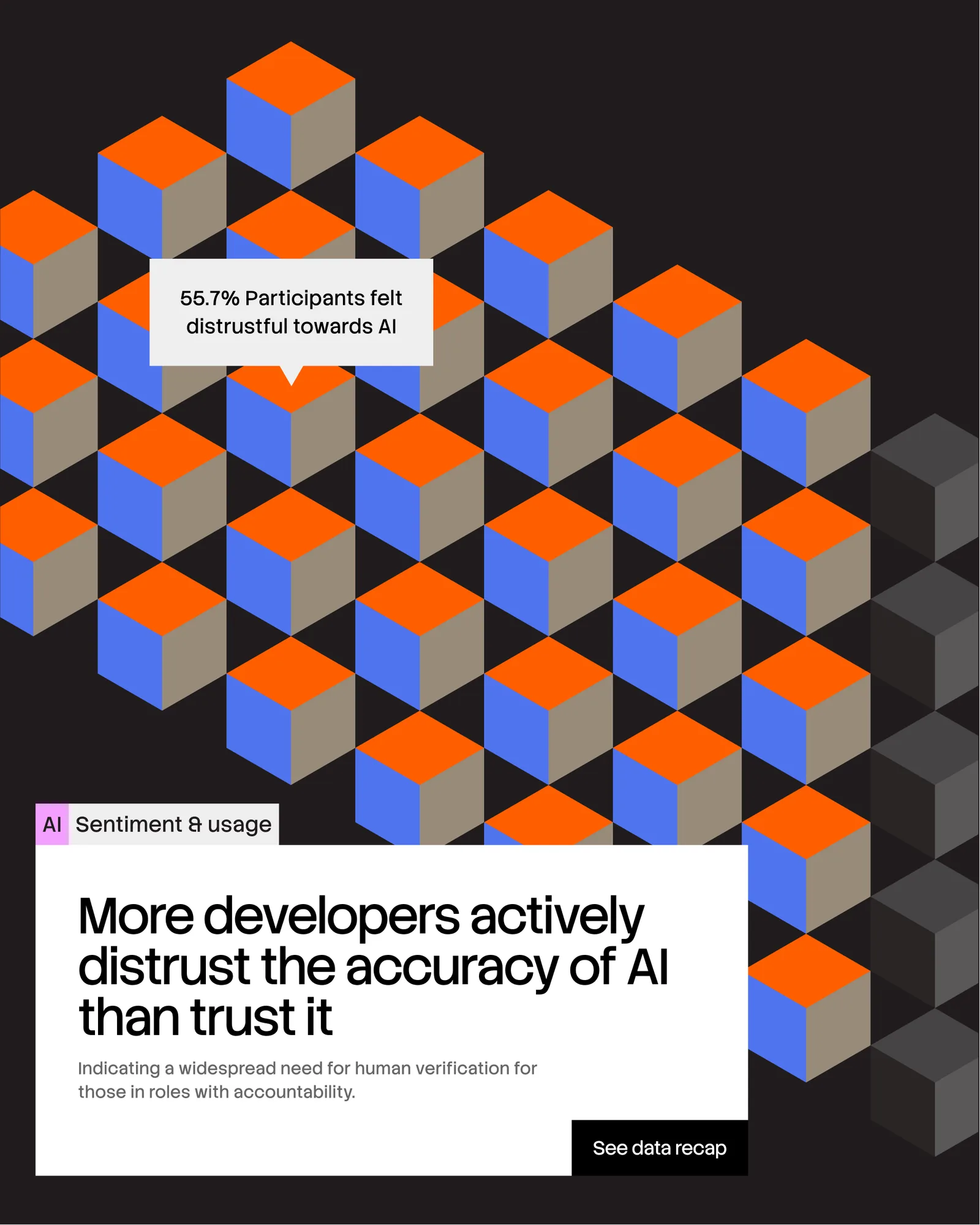
The digital side stays quiet inside the product so developers can focus, and gets louder in campaigns and the annual Developer Survey. The tone of voice follows three words: simple, spirited, syntax.
Typefaces: Stack Sans by Koto
The BRRRANDING newsletter
Liked Stack Overflow?
Get work like this in your inbox.
New identities every Monday, a themed issue every Thursday. Picked by hand, free.
More inspiration

Branding mockups right inside Figma. No PSD wrestling.
Try the Figma plugin →This spot is booked monthly. Become a sponsor

Designing typefaces for creatives seeking to leave a lasting impression.
Explore Salina →This spot is booked monthly. Become a sponsor
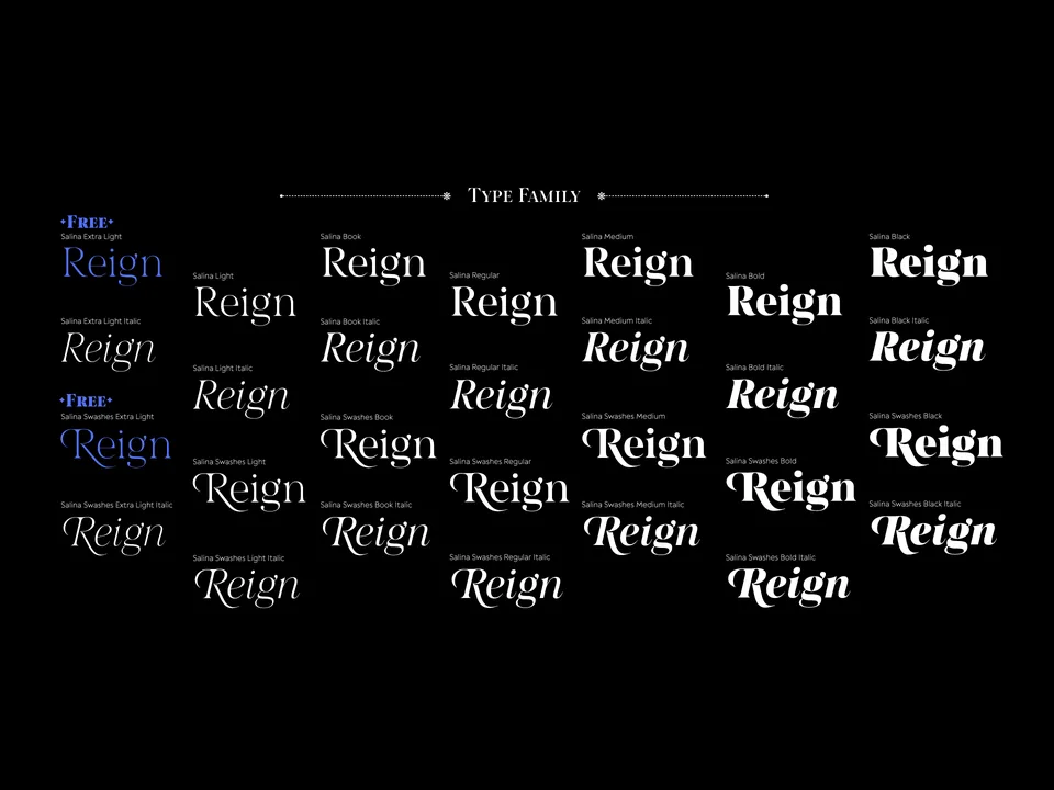
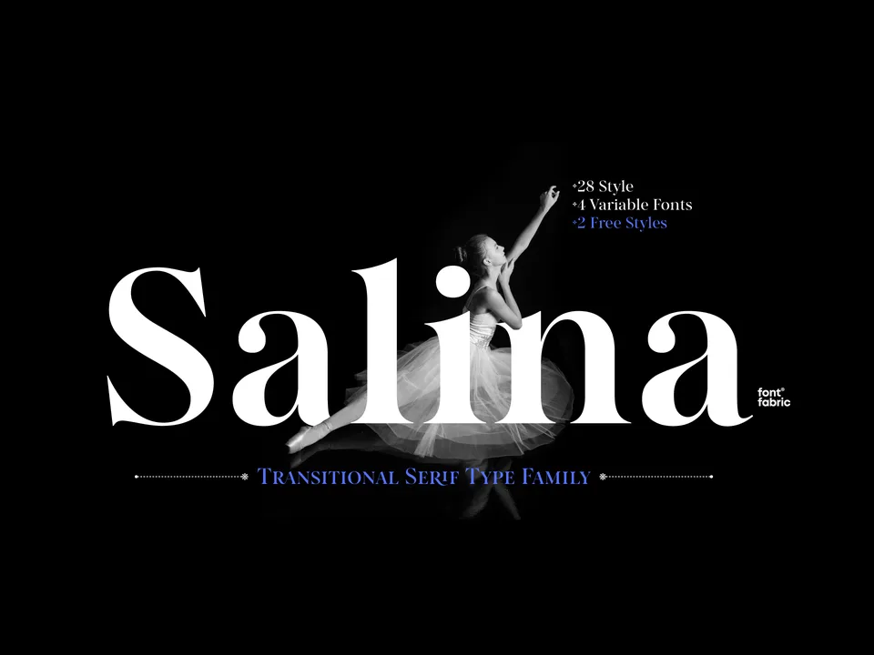
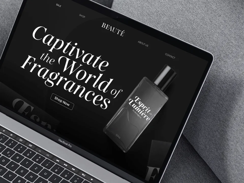
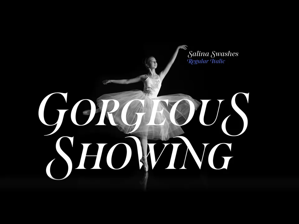
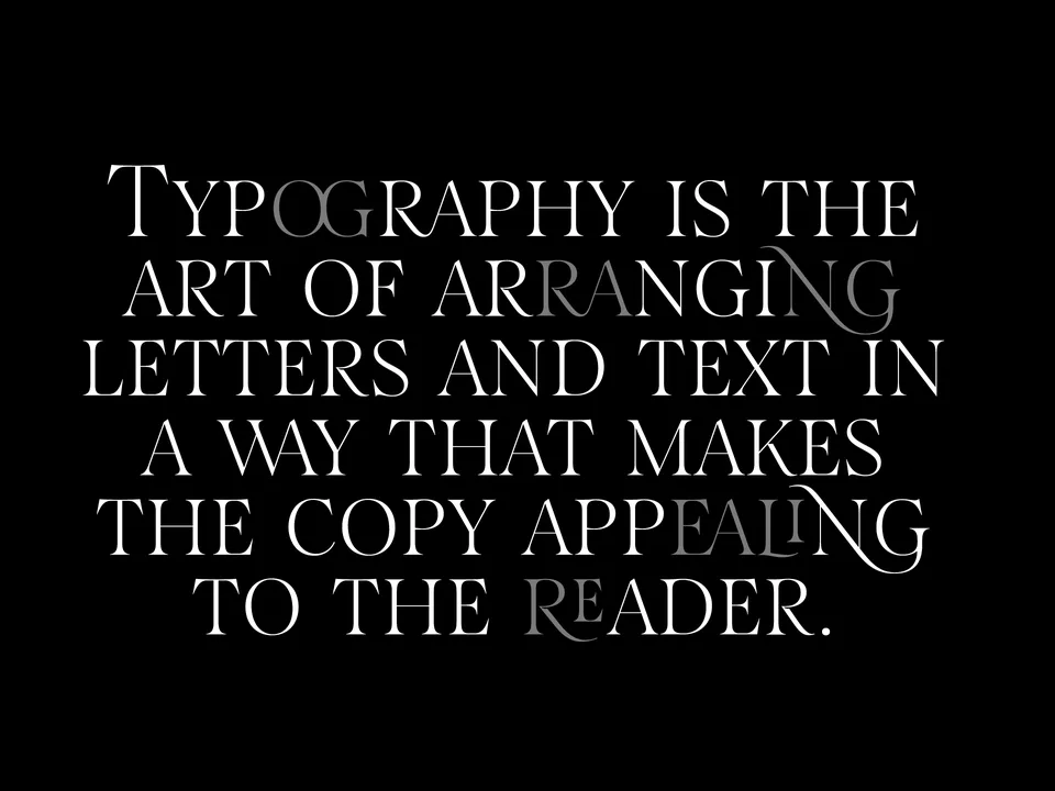
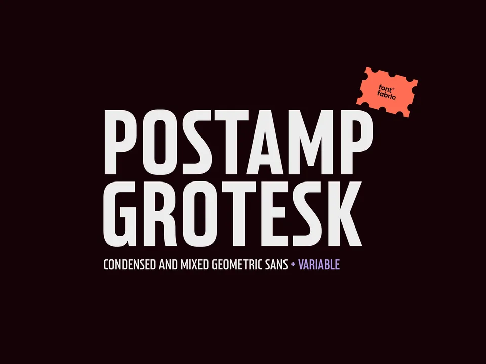
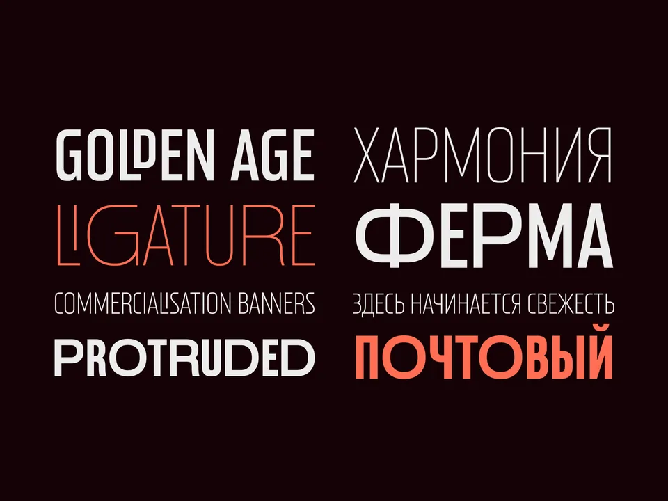
Designing typefaces for creatives seeking to leave a lasting impression.
Explore Postamp Grotesk →This spot is booked monthly. Become a sponsor
Designing typefaces for creatives seeking to leave a lasting impression.
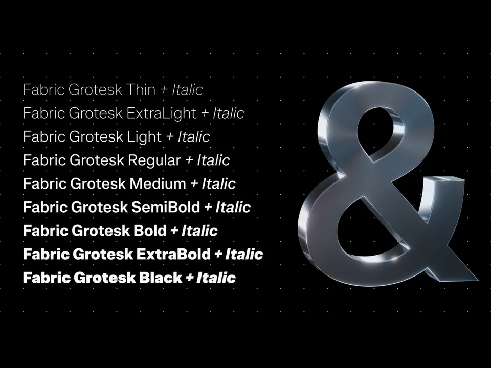
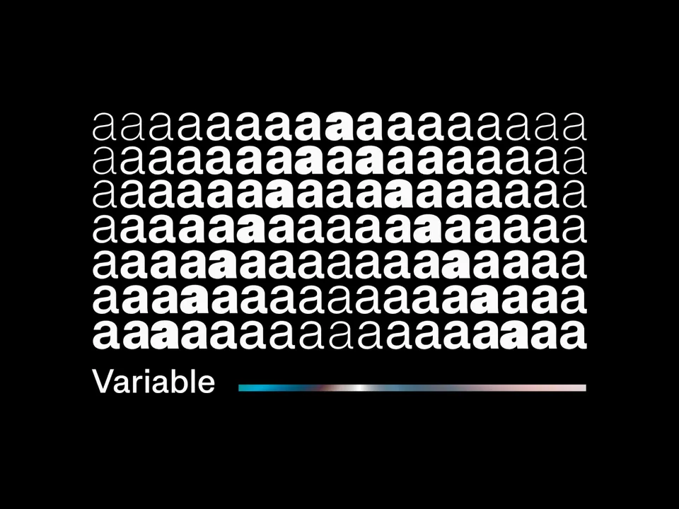
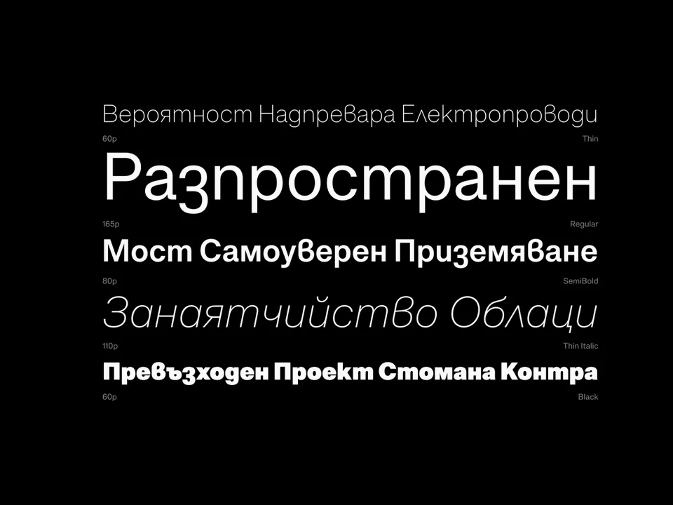
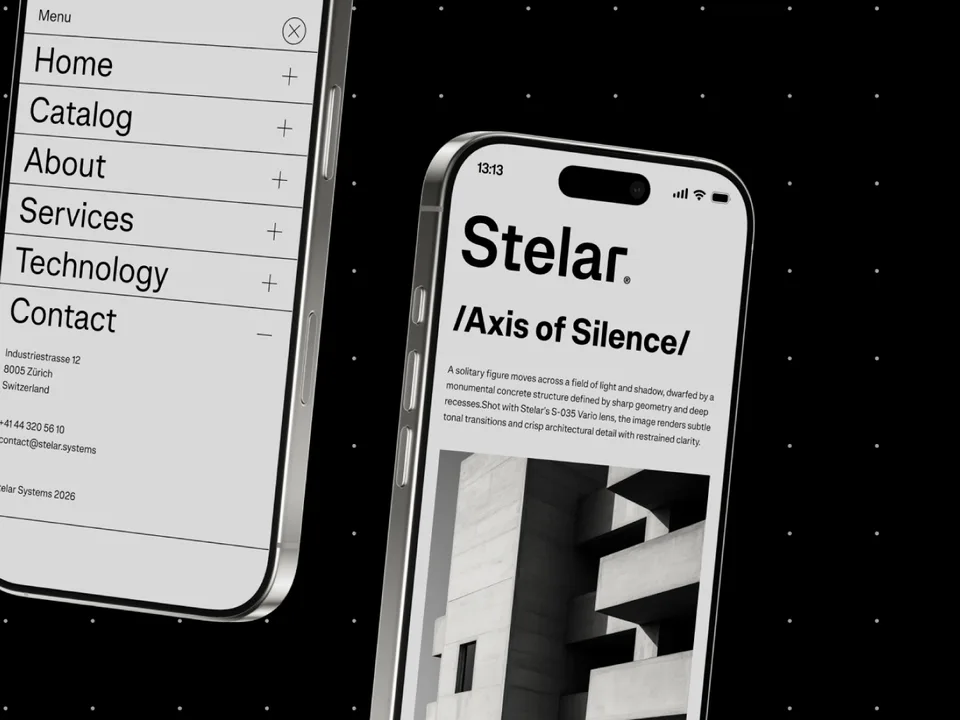
Explore Fabric Grotesk →This spot is booked monthly. Become a sponsor