Pauli & Sisters
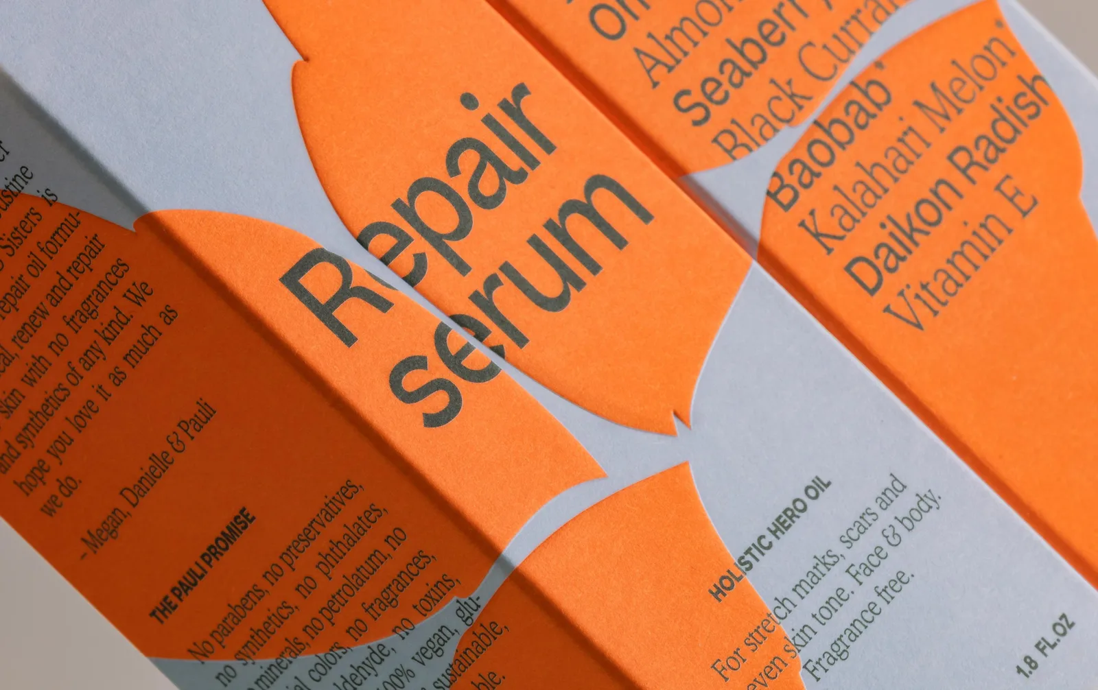
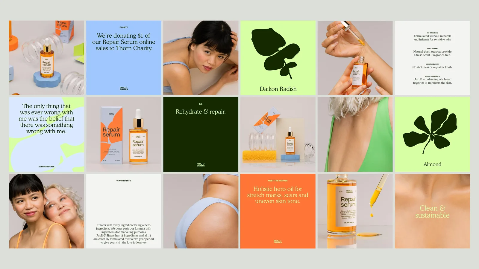
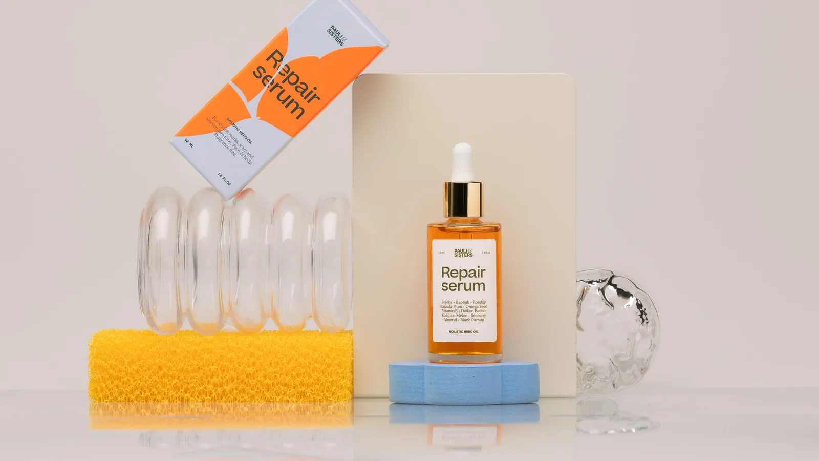
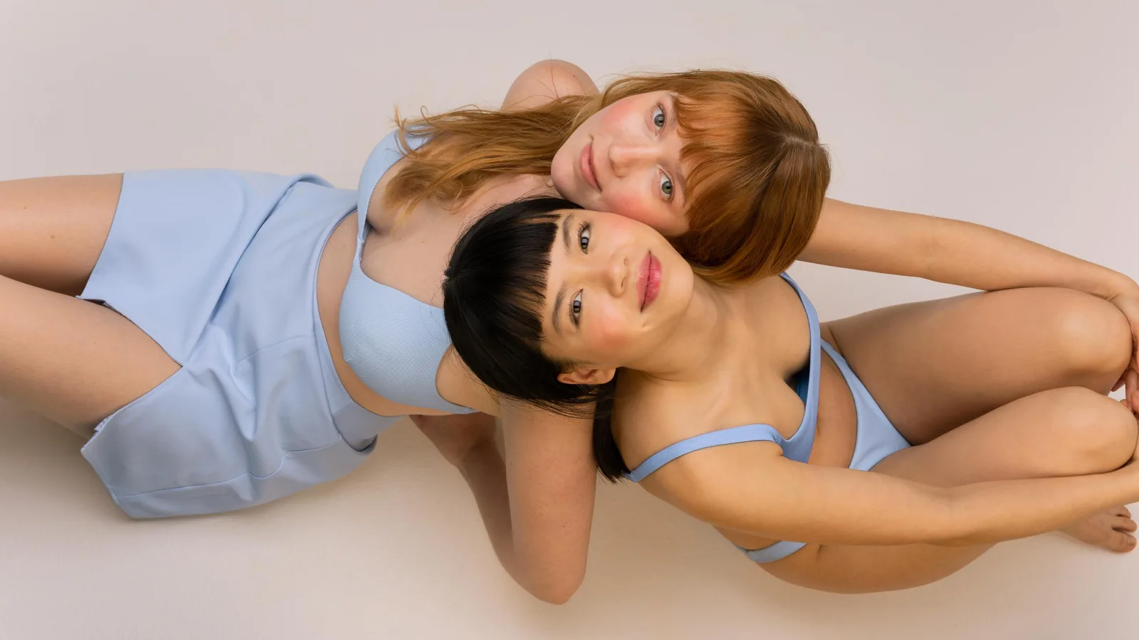
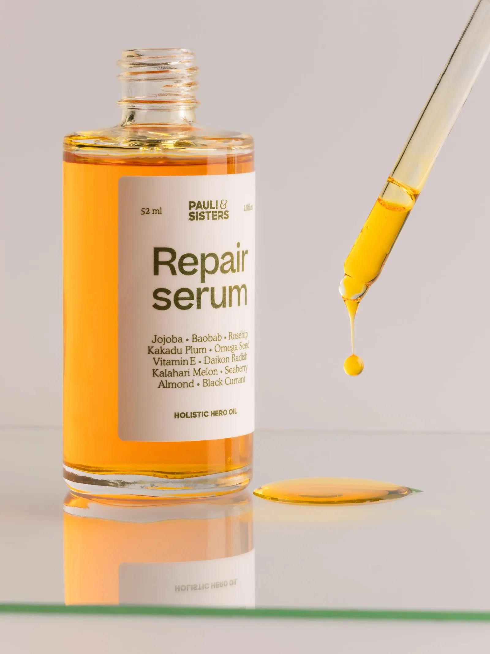
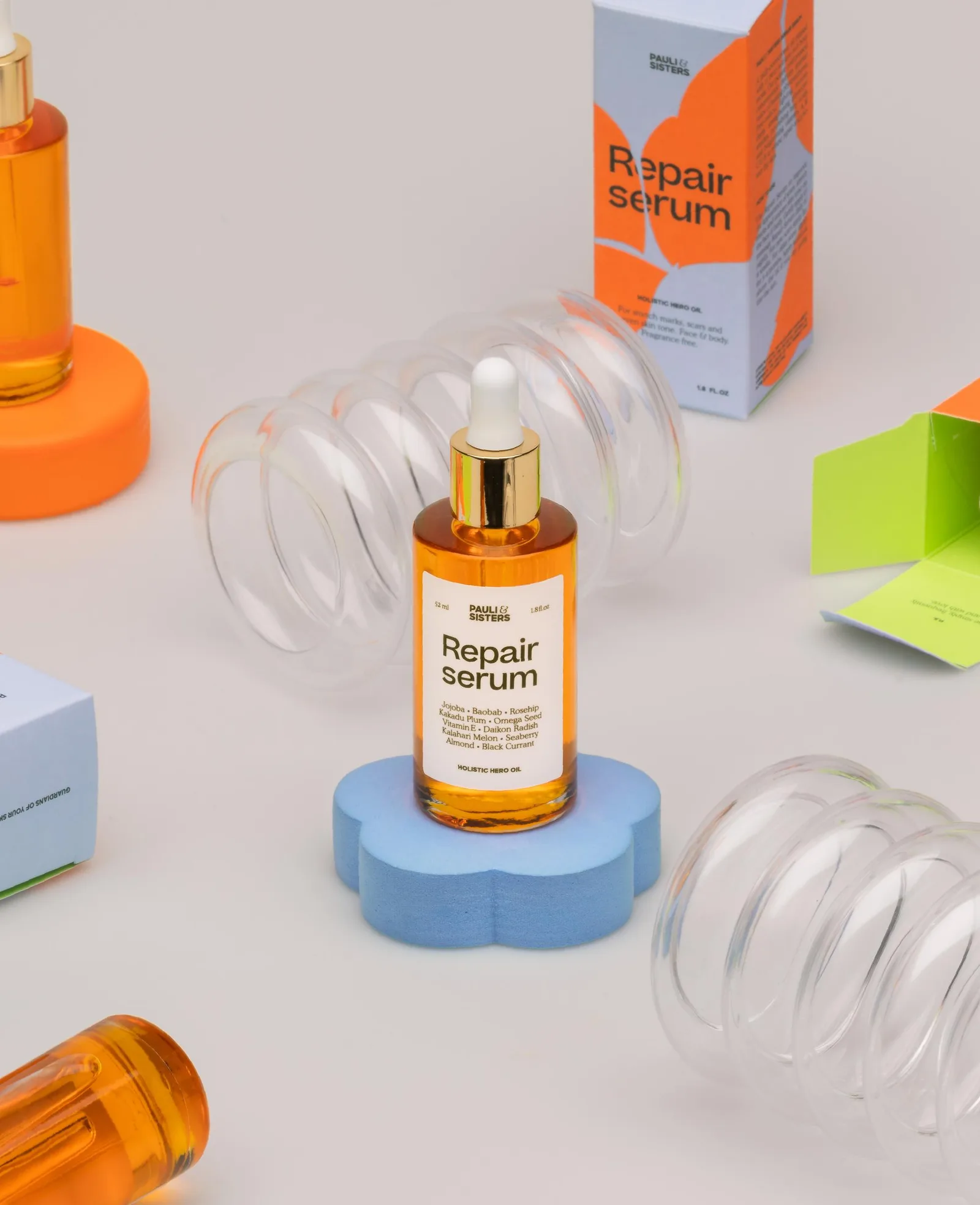
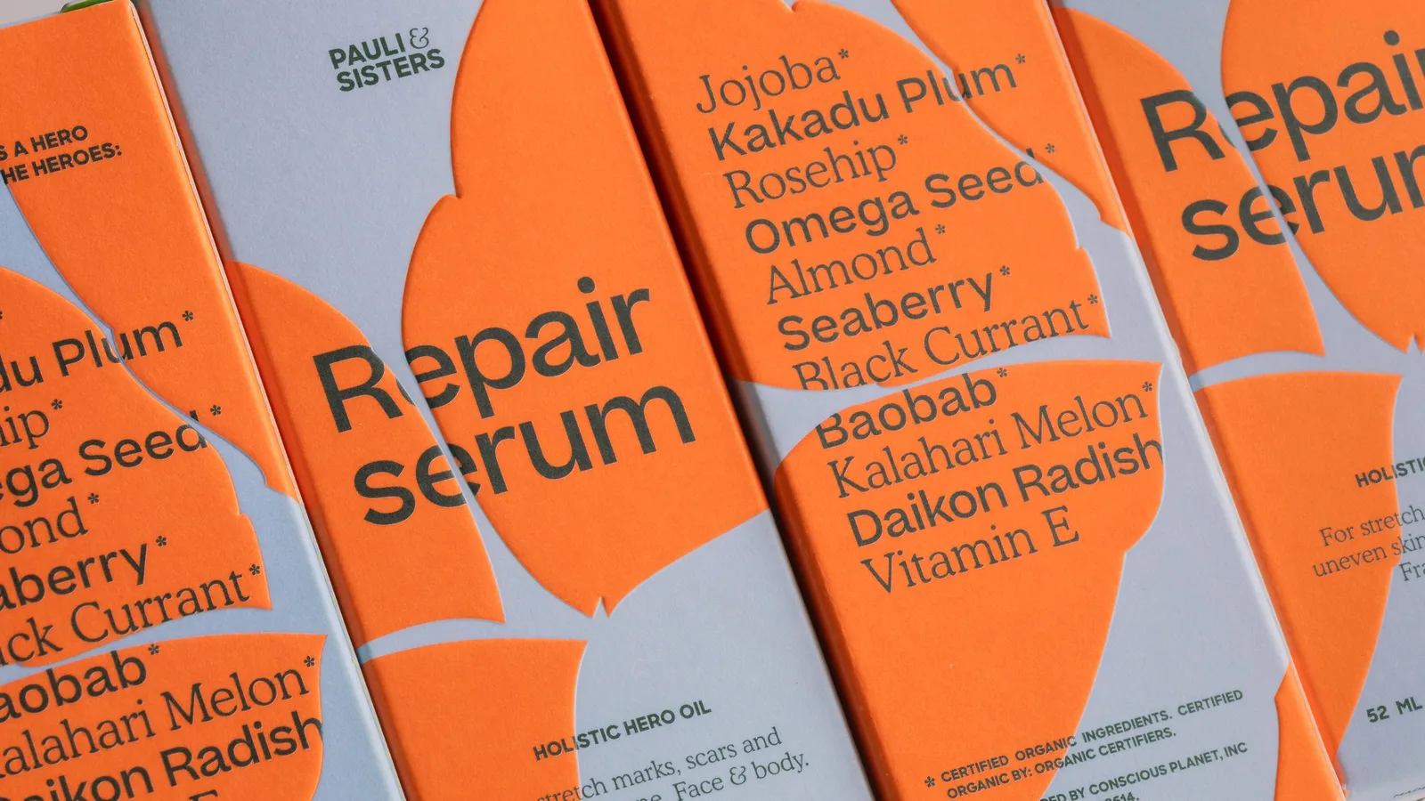
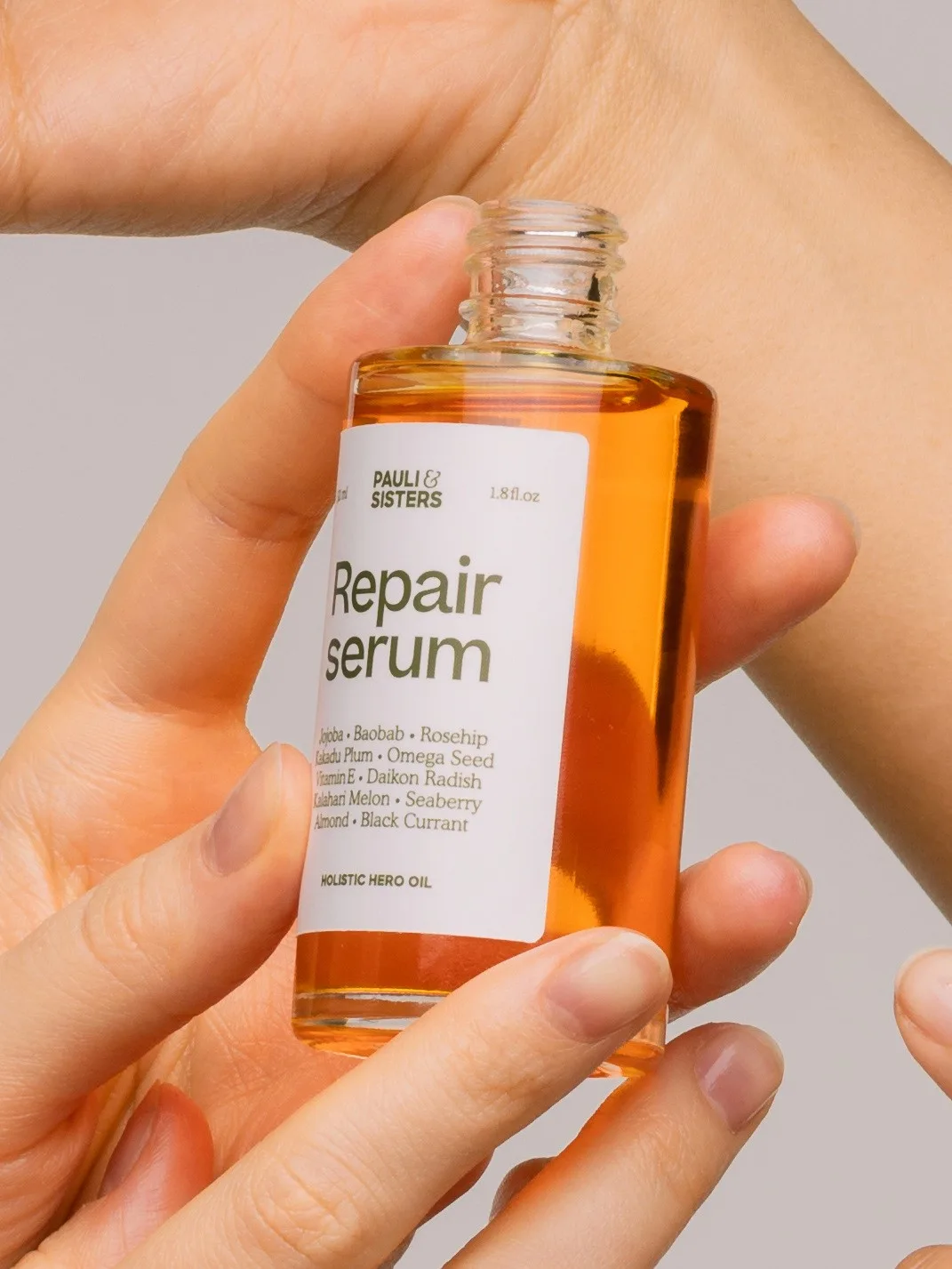
"A punchy, perky and poppy identity for the Californian organic skincare brand, built to subvert everything expected of organic cosmetics: a typographic system of Sharp Sans and Beatrice with Cooper Light, a vivid orange palette drawn from the Repair serum paired with pastel blue, and embossed leaf details that keep the healing purpose sincere."
Typefaces: Sharp Sans, Beatrice, Cooper
The BRRRANDING newsletter
Liked Pauli & Sisters?
Get work like this in your inbox.
New identities every Monday, a themed issue every Thursday. Picked by hand, free.
More inspiration
Sponsor

Branding mockups right inside Figma. No PSD wrestling.
Try the Figma plugin →This spot is booked monthly. Become a sponsor