

Nayla Arida
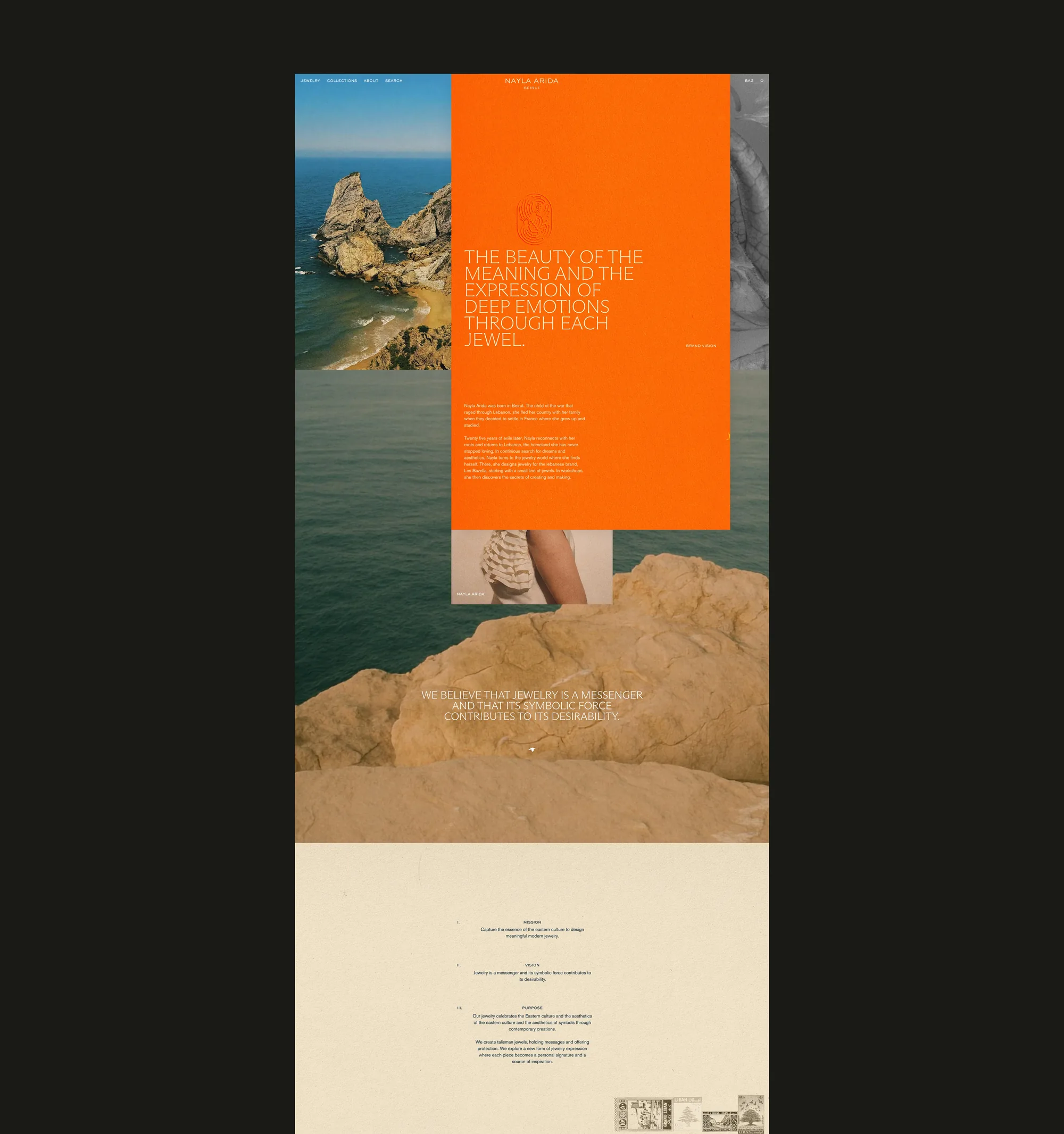
Nayla Arida makes fine jewellery in Beirut. She grew up in France after her family fled the war in Lebanon, and came home twenty-five years later to reconnect with her roots and her craft. When she came to Creative Nights, all of that lived on a standard Shopify template.
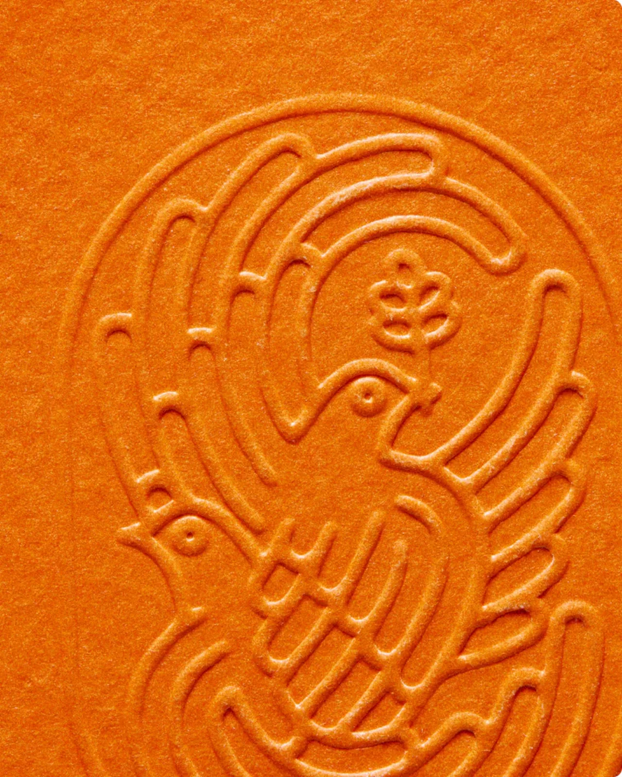
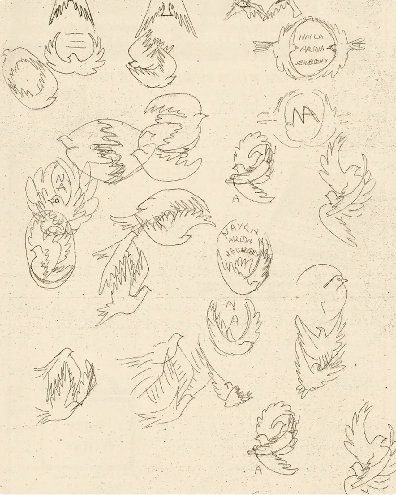
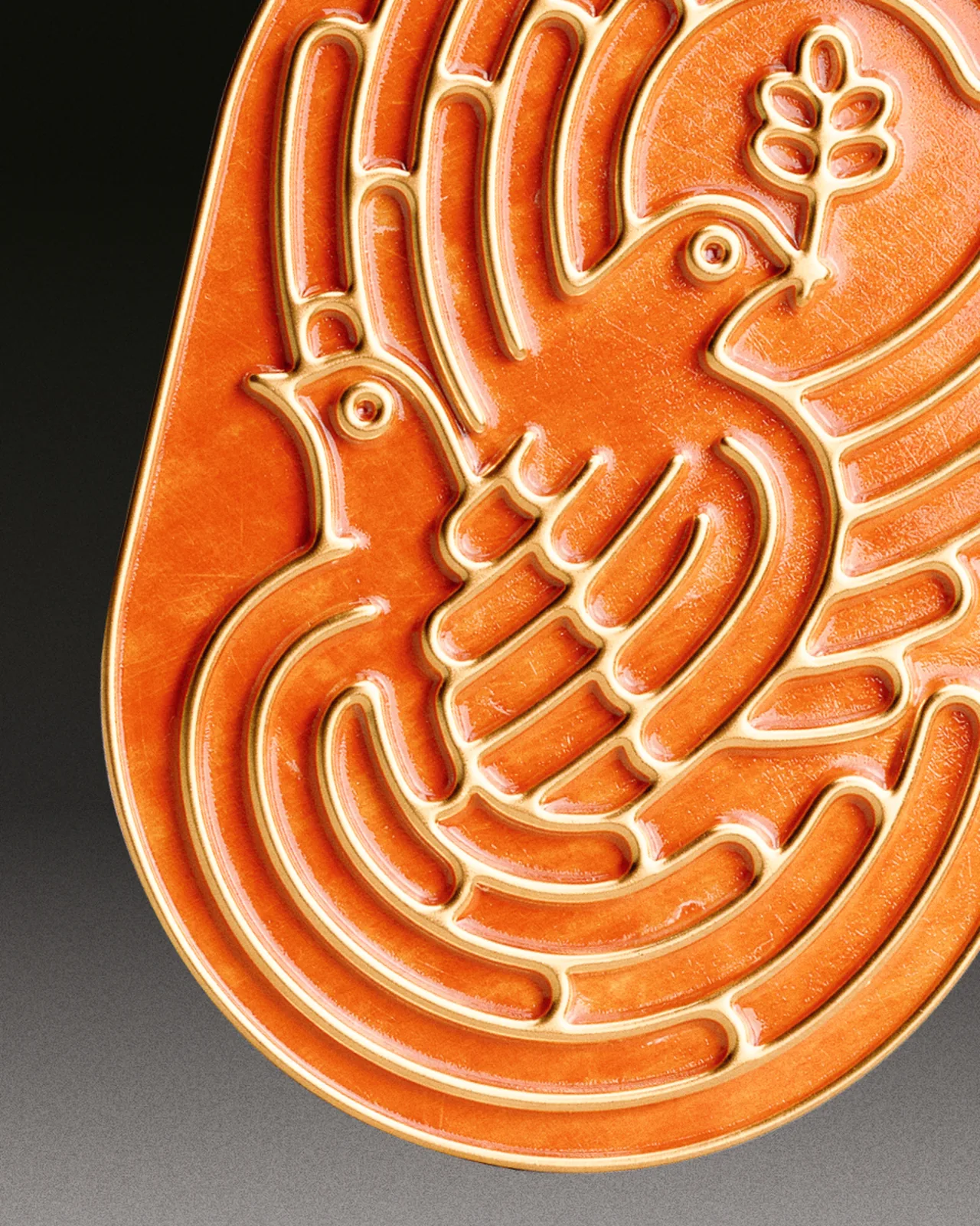
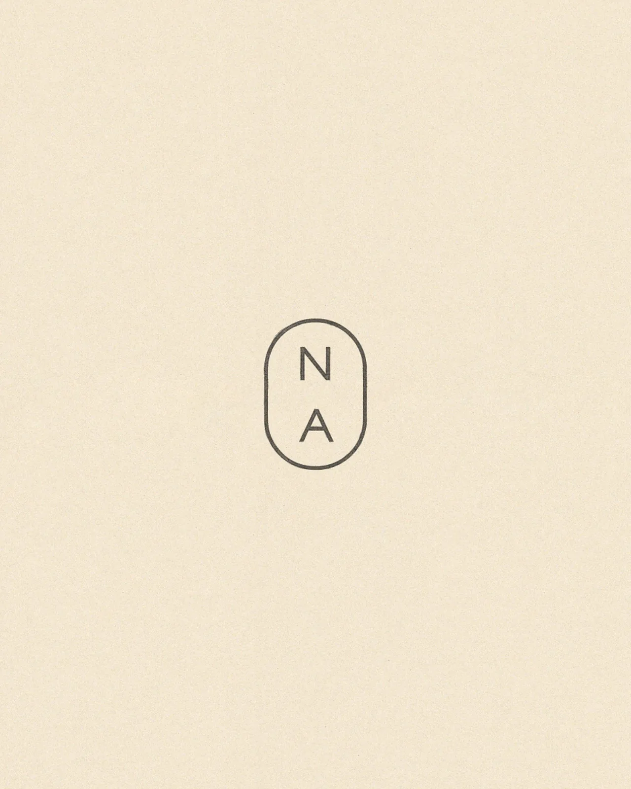
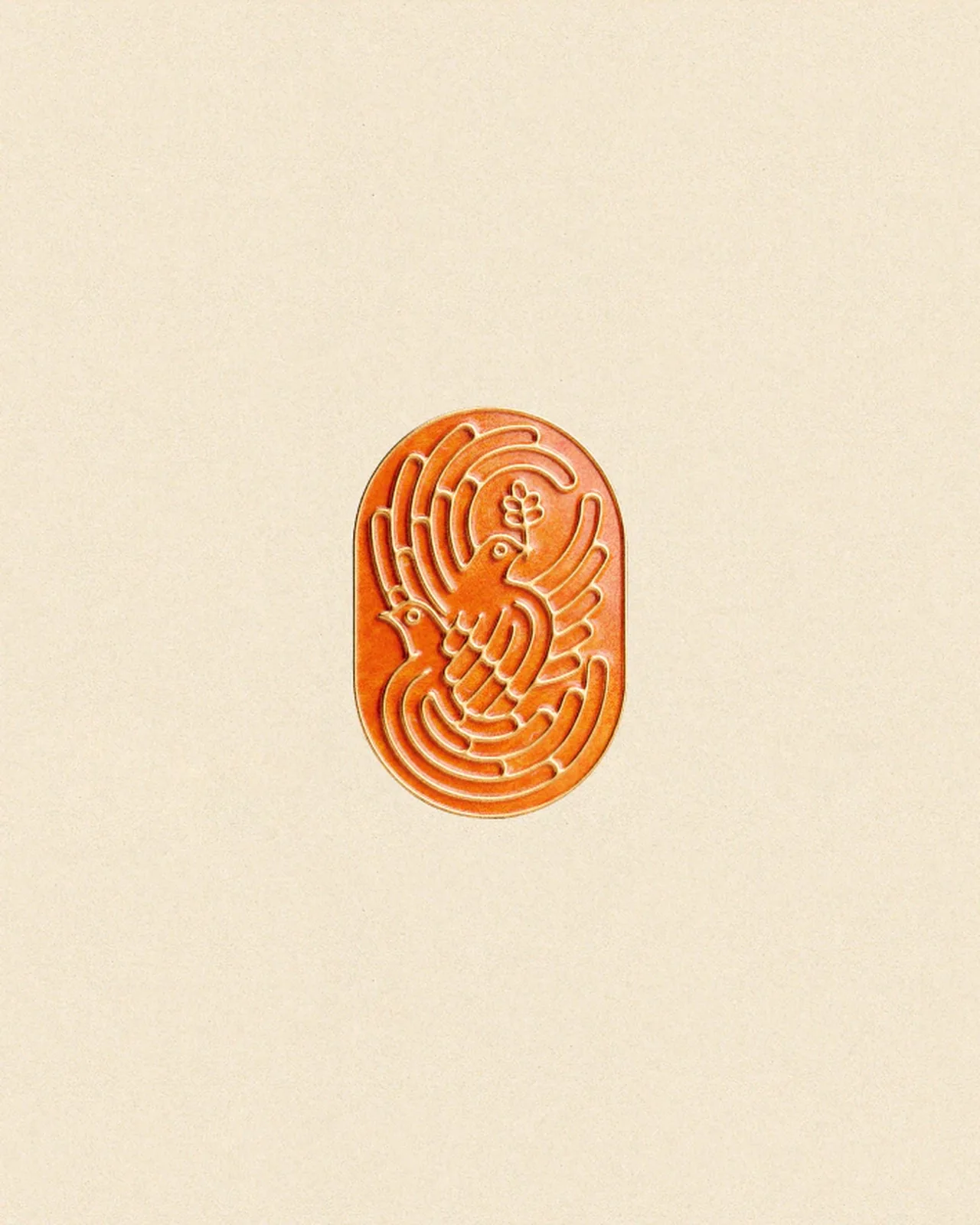
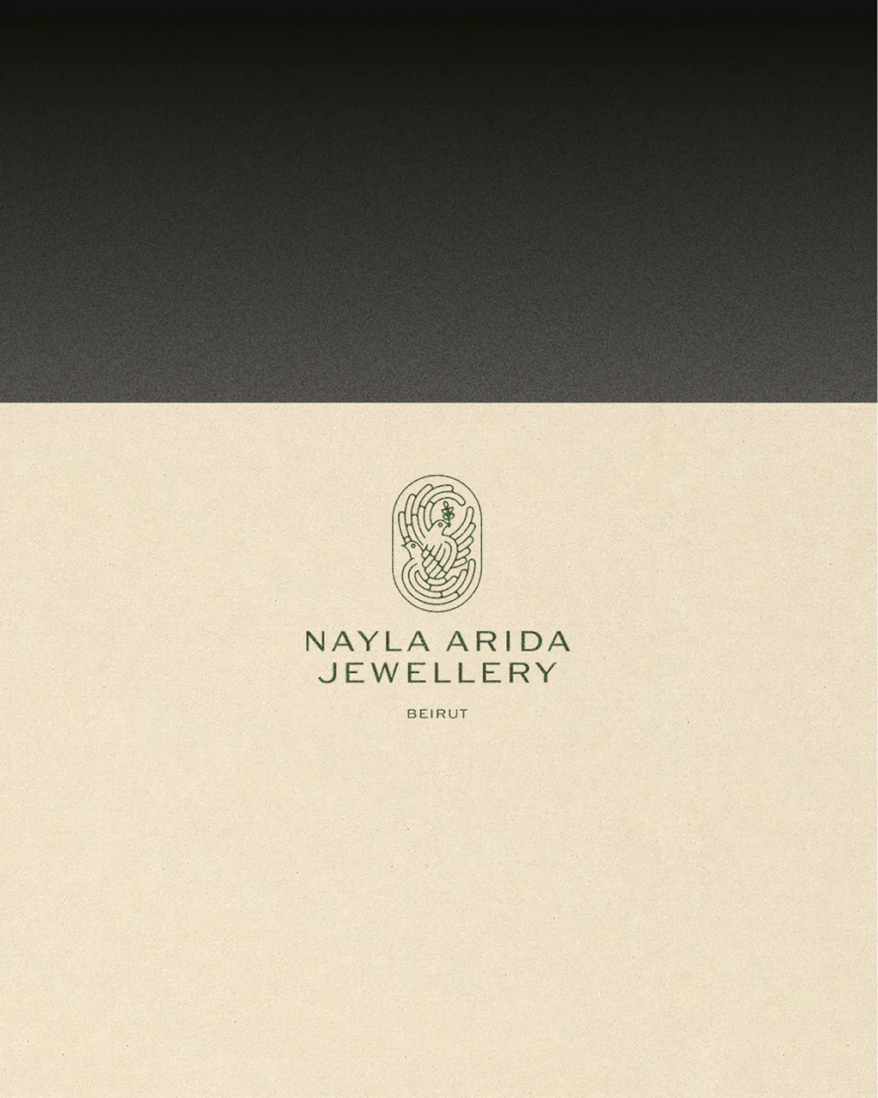
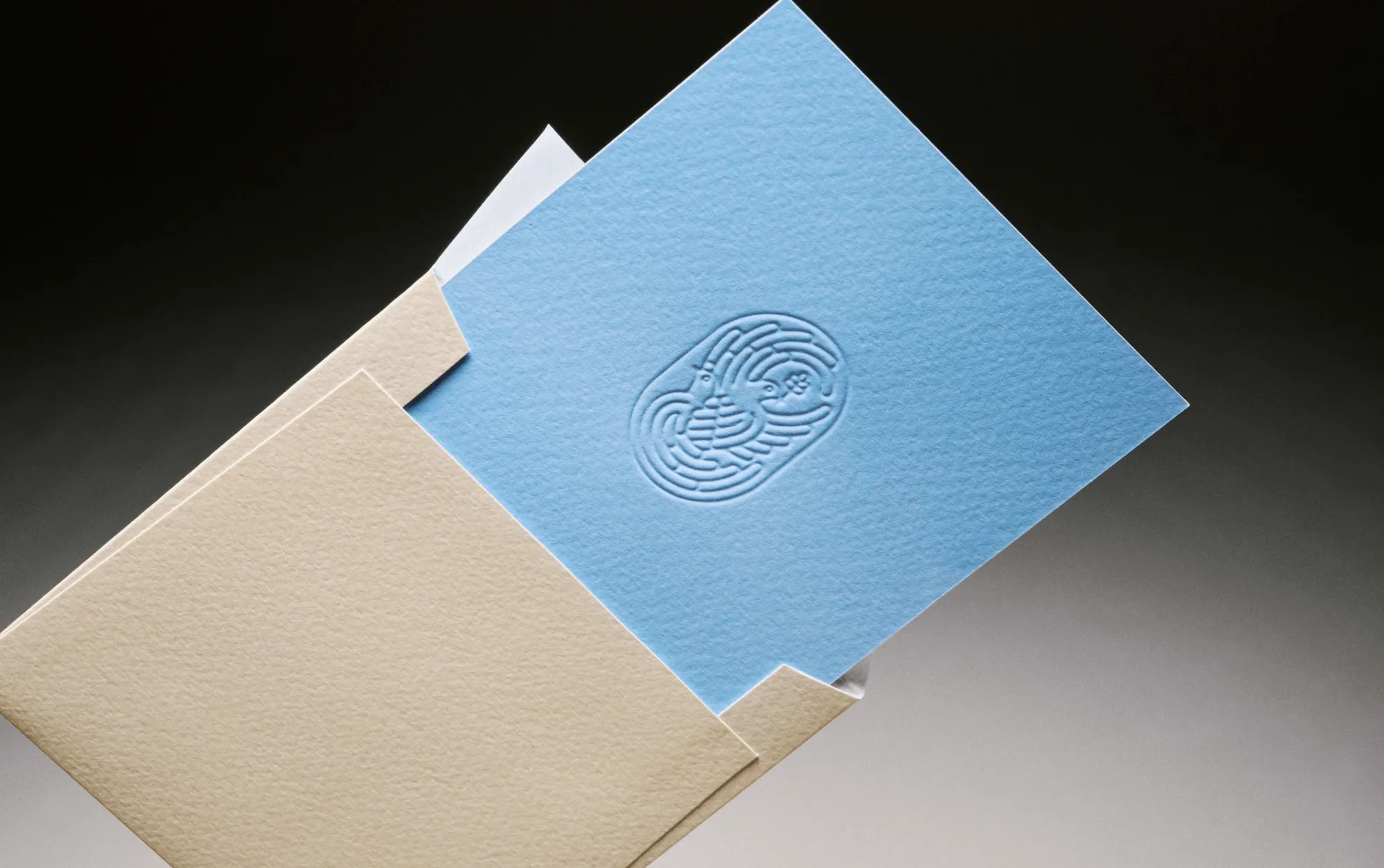
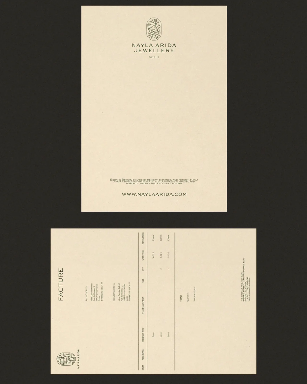
The studio built the brand around a symbol Nayla had already drawn but barely used: two turtle doves carrying a branch between them, for devotion, peace and the journey home. Dozens of hand sketches refined it into a mark delicate enough to sit next to the jewellery instead of shouting over it.
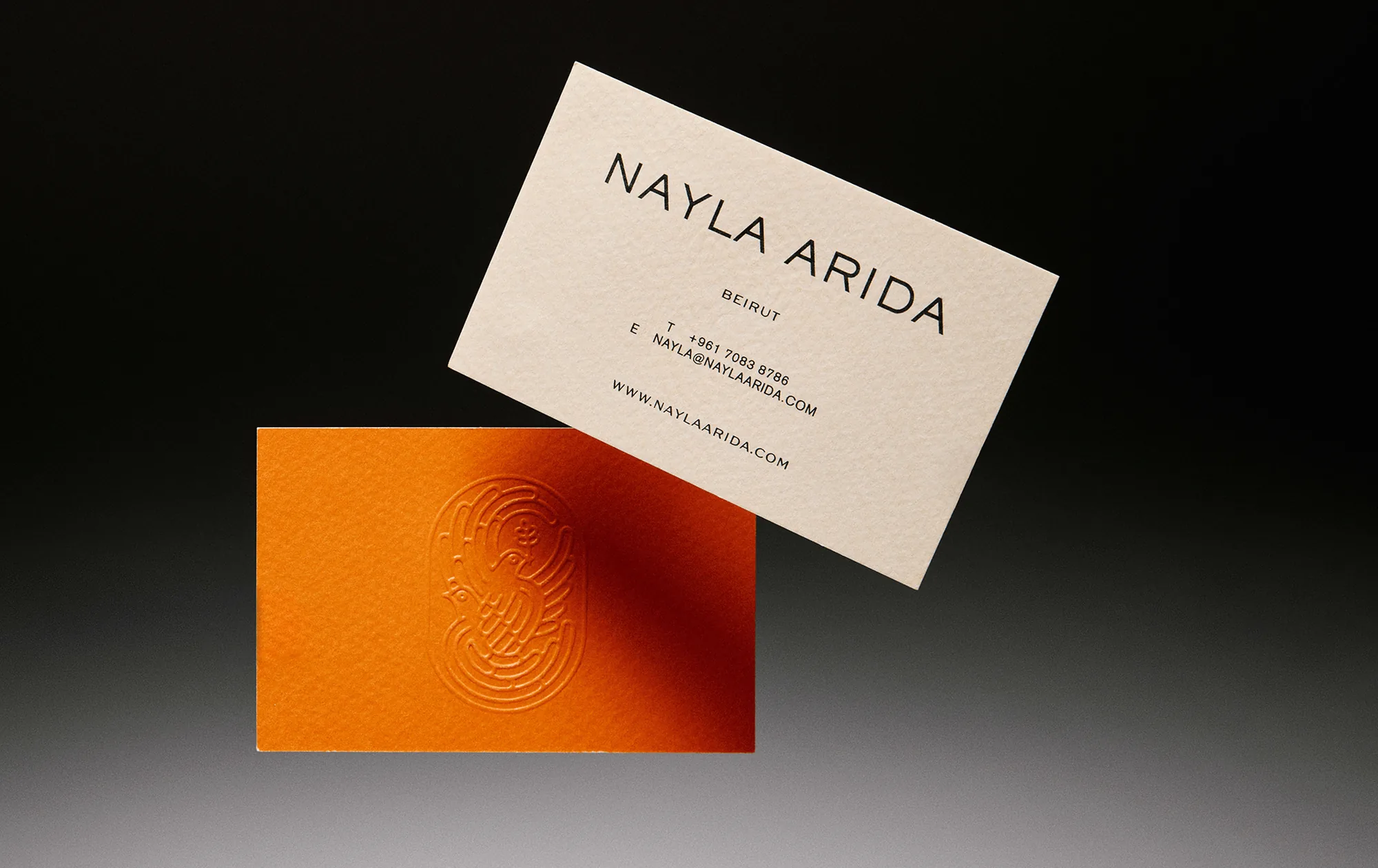
The type speaks in three voices: Sackers Gothic for the logotype, ABC Arizona for editorial moments and Akzidenz-Grotesk wherever text simply has to be read. The colours come from her story: warm sand for the limestone streets, deep navy for the sea, and blue and orange for the optimism she never lost.
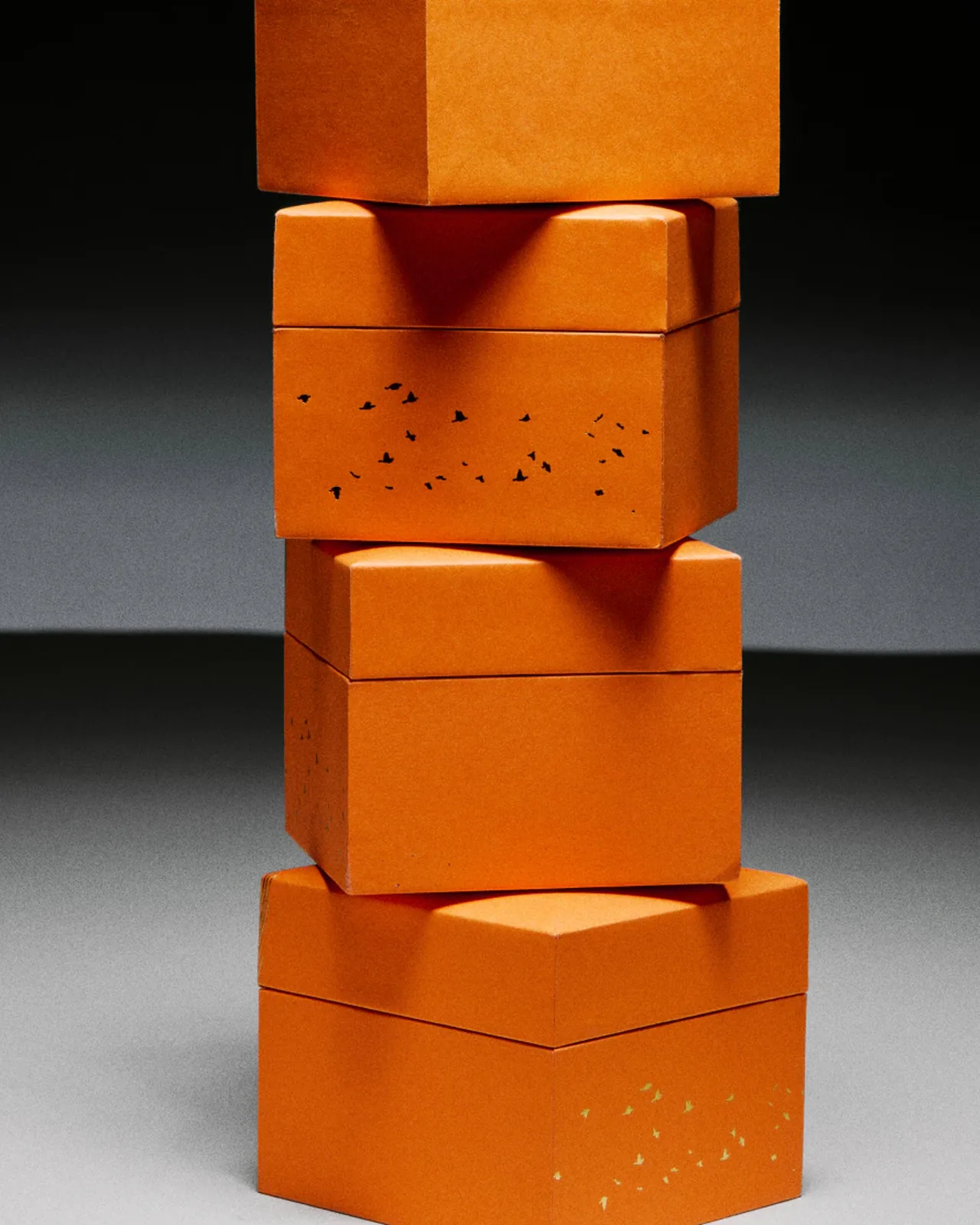
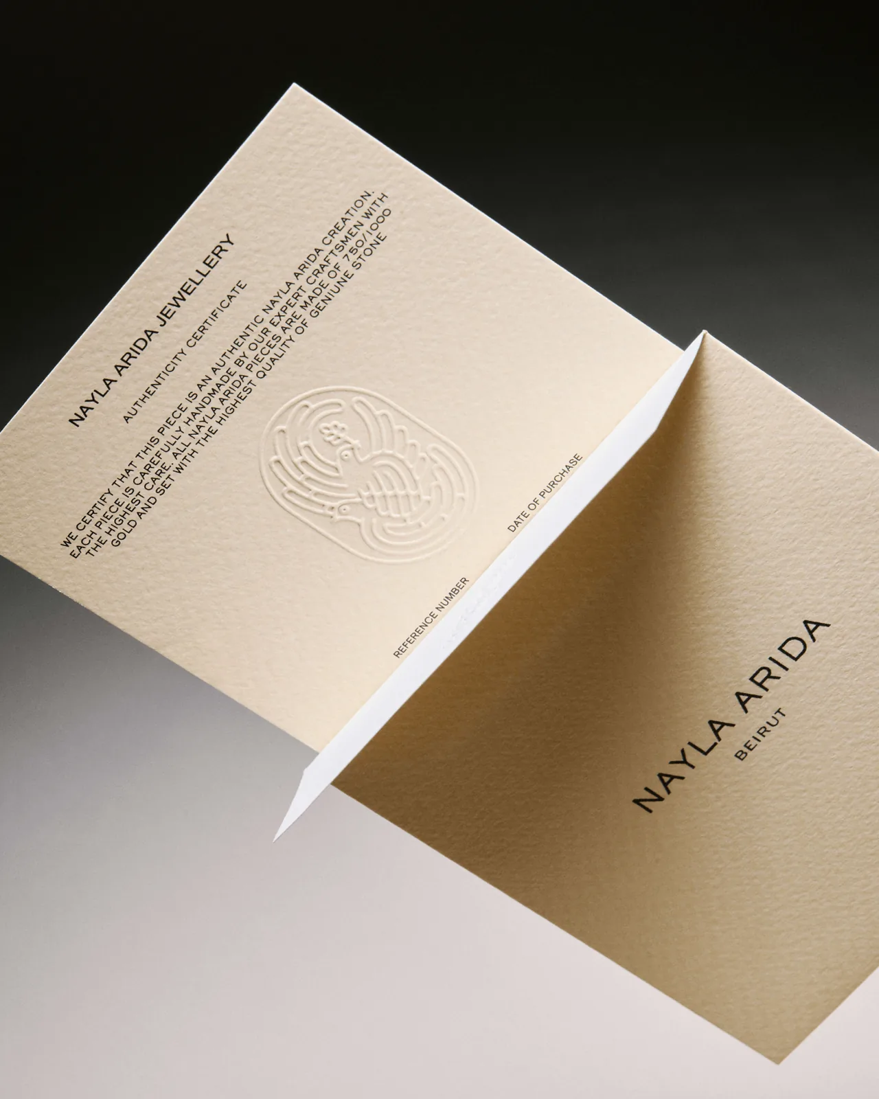
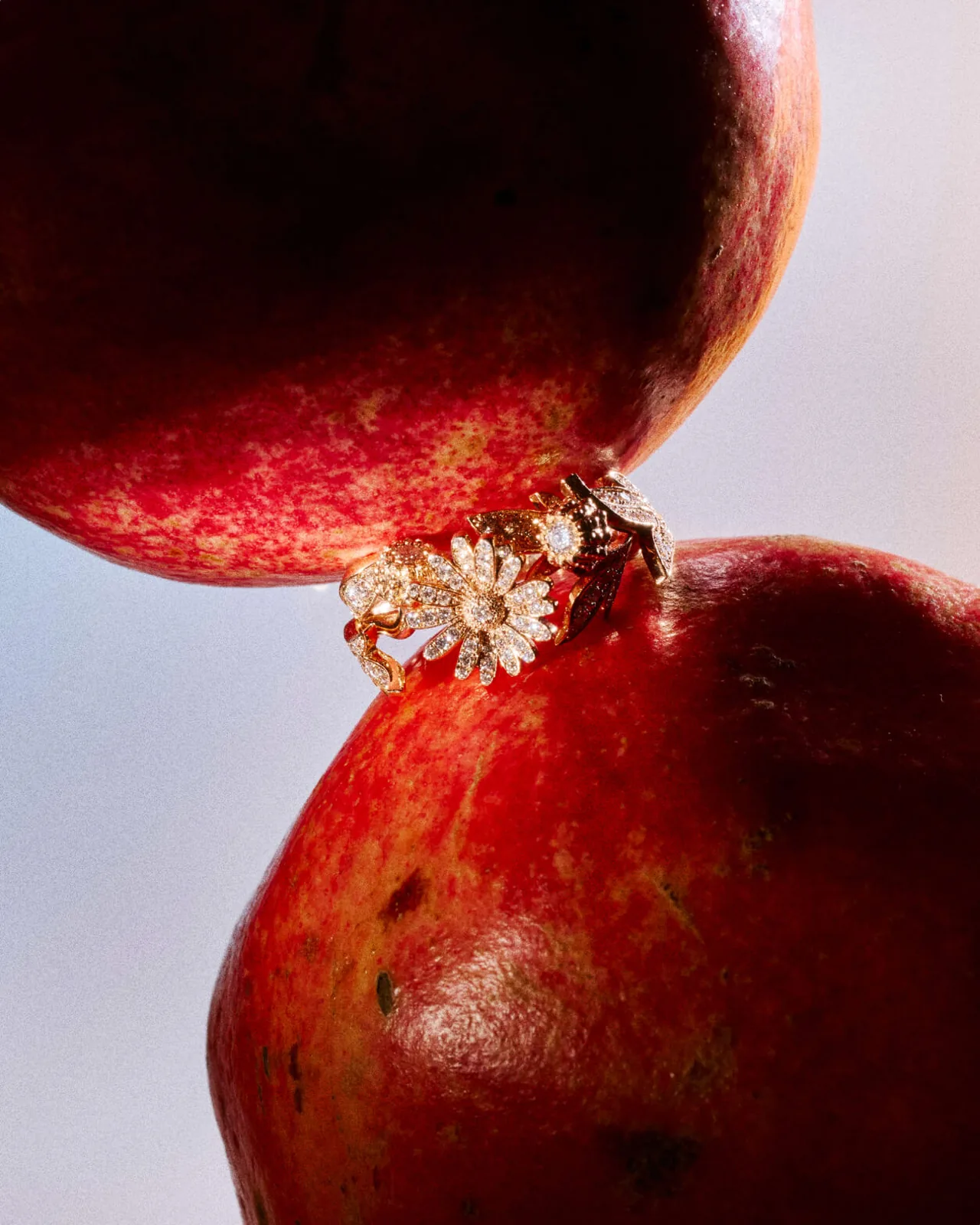
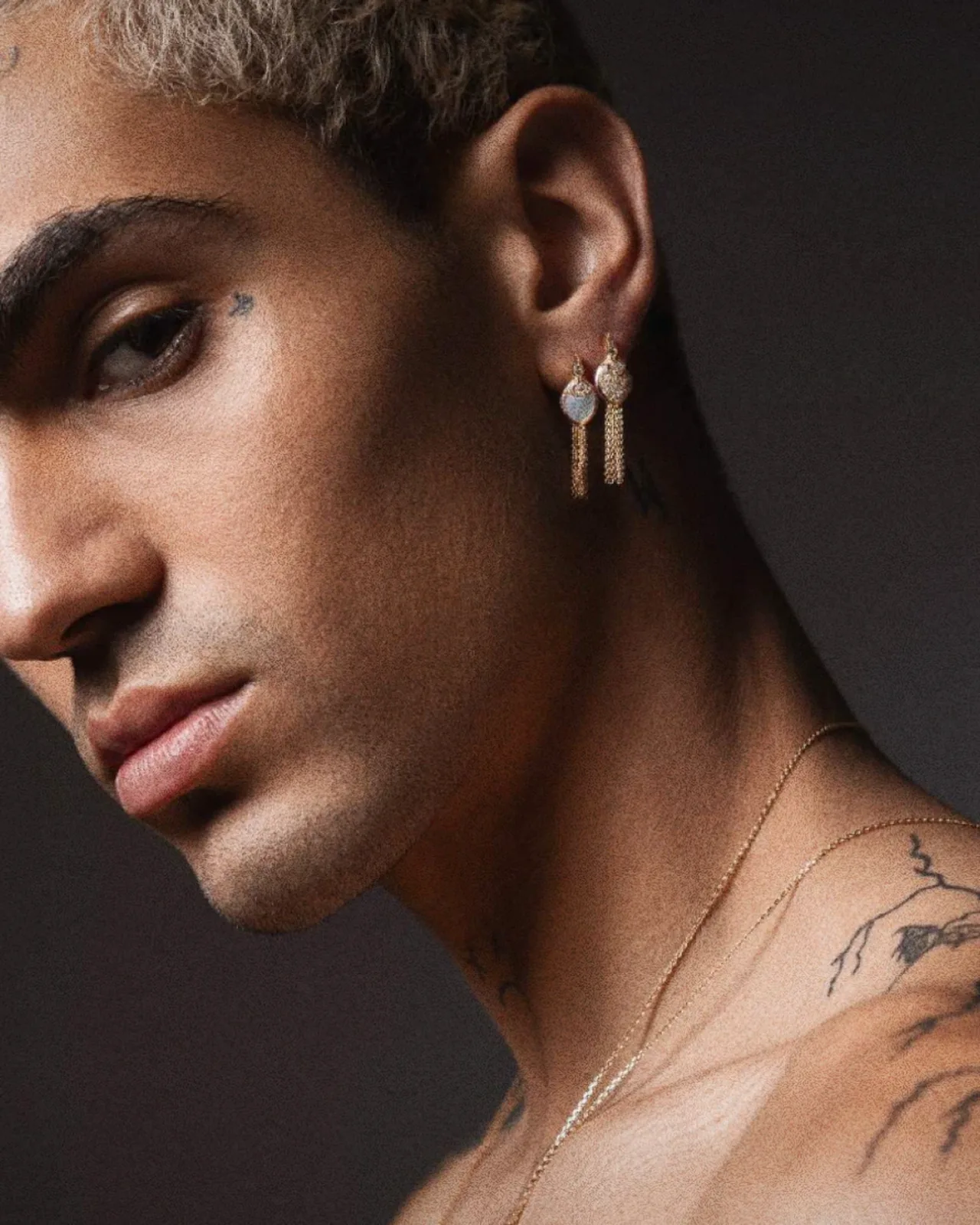
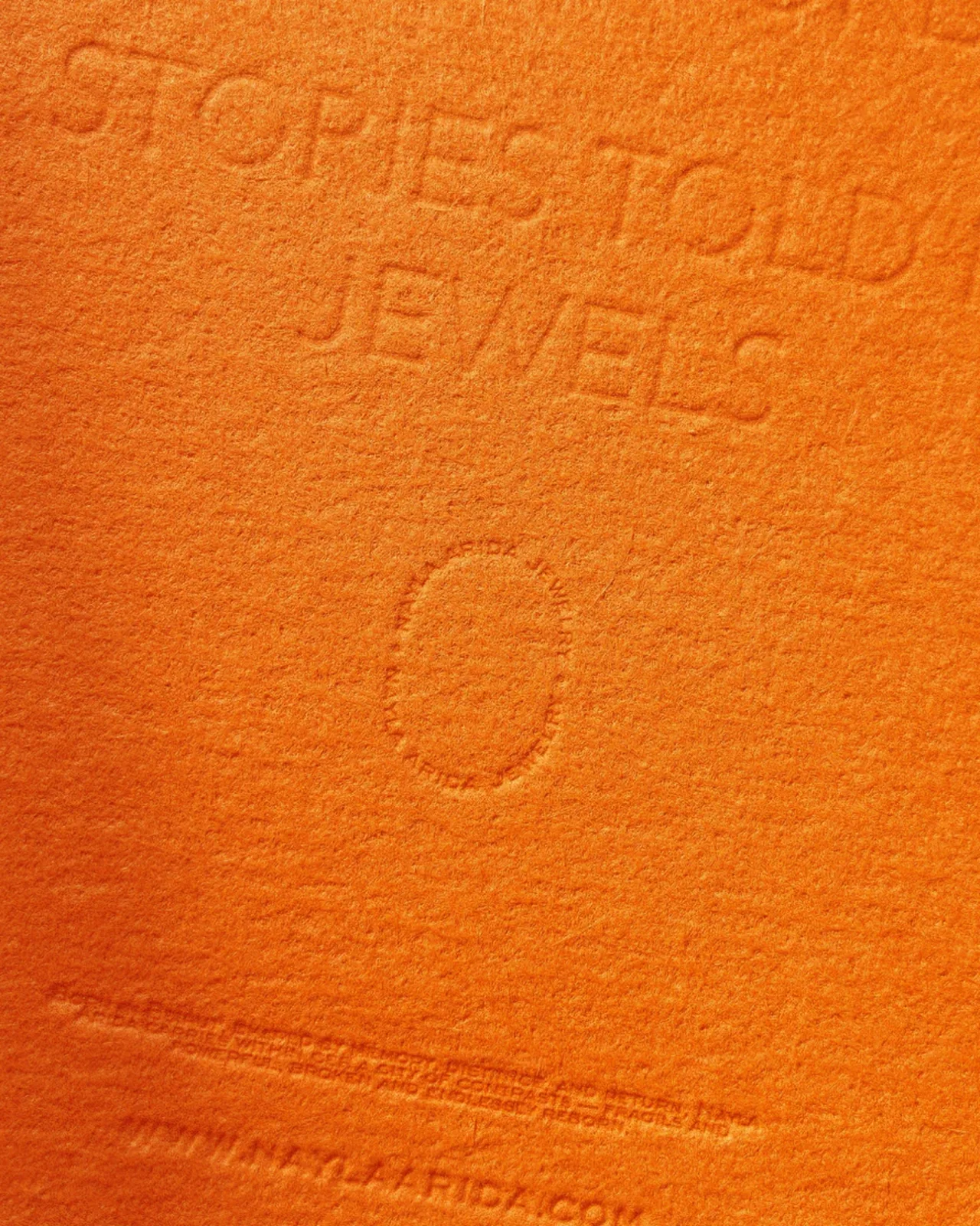
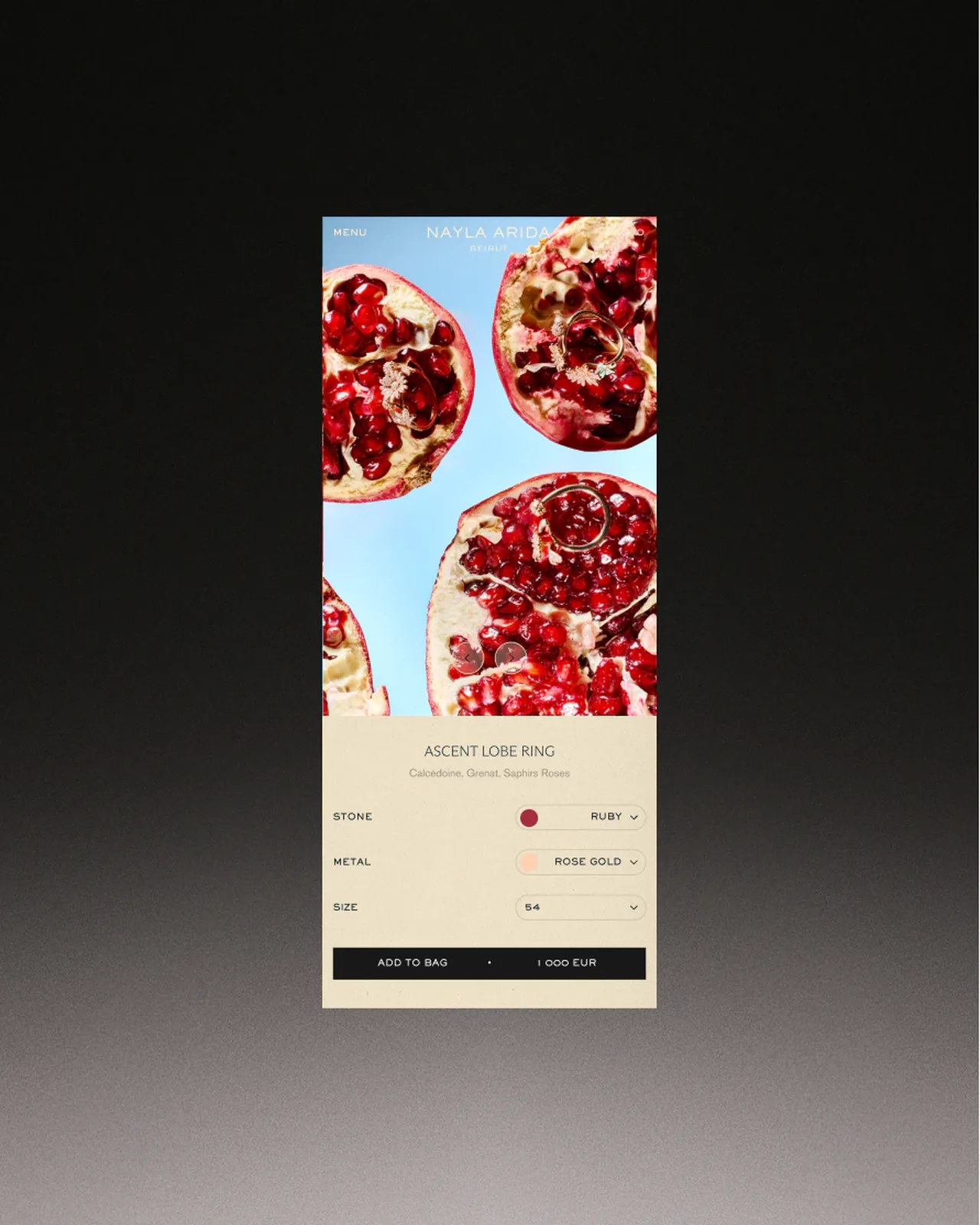
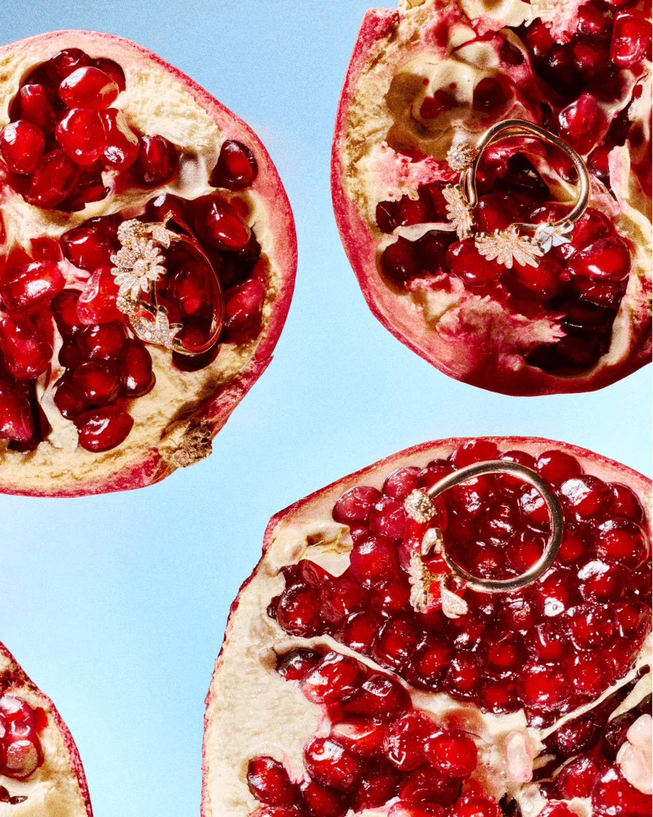
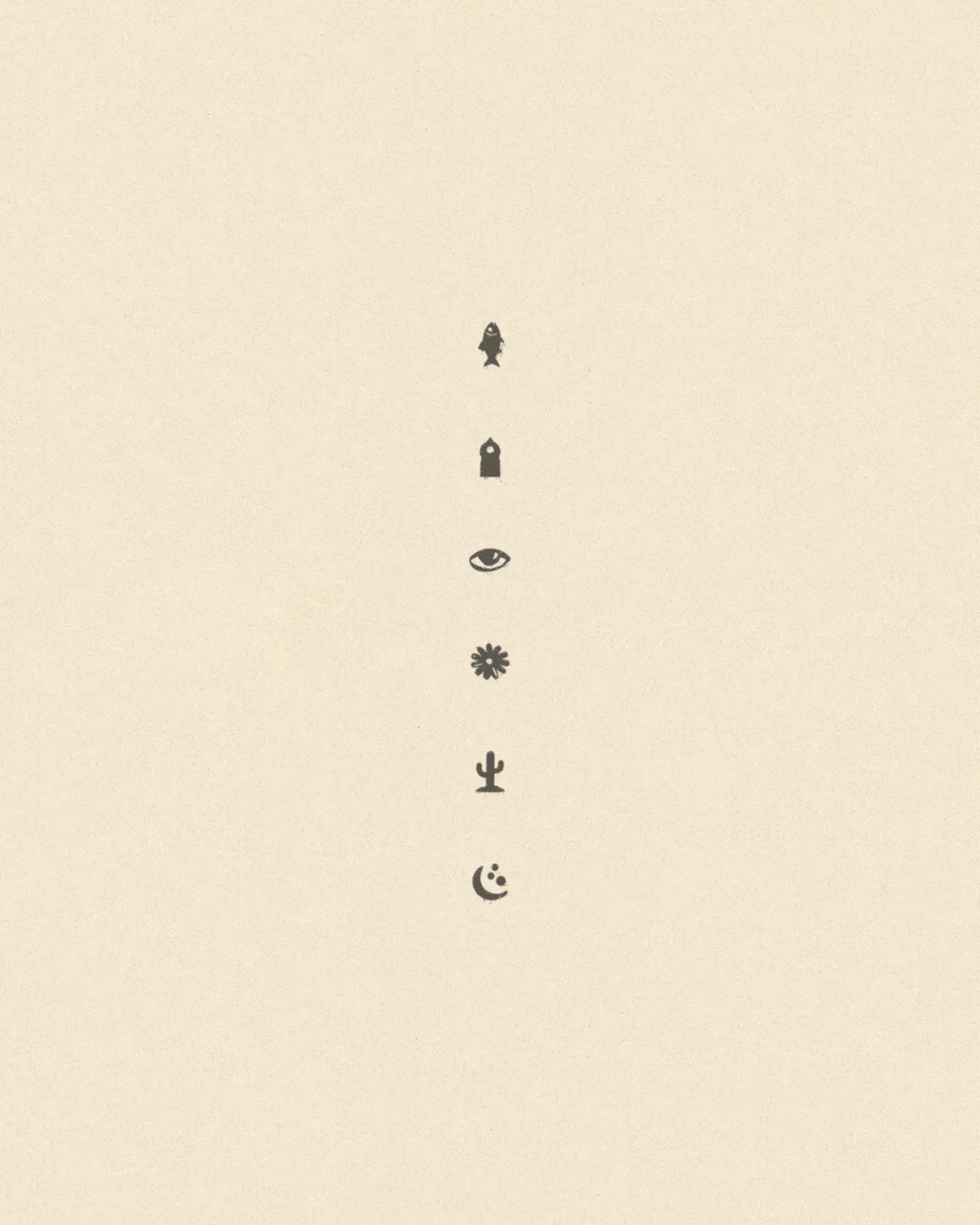
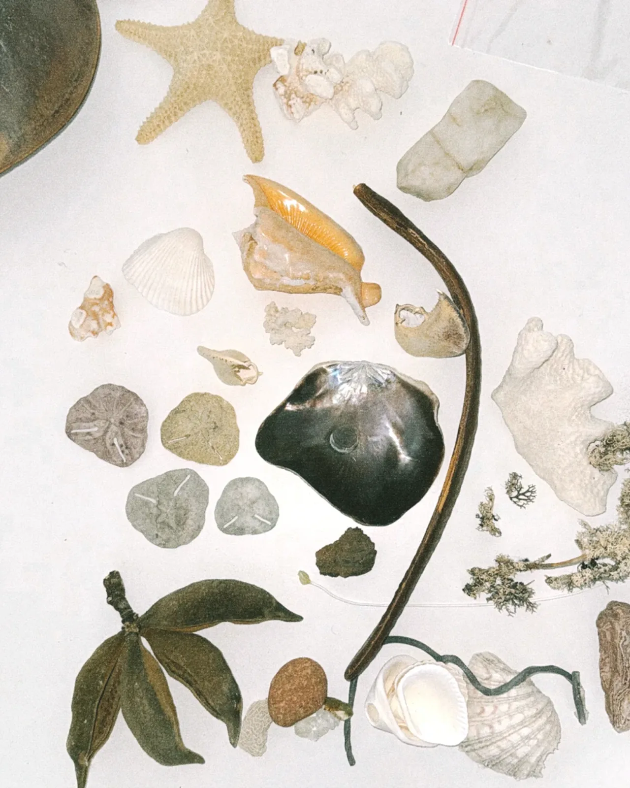
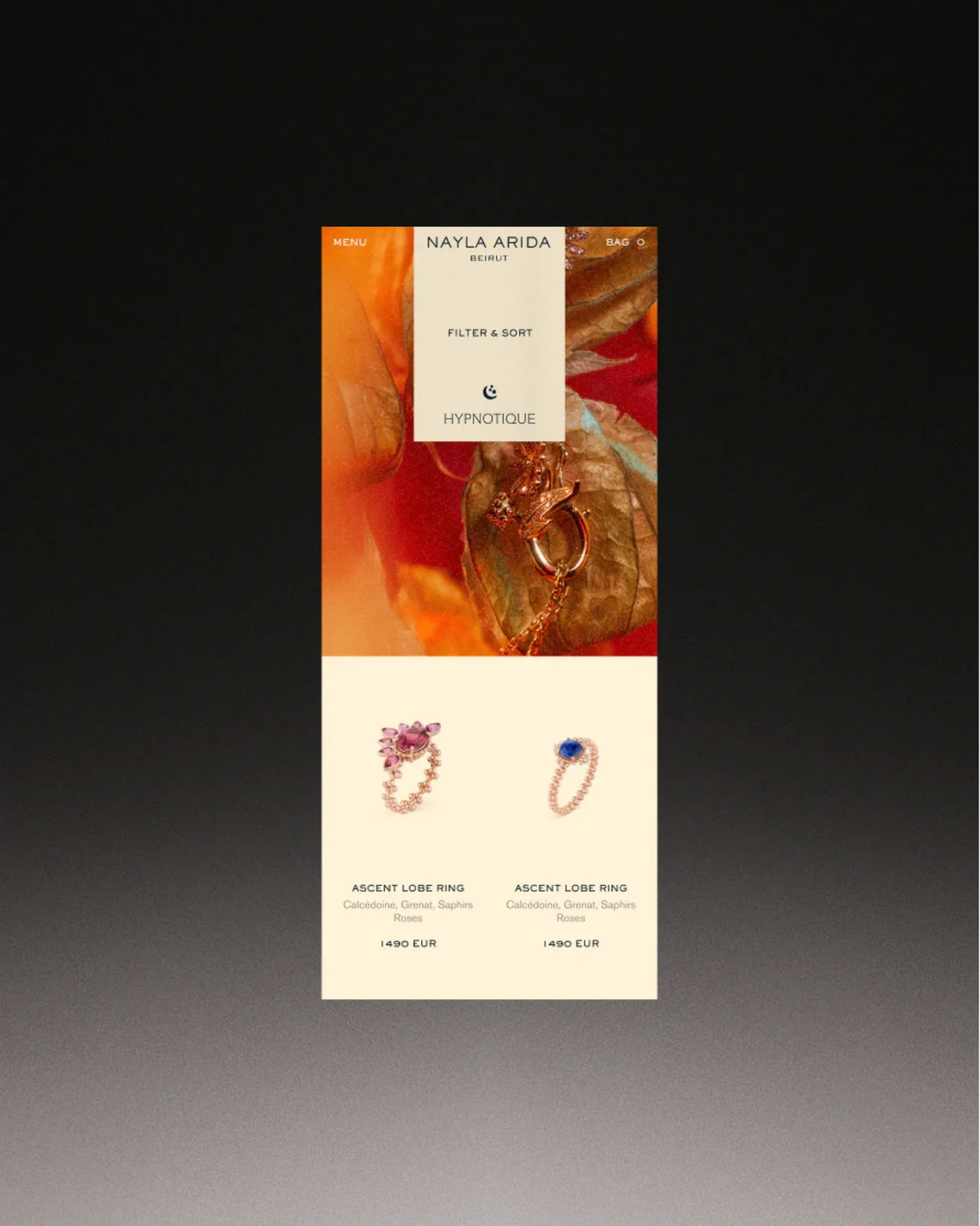
The packaging uses gold embossing, textured papers and small printed symbols, so the unboxing carries the story on. Every collection got its own photo world of pomegranates, dried flowers, sea shells and translucent materials, extended into motion and into an online shop that tells the story instead of acting as a catalogue.
Creative direction by Marek Suchánek, project management by Sara Bauerova, graphic design by Markéta Mášová and Jesus Lopéz, web design art direction by Elena Smirnova, photography and video by Filip Beránek, motion design by Kryštof Ježek, Tomáš Honěk and Domagoj Štrok, and sound design by Ondřej Holý.
Typefaces: Sackers Gothic by Monotype, ABC Arizona by Dinamo, Akzidenz-Grotesk by Berthold
The BRRRANDING newsletter
Liked Nayla Arida?
Get work like this in your inbox.
New identities every Monday, a themed issue every Thursday. Picked by hand, free.
More inspiration

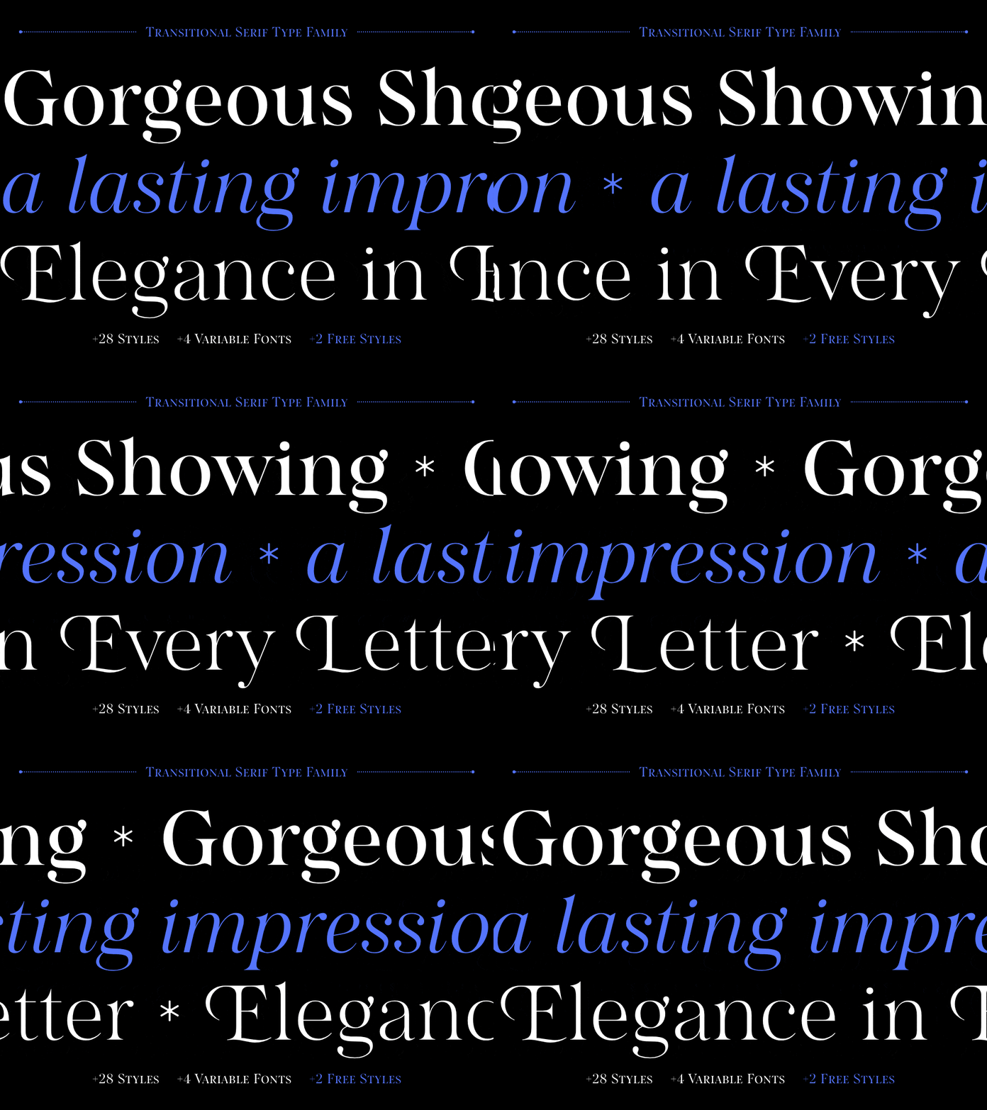
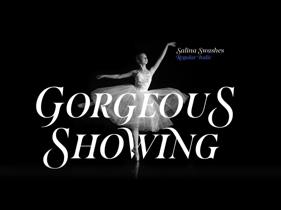
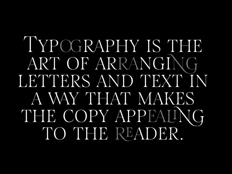
Designing typefaces for creatives seeking to leave a lasting impression.
Explore Salina →This spot is booked monthly. Become a sponsor
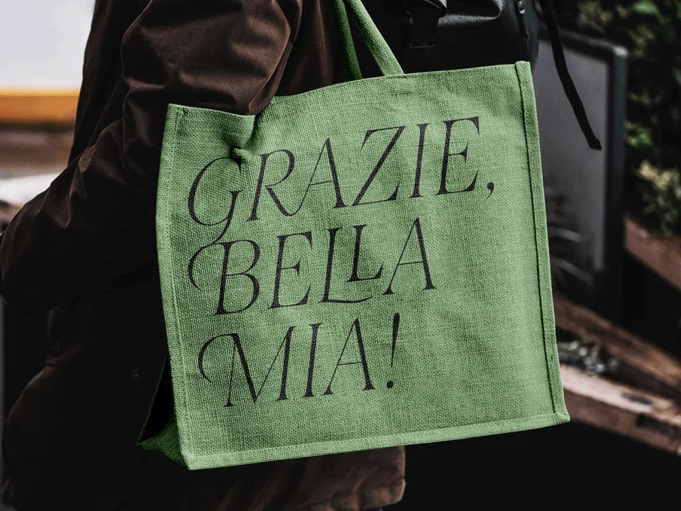
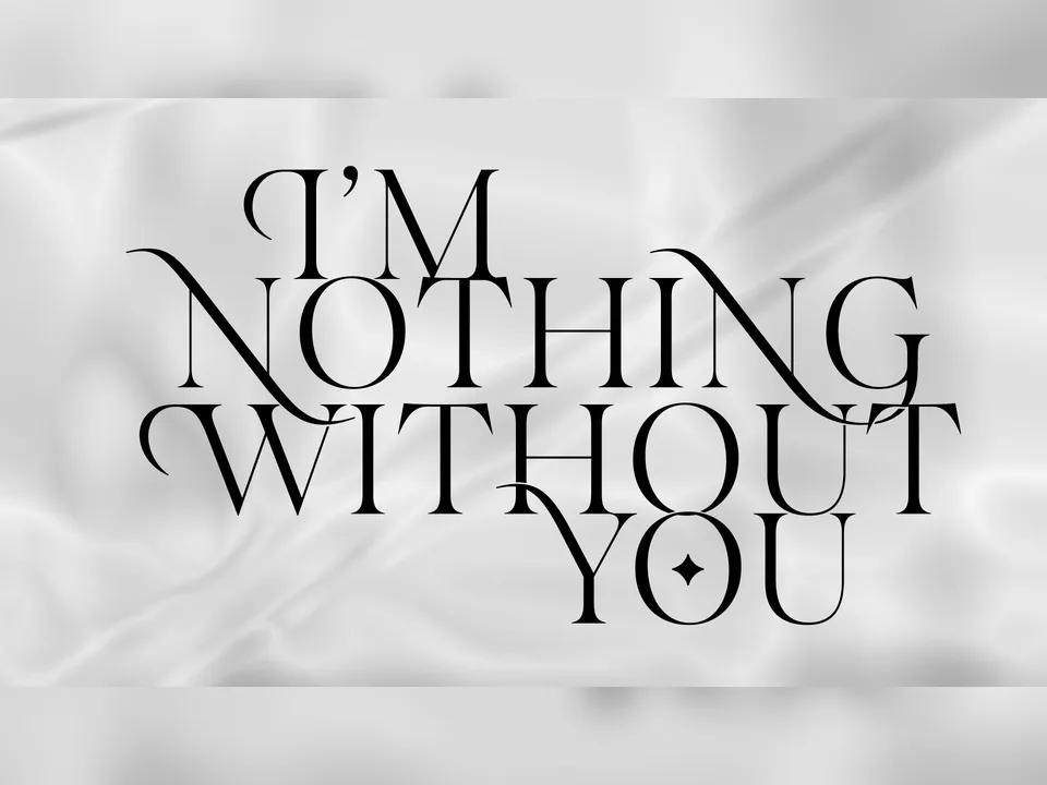
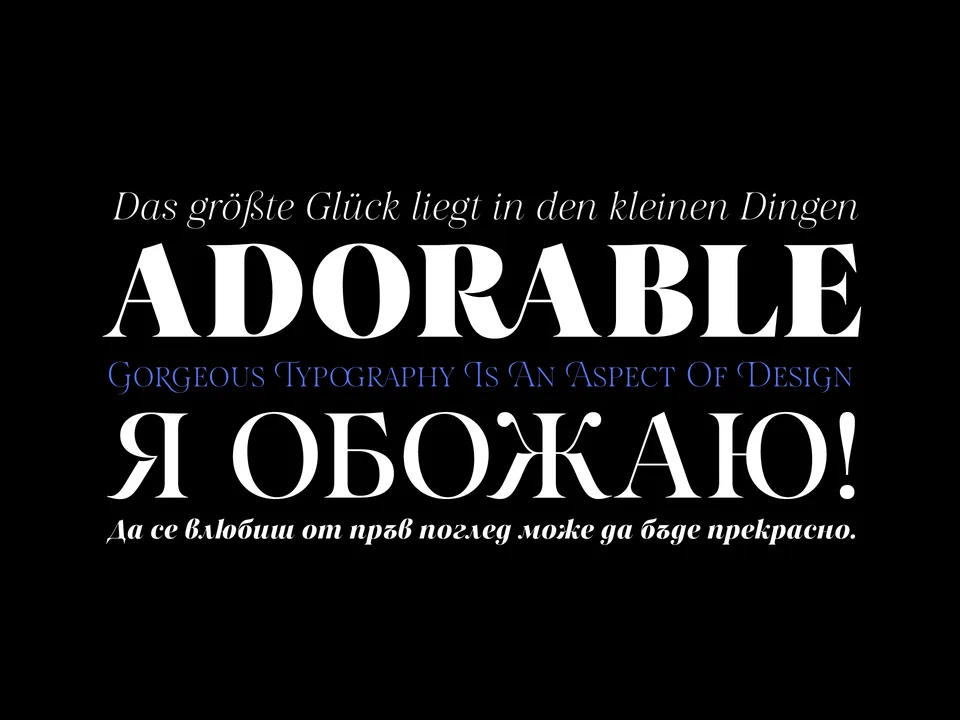
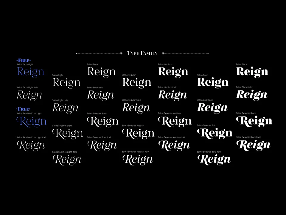
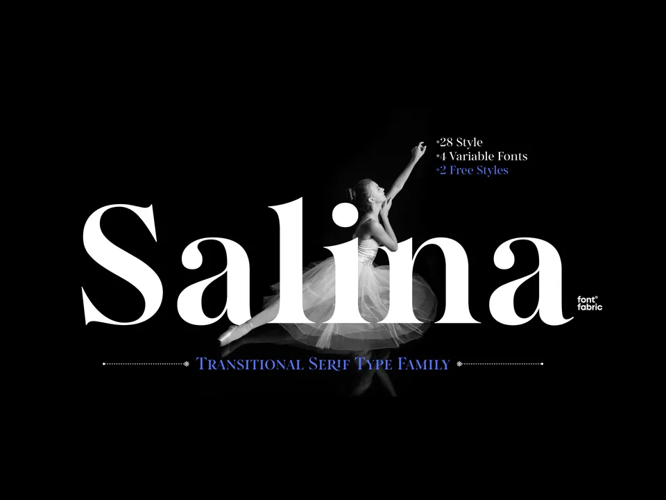
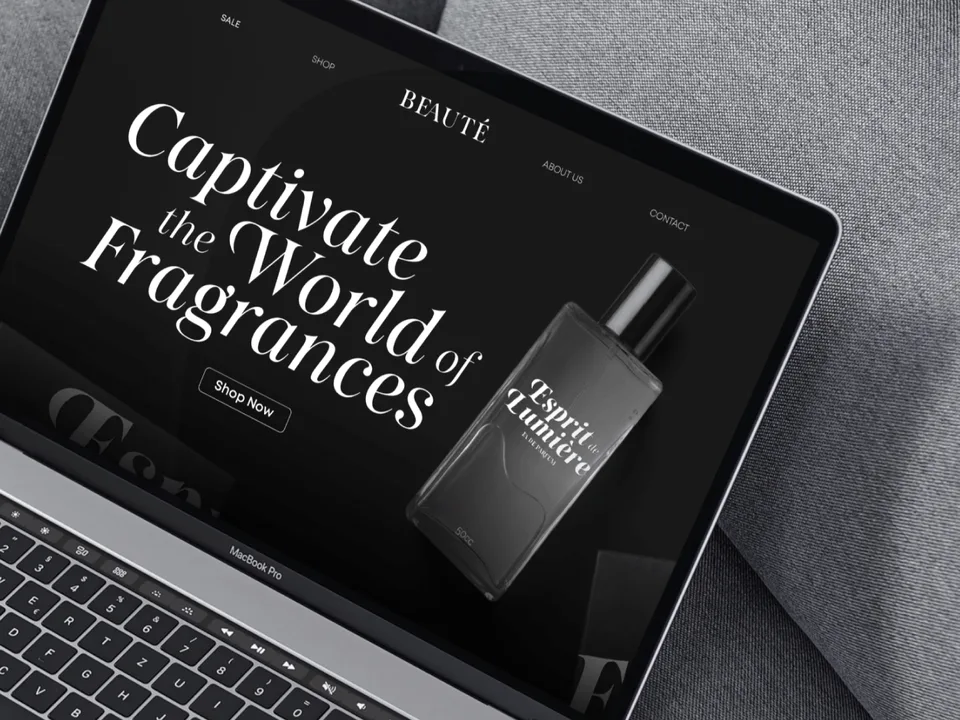
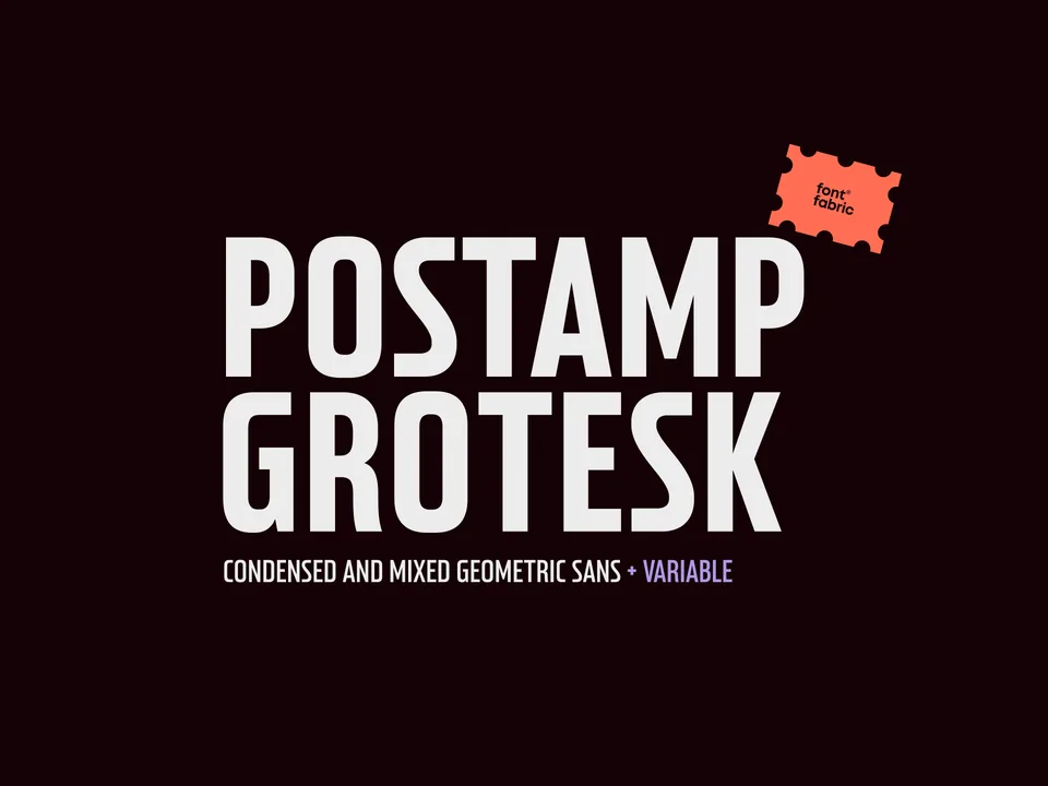
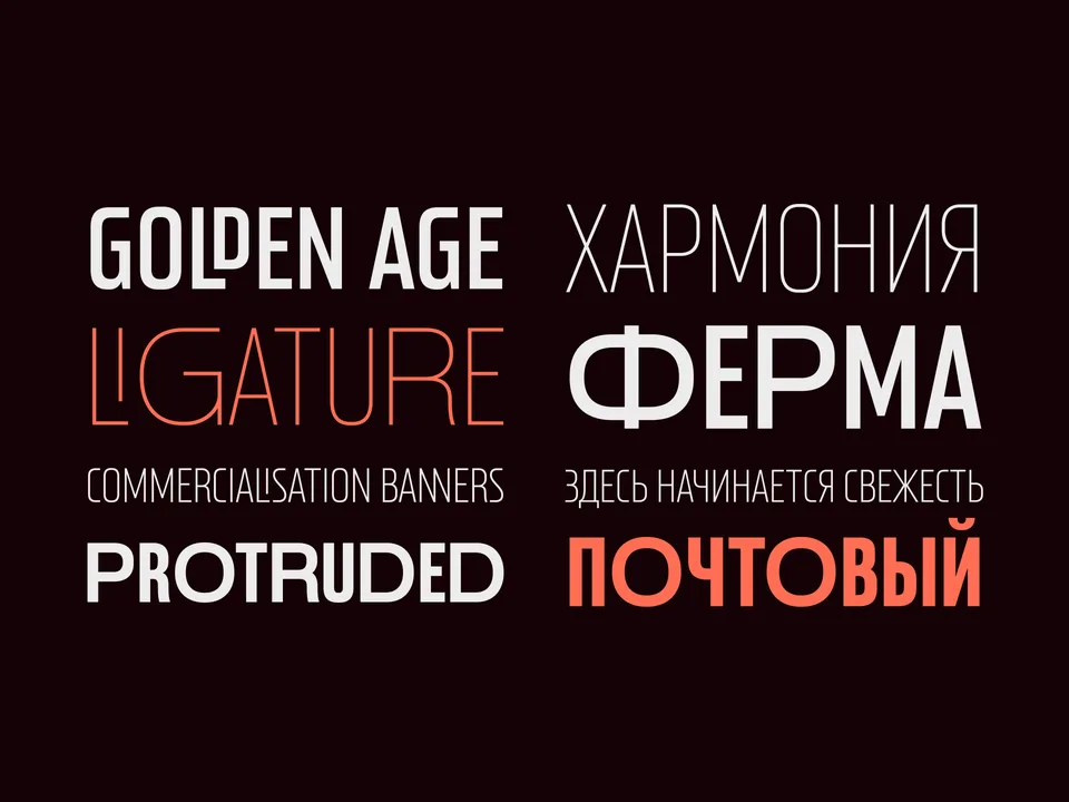
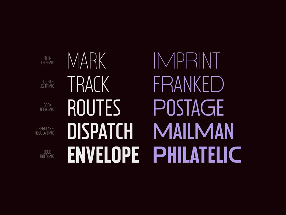
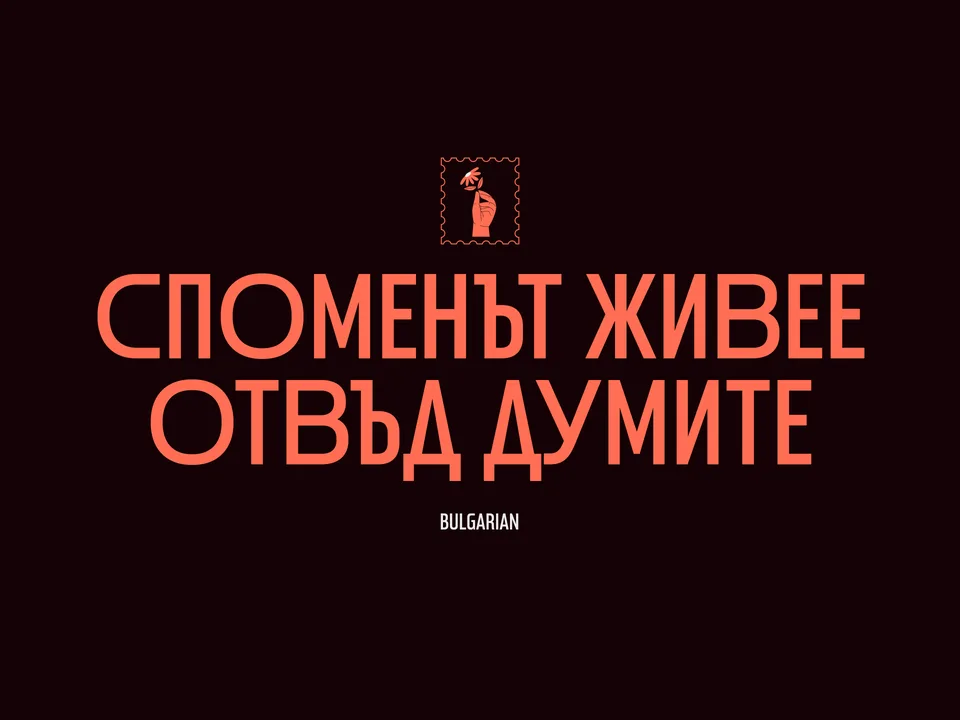
Designing typefaces for creatives seeking to leave a lasting impression.
Explore Postamp Grotesk →This spot is booked monthly. Become a sponsor
Designing typefaces for creatives seeking to leave a lasting impression.
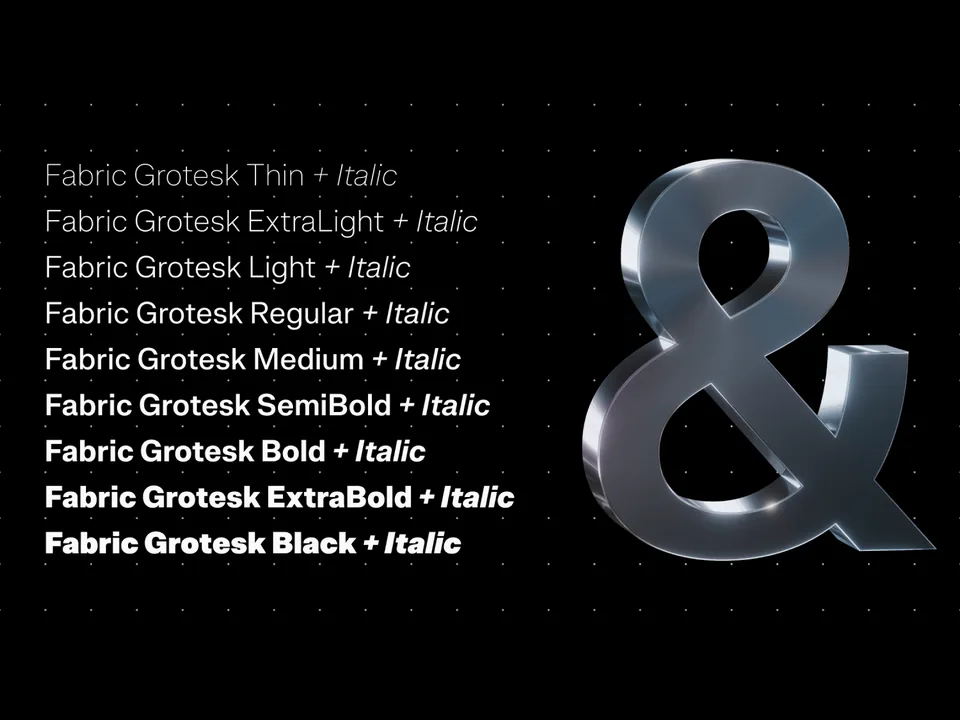
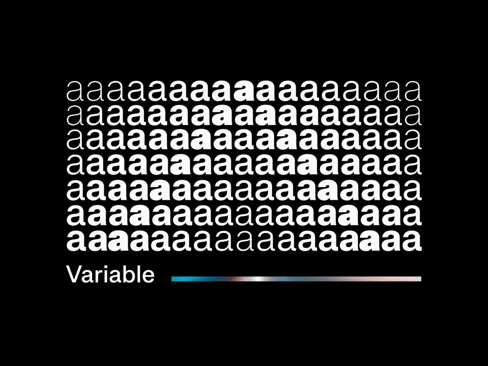
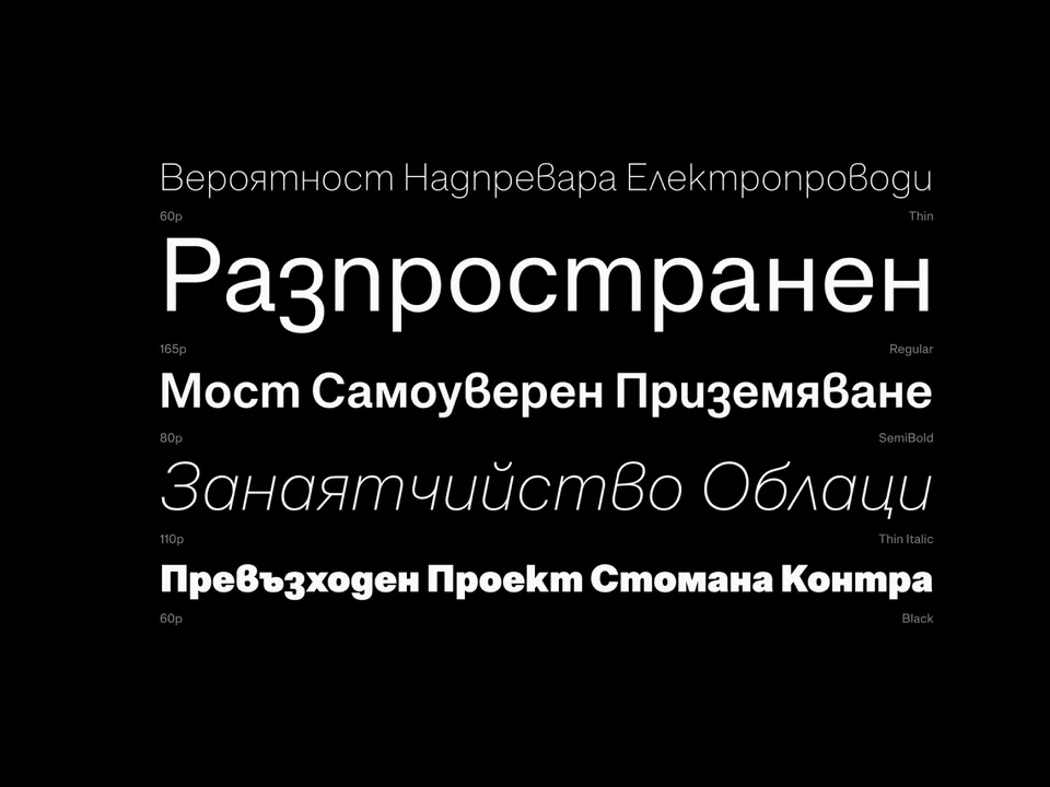
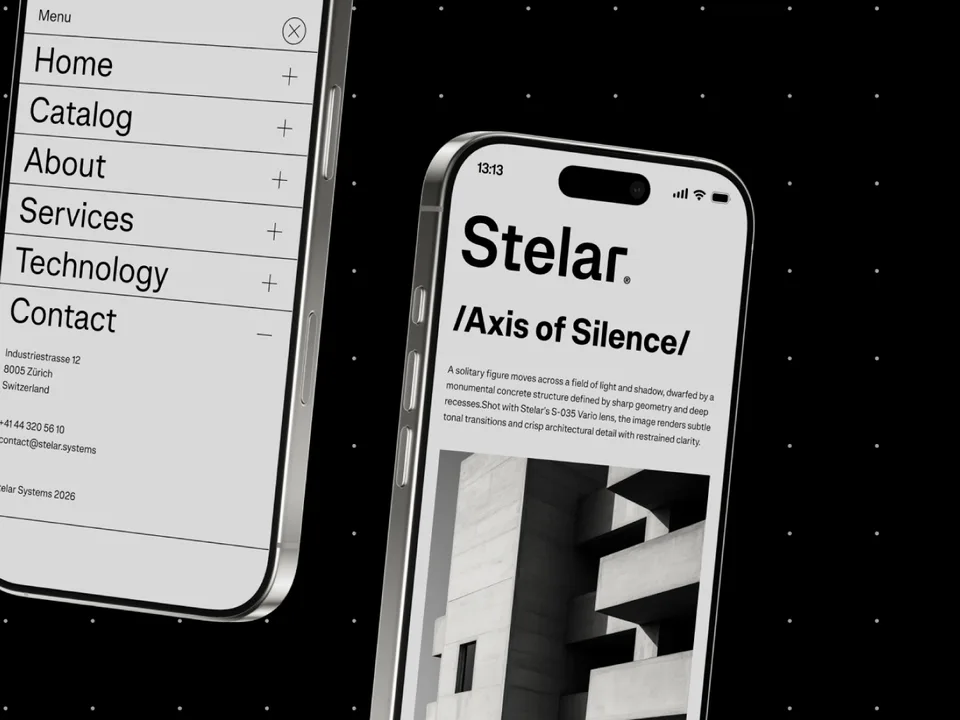
Explore Fabric Grotesk →This spot is booked monthly. Become a sponsor