Ytri Island Retreat
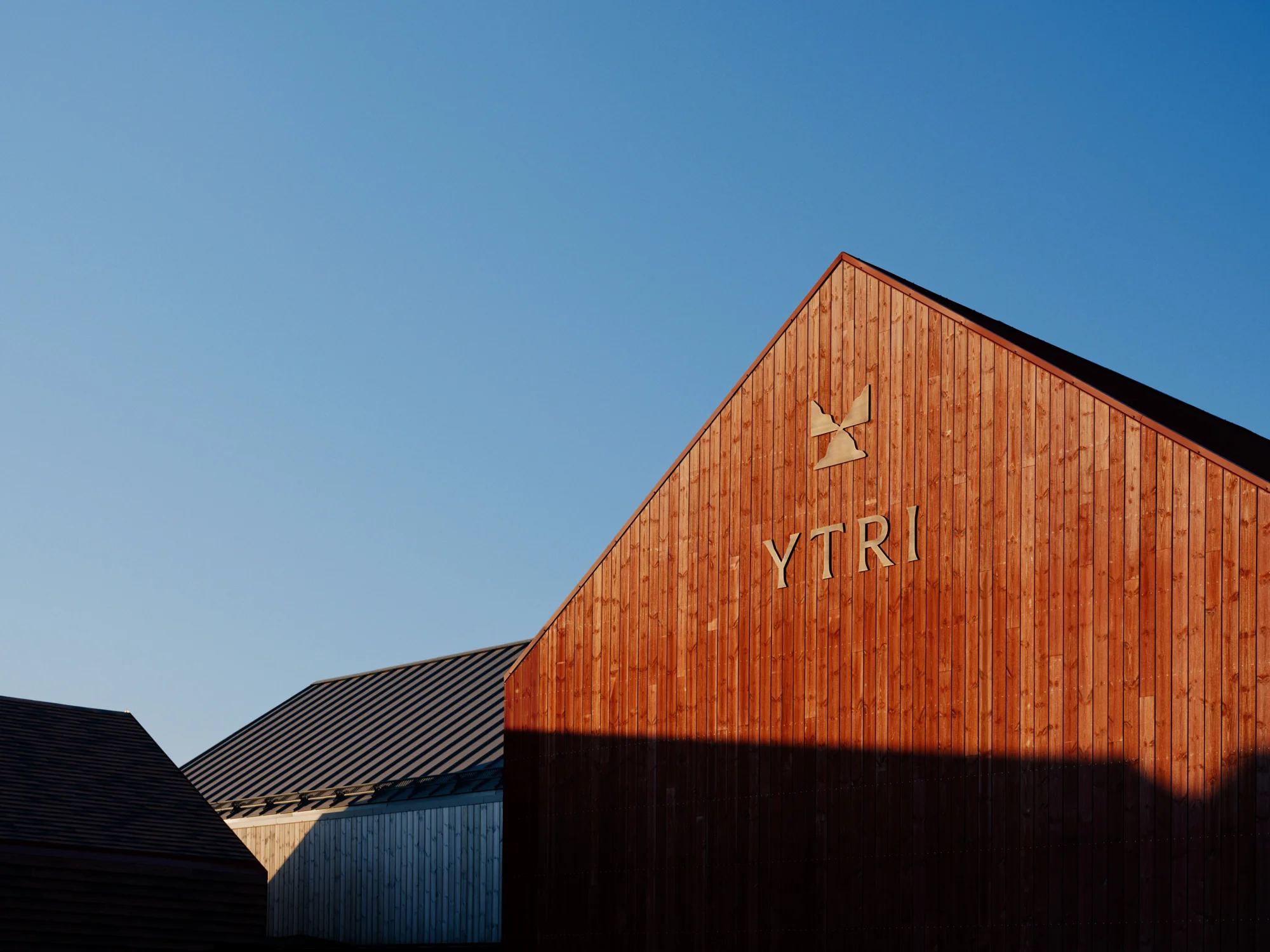
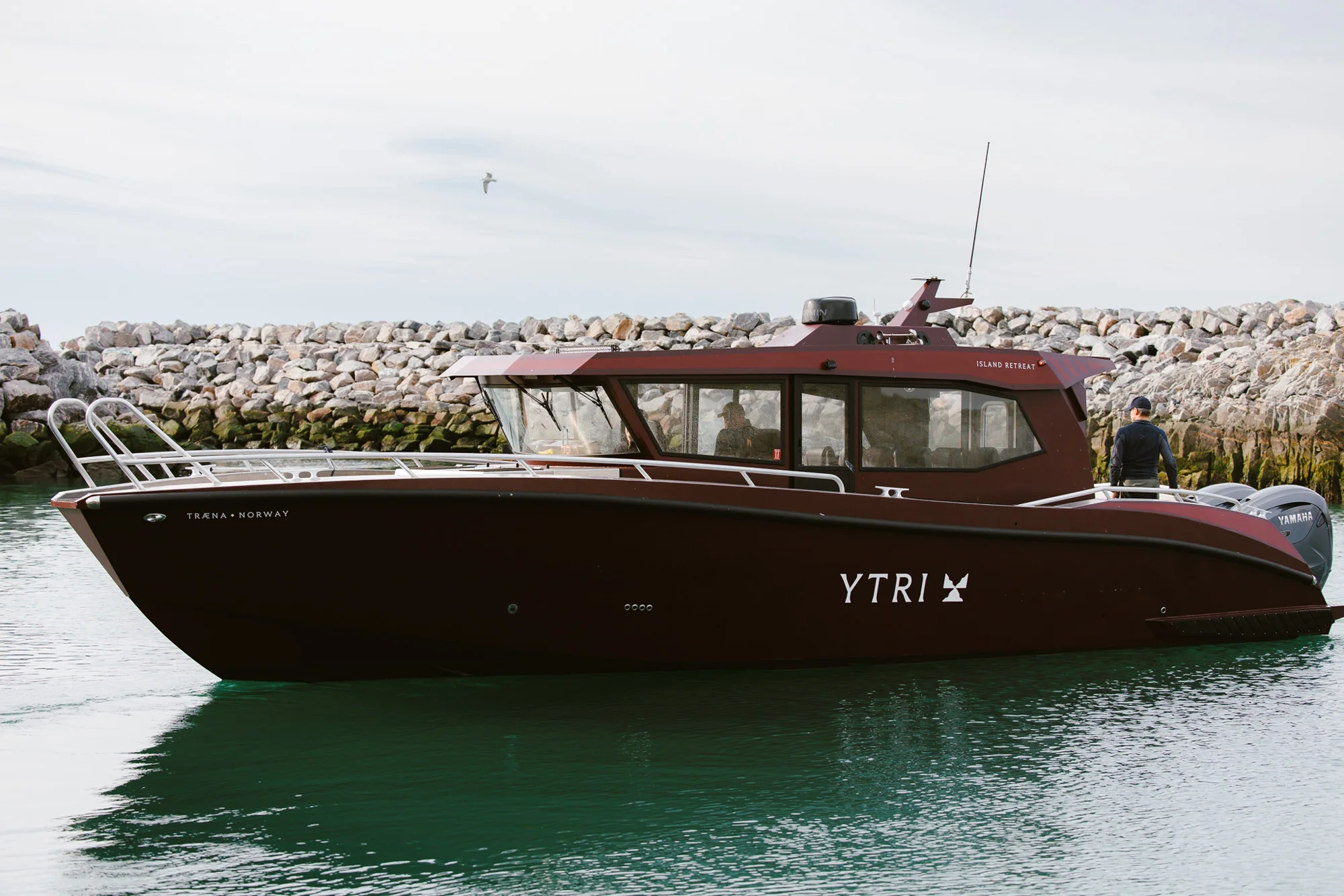
Ytri is a new destination hotel on Træna, a remote island group far out in the sea off northern Norway, and Bielke&Yang built the brand from the name up. Ytri comes from Old Norse and means the outermost point: the place at the edge of the map, facing the open ocean, a long way from everyday noise and pace.
The big idea is the sea people, the islanders who have lived from and with the ocean for 9,000 years. It is not there to romanticise the past but to explain the place, and it ties everything together: the hotel, the restaurants, the activities and the way guests meet the local community, with room to grow. The tone is barefoot luxury, where quality lives in details, materials, silence and presence rather than status or excess.
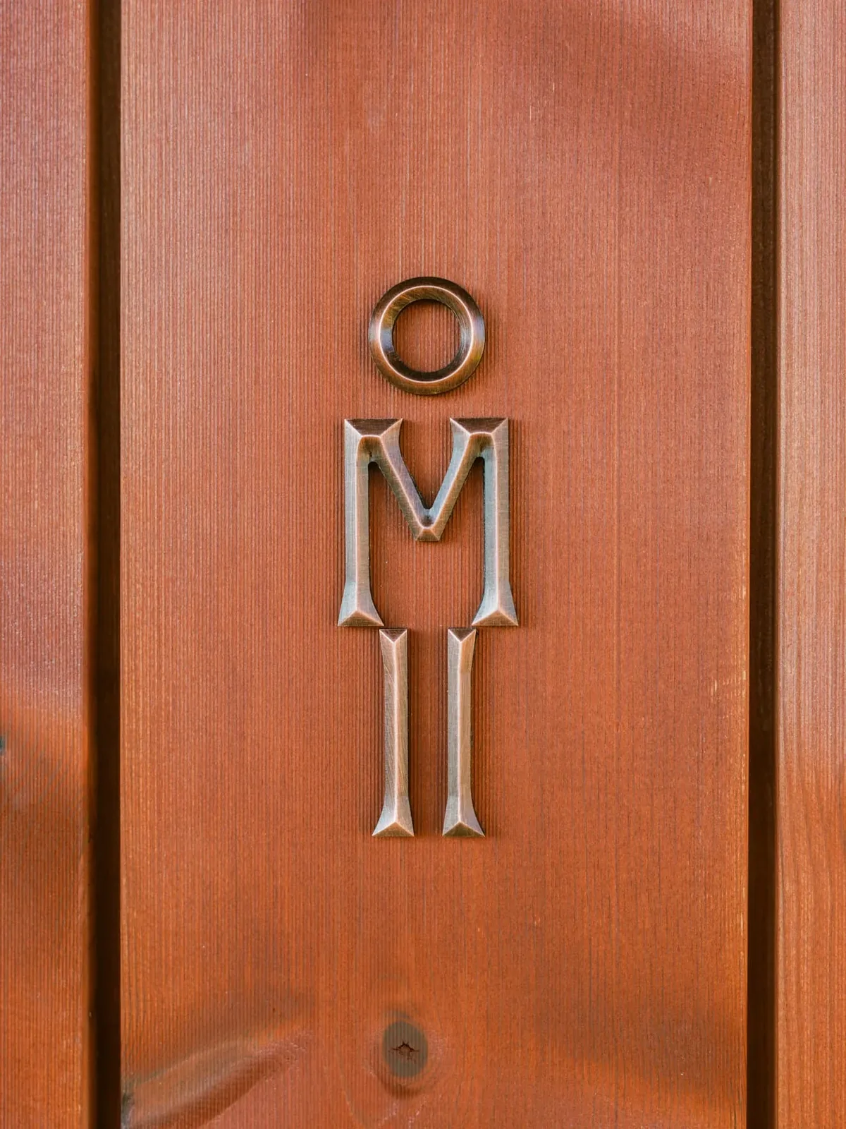
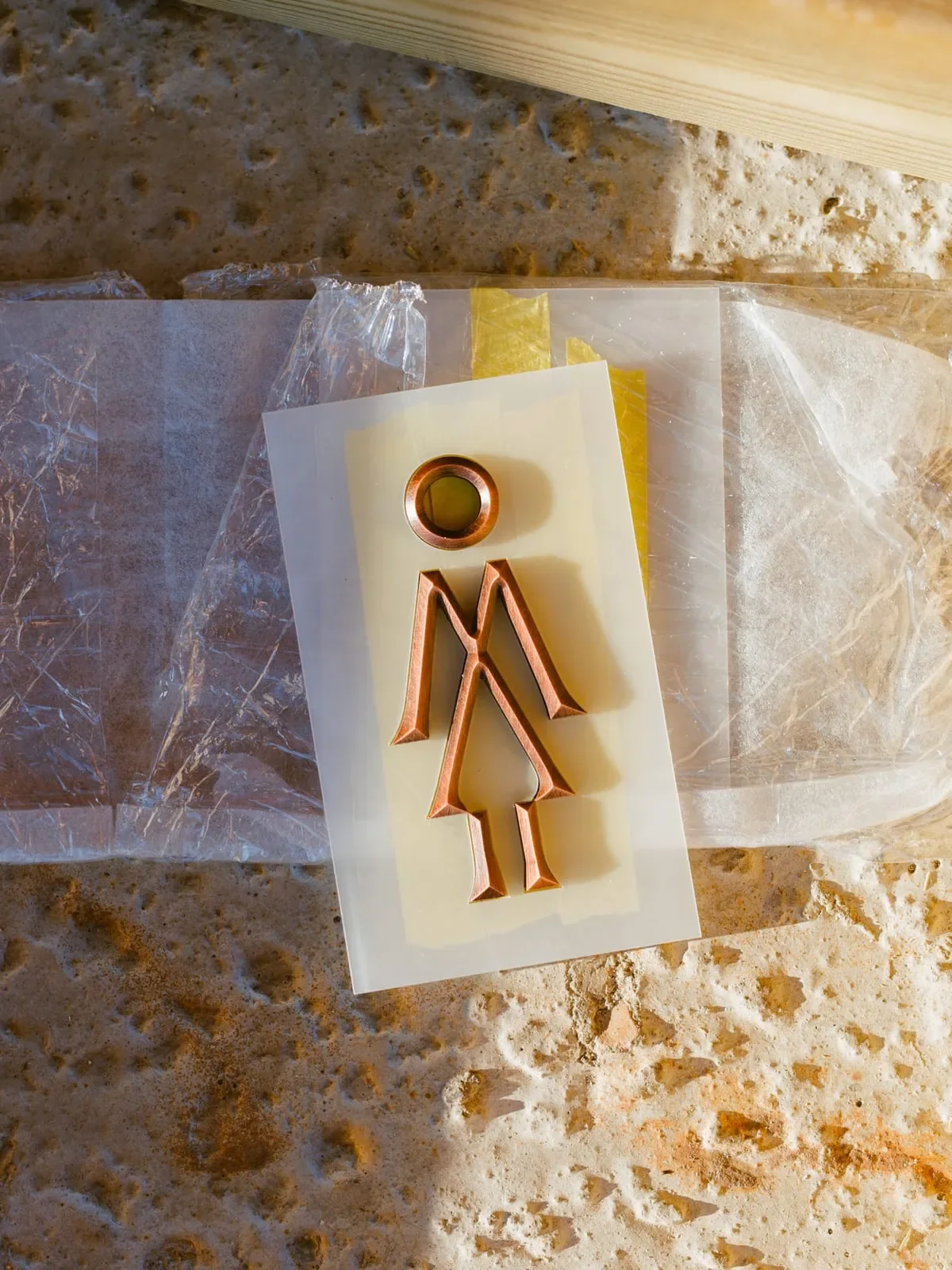
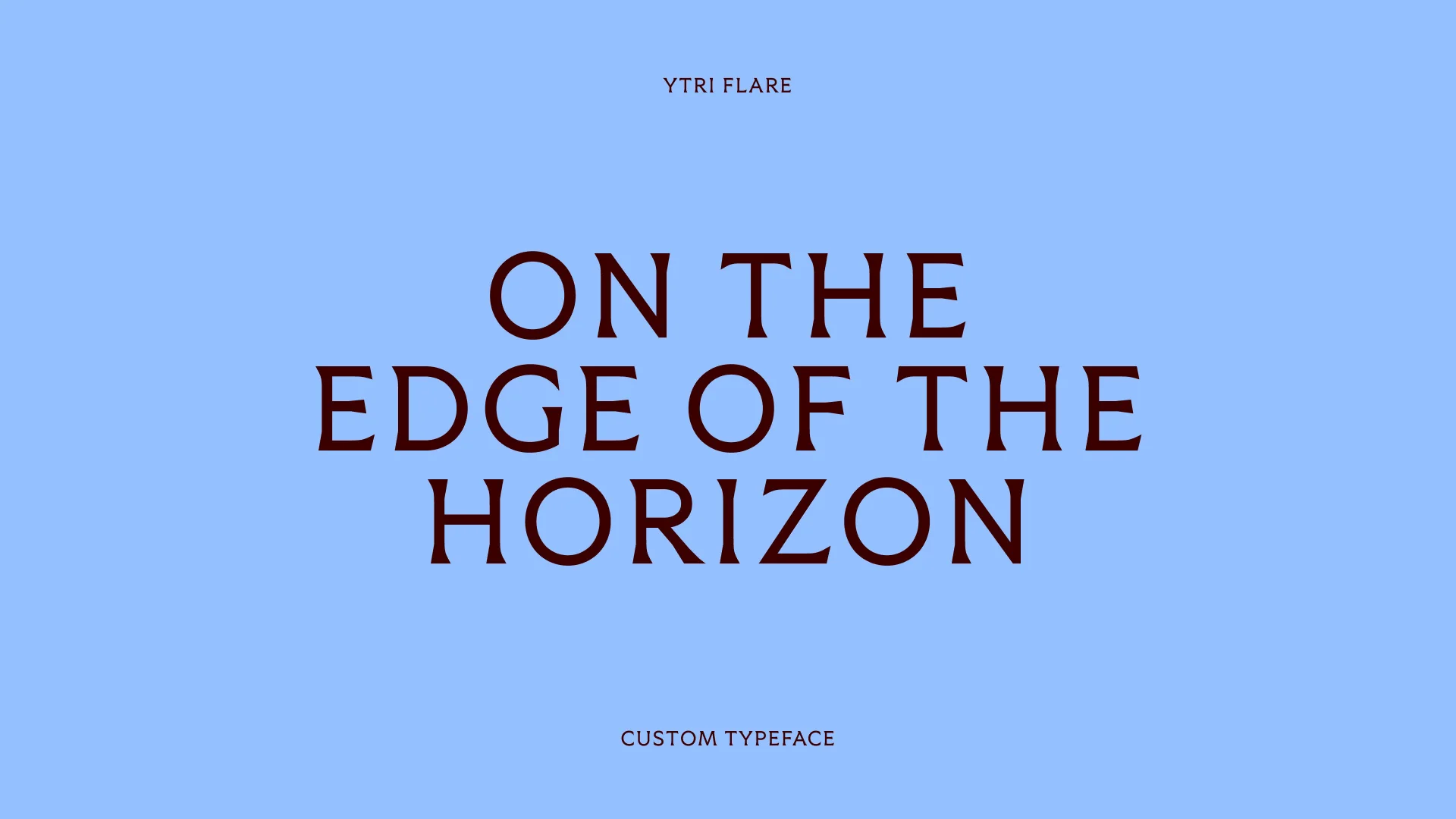
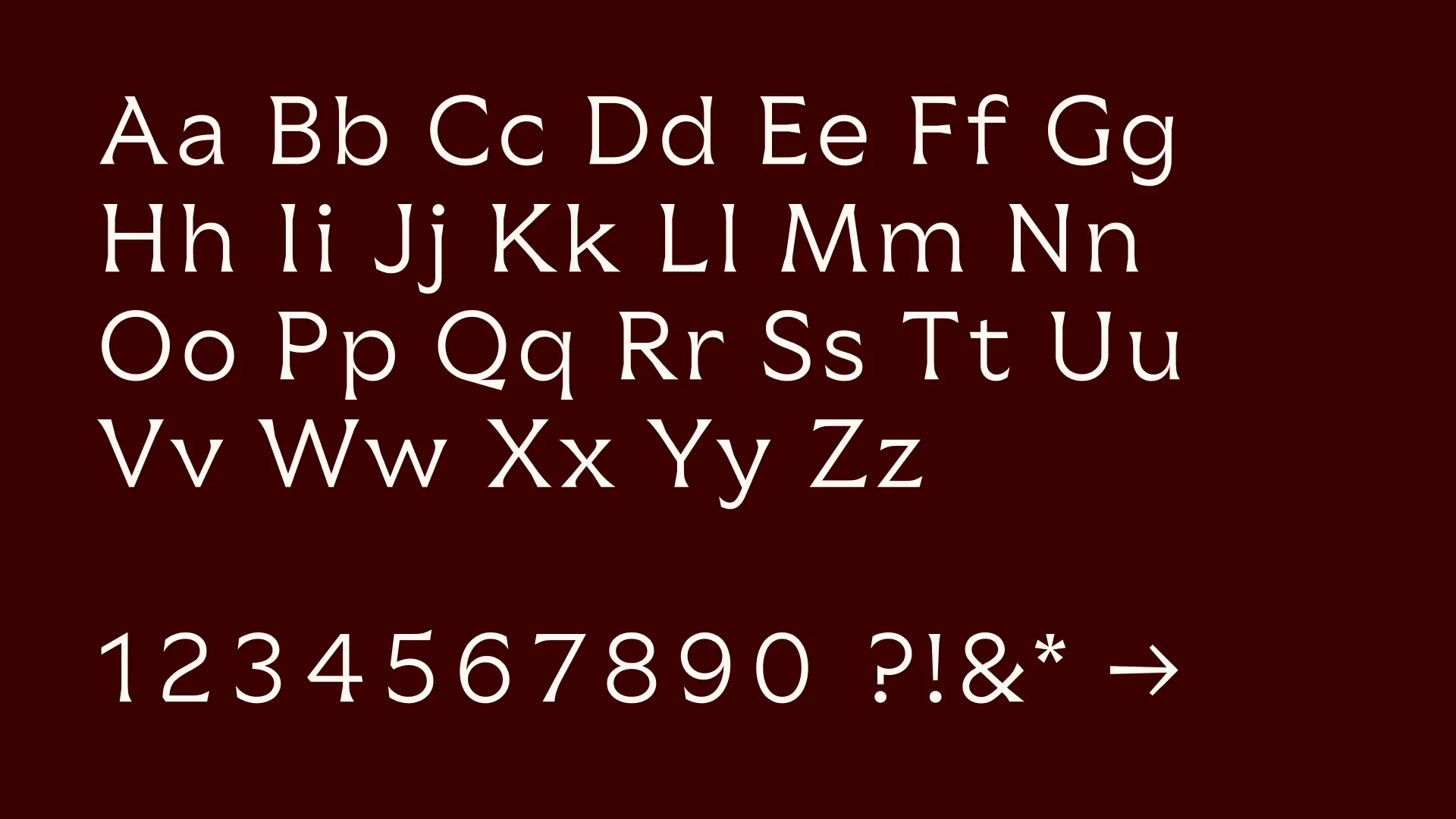
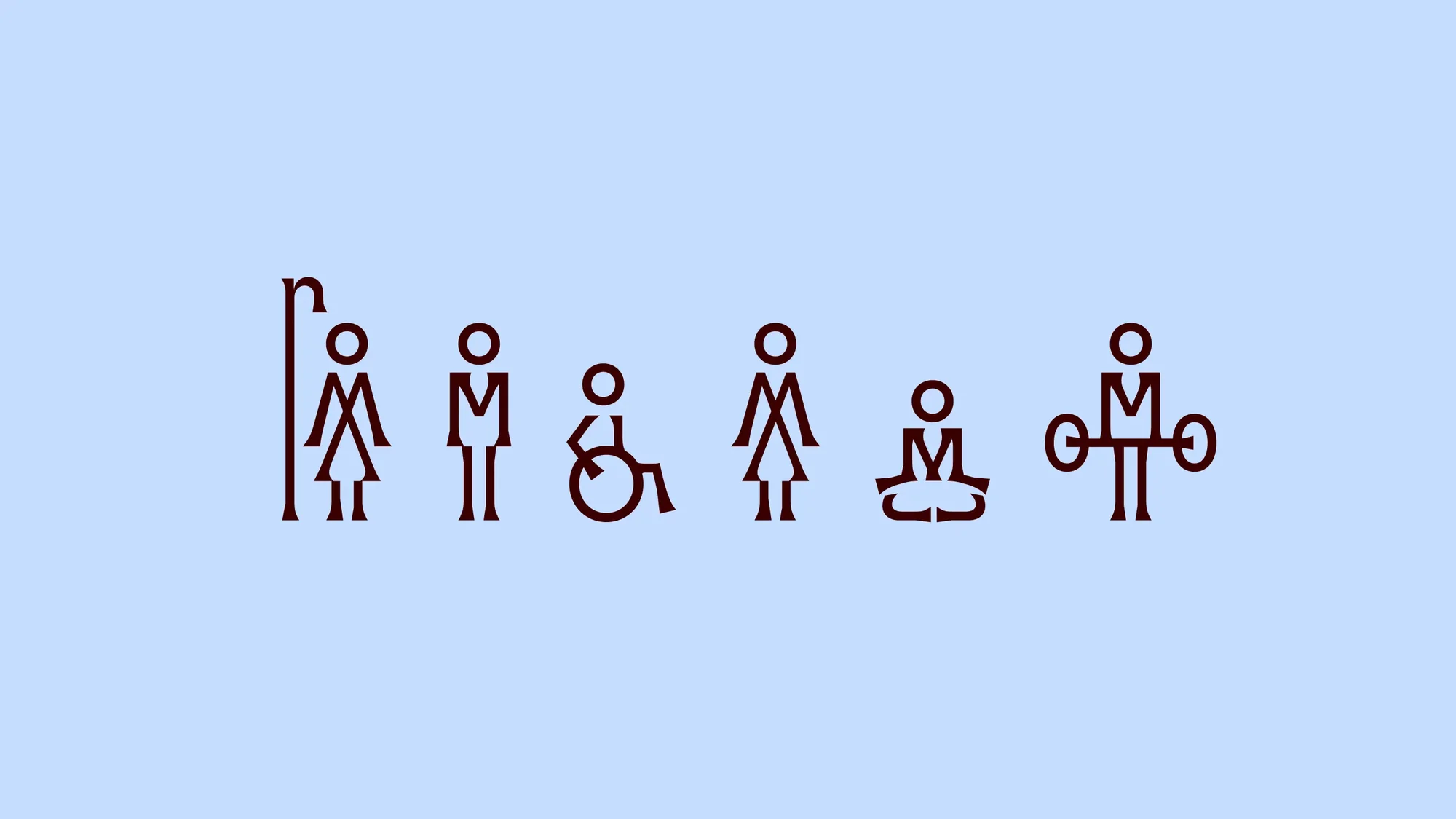
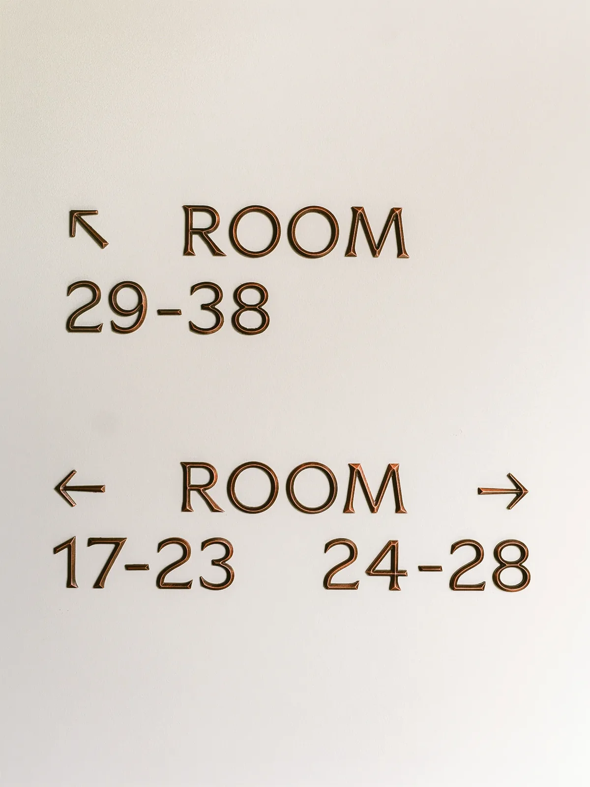
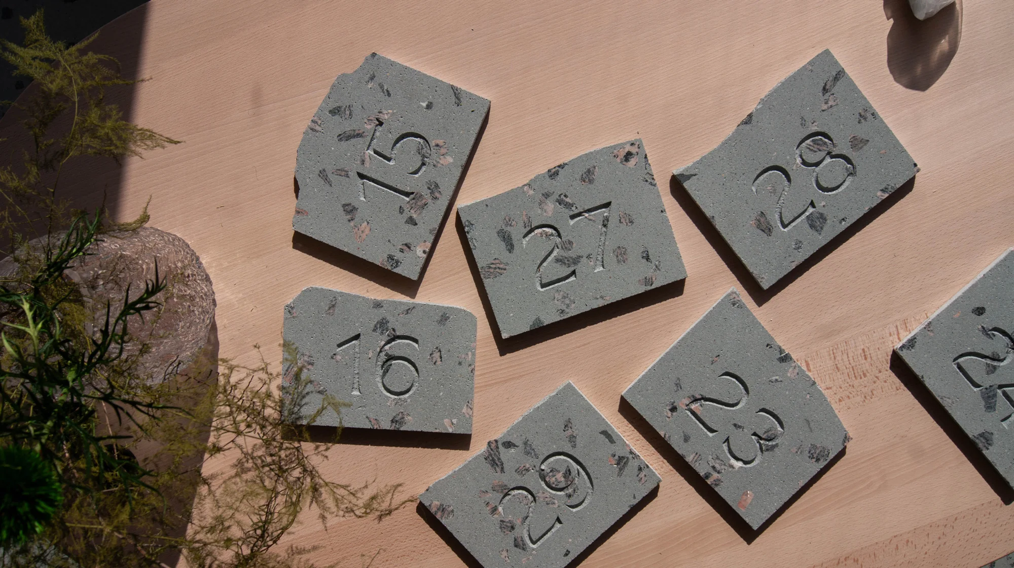
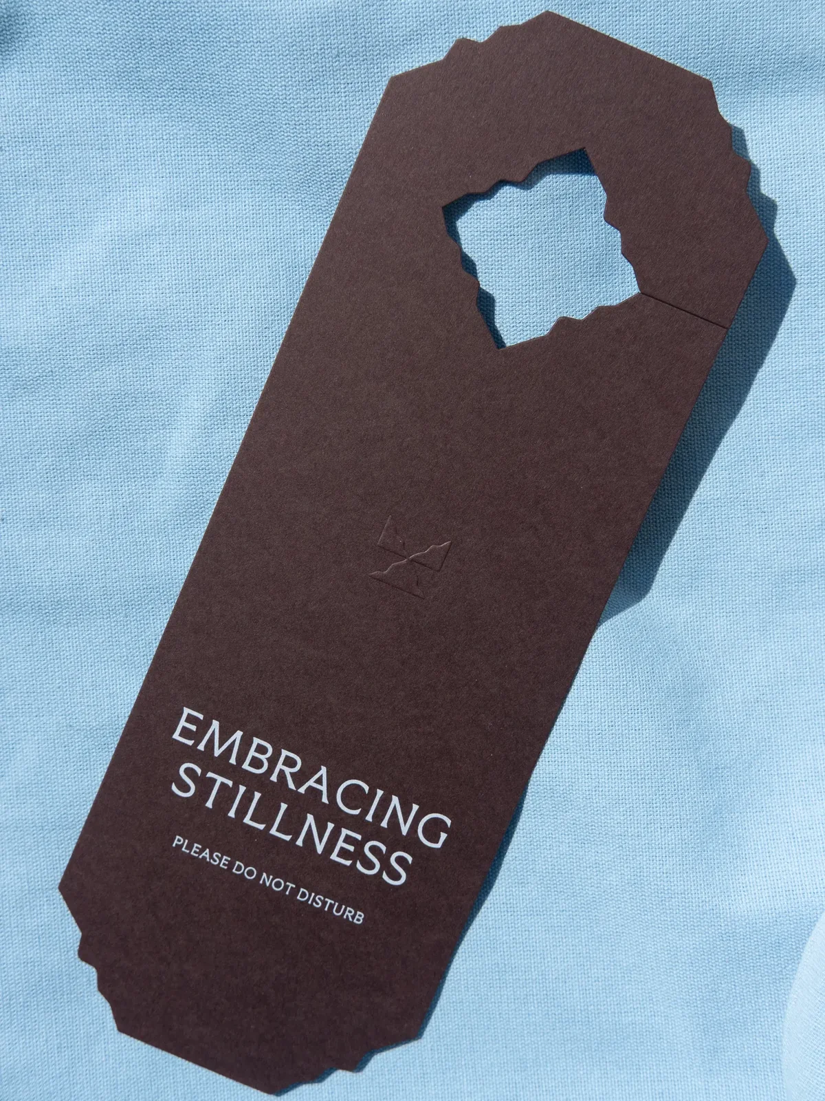
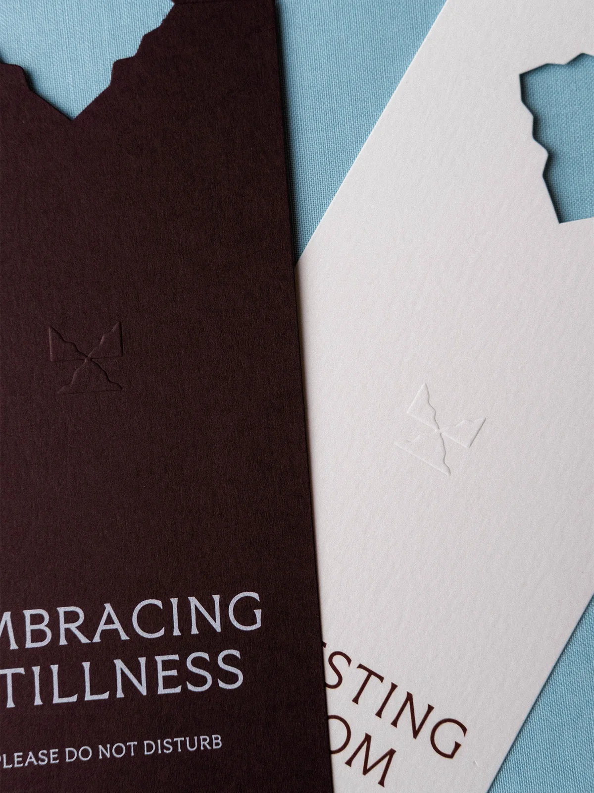
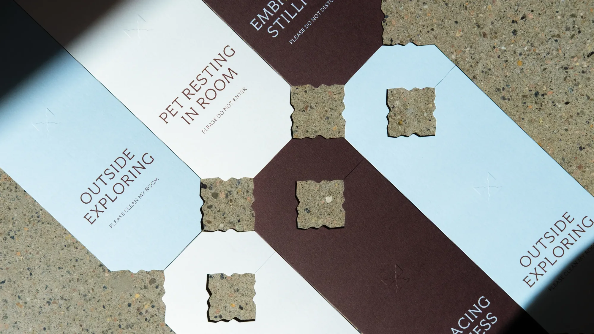
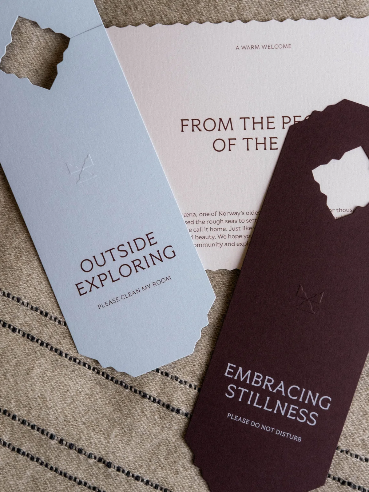
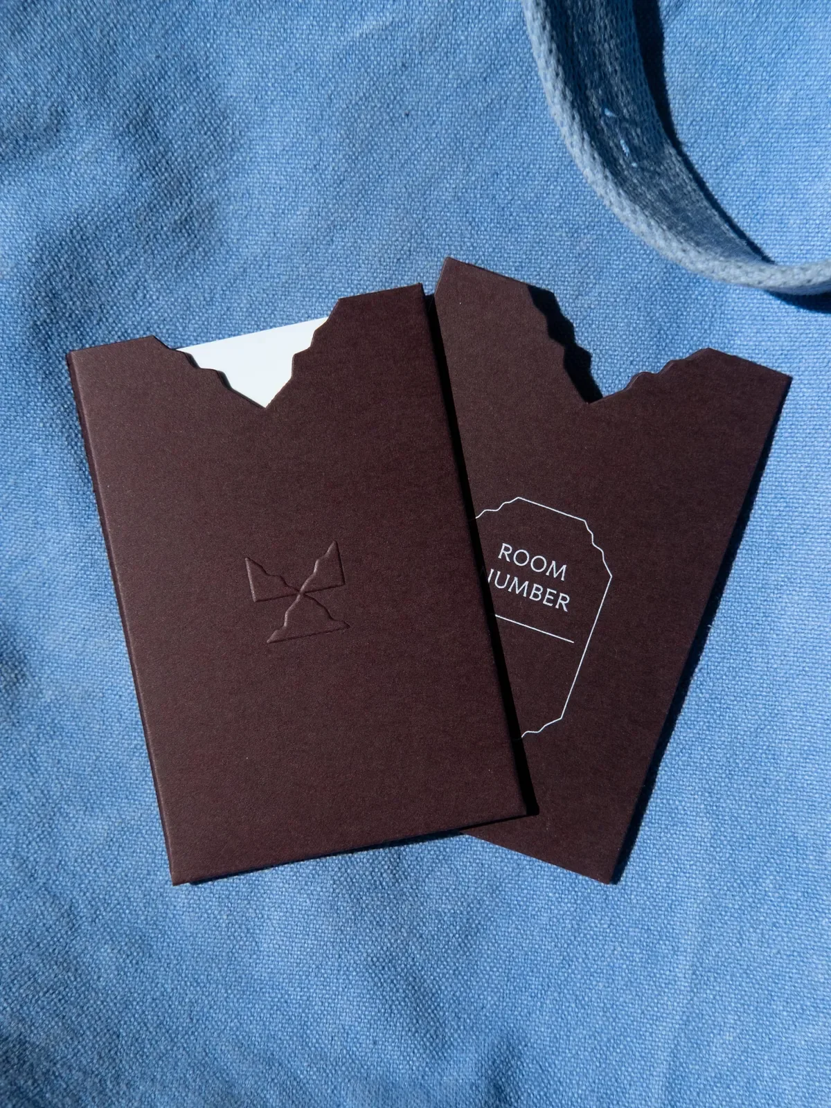
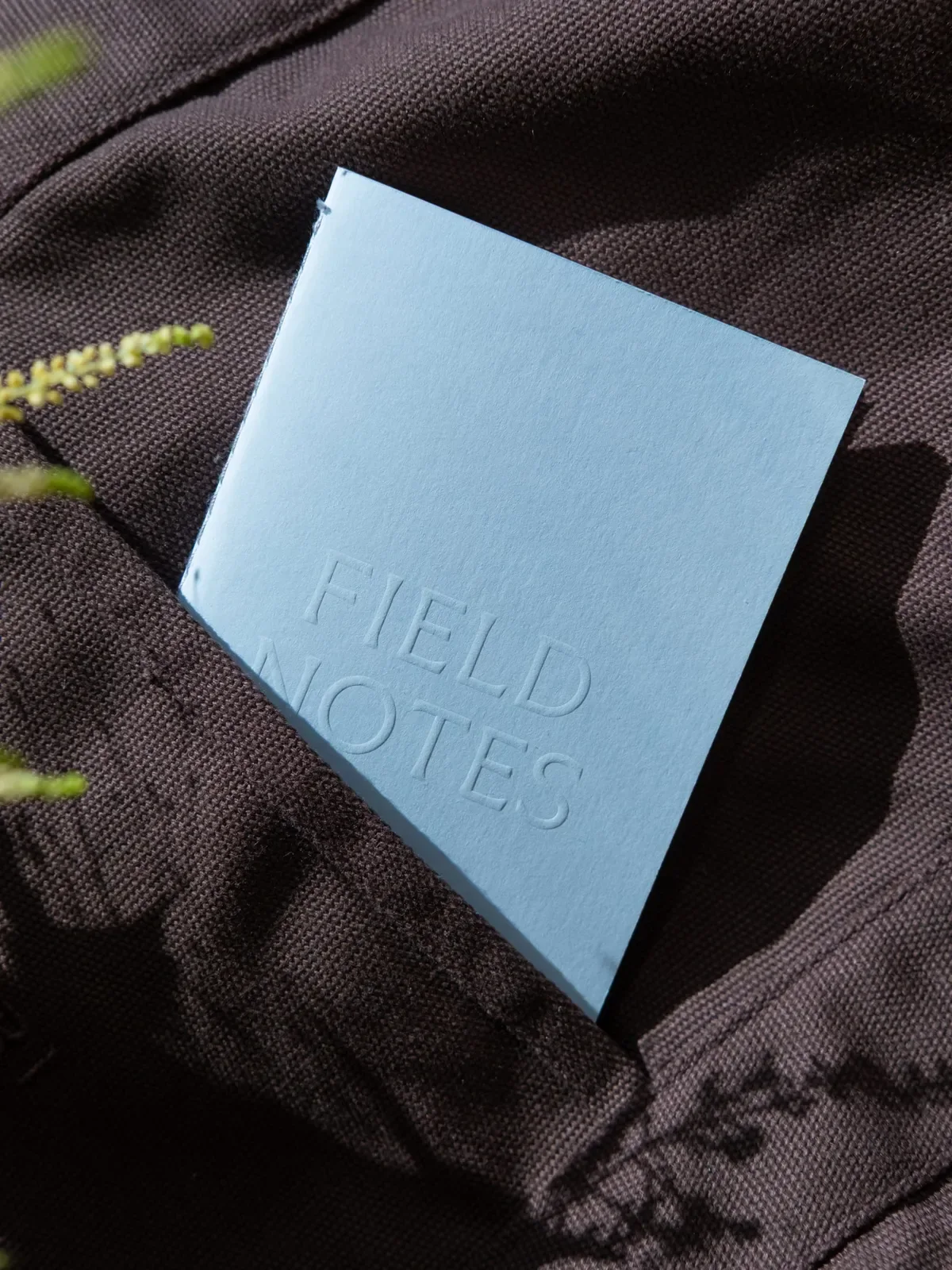
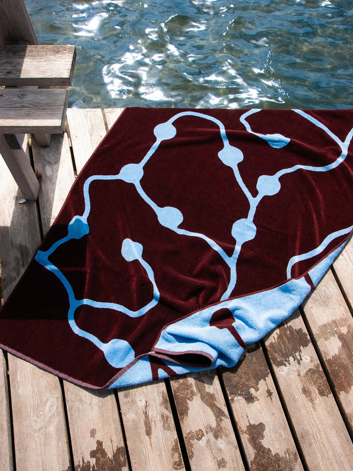
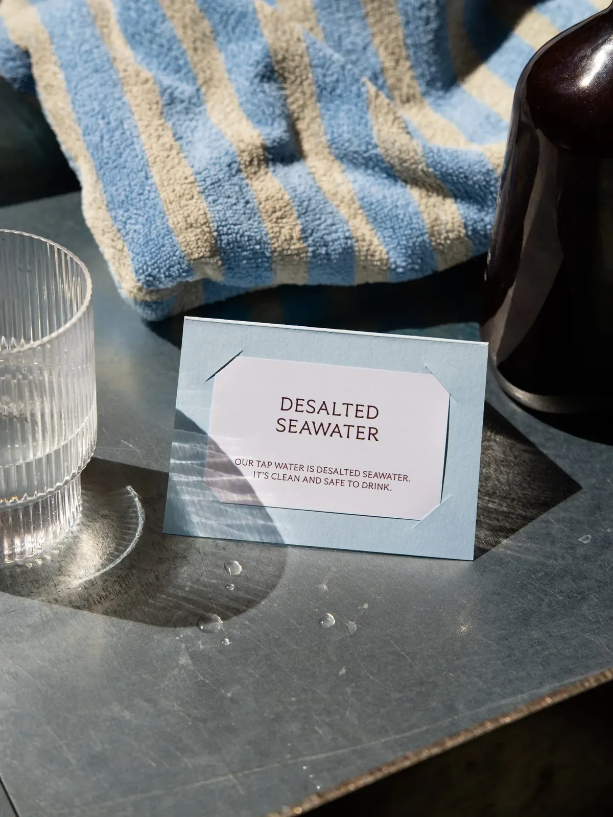
The identity plays on Træna's contrasts, rugged and warm, weathered and welcoming, simple and detailed. A deep sea red and a pale sky blue carry Ytri Flare, a custom typeface drawn with Bobby Tannam, a set of pictograms and a flexible system that runs across signage, key cards, door hangers, textiles, menus and the website, which works as both a practical travel guide and a way into Ytri's world. The hotel opened in spring 2026 and has since joined Relais & Châteaux.
Typefaces: Ytri Flare by Bobby Tannam

More inspiration

Branding mockups right inside Figma. No PSD wrestling.
Try the Figma plugin →This spot is booked monthly. Become a sponsor